The network for creativity
Join 1.25M professional creatives like you
Connect with clients, get discovered, and run your business 100% commission-free
Creatives on Contra have earned over $150M and we are just getting started
Back to feedPost
🎥The Free,Portrait
In the middle of the night, inside the silent, modern halls of a museum art gallery, a young curator discovers a mysterious, nameless painting. The more he attempts to uncover the secrets hidden within its brushstrokes, the stronger he feels the presence of something that should have remained locked away.
Darkness begins to take hold, and the line between reality and nightmare slowly fades. Will he succeed in revealing the truth, or will this gallery museum become his final resting place?
Witness a thrilling tale of obsession and unspoken mysteries.
Fully generated with Renoise AI.


thank u


honestly, i really want to know what happens next in this gallery


This is creative and engaging. Looking forward to more AI-generated stories!


A mysterious painting and dark secrets? I’m hooked already

Brilliant work! Looking forward to seeing more of your AI creations. 🎬


Really looks like an incredibly thrilling and eerie concept. The Renoise AI generation captures a beautifully haunting art museum atmosphere.


This is such an atmospheric and captivating concept! The mystery of the portrait really pulls you in! Great work.


Great atmospheric concept! The eerie museum vibe and mysterious portrait had me hooked from the start, perfect thriller setup. 🔥 Well done!

🚀 "This concept is insanely creative! Massive potential for Renoise AI. Bullish on AI-generated storytelling! 🔥📈"

Incredible atmosphere and storytelling. The tension builds naturally, and the museum setting makes the mystery even more haunting. Amazing work with Renoise AI—looking forward to seeing more! 🎨🌙👏


Very interesting to see

What a consept 🤔 i can't wait to see it 🔥

the atmospher in this looks so incridible


*Chills — this premise is pure psychological horror perfection 🎨🌑*

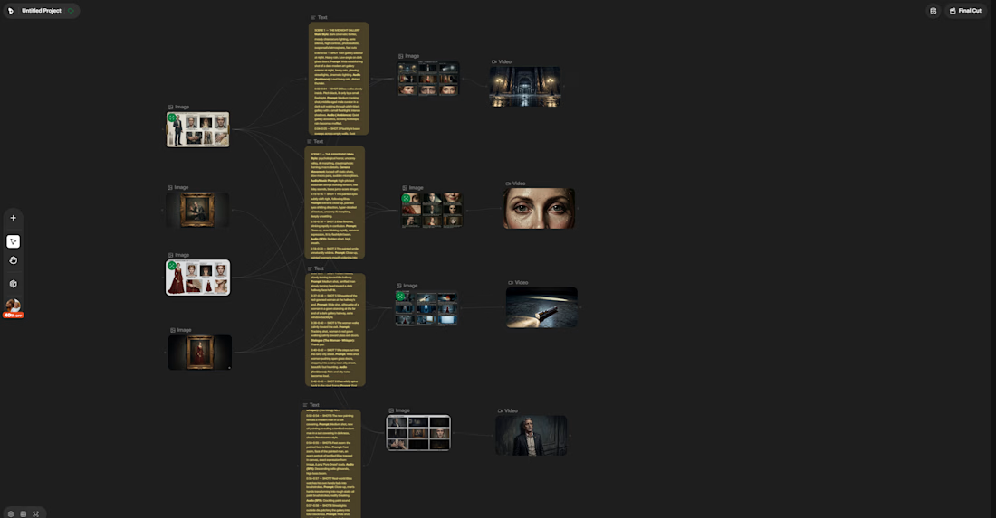
my workflow and how i made this in Renoise Canvas

The network for creativity
Join 1.25M professional creatives like you
Connect with clients, get discovered, and run your business 100% commission-free
Creatives on Contra have earned over $150M and we are just getting started





Related posts

This reel for @afterluc was a chance to play a little more with the visual language we usually use for his content.
It’s a fun “get ready with me” piece that opens with a teleport effect and moves into a faster, more playful edit. Since Luc’s profile normally leans toward a cleaner and more minimalist aesthetic, I pushed the typography further here, using bolder text treatments and more expressive motion without losing the visual identity we’ve built around his content.
The goal was to make the edit feel energetic and entertaining while still polished, using pacing, text, sound and small visual moments to support his personality rather than overwhelm it.
I really enjoy projects like this because they show how a consistent visual identity doesn’t have to mean doing the same thing every time. Sometimes the right choice is knowing exactly where you can break the rules a little.
Role: Video Editing, Motion Design, Text Animation, Sound Design, Color & Visual Storytelling


The jump cut into the teleport with the bold yellow OUTFIT type feels snappy. Good fit for a get ready with me reel.


Only one will win, and you get to decide which.
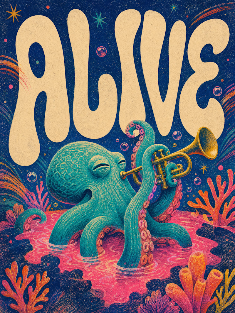
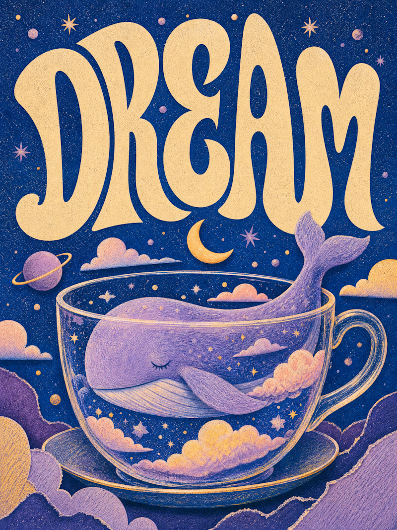
Two AI-generated images. Same creative intent. Different visual outcomes.
The images were generated with AI, but the art direction, visual decisions, composition, styling, and overall creative direction came from me as the human behind the work.
Now comes the real taste test.
Which one has the stronger visual language? Which one feels more intentional, more refined, and more memorable?
11 voted
69%
5 voted
31%
16 votes
Closed

Outstanding work

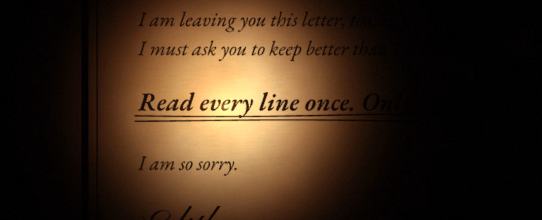
I built a horror text experience with Rive. The piece is called Read Once. Please try it, it's kinda hard to explain.

So cool this is.