The network for creativity
Join 1.25M professional creatives like you
Connect with clients, get discovered, and run your business 100% commission-free
Creatives on Contra have earned over $150M and we are just getting started
Back to feedPost
Taste Test

Two directions for the same real-estate hero. Same headline, same logo — two very different ideas of what a first screen should do.
A plays on its own: one cinematic shot, gold serif, a single call to action.
B stays still until you scroll — then the camera walks you into the property.
Which one would you keep? 👇


19 voted
90%
2 voted
10%
21 votes
Closed

Option 1
thank you!


the immersion in option 1 is incredible, wow!
Thank you Nicolette!

Option 1 🔥
thank you

I think I like 2

Option 1 definitely

Option 1 is the best it's Obvious
Yes, from the design side, but what do you think a real estate agency founder would choose?


option 1 for me, the gold serif on the dark shot looks strong
Okay, thanks! Could you maybe change the gold texture to a serif or is this fine?

Creative work
thank you

Option 1 is better
The network for creativity
Join 1.25M professional creatives like you
Connect with clients, get discovered, and run your business 100% commission-free
Creatives on Contra have earned over $150M and we are just getting started








Related posts

Same content, different experience. A few thoughtful design choices can completely change how a presentation feels, flows, and communicates. Which version would you choose?

11 voted
31%
24 voted
69%
35 votes
Closed

Verde Vista 1 is more modern and futuristic specially with blue colors and robotic hand❤️
Great job Rasid🎉🎉🔥🔥

Which creative direction better communicates a Tech-Forward AI Brand Identity for anvio.online ?
25 voted
44%
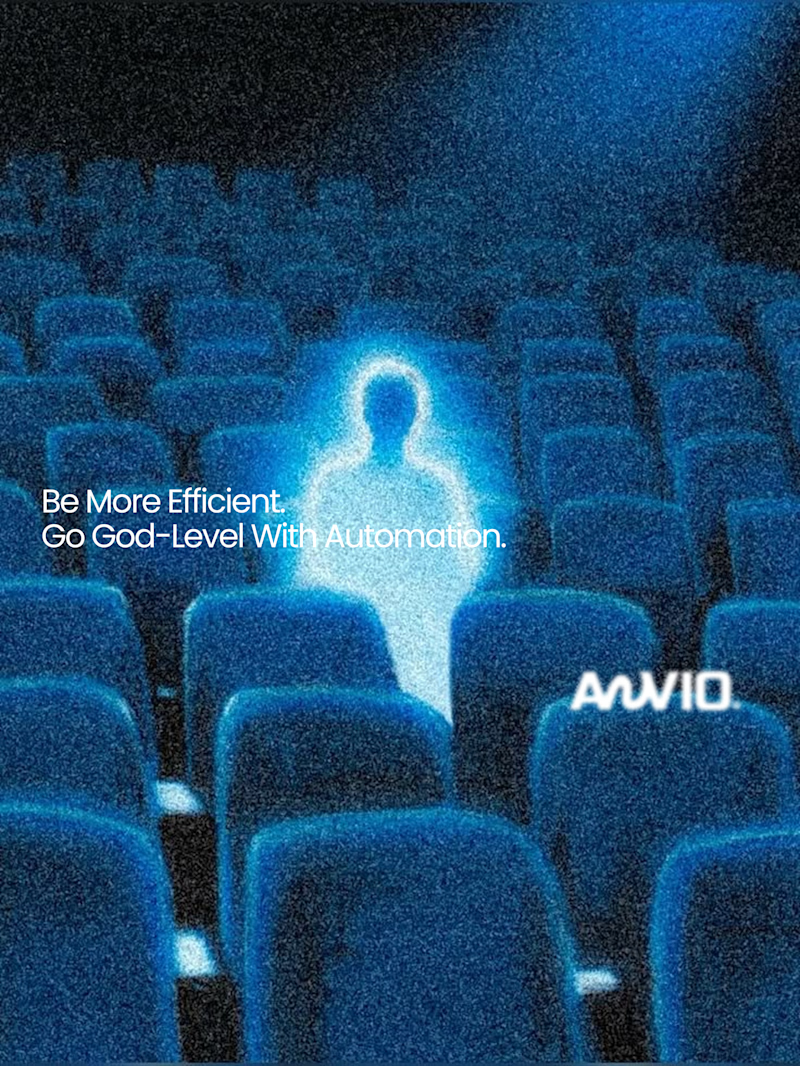
32 voted
56%
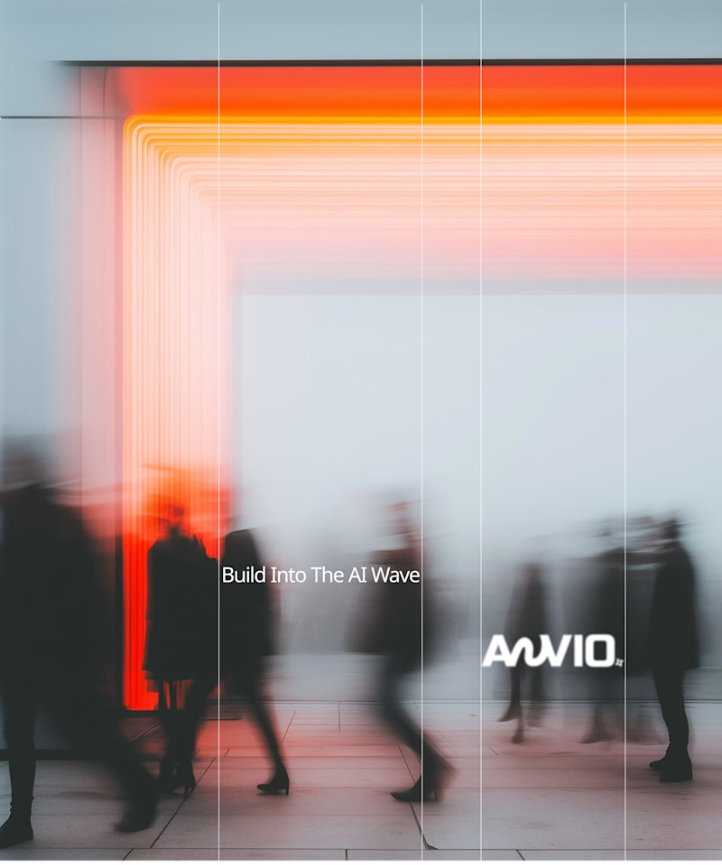
57 votes
Closed

Fast vibrant energy gets my vote. The warm glow feels more human, which is nice for an AI brand.

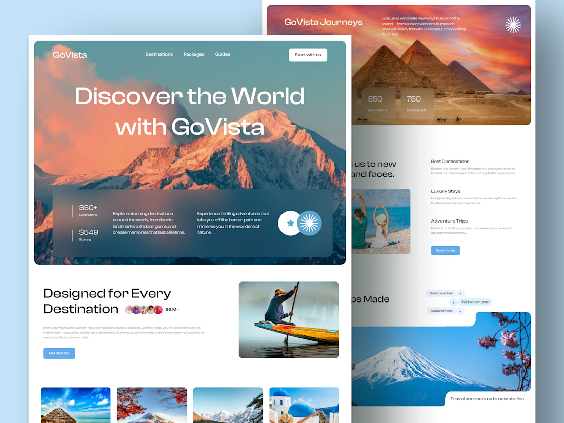
GoVista Journeys - A travel landing page designed to make people dream of their next destination.
A travel company based in Leicester, UK, needed a visually engaging landing page to showcase its destinations and travel experiences while its larger website was being prepared.
The goal was simple: make a strong first impression through beautiful travel imagery, a clean layout, and a design that makes people want to explore more.
Because in travel, the journey can begin long before the booking. ✈️
What catches your attention first on a travel website: the images, the destinations, or the overall design? 👇


I like this very much, very good concept