The network for creativity
Join 1.25M professional creatives like you
Connect with clients, get discovered, and run your business 100% commission-free
Creatives on Contra have earned over $150M and we are just getting started
Back to feedPost


Truly a high-quality branding project. Well done!🔥

Love this 😍

Love the animation... Can't wait to see the case study

great work


Awesome work🔥👏👏
The network for creativity
Join 1.25M professional creatives like you
Connect with clients, get discovered, and run your business 100% commission-free
Creatives on Contra have earned over $150M and we are just getting started








Related posts


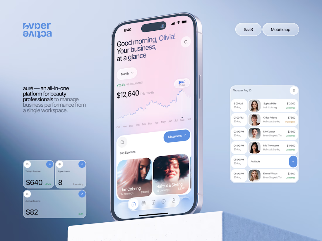
Finally wrapped up this project, and I’m excited to share the case study! 💅 A fresh product design concept for a beauty dashboard. Would love to hear your thoughts! ✨


A beauty dashboard is such a fun product design challenge, Oleksandra. The Good morning, Olivia! greeting in the header makes business metrics feel personal instead of clinical, which is exactly what a beauty professional would want.


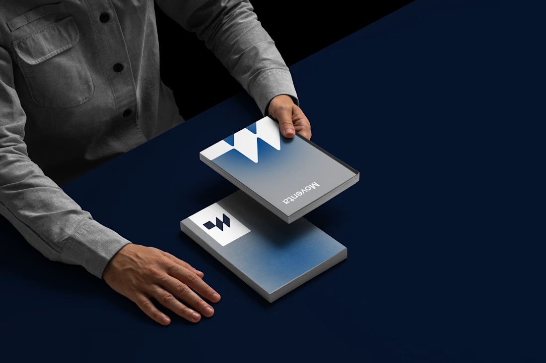
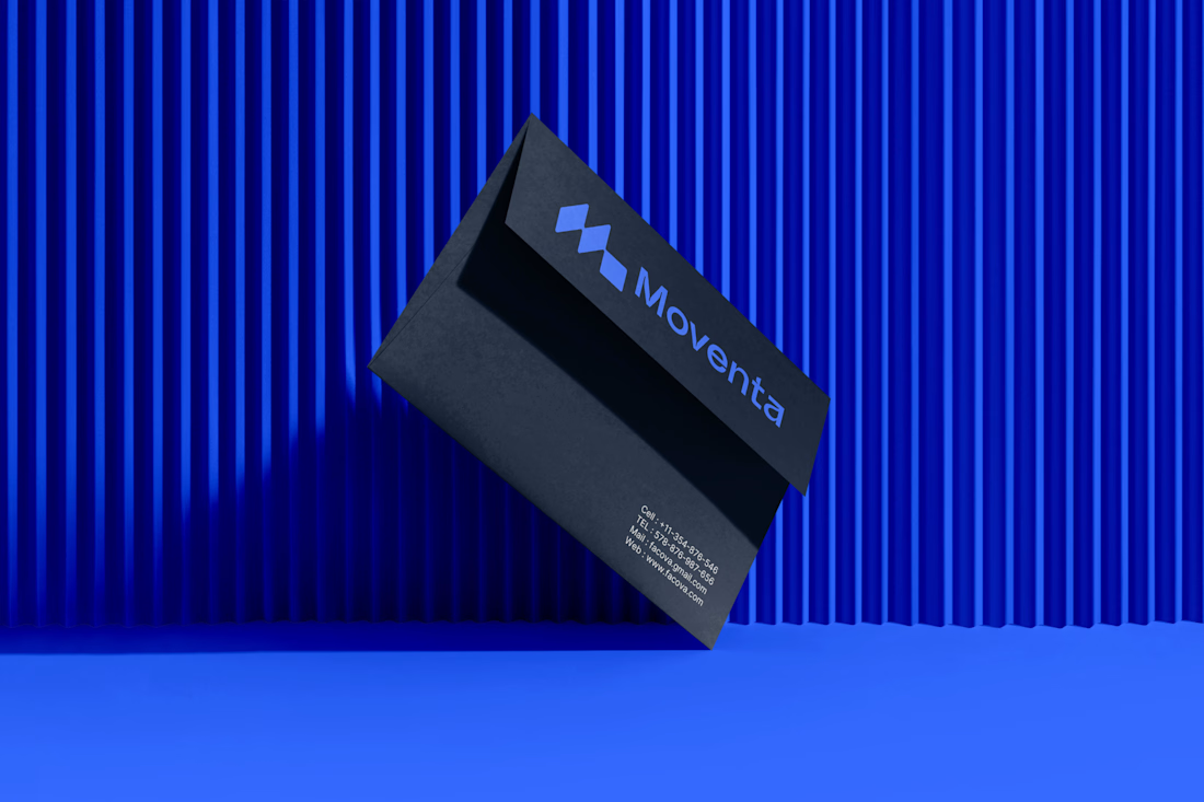
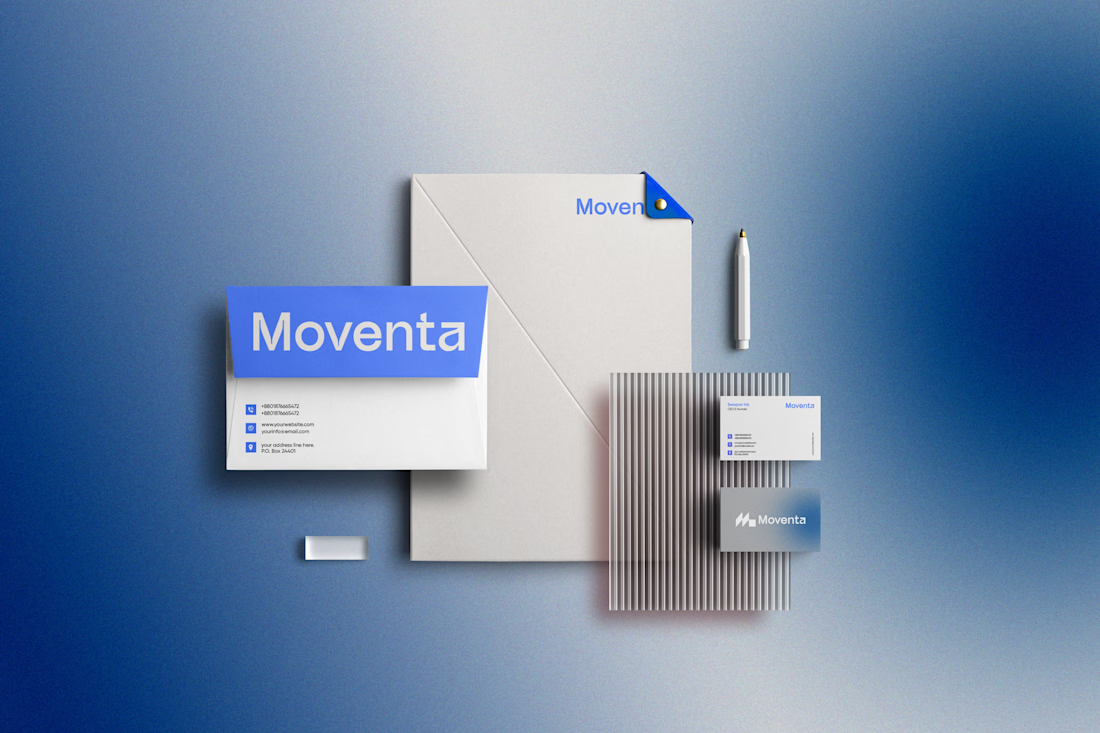
Same brand. Same palette. Two completely different proposals for a real estate developer.
A: An isotype built from blocks. Geometric, precise, the language of construction. It says we build.
B: Custom lettering with movement. Warmer, more editorial. It says we build places you’d want to live in.
36 voted
51%

35 voted
49%

71 votes
Closed
My vote is B, Milagros. Custom lettering with movement has real editorial warmth, which suits a developer selling places people actually want to live in.



I like the Clarity and neatness in your work