The network for creativity
Join 1.25M professional creatives like you
Connect with clients, get discovered, and run your business 100% commission-free
Creatives on Contra have earned over $150M and we are just getting started
Back to feedPost
Last month I audited a legal SaaS homepage as part of a speculative pitch. Strong product - case management, client intake, SEO, staffing, web development, lead generation.
But a first-time visitor saw three product names with zero descriptions. Six services weren't on the page at all. Not buried - completely absent.
Every visitor who needed those services left without knowing they existed. That's a revenue problem, not a UX problem.
The fix was structural: Products with one-line value statements — Full services offering made scannable — Hero headline rewritten from feature to outcome language
Same product. Same pricing. Just visible.
I do audits like this. If your homepage isn't reflecting your full offering, reach out.

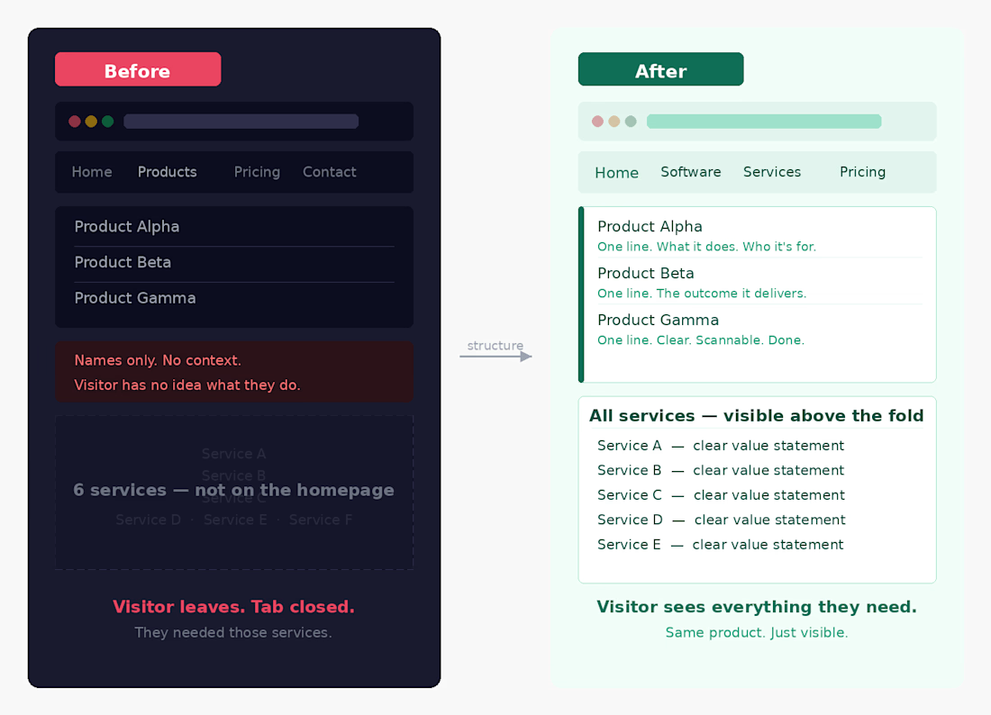

after is better.

Exactly!!
The network for creativity
Join 1.25M professional creatives like you
Connect with clients, get discovered, and run your business 100% commission-free
Creatives on Contra have earned over $150M and we are just getting started





Related posts

Created these interactive animation variants for a section in my recent web design project.
Which one do you think grabs users’ attention and keeps them engaged?
Linear ✲ or Dotted⚪?

24 voted
52%
22 voted
48%
46 votes
Closed

dotted one

Which hero direction feels right for this founder-focused brand?
While working on the homepage for Sean Parsons, a brand focused on empowering non-technical founders to launch tech startups, I explored two different visual directions for the hero section. Same message, same structure, just a different mood and color system.
Option 1 - Warm Olive. Dark, grounded, and editorial, giving a warm, established, expert feel.
Option 2 - Light Purple. Clean, modern, and vibrant, giving a fresh, SaaS-like, approachable feel.
Would love your honest UX/UI take, which direction feels more trustworthy, engaging, and aligned with a founder-focused brand, and why?
25 voted
69%
11 voted
31%
36 votes
Closed

I like worm Olive most because it has different personality
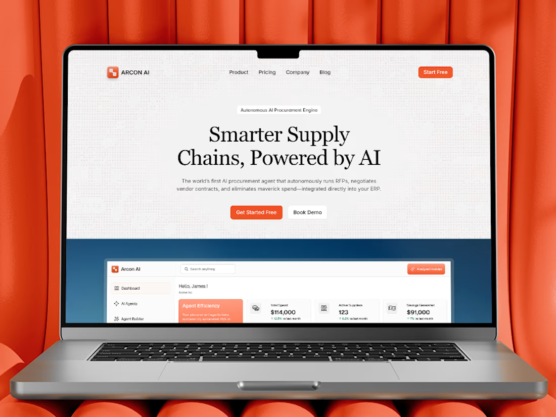
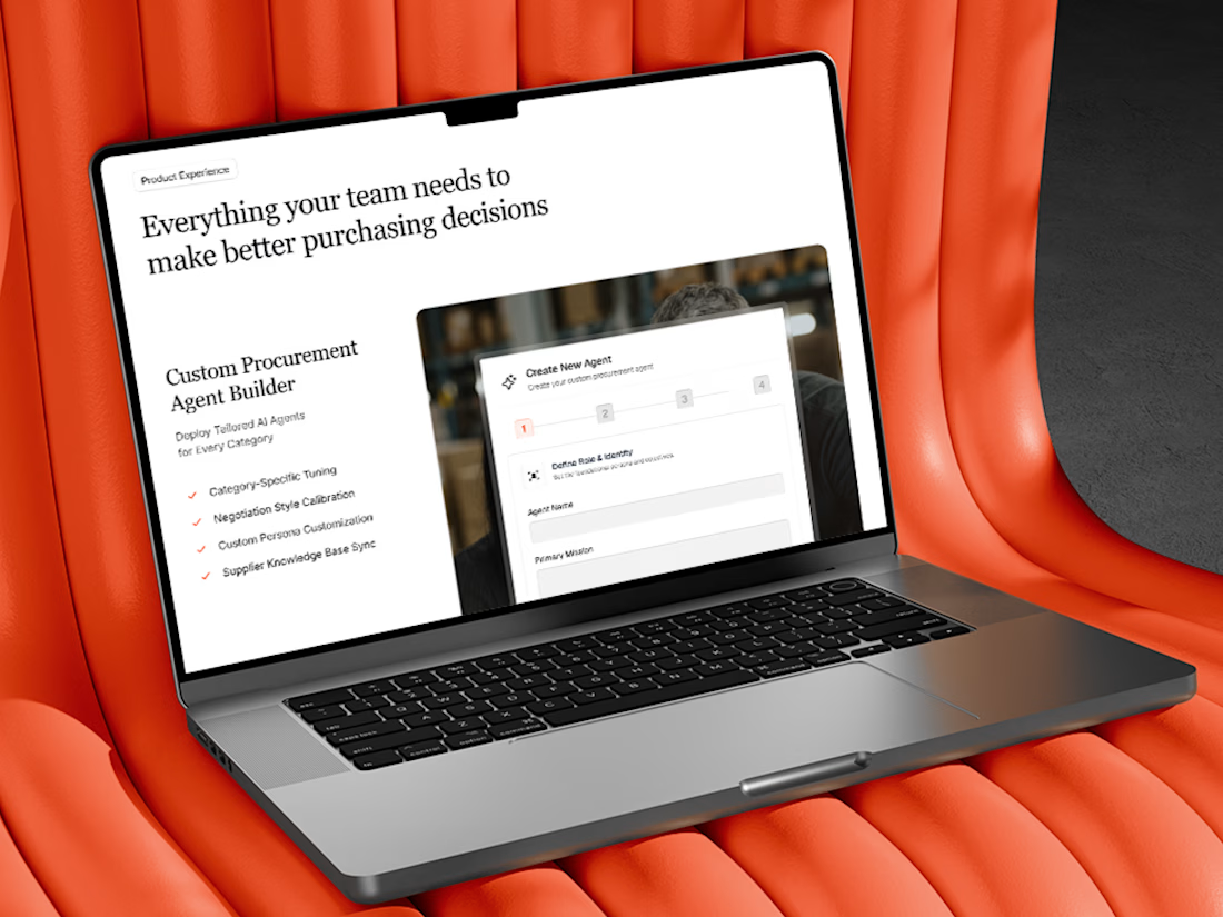
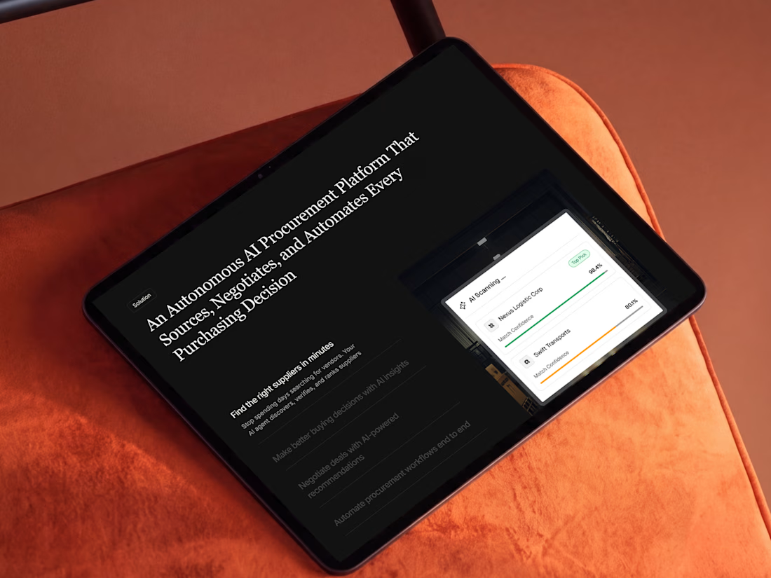
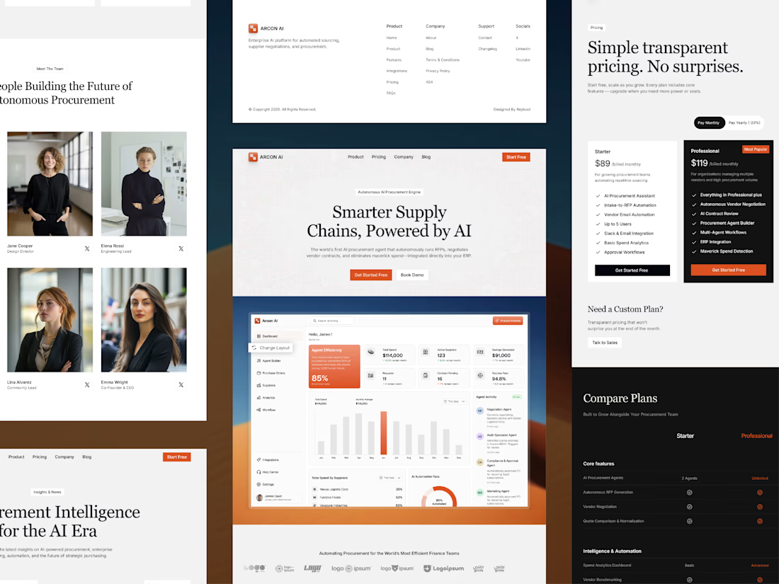
Free AI Framer template we designed for B2B SaaS.
Arcon AI is a premium Framer template built for AI startups, procurement platforms, enterprise SaaS, AI agents, workflow automation, supply chain technology, and B2B software. Designed with a modern enterprise aesthetic, it helps you launch a professional website that builds trust, showcases your product, and drives conversions.
Get it for free: https://www.framer.com/marketplace/templates/arconai/


Lovely work