The network for creativity
Join 1.25M professional creatives like you
Connect with clients, get discovered, and run your business 100% commission-free
Creatives on Contra have earned over $150M and we are just getting started
Back to feedPost

The Never‑Ending Fight: Logo vs. The Brand’s Character Hero.
- I’m the logo. I’m the main one. I’m the face of the brand.
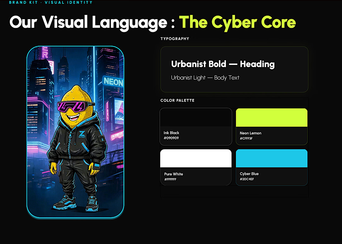
- The face? You’re a pixel‑minimalist who lives on a business card. I’m Cyber Lemon. I drive the campaign, the UI, and the emotions.
The logo puffed up like it’s about to be printed on premium packaging.
Cyber Lemon rolled his eyes - here we go again.
Logo:
“Without me, no one will recognize the brand!”
Cyber Lemon:
“Without me, no one will love it.”
Logo:
“I’m strict, geometric, professional!”
Cyber Lemon:
“And I’m the hero who connects the print, the interface, and the campaign. I live in the system, not in a single SVG.”
And here I am, standing between them like a mediator:
“Guys, relax. You’re both important. But honestly… the visual system wins.”
Typography is the voice.
Color is the mood.
Rhythm is the breath.
The character is the soul.
Patterns are the behavior.
And the logo?
Well... the logo is just trying not to get jealous.
What do you consider the heart of a visual system
brandidentitydesignercharacterdesignAI VIsual DesignerArt DirectionCreative DirectionFigmaFigma Make


The network for creativity
Join 1.25M professional creatives like you
Connect with clients, get discovered, and run your business 100% commission-free
Creatives on Contra have earned over $150M and we are just getting started





Related posts

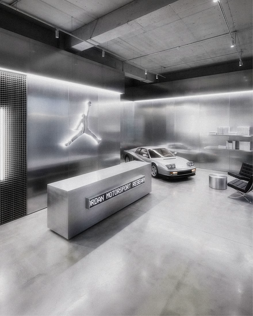
Jordan Racing concept.
What if Jordan Brand launched its own racing team? We imagined the full launch, from the Speed Demon campaign and posters to a telemetry inspired website, racing streetwear and a flagship research facility. Basketball heritage meets Formula 1 speed.
Designed by Studio /03
Concept project, not affiliated with Nike or Jordan Brand.
Art Direction, Brand Identity, Campaign Design, Web Design, Poster Design, Apparel Graphics, Motorsport, Concept


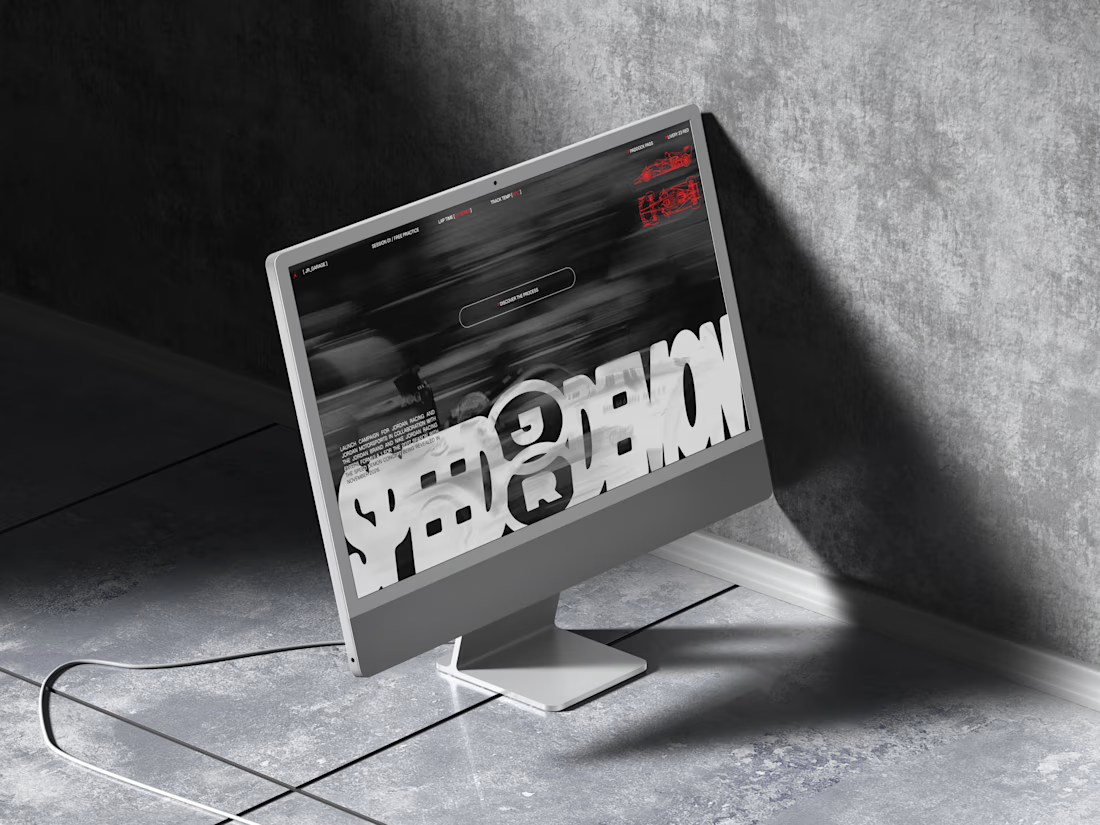
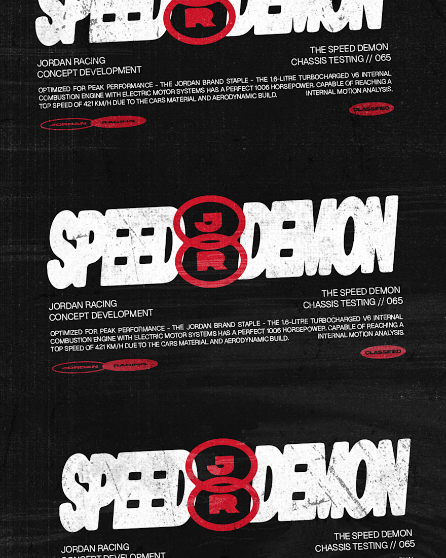
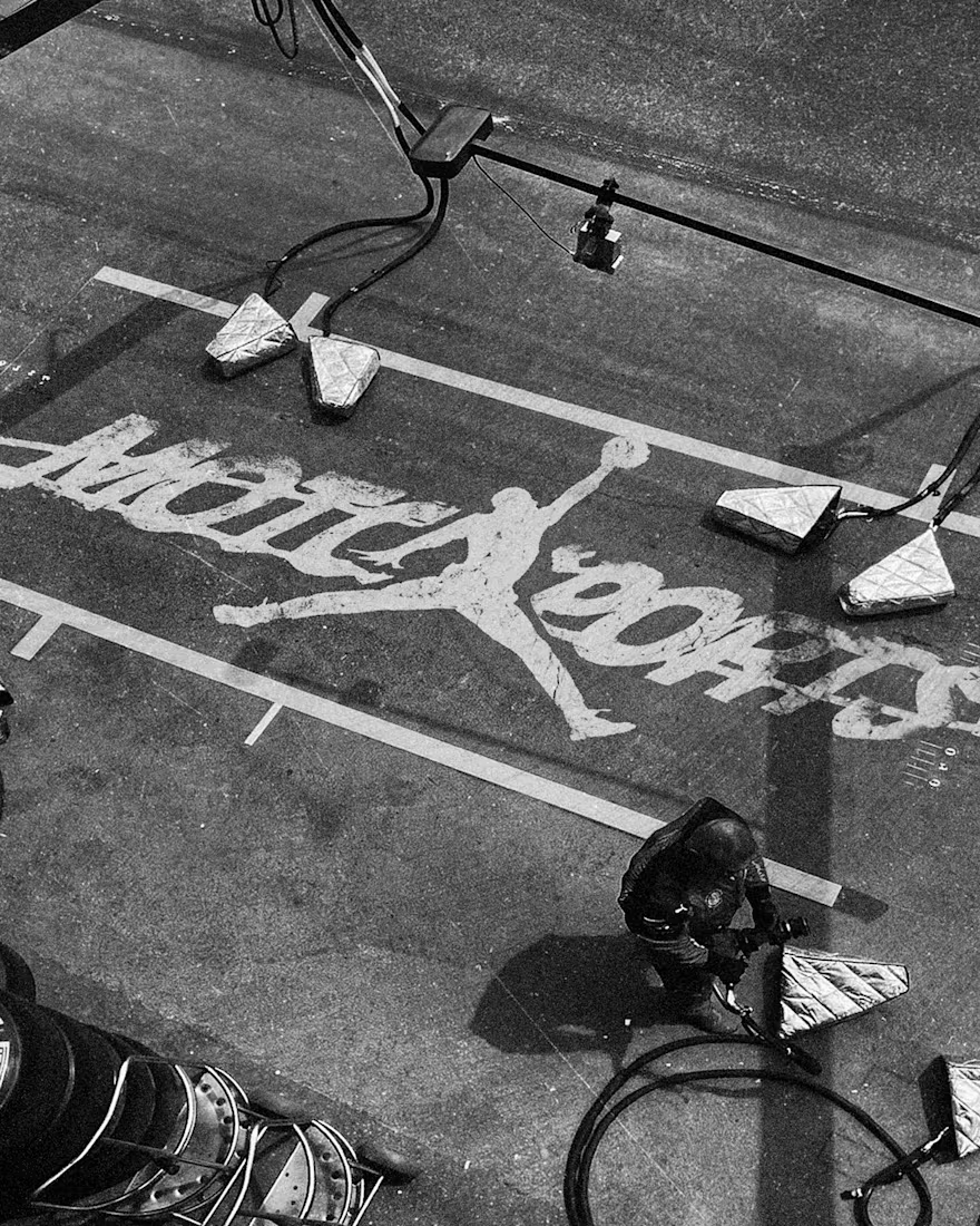

The grayscale with that one red accent keeps the whole system tight. Telemetry style site is a smart touch.


A logo reveal created in Blender, where simple geometric shapes come together to form the Geisleris Studio identity.


Nice

Title: Proper Form — Brand Identity & Visual Language
A brand identity for Proper Form built around a more modern, movement-driven take on recovery and healthcare.
The visual system extends the logo into a complete language through color, typography, imagery and layout, creating a consistent identity across different brand touchpoints.
Created by Lepisov Branding in collaboration with @Creative Mints
Logo design: Ilya Gorchanyuk
Creative direction: Dmitry Lepisov
Brand identity: Lepisov Branding × Creative Mints

Using the logo mark as the big graphic across the layouts is smart. The purple to pink gradient gives recovery a more energetic feel.