The network for creativity
Join 1.25M professional creatives like you
Connect with clients, get discovered, and run your business 100% commission-free
Creatives on Contra have earned over $150M and we are just getting started
Back to feedPost

Title: Proper Form — Brand Identity & Visual Language
A brand identity for Proper Form built around a more modern, movement-driven take on recovery and healthcare.
The visual system extends the logo into a complete language through color, typography, imagery and layout, creating a consistent identity across different brand touchpoints.
Created by Lepisov Branding in collaboration with @Creative Mints
Logo design: Ilya Gorchanyuk
Creative direction: Dmitry Lepisov
Brand identity: Lepisov Branding × Creative Mints


Cool work

This is beautiful! 🔥 Love how you made healthcare feel so modern and movement-driven. The visual system - logo extending through color, typography and layout is so smart. That purple gradient logo mark is premium! Healthcare branding is tough but you nailed the modern recovery vibe. Amazing work Lepisov! 👏

Great job Lepisov🎉🎉🔥🔥
The network for creativity
Join 1.25M professional creatives like you
Connect with clients, get discovered, and run your business 100% commission-free
Creatives on Contra have earned over $150M and we are just getting started








Related posts
One of our older branding projects, but it still feels surprisingly fresh.
Cashbox started with a very simple idea: a box-shaped logo.
The identity went a little more out of the box.
Still a good example of how we like to work: keep the core idea simple, then push the visual system much further.


the design here is so immersive & innovative, love it.

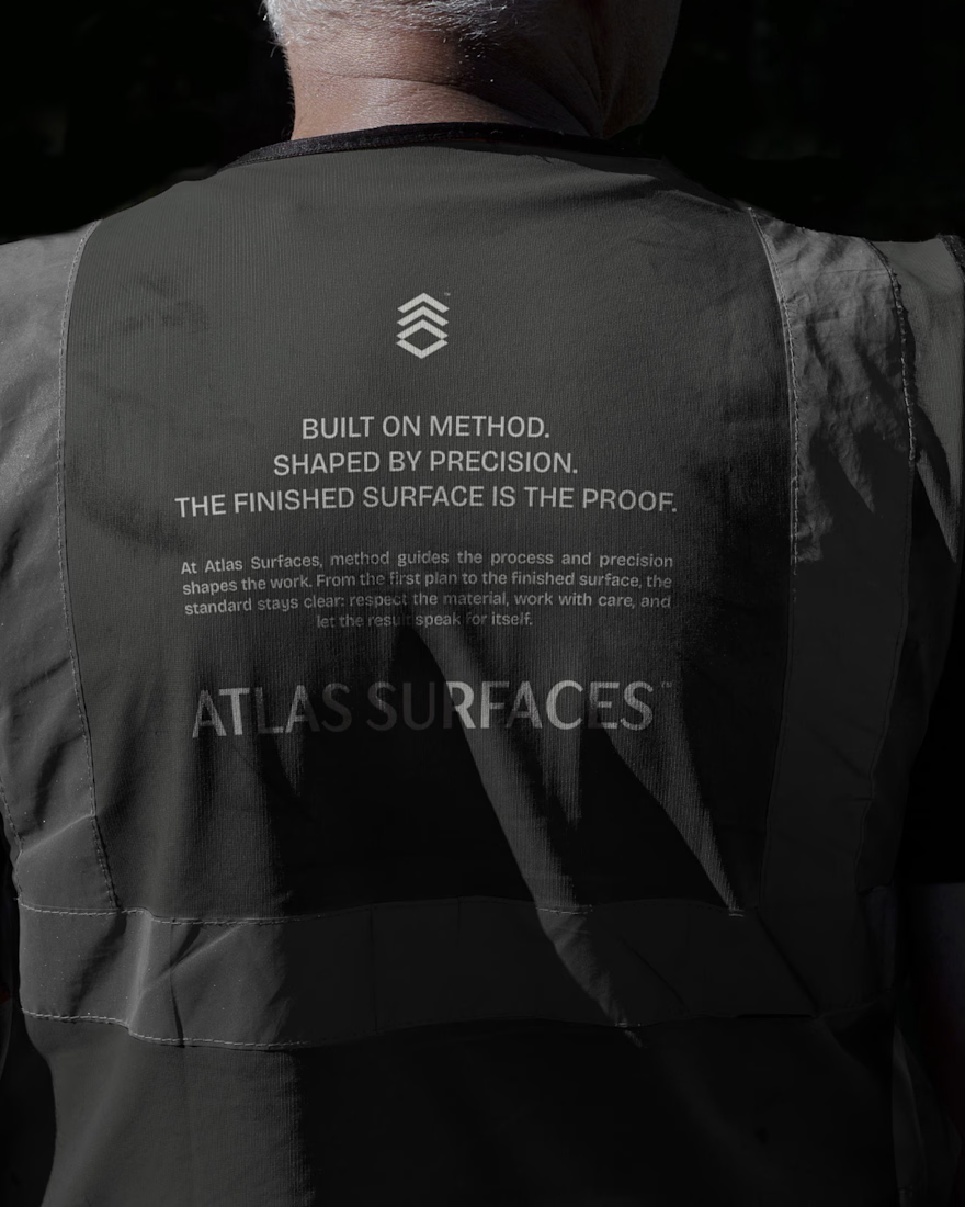
A closer look at Atlas Surfaces, from the final logo to the structure behind its design.
Brand identity developed in collaboration with Pedro Lopes (Griffo).

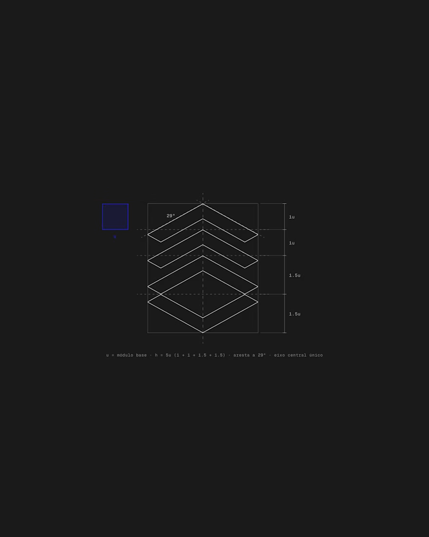
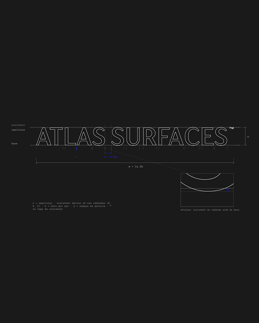


the structure breakdown is more interesting than the final mark tbh


A cultural tribute to the history of human artistic mastery for @Contra Labs