The network for creativity
Join 1.25M professional creatives like you
Connect with clients, get discovered, and run your business 100% commission-free
Creatives on Contra have earned over $150M and we are just getting started
Back to feedPost

Sportsforce — Sports Tech Seed Deck
Sportsforce built a genuine AI + ML recruiting engine. It pulls from unified data sources (profiles, stats, social signals, roster needs, recruiting budgets) and matches athletes to college programs.
They were trying to explain all of that with text and images. Just words doing the heavy lifting for something words can't carry alone.
My Approach
Translate the algorithm into something a non-technical investor can follow in under 10 seconds. I built their tech visualization from scratch. Turning a dense process into a clean input → engine → output flow. The rest of the deck followed the same logic: each slide earns the next one.
The Result
They started booking investor meetings immediately after the new deck went out. Response rates went up. Their previous deck had been holding them back.


The network for creativity
Join 1.25M professional creatives like you
Connect with clients, get discovered, and run your business 100% commission-free
Creatives on Contra have earned over $150M and we are just getting started







Related posts

Working with AI startups usually comes down to solving one major visual problem.
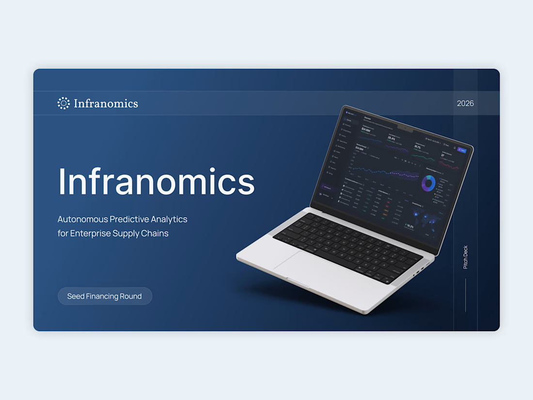
For this Infranomics project, the founders had built an incredibly powerful machine learning tool for supply chain analytics. The challenge was that their original materials looked like a dense technical manual rather than a compelling business narrative for venture capital funds. We needed to translate that heavy data into a clear and persuasive story.
The solution was to cut the noise and focus on pure clarity.
I moved the entire workflow into Figma to architect a highly customized design system from scratch. By using a minimalist aesthetic, clean typography, and very intentional custom data visualization, we managed to take their complex metrics and make them instantly understandable. Once the layouts were perfectly polished, everything was carefully rebuilt as a fully editable native PowerPoint file so the team could easily update numbers in the future.
The final result completely changed how their pitch was received.
Instead of forcing investors to suffer through cognitive overload and confusing charts, the new presentation gave the data room to breathe. It built institutional trust right from the first slide and ultimately helped the founders successfully secure their seed capital.
Sometimes the most advanced technology requires the simplest design.

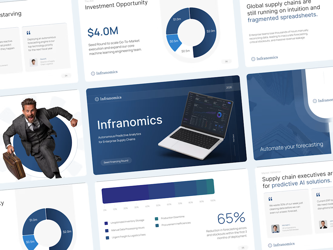

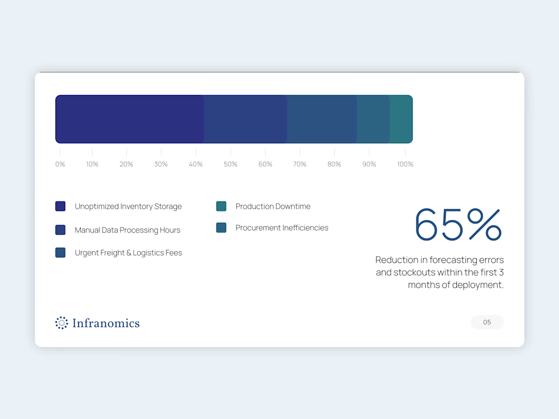

Rebuilding the Figma layouts as a native, editable PowerPoint is the step that usually gets skipped, and it decides whether the deck survives the next round of number updates. Did you keep the custom data visuals as live charts, or as shapes the team adjusts by hand?

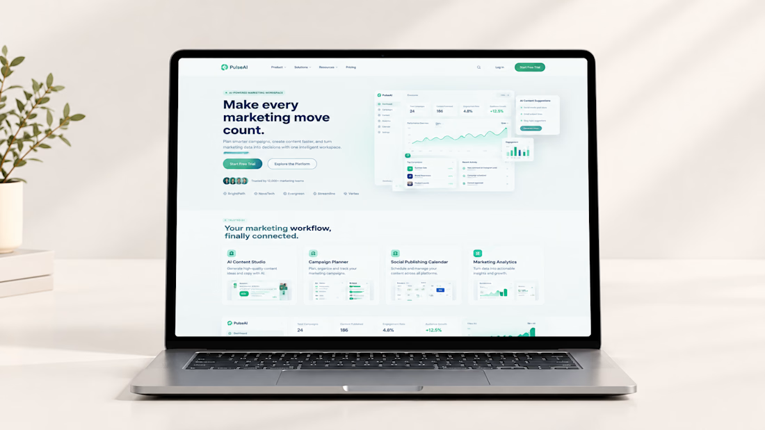
PulseAI — Modern AI Marketing SaaS Website Design in Framer
PulseAI is a modern SaaS website concept for an AI-powered marketing workspace designed to help businesses organize campaigns, streamline content planning, manage publishing schedules, and understand marketing performance from one connected platform.
Designed in Framer, the website combines a clean interface, strategic content structure, and polished dashboard visuals to communicate a complex software product in a simple, engaging, and professional way.
The goal was to create a conversion-focused SaaS marketing website that builds trust, communicates product value, and encourages visitors to explore the platform or start a free trial.