The network for creativity
Join 1.25M professional creatives like you
Connect with clients, get discovered, and run your business 100% commission-free
Creatives on Contra have earned over $150M and we are just getting started
Back to feedPost

Padel Club Management App UI/UX Design | Sports Booking SaaS Dashboard & Mobile App
Most sports club management tools feel outdated, making it difficult for owners to manage bookings, coaches, members, and courts efficiently.
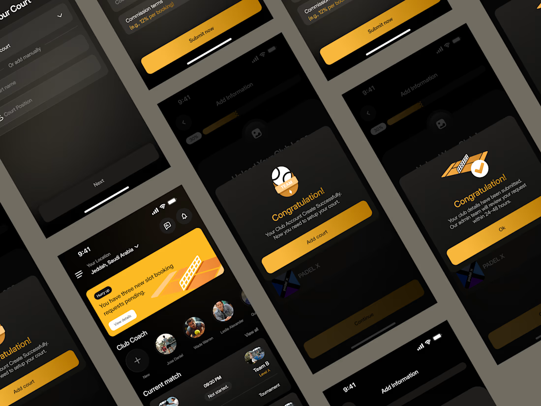
For this concept, I designed a premium mobile experience that simplifies the entire club management workflow—from club onboarding and court setup to booking requests, coach management, and tournament organization.
The goal was to reduce operational complexity while creating an interface that feels modern, intuitive, and trustworthy for club owners.
What I designed
• Club onboarding flow
• Court management
• Booking management
• Team & coach management
• Tournament features
• Dark premium interface
• Mobile-first UX
• Design system components
I'm always open to collaborating with startups, SaaS companies, and sports-tech teams looking to build meaningful digital products.


The network for creativity
Join 1.25M professional creatives like you
Connect with clients, get discovered, and run your business 100% commission-free
Creatives on Contra have earned over $150M and we are just getting started











Related posts

Figma Football
An unofficial football concept inspired by Figma and its visual language.
The ball was created using a custom 3D generator I built in ChatGPT, with animated interface icons and graphics developed with Claude.
Part design experiment, part exploration of how custom AI-powered tools can become part of the creative process.


The interface icons translate surprisingly well into a football identity.

A little peek at the brand work we did for Elio Mortgage.
A warm, approachable identity full of warm vibrant colors paired with soft sun rising inspired gradients, inner glows and custom illustrations & more. Loved this direction!
Full case study coming soon, from process to final identity.
Plenty of logo explorations to share too!


That color palette takes the whole identity to a different level!! I loove it.

Brand Expressions -- Olivir



Thats so crazy!!!!!! Seeing this I feel we humans are still far better than AI