The network for creativity
Join 1.25M professional creatives like you
Connect with clients, get discovered, and run your business 100% commission-free
Creatives on Contra have earned over $150M and we are just getting started
Back to feedPost

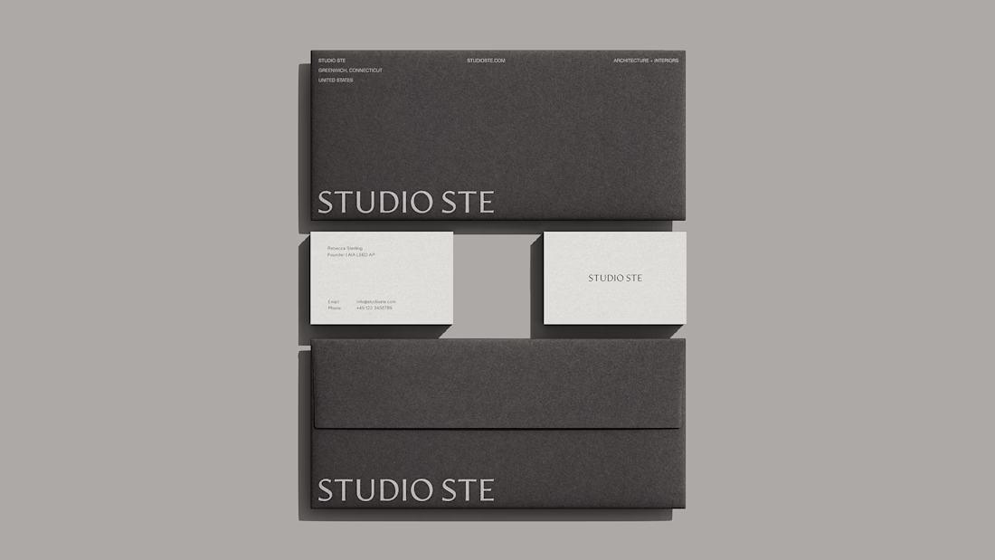
Excited to share a recent identity project for Studio STE, an architecture and interiors studio based in Greenwich, CT.
We evolved the brand to feel warmer, more grounded and timeless, creating space for conversations around thoughtful, sustainable design without making sustainability the headline.
Really enjoyed bringing this one to life with Rebecca and the Studio STE team. ✨


Love this STUDIO STE identity! The minimal black packaging with clean white contrast looks so premium and timeless. The sustainable design story comes through perfectly. Great use of After Effects for the presentation too!
The network for creativity
Join 1.25M professional creatives like you
Connect with clients, get discovered, and run your business 100% commission-free
Creatives on Contra have earned over $150M and we are just getting started





Related posts

Good branding isn’t just about how a logo looks. It’s about what it represents.
Sharing one of our recent projects: NEXU, a fintech brand identity built around connection, trust, and opportunity.
The idea was to create a visual identity that makes finance feel more human and approachable. The symbol brings together the gesture of reaching out and the strength of a bridge, representing the connection between people, capital, and opportunity.
From the logo concept to the broader visual identity, every detail was designed to communicate confidence, clarity, and progress.
It’s always rewarding to see how a simple visual idea can tell a much bigger story.
Would love to hear what you think!
Check it out
#BrandIdentity #LogoDesign #Fintech #BrandDesign #ContraCommunity


Such a thoughtful concept! Making finance feel more human and approachable through design is a great way to build connection and trust.

People don’t just want a banking app. They want to feel in control of their money.
Great fintech design doesn’t just look premium. It makes money feel simpler, safer, and easier to control.
Meet Ziko, a mobile banking concept where every interaction is designed to reduce friction and build trust.
What wins your trust first: 🔒 Security, ✨ Simplicity, or ⚡ Speed?

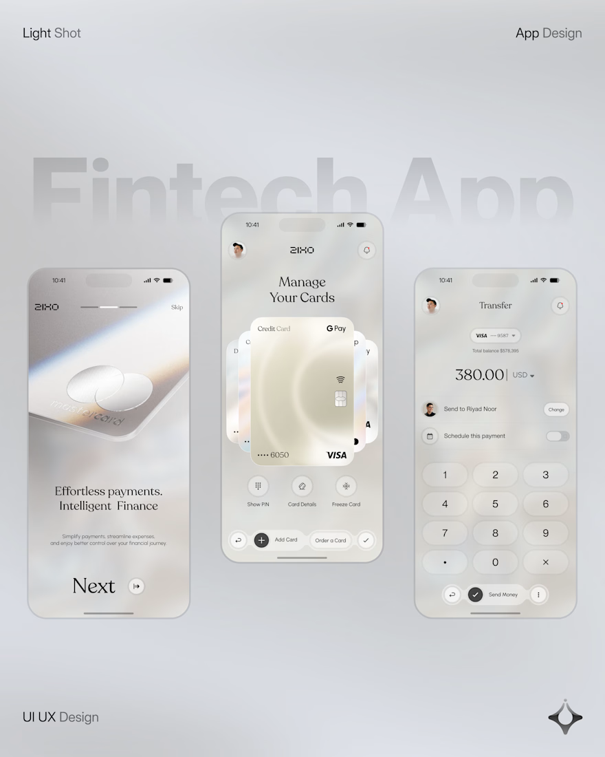
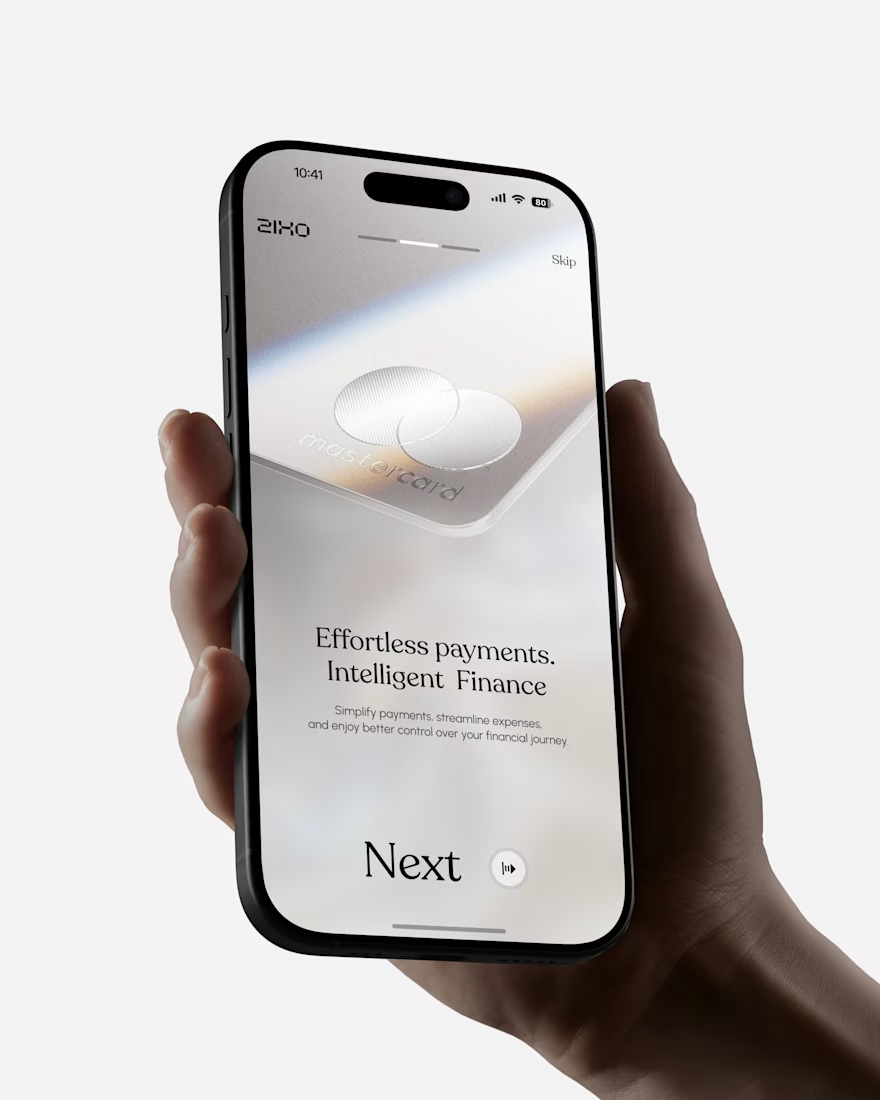
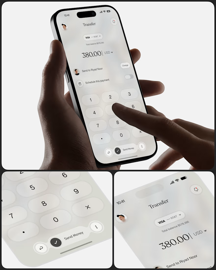
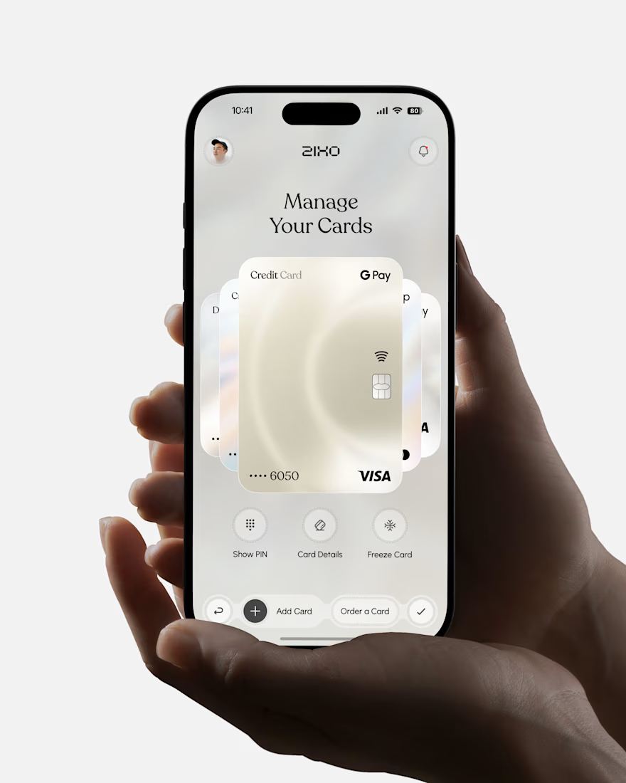

Absolutely love this Fintech App design! The minimal soft 3D elements with the clean UI is such a premium combo — feels very Apple-like and trustworthy. The interaction "designed to reduce" cognitive load really shows in the execution. Super polished work, that "Effortless payments. Intelligent Finance." screen is my fav!

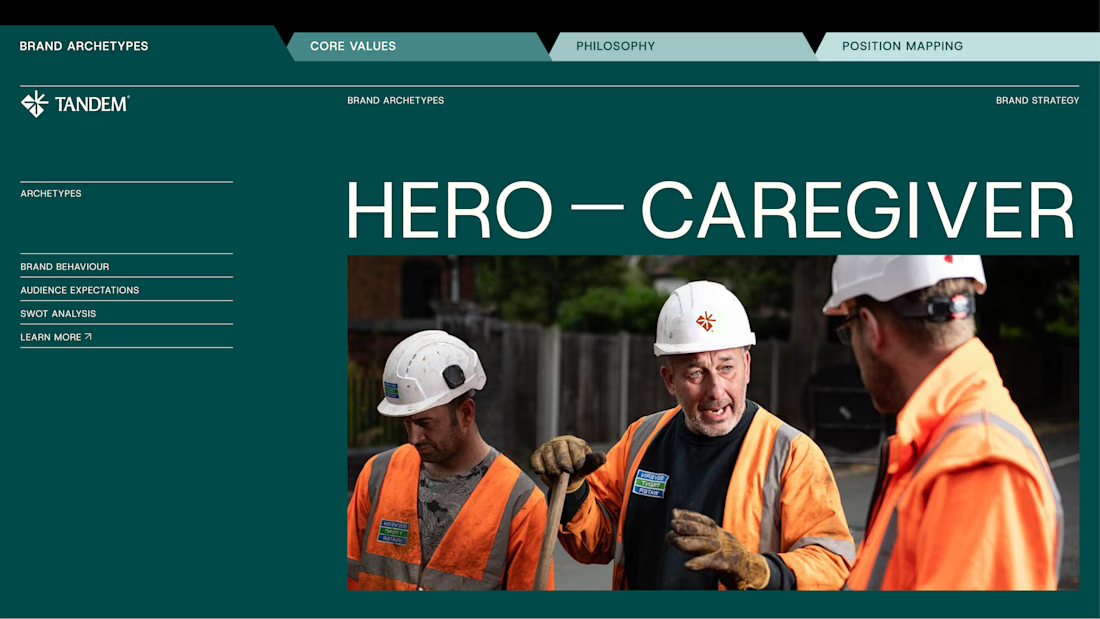
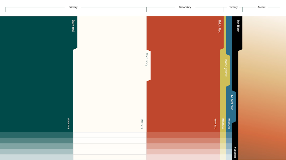
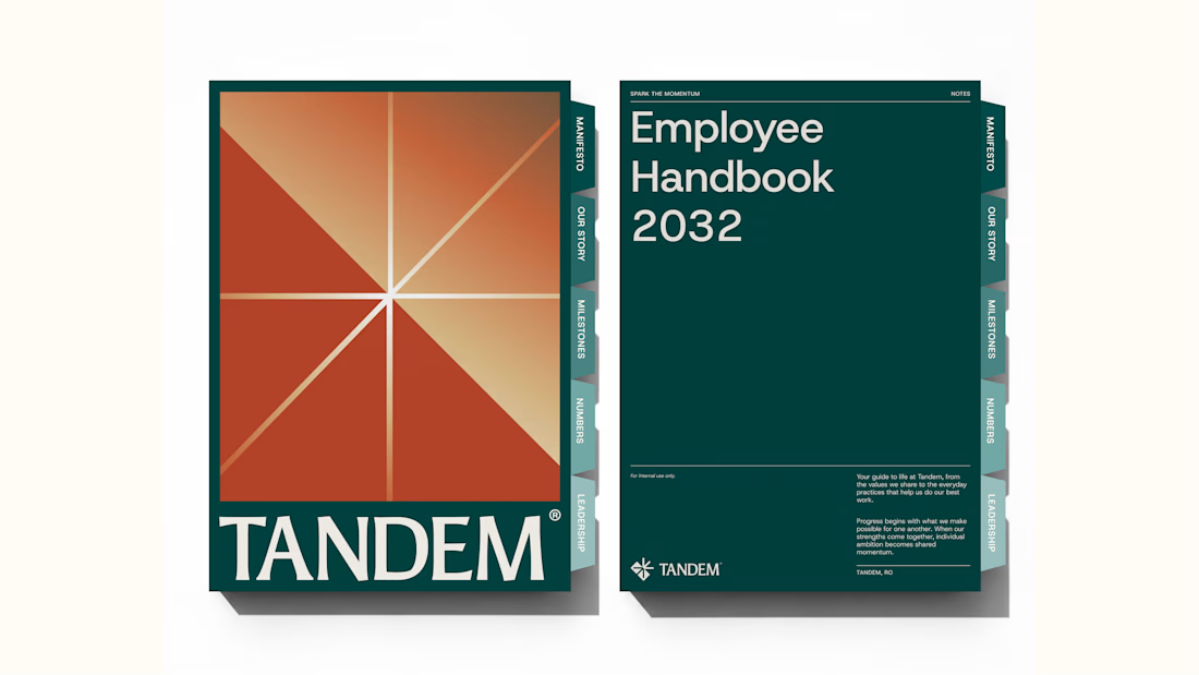
Wrapping up another brand identity project for a workforce management company.
We're currently putting together the full case study, but here's an early look at some of the visuals. Really pleased with how this one has come together!
We explored several distinct creative directions before arriving at the final identity. And there's plenty of interesting work that didn't make the cut.
While we prepare the full case study, I'm thinking of sharing some of those rejected directions and the thinking behind them.
Would you be interested in seeing what didn't make it?