The network for creativity
Join 1.25M professional creatives like you
Connect with clients, get discovered, and run your business 100% commission-free
Creatives on Contra have earned over $150M and we are just getting started
Back to feedPost

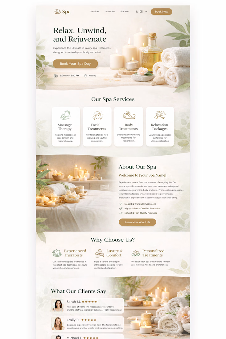
This spa landing page concept focuses on calm visuals, clean layout, and conversion focused design. The goal was to create a relaxing user experience that reflects the serenity of a real spa while guiding visitors smoothly toward booking their treatment.
As a designer who works with platforms like Shopify, I always aim to combine beautiful design with business results helping brands attract clients, increase bookings, and create memorable online experiences.
This concept highlights:
• Clean and calming UI
• Conversion-focused landing structure
• Clear service presentation
• Trust-building client testimonials
Design is not just about appearance it's about creating experiences that convert.
#WebDesign #UIUX #LandingPageDesign #ShopifyDesign #CreativeDesign #DigitalExperience


The network for creativity
Join 1.25M professional creatives like you
Connect with clients, get discovered, and run your business 100% commission-free
Creatives on Contra have earned over $150M and we are just getting started





Related posts




Option B feels nothing but premium

Which hero visual feels right for this brand?
While working on the homepage for Halfspace, a website design and SEO agency, I explored two different hero visuals for the same headline and layout. Same message, same structure, just a different visual metaphor and mood.
Option 1 - Rocket Launch. Bold, literal, and energetic, visually reinforcing the "launch your business" message with motion and fire.
Option 2 - Glass Cube. Abstract, sleek, and premium, giving a more refined, tech-forward feel without relying on a literal metaphor.
Would love your honest UX/UI take, which direction feels more impactful, memorable, and aligned with a web design/SEO brand, and why?
11 voted
41%
16 voted
59%
27 votes
Closed

Both design are great; it's hard to choose one


