The network for creativity
Join 1.25M professional creatives like you
Connect with clients, get discovered, and run your business 100% commission-free
Creatives on Contra have earned over $150M and we are just getting started
Back to feedPost

Development of social media content for a medical clinic, focused on creating a professional, trustworthy, and welcoming visual communication aligned with the clinic’s identity.
The project combines typography, color palettes, and clean layouts to deliver information clearly while maintaining an approachable and human-centered aesthetic. The visual direction was designed to balance credibility and accessibility across all content.
Each post was created to strengthen the clinic’s online presence, improve communication with patients, and support the promotion of services, health information, and institutional content in a cohesive and engaging way.


The network for creativity
Join 1.25M professional creatives like you
Connect with clients, get discovered, and run your business 100% commission-free
Creatives on Contra have earned over $150M and we are just getting started
Related posts


A great website should do more than look good, it should make choosing a business feel easy.
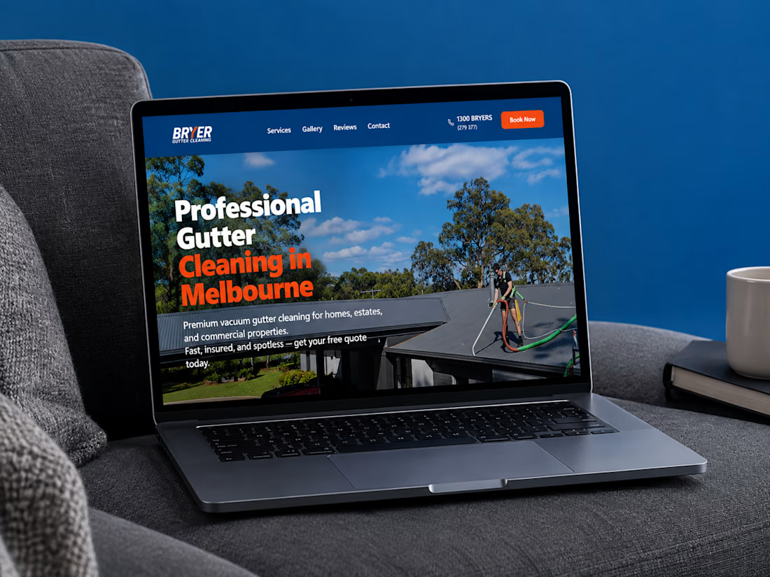
I recently completed a website project for Bryer, a Melbourne-based gutter and solar panel cleaning business.
The goal was to create a clean, professional online presence that communicates their services clearly, builds trust, and makes it easier for potential customers to request a quote.
Now, I’m curious:
When you visit a service-based business website, what matters most to you, the design, the information, or how easy it is to get in touch?
Let’s hear your thoughts! 👇
#WebDesign #Webflow #UXDesign #WebDevelopment #WebsiteDesign #Contra



this is amazing work

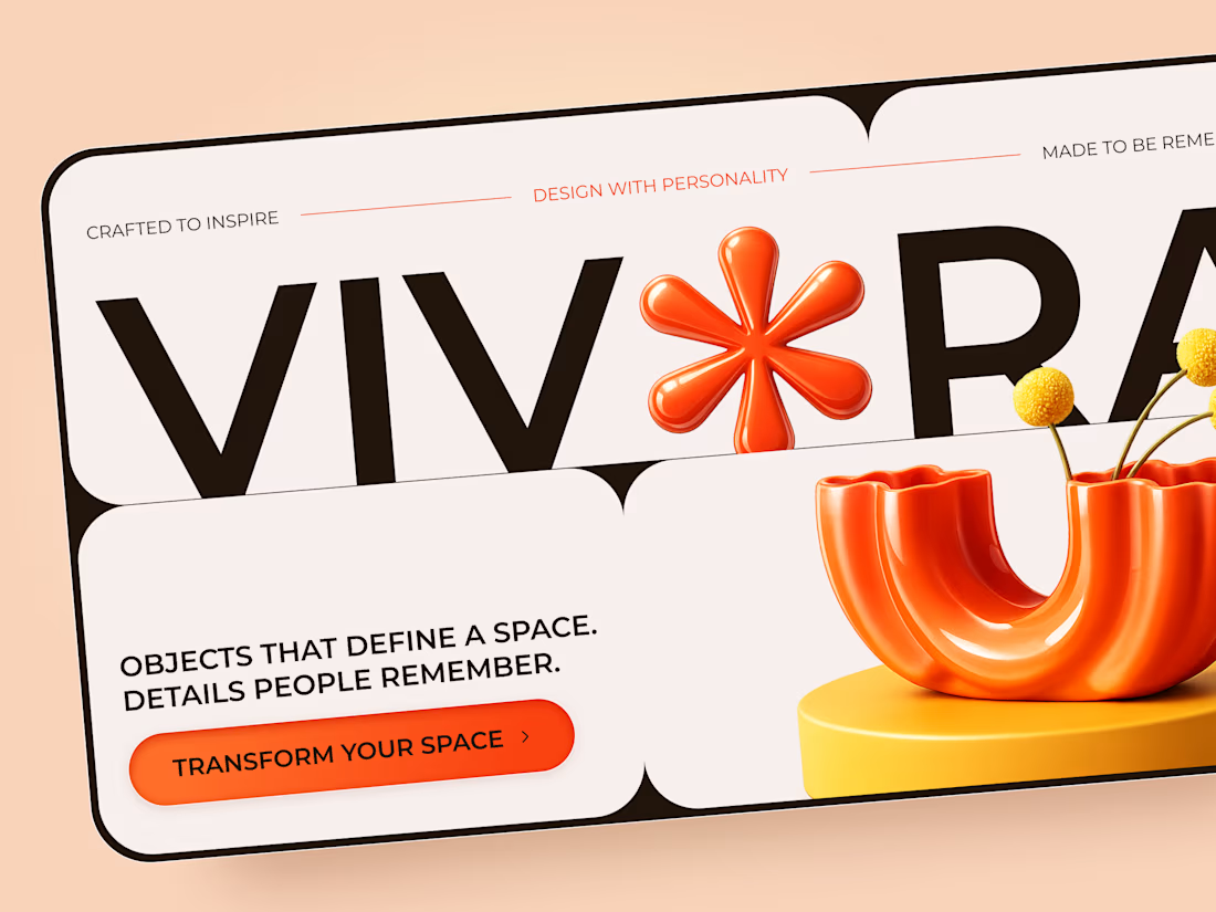
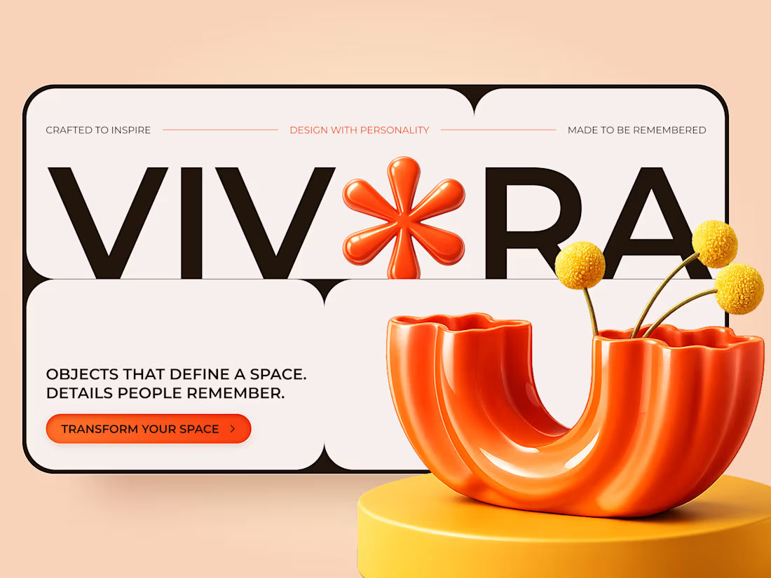
VIVORA — Creative Home Decor & Furniture Landing Page
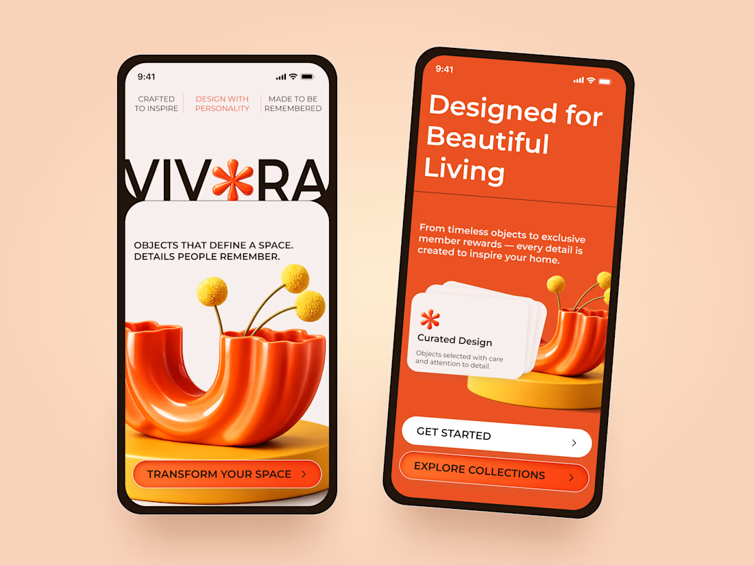
A bold and playful landing page concept for VIVORA, a home decor brand focused on expressive objects and design with personality.
The visual direction combines vibrant orange tones, oversized typography, and sculptural 3D elements to create a memorable shopping experience.
Special attention was given to:
• Bold typography and expressive brand identity
• Vibrant orange and warm neutral color palette
• Sculptural 3D product visuals and playful compositions
• Rounded layouts with strong visual hierarchy
• Clear CTAs and engaging product presentation
• Responsive desktop and mobile layouts
• Mobile-friendly navigation and collection discovery
The result is a distinctive website concept that brings personality to home decor and makes everyday objects feel like statement pieces.
Looking to create a standout website for your furniture or lifestyle brand? Let's connect 🚀

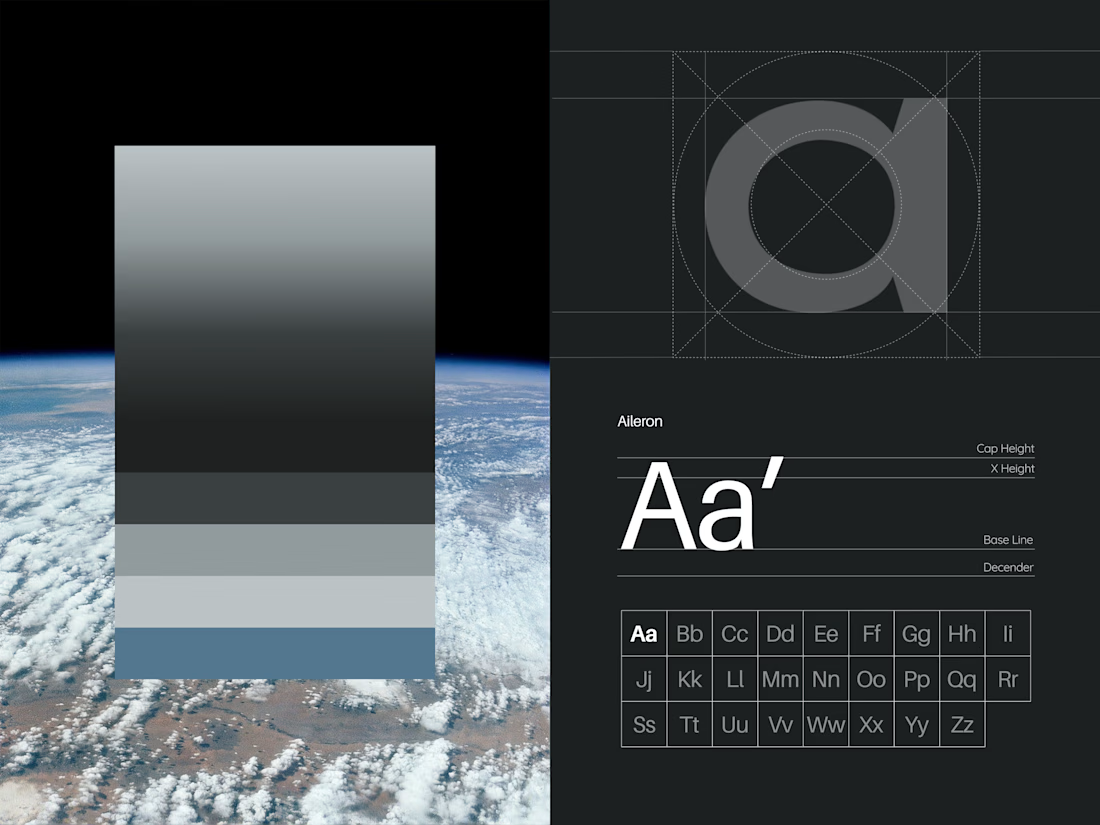
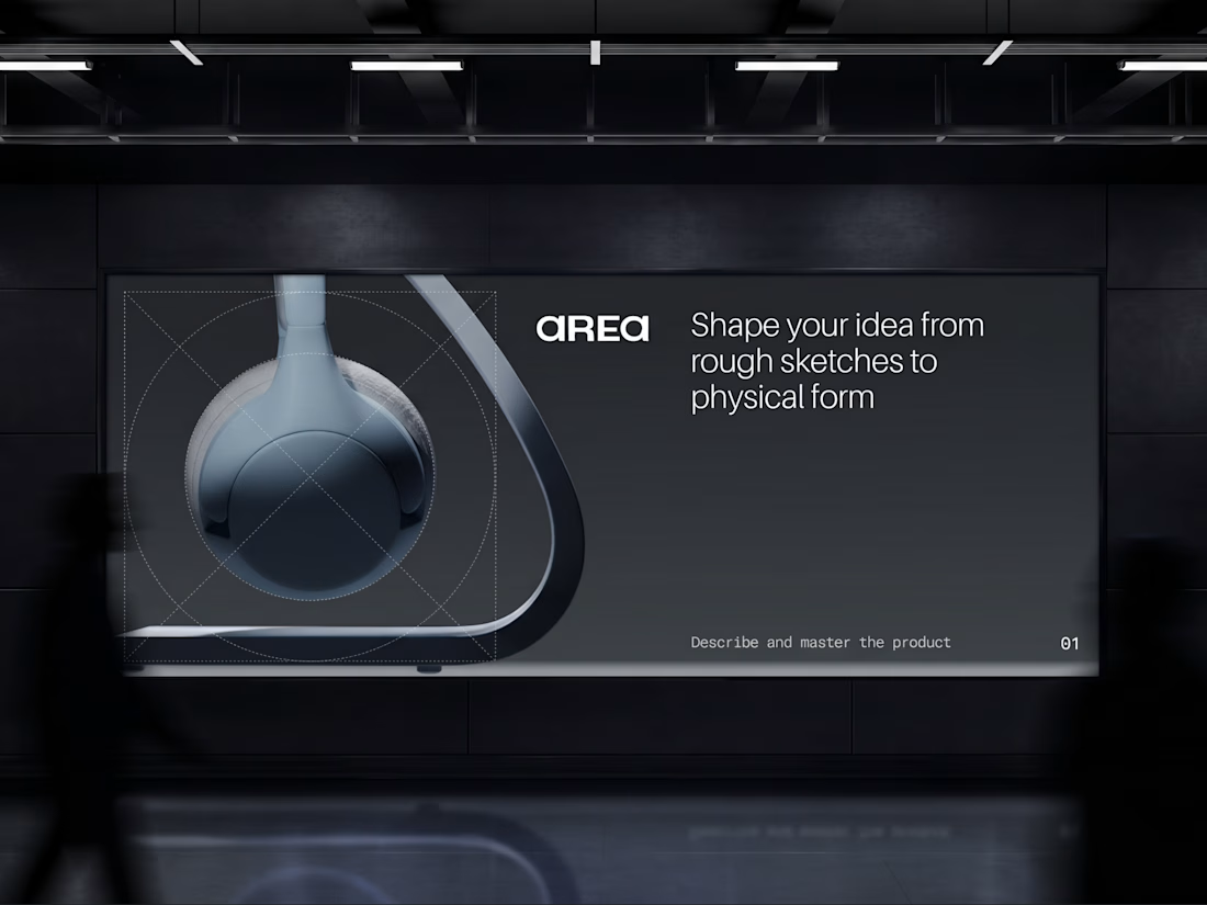
AREA — Minimal Brand Identity
AREA’s identity began with a simple idea: structure can make a brand more distinctive.
We explored it through bold typography, geometric forms, and a restrained monochromatic palette, bringing clarity and consistency to every touchpoint.

Monochrome can feel cold, but the big type keeps this sharp. Did you start with the type or the shapes?