The network for creativity
Join 1.25M professional creatives like you
Connect with clients, get discovered, and run your business 100% commission-free
Creatives on Contra have earned over $150M and we are just getting started
Back to feedPost
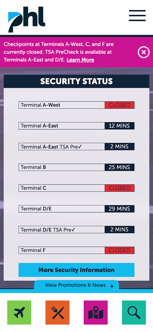
I was catching a flight at PHL last week and almost missed a critical alert.
The notification banner is pink. I ignored it — pink doesn't say "warning" to me.
Then I looked at the security status board. Too much spacing between rows, hard to scan fast when you're rushing to the airport.
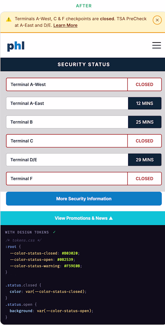
2 UI problems I noticed — and here's how I'd fix them.
The banner → warning yellow with a ⚠️ icon. Universal. Impossible to ignore.
The status rows → tighter spacing, closed terminals get a red outline so they stand out immediately from open ones.
I would use these custom tokens to keep things consistent across both components:
`--color-status-closed` · `--color-status-warning` · `--color-status-open`
Small decisions. Big difference.
The network for creativity
Join 1.25M professional creatives like you
Connect with clients, get discovered, and run your business 100% commission-free
Creatives on Contra have earned over $150M and we are just getting started
Trending
Claude
Claude has entered the design space. How are you using Claude Design?
Contra University
Learn from expert creatives how to earn more using next-gen AI tools.
creativeaiflow
Creative AI workflows are evolving. What tools do you use, and what are their strengths and weaknesses?
freelancerlife
Freelancer life is wins, pivots, and everything in between. What’s yours right now?
Related posts
Pixels with a purpose. Fresh onboarding concepts for a health app. 🚀
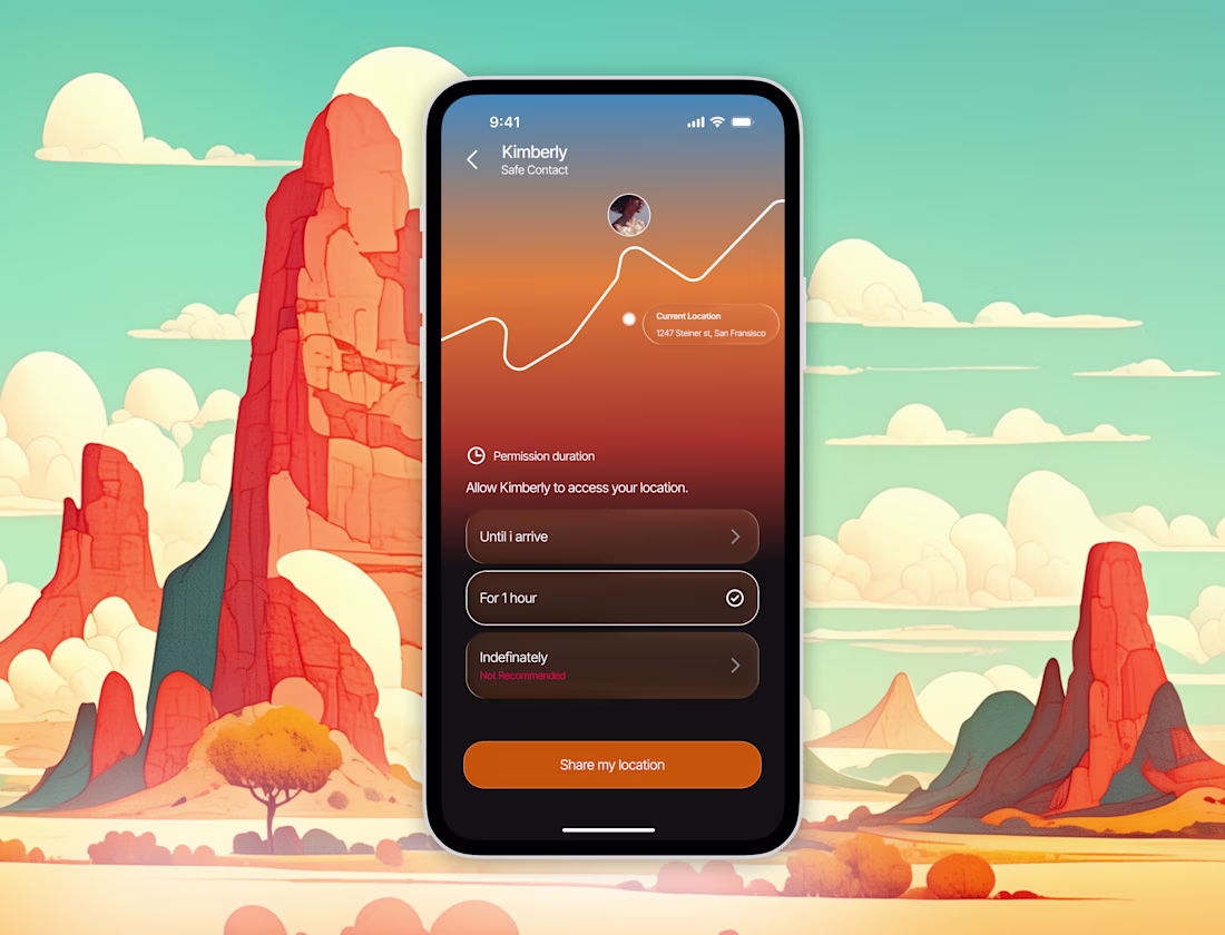
I designed the safety location sharing feature, so when you need help you can have help come meet you at your location.
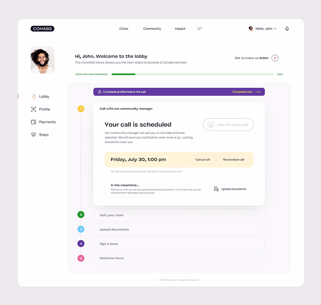
I've been in the industry for almost 20 years, so I've had the chance to work in many different areas, including product design. I remember this project for Cohabs very well. I was visiting Brussels and had a chance to work with them at their headquarters.
This screen comes from the flow where you want to rent a flat and need to pass the verification process.