The network for creativity
Join 1.25M professional creatives like you
Connect with clients, get discovered, and run your business 100% commission-free
Creatives on Contra have earned over $150M and we are just getting started
Back to feedPost

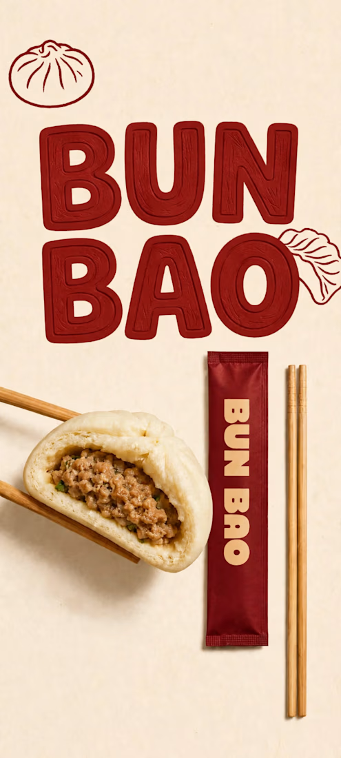
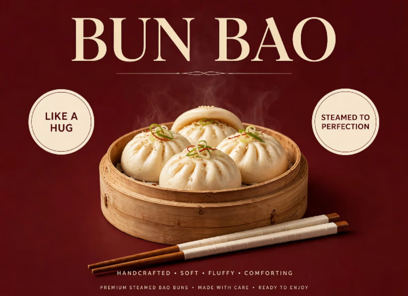
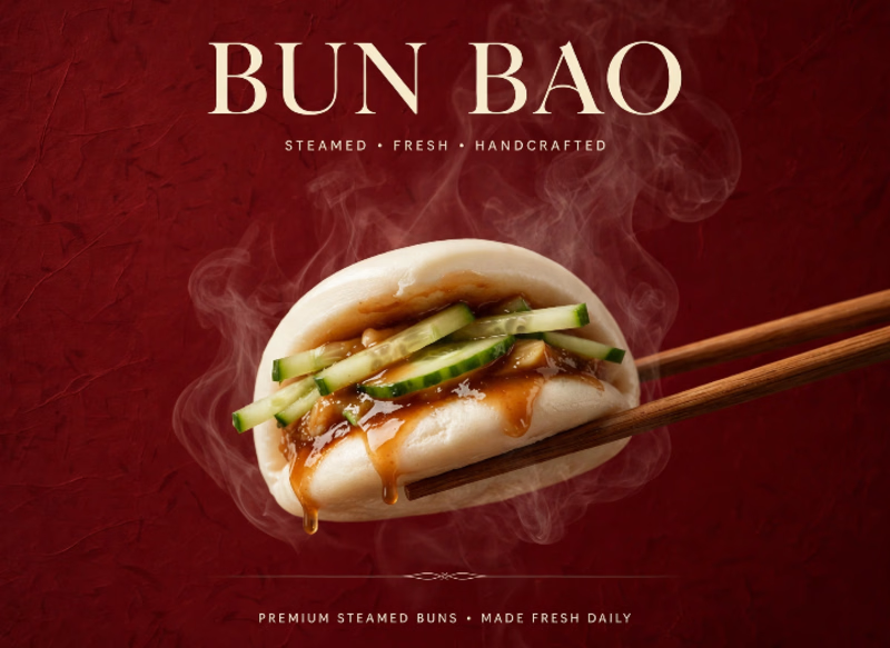
BUN BAO — Steamed, Fresh Handcrafted, Soft, fluffy & steamed to perfection. Like a hug in every bite🥟. Red + Cream Premium Concept.
#FoodBranding #BunBao #BrandDesign
The network for creativity
Join 1.25M professional creatives like you
Connect with clients, get discovered, and run your business 100% commission-free
Creatives on Contra have earned over $150M and we are just getting started



Related posts

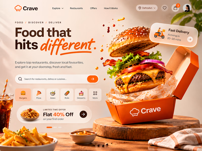
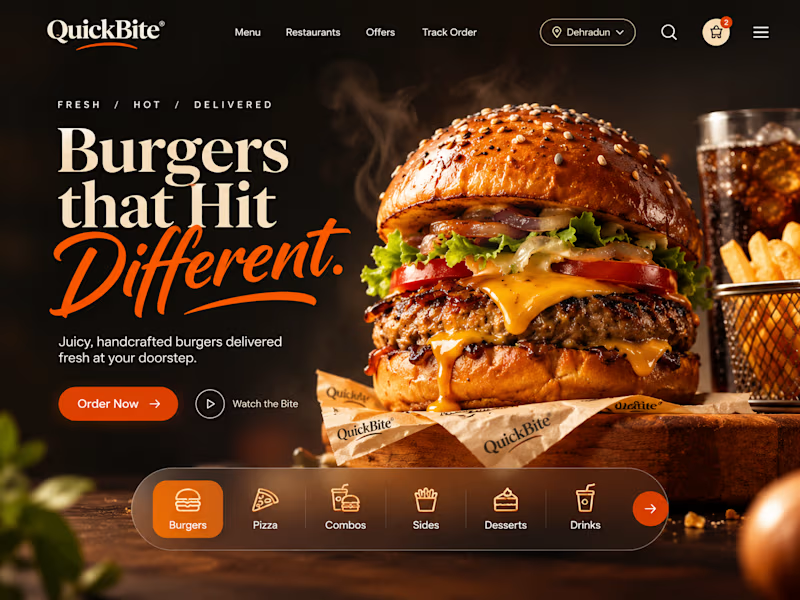
ONE CRAVING. TWO VERY DIFFERENT EXPERIENCES. 🍔
What if the same food-delivery industry could tell two completely different visual stories?
🍊 CRAVE — Made to Tempt
Warm tones, expressive typography, vibrant food photography and playful 3D elements. Designed to make food discovery feel exciting, inviting and full of personality.
🖤 QUICKBITE — Made to Indulge
A darker, richer visual direction with cinematic burger photography, bold editorial typography and immersive layouts. Designed to put the food front and centre and make every interaction feel intentional.
Two brands. Two moods. Two approaches to the same experience.
Now I'm curious:
Which direction would make YOU stop scrolling and place an order?
Drop your pick below. I'd love to hear the reasoning behind it!
3 votes
Ends in 1d

Crave would make me stop scrolling. The warm tones and playful type feel appetising and fun, while QuickBite feels more premium and cinematic. For a food delivery landing page, Crave matches the craving mood better.

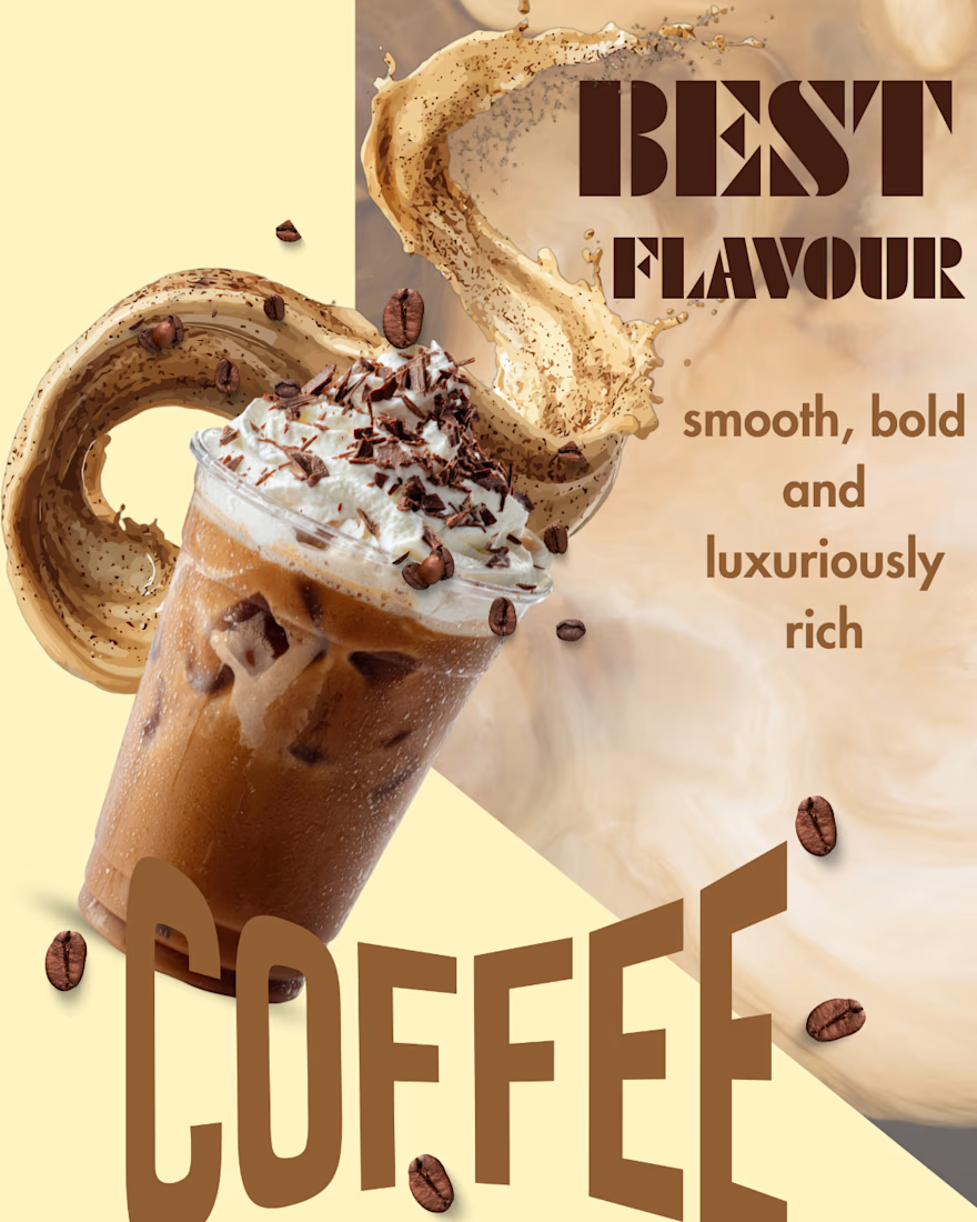
Brewing creativity, one cup at a time! ☕ A self-initiated coffee advertising concept focused on rich visuals, warm tones and appealing product presentation. Designed using Canva.

What if the founder's personal touch became the brand's visual identity?
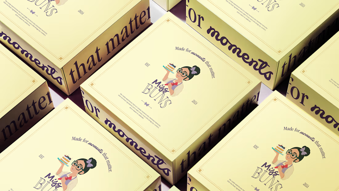
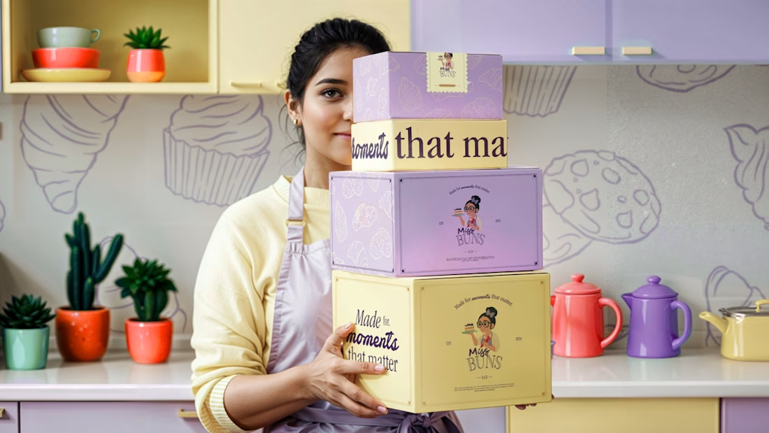
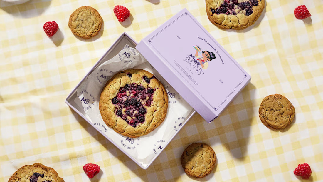
That was the creative direction behind Miss Buns, a patisserie built around personalized treats and delightful customer experiences.
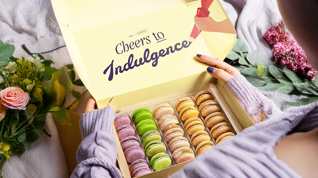
We developed a mascot logo featuring the founder writing the brand name "Miss Buns" with a piping cream container. This idea became the foundation for the wider packaging and touchpoint system, with the founder's handwriting bringing a personal touch to every detail.
Warm, nostalgic and indulgent, the entire experience was designed to feel handmade, thoughtful and made especially for you.
Would you love receiving an order this personal?