The network for creativity
Join 1.25M professional creatives like you
Connect with clients, get discovered, and run your business 100% commission-free
Creatives on Contra have earned over $150M and we are just getting started
Back to feedPost

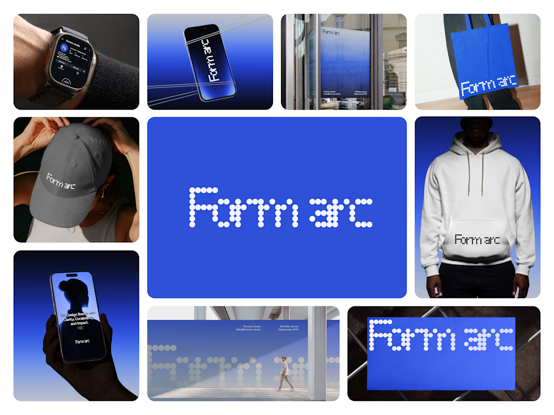
About Form Arc
Form Arc is a multidisciplinary design studio committed to building meaningful brands through strategic clarity and contemporary visual expression.
The Challenge: To stand out in a sea of modern agencies, Form Arc needed a brand identity that made their authority, intention, and long-term focus clear at a glance.
The Solution: We crafted a clean, structured identity utilizing thoughtful typography, a controlled color palette, and organized layouts positioning Form Arc as a smart, trustworthy, and enduring creative partner.
Tags
#Brand Identity #Brand Strategy #Visual Design #Creative Studio


The network for creativity
Join 1.25M professional creatives like you
Connect with clients, get discovered, and run your business 100% commission-free
Creatives on Contra have earned over $150M and we are just getting started











Related posts

How can branding make people feel part of a community?
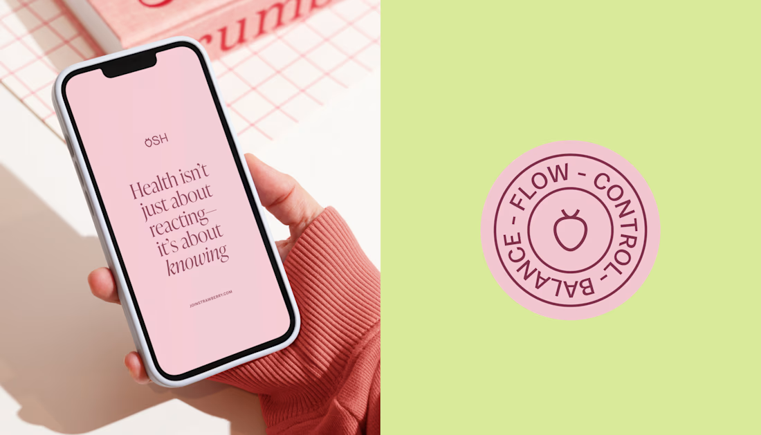
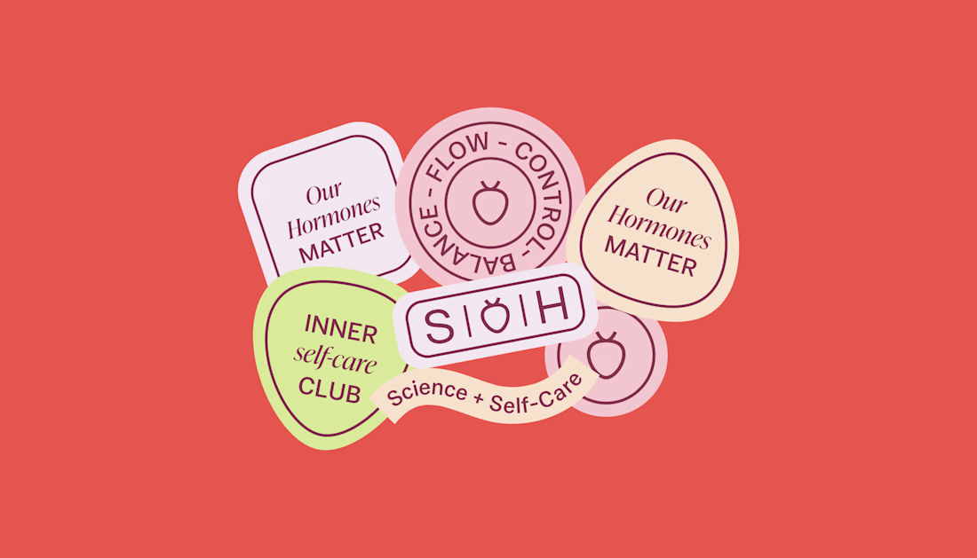
When working on Strawberry Health, we explored how visual identity could make women’s health feel more approachable and collective.
One of the ways was through supporting brand elements: stickers, badges and phrases that could live beyond the logo and become expressions of belonging.
These elements turned the identity into something people could interact with, share and make their own.
It’s a small detail, but I think it’s an important part of building brands around communities: the identity shouldn’t only identify the brand. It should give people something to identify with.
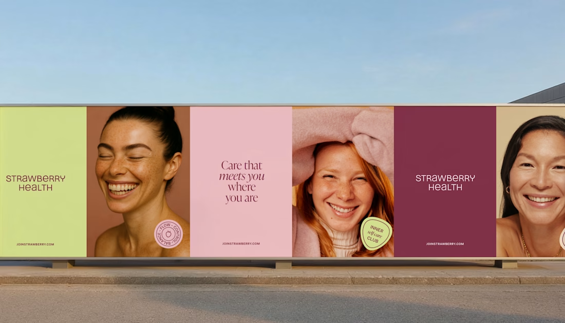
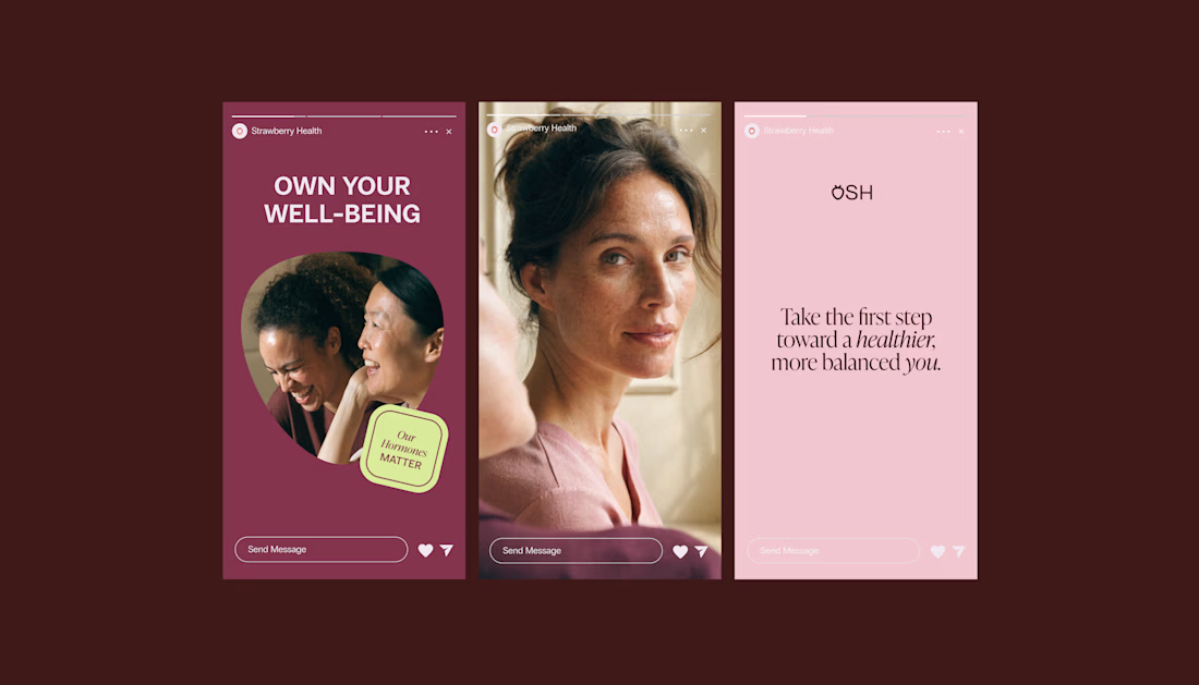

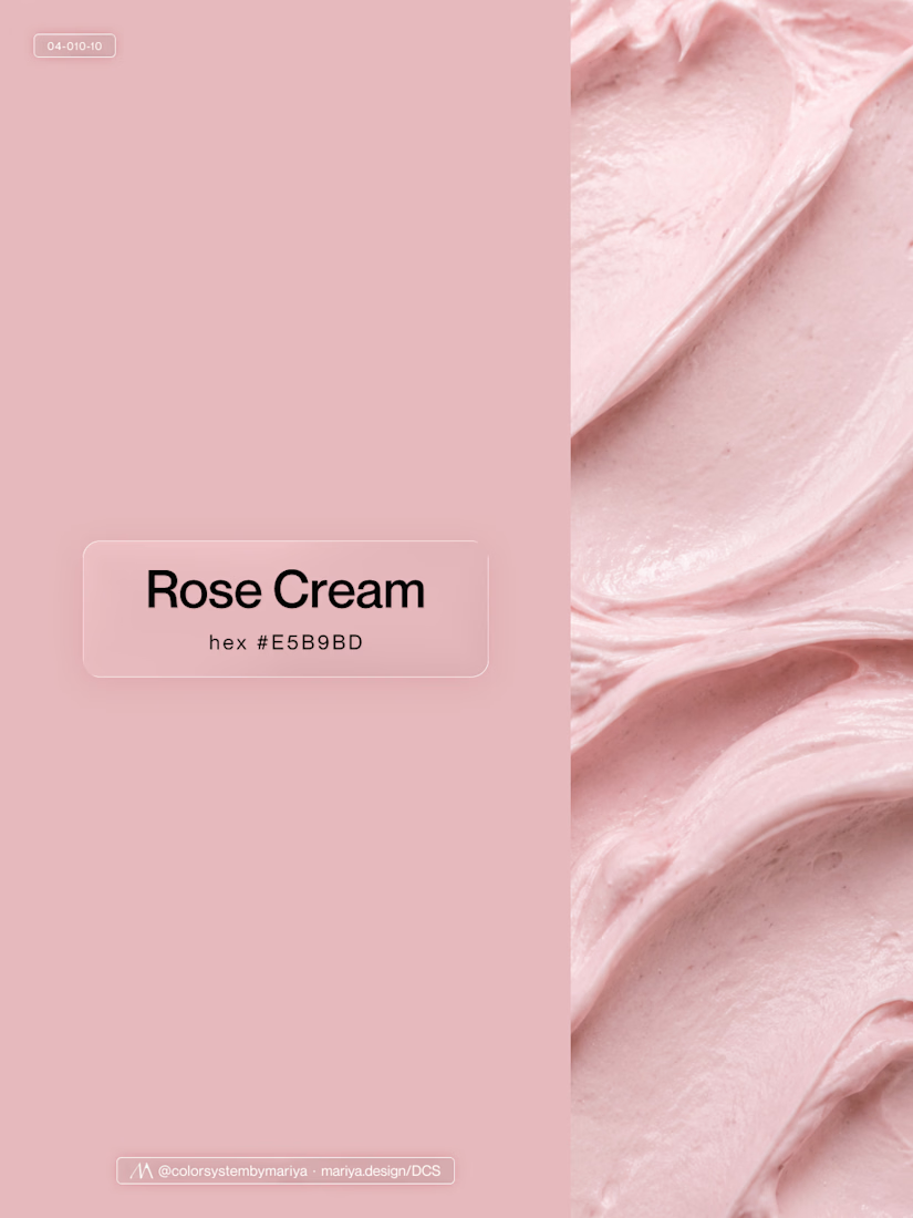
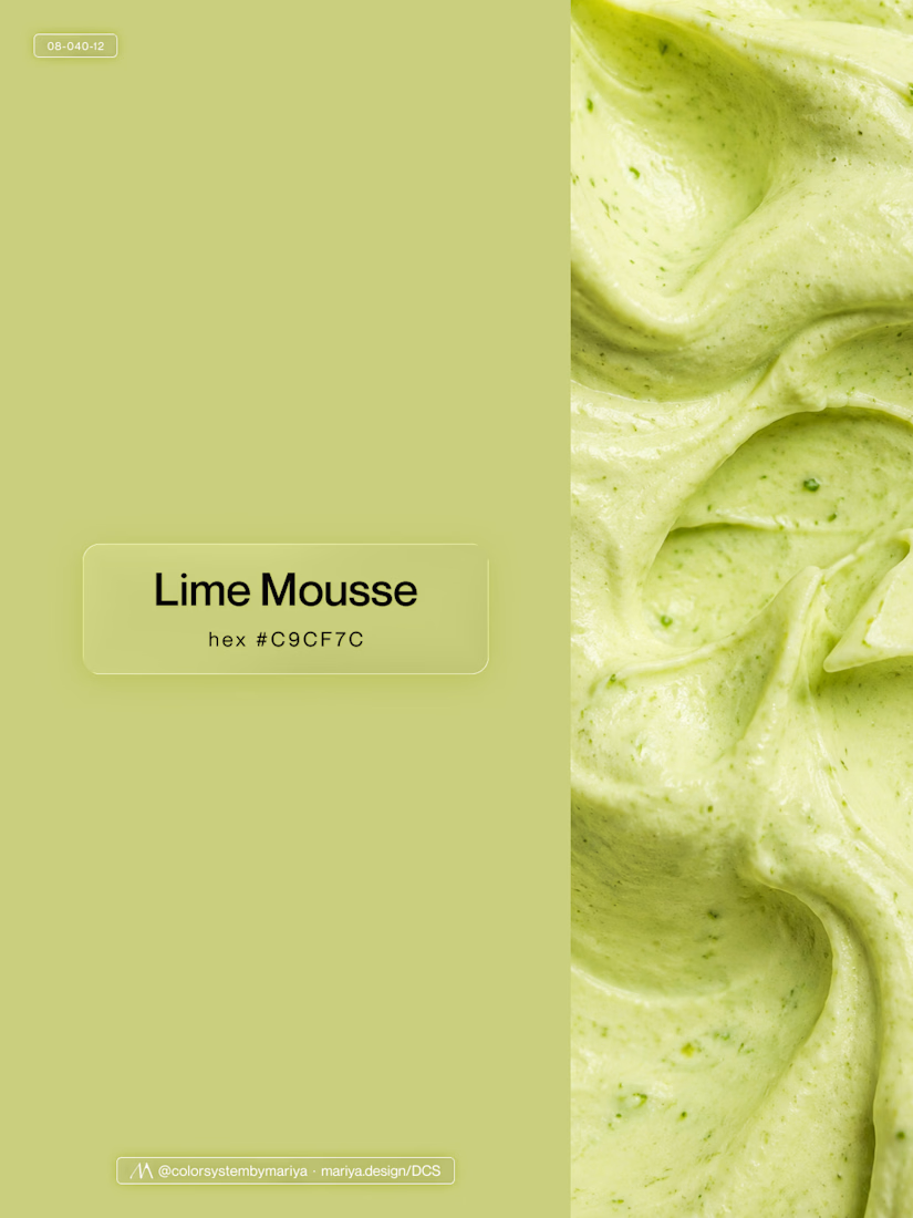
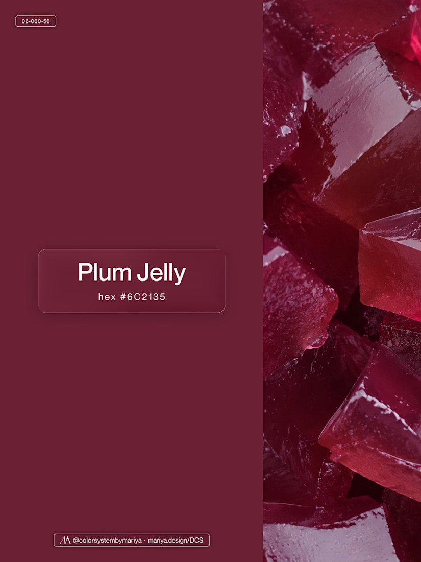
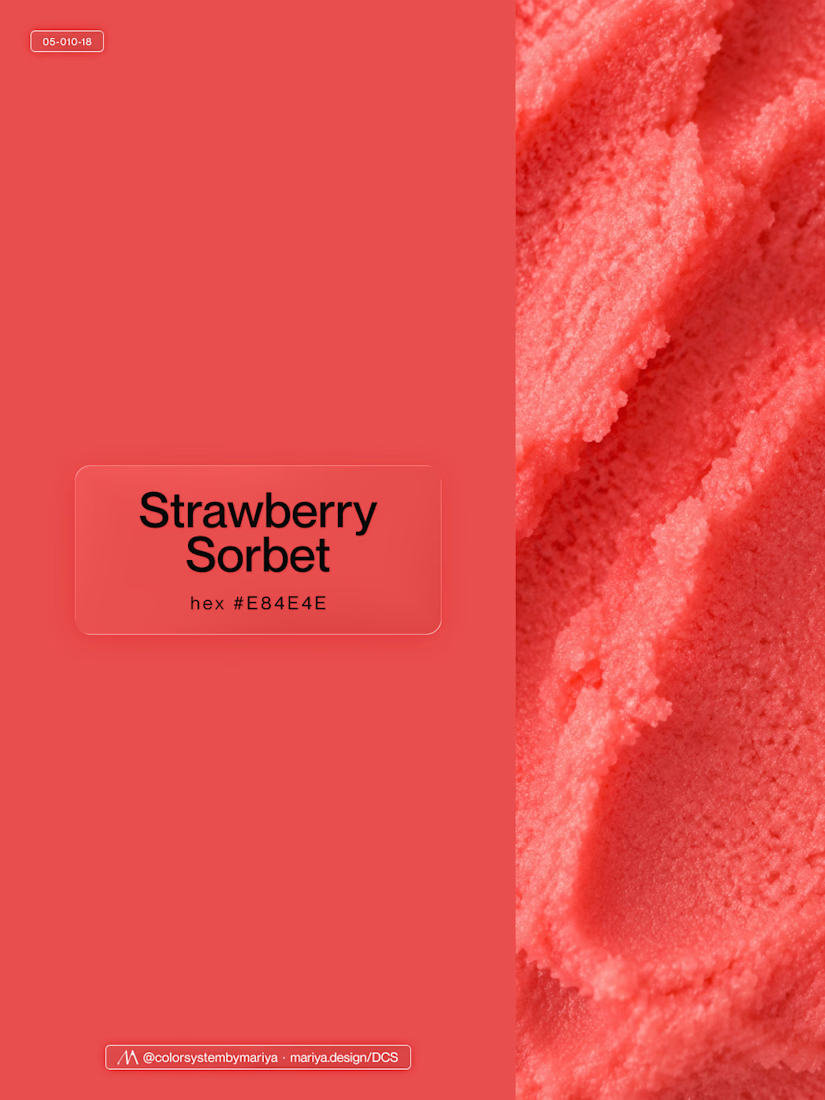
Love, love, love the colors. My mind goes: Rose Cream, Lime Mousse and Plum, hmmmm, which Plum... Plum Jelly. And of course, Strawberry Sorbet.
Let me match the vibe using my delicious swatches 😊

This is my biggest client success story of my carreer.
It's hard to capture 3+ years of work into a single use case page.
Though I gave it a try (it's never perfect 😉)
Read the use case here and let me know what you think of the work. Thanks!🤙🏻

Distilling three years of multidisciplinary work into one use case page is the real craft here, Tim. Long-term client relationships are the best portfolio proof there is. Congrats on the DeFi brand journey.

New case study added!
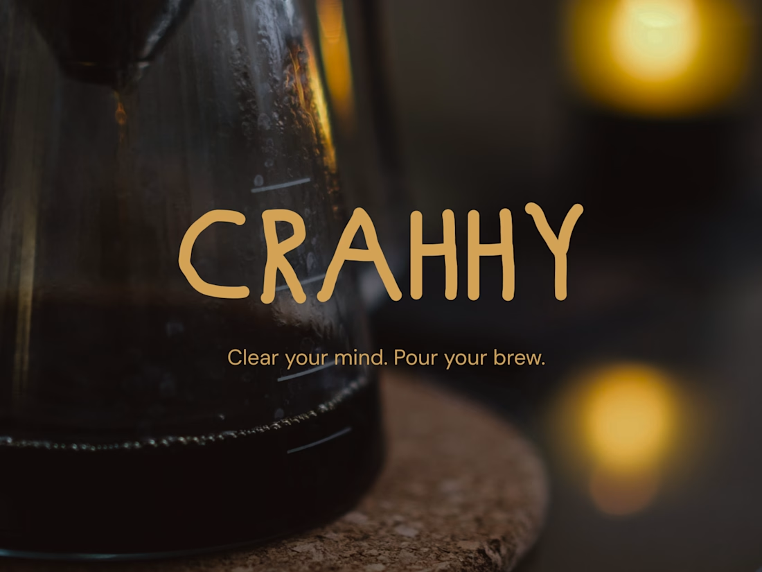
Crahhy is a speciality coffee brand rooted in the relatable human psychology of coffee cravings.
The objective was to design a brand that is minimal on the outside yet delightfully chaotic on the inside, blending specialty coffee aesthetics with honest, humorous storytelling.


minimal outside chaotic inside is the right brief for coffee