The network for creativity
Join 1.25M professional creatives like you
Connect with clients, get discovered, and run your business 100% commission-free
Creatives on Contra have earned over $150M and we are just getting started
Back to feedPost
New case study added!
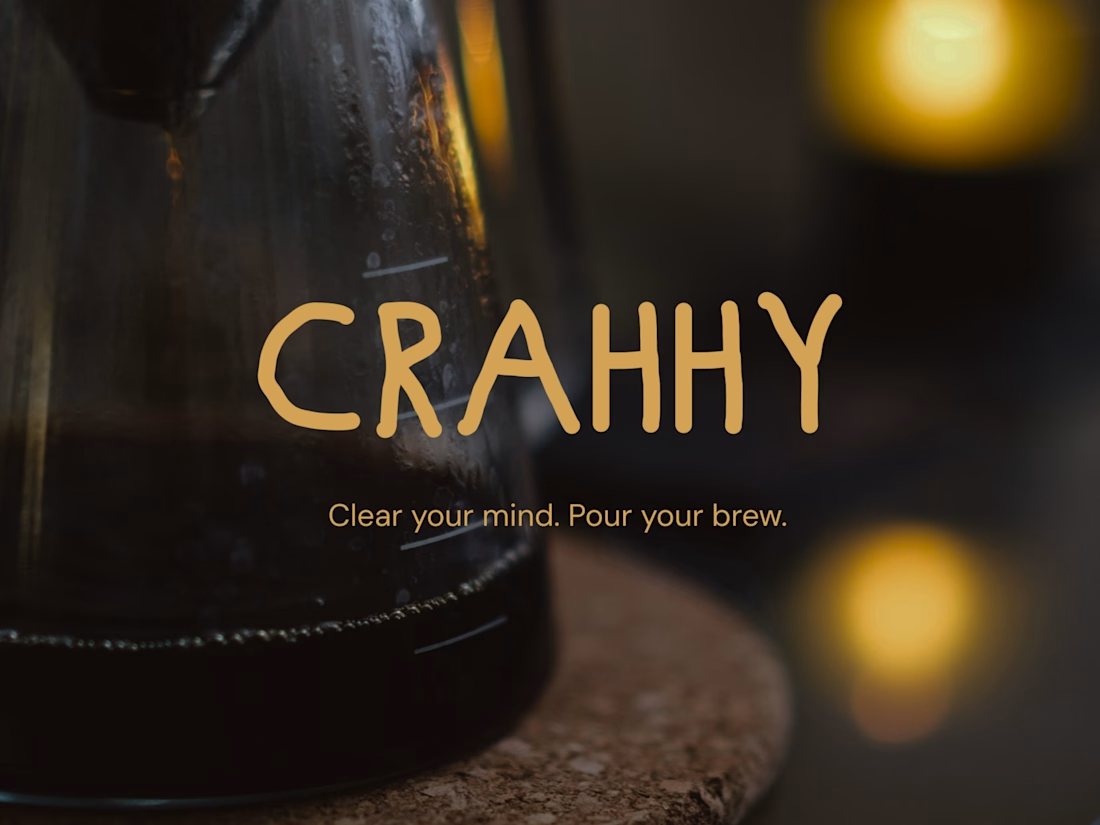
Crahhy is a speciality coffee brand rooted in the relatable human psychology of coffee cravings.
The objective was to design a brand that is minimal on the outside yet delightfully chaotic on the inside, blending specialty coffee aesthetics with honest, humorous storytelling.


minimal outside and chaotic inside is hard to pull off, the gold hand lettering helps a lot

Thank you Benjamin 🙌

minimal outside chaotic inside is the right brief for coffee
Indeed it is!

Beautiful work!!
Thank you Celia, means a lot!

Minimal outside, delightfully chaotic inside is a brilliant tension to design around, Nimesh. Clear your mind. Pour your brew. is the kind of tagline that sells a ritual. That gold hand lettering over the dark brew shot is gorgeous.
Thank you Timothy 🙌
The network for creativity
Join 1.25M professional creatives like you
Connect with clients, get discovered, and run your business 100% commission-free
Creatives on Contra have earned over $150M and we are just getting started





Related posts

Happy to share a little piece of what I've been working on lately: Nexus.
Nexus is a concept for a network that moves money and data as fast as the internet moves information. Payments, tokenized assets, AI agents that pay for things on their own, apps that need privacy by default.
The full website is coming soon.



Big idea and it looks great. Excited to see where you take Nexus next.

Torna-te quem tu és. Become who you are.
That is the motto of Colégio Altiora, and the whole identity starts from it. Altiora is Latin for "higher things", so the symbol is a small "a" built from two pieces, an arch that rises and a yellow ball.
From those two pieces came everything else. The patterns, the brand elements, the icons for the school app, the classroom signs and the uniform all share the same arch and the same ball.
A school for those who always reach higher.


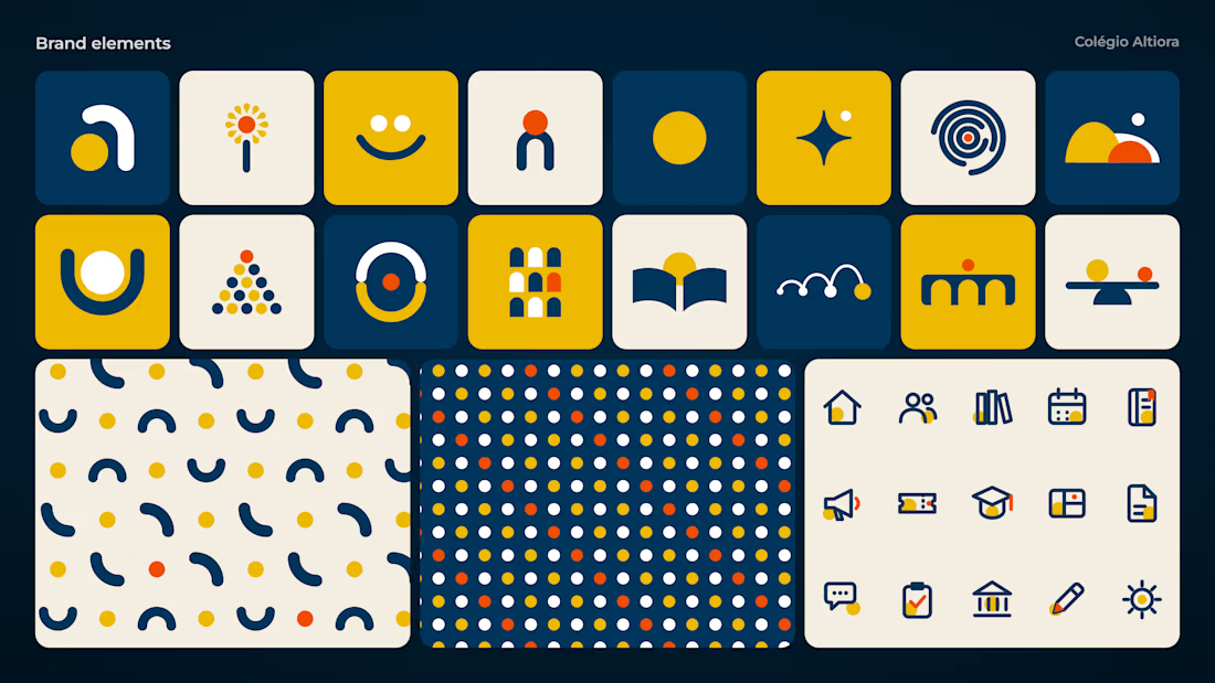
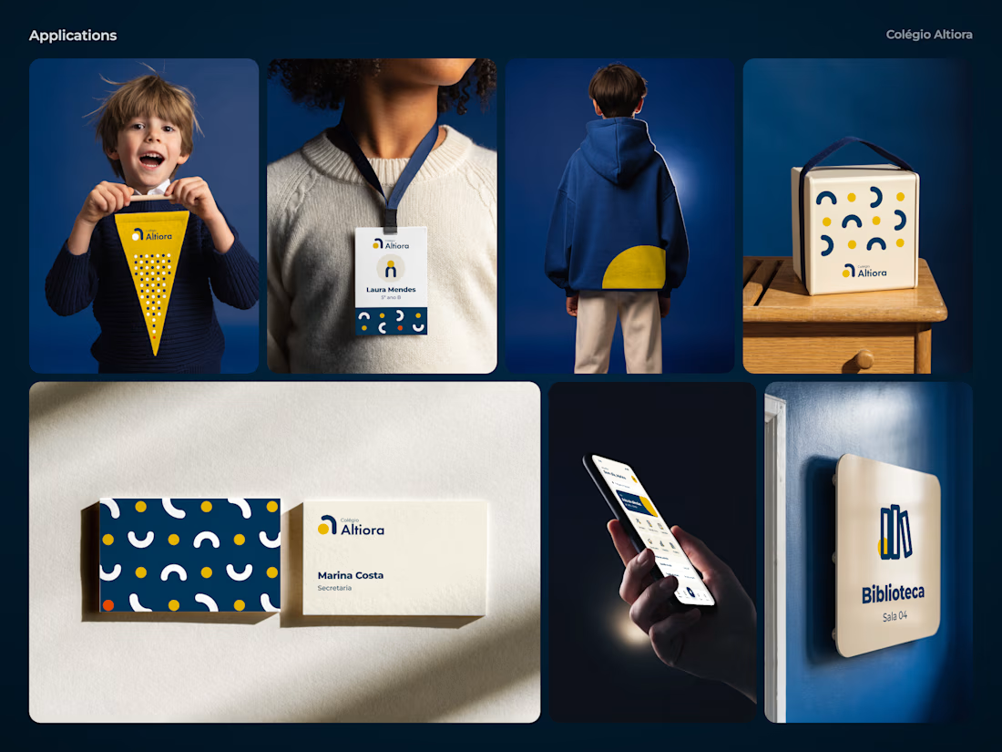

Great job nice icons

Great brands are built through details, consistency, and a clear creative vision. ☀️
For CORVX, we brought a skincare brand to life — from the initial logo concept and complete brand identity to product aesthetics, creative photography, social media graphics, and ongoing social media management.
Every visual, every detail, and every touchpoint works together to create a cohesive brand experience that feels premium, distinctive, and memorable.
From the first concept to every social interaction — one vision, one consistent brand. ✨


Thumbs up