The network for creativity
Join 1.25M professional creatives like you
Connect with clients, get discovered, and run your business 100% commission-free
Creatives on Contra have earned over $150M and we are just getting started
Back to feedPost
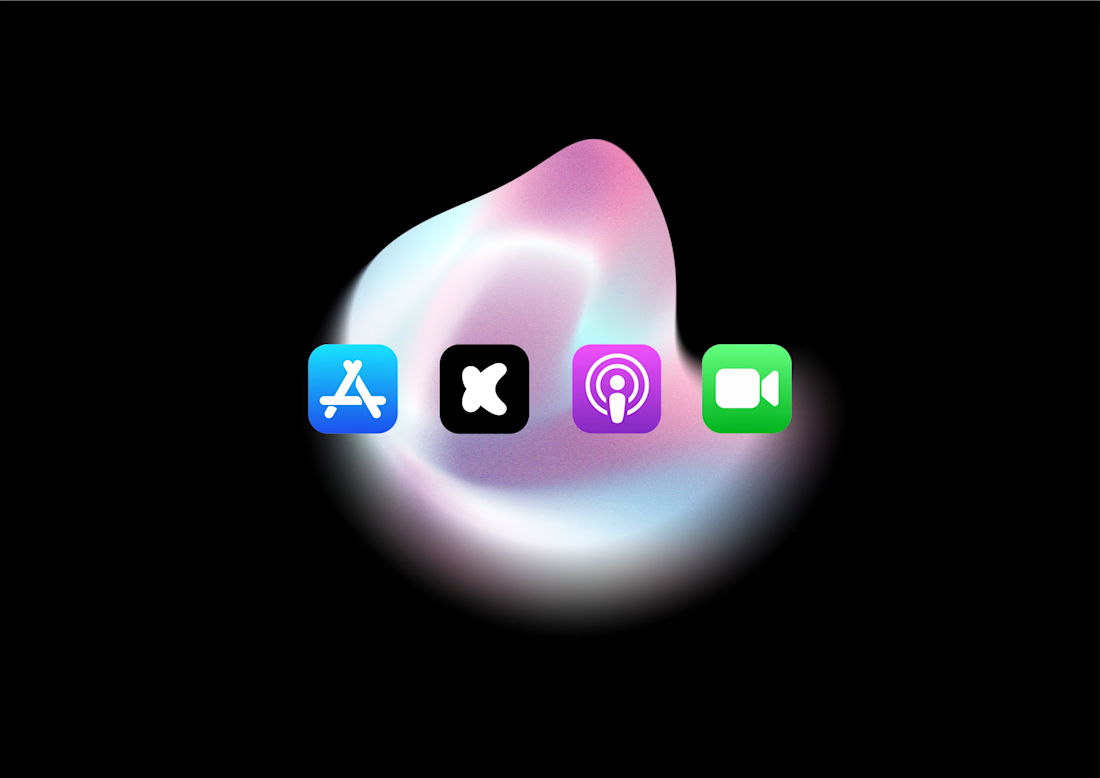
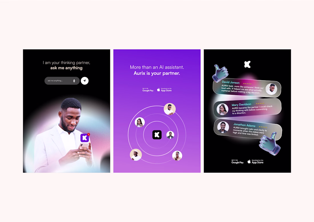
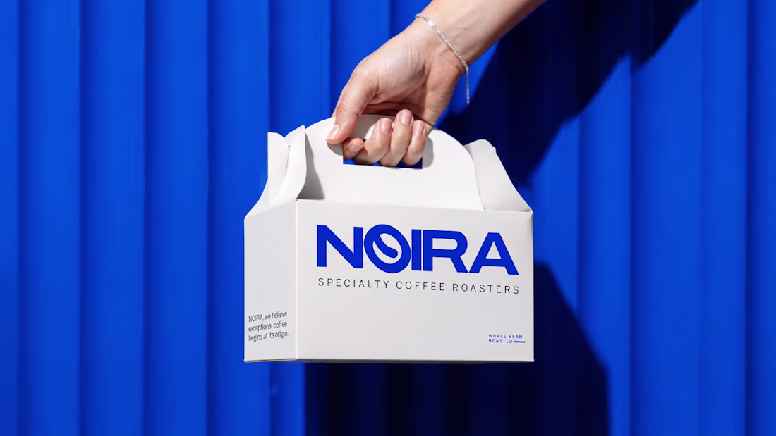
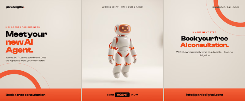
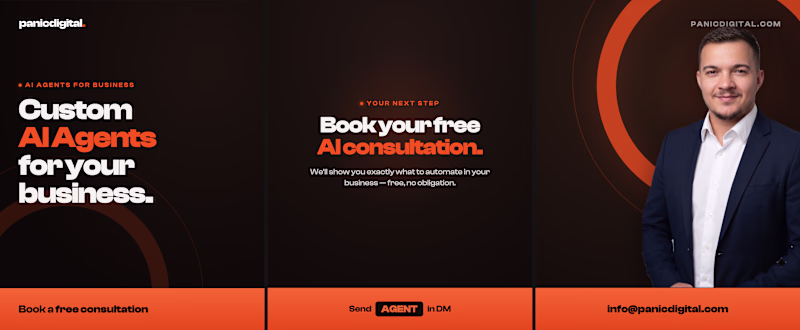
Building AURIX wasn’t about designing another “AI-looking” brand.
From the start, the idea was clear: AURIX needed to feel like a partner founders can trust, not just a tool they use.
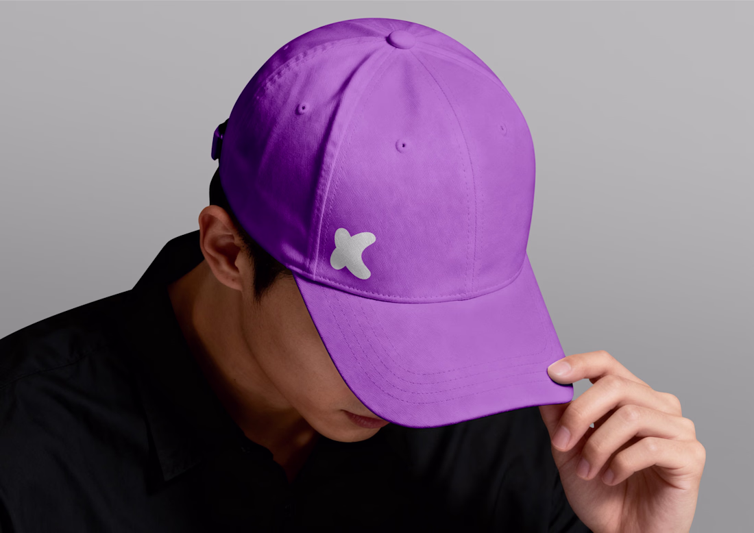
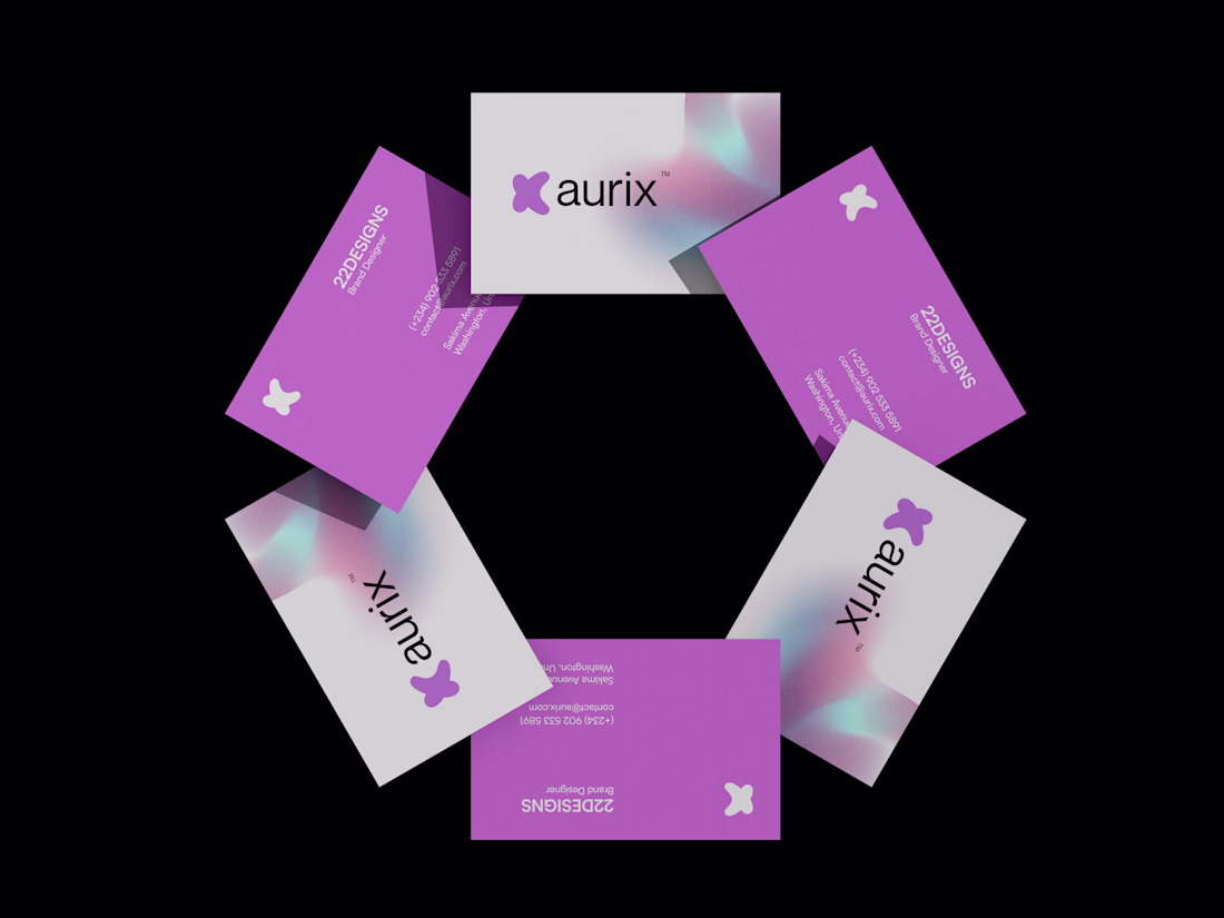
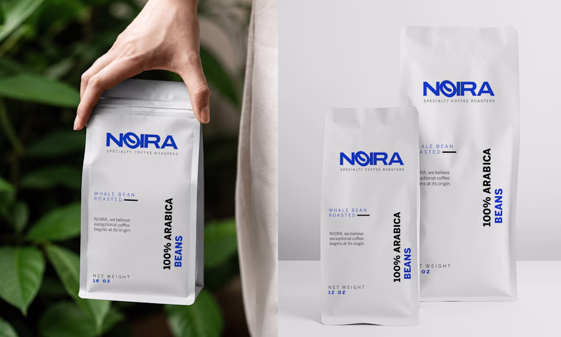
The logo and visuals were intentionally kept calm, minimal, and abstract, no sharp edges, no loud symbols. Every curve and form was designed to represent thinking in progress, collaboration, and clarity forming out of uncertainty. The softness reflects trust and presence, while the bold simplicity ensures the mark feels confident and future-ready.
The visual system follows the same philosophy: quiet layouts, space to think, and subtle motion that feels alive but never distracting.
This is what designing a thinking partner looks like.
AI Agent DesignerLogo DesignAdobe IllustratorAdobe PhotoshopCorelDrawBrand Designaibrandingailogobranddesigner
The network for creativity
Join 1.25M professional creatives like you
Connect with clients, get discovered, and run your business 100% commission-free
Creatives on Contra have earned over $150M and we are just getting started
Related posts
Love this!
3D object is on point
Trending
Claude
Claude has entered the design space. How are you using Claude Design?
Contra University
Learn from expert creatives how to earn more using next-gen AI tools.
creativeaiflow
Creative AI workflows are evolving. What tools do you use, and what are their strengths and weaknesses?
freelancerlife
Freelancer life is wins, pivots, and everything in between. What’s yours right now?