The network for creativity
Join 1.25M professional creatives like you
Connect with clients, get discovered, and run your business 100% commission-free
Creatives on Contra have earned over $150M and we are just getting started
Back to feedPost


One of my first posts on Contra, with the Artemis II mission and current # on Contra, this seems like the perfect time to revisit it.
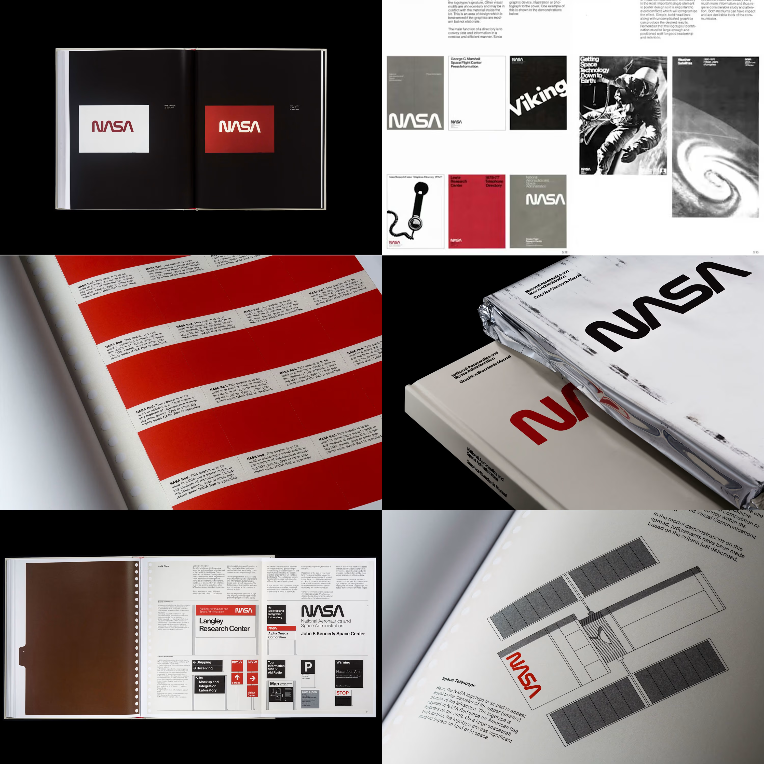
My golden standard when creating brand guidelines to this day remains the 1975 NASA Graphic Standards Manual.
It represents NASA's vision at the time and gives a very comprehensive view of their elements.
Keep in mind this document is in large part still used today, yet it was created almost 50 YEARS AGO!
One element specifically I've taken from this and use in almost all guidelines I create is a square grid over which the logo is overlayed, for reproduction on surfaces where printing in clear dimensions is not possible - use the grid.
"The NASA Graphics Standards Manual by Richard Danne and Bruce Blackburn is a futuristic vision for an agency at the cutting edge of science and exploration."

absolutely stunning 👌

This is sooo cool! I love these type of posts

The worm logo alone is a masterclass in timeless mark making 🚀
The network for creativity
Join 1.25M professional creatives like you
Connect with clients, get discovered, and run your business 100% commission-free
Creatives on Contra have earned over $150M and we are just getting started

Related posts

Throwback: OFF GRID. A premium retreat with no phones, no signal, no noise. Just concrete, silence, and 12 hours of nothing.
Brand identity, campaign, objects, environments.
OG ⤙ 01

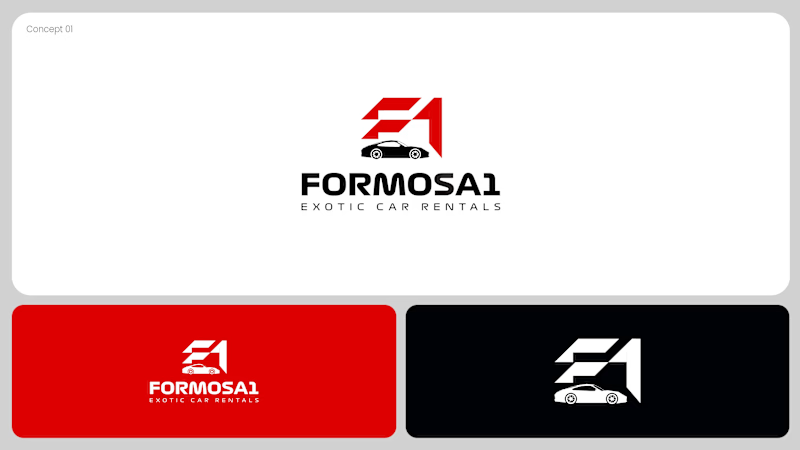
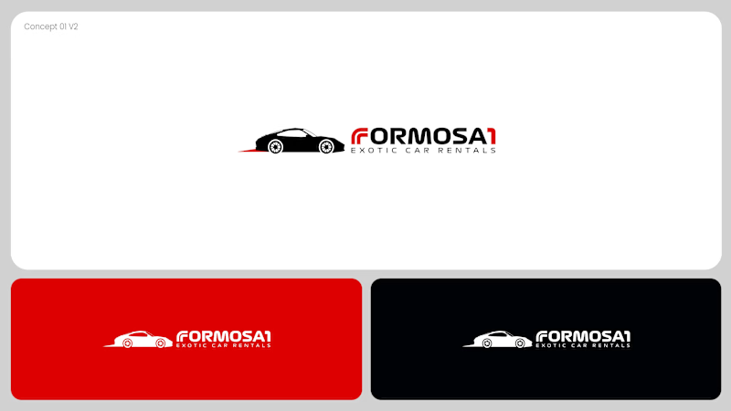
Two logo concepts for Formosa1 Exotic Car Rentals. Which one wins?
A: bold geometric F1 monogram, car tucked inside the mark. Strong and iconic.
B: car silhouette leads, red wordmark with a speed streak. Fast and clean.
Drop your vote 👇
17 voted
53%
15 voted
47%
32 votes
Closed

Both are great but I feel that was something special in the bottom one that's why I choose it❤️❤️

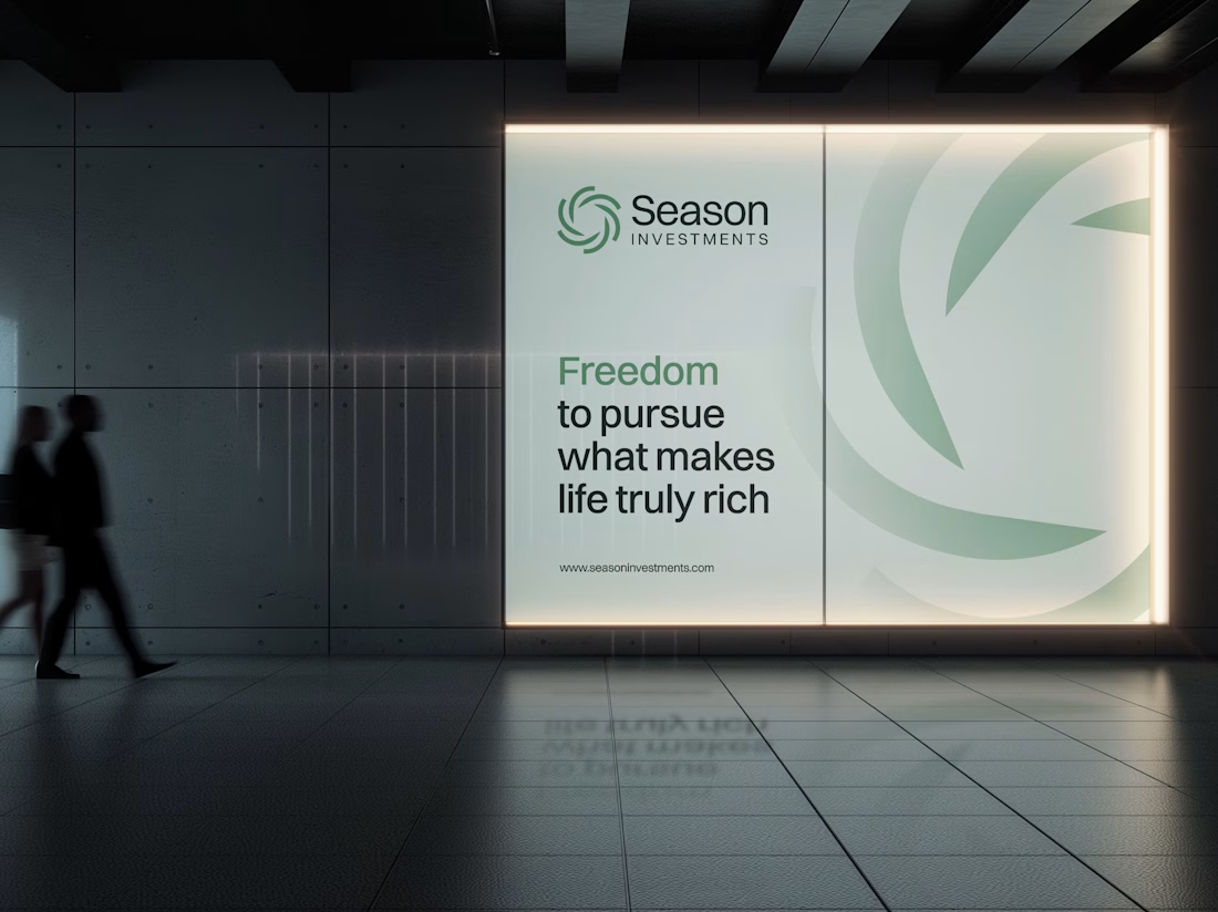
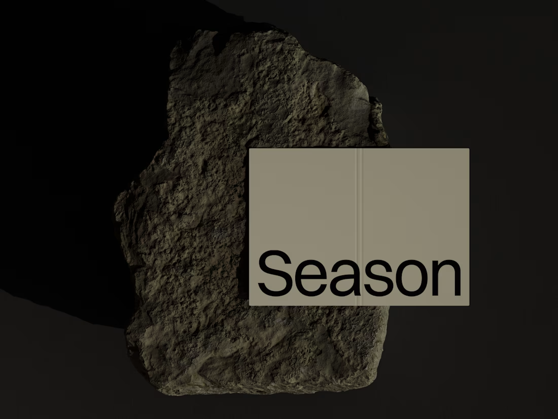
The Rebranding Challenge - Season Investments
One of the key challenges was deciding what to change and what was worth preserving.
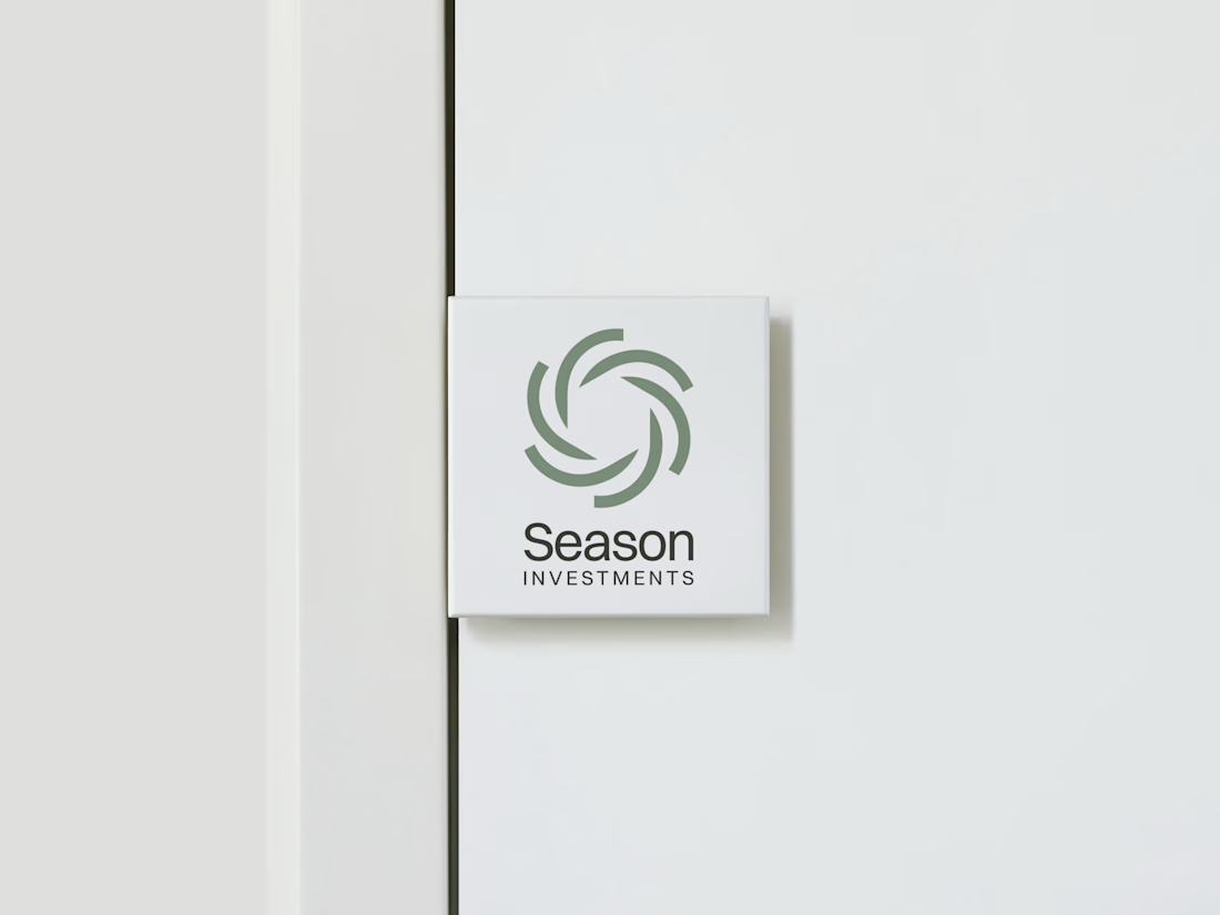
Rather than starting from scratch, the new identity retains a visual connection to Season Investments’ heritage, but reframes it for a more contemporary and flexible brand system.
A major improvement was creating a symbol that can work independently from the wordmark. This gives the brand a stronger presence across investment platforms, digital interfaces, profile images, and other compact applications where the previous identity was difficult to use.
The result is a more adaptable system that moves the brand forward without losing its familiarity.



Love how adaptable this feels across compact digital spaces. Really well done. Any plans to post the original before version for comparison?





