
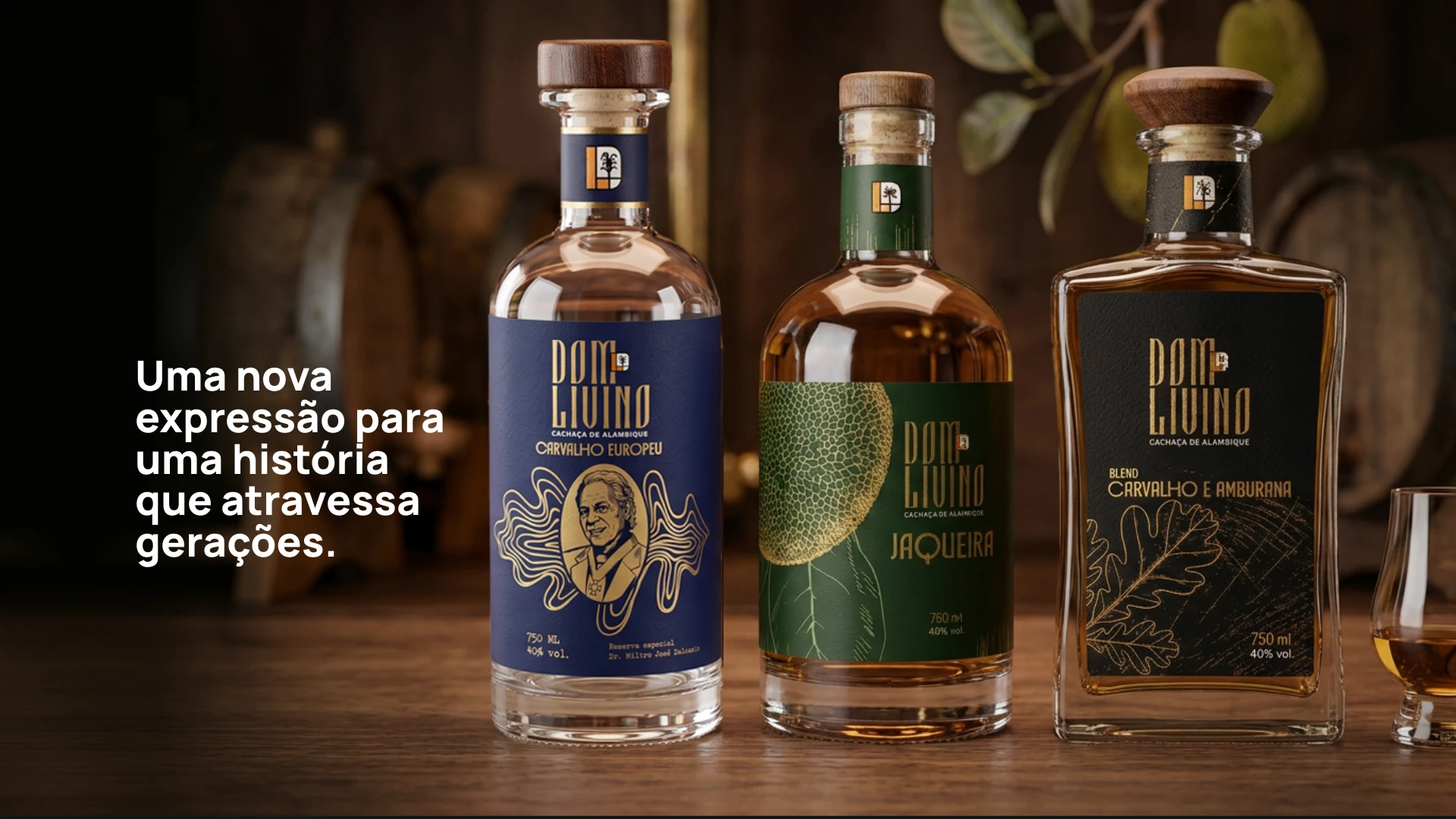
A New Expression for a Story That Spans Generations.
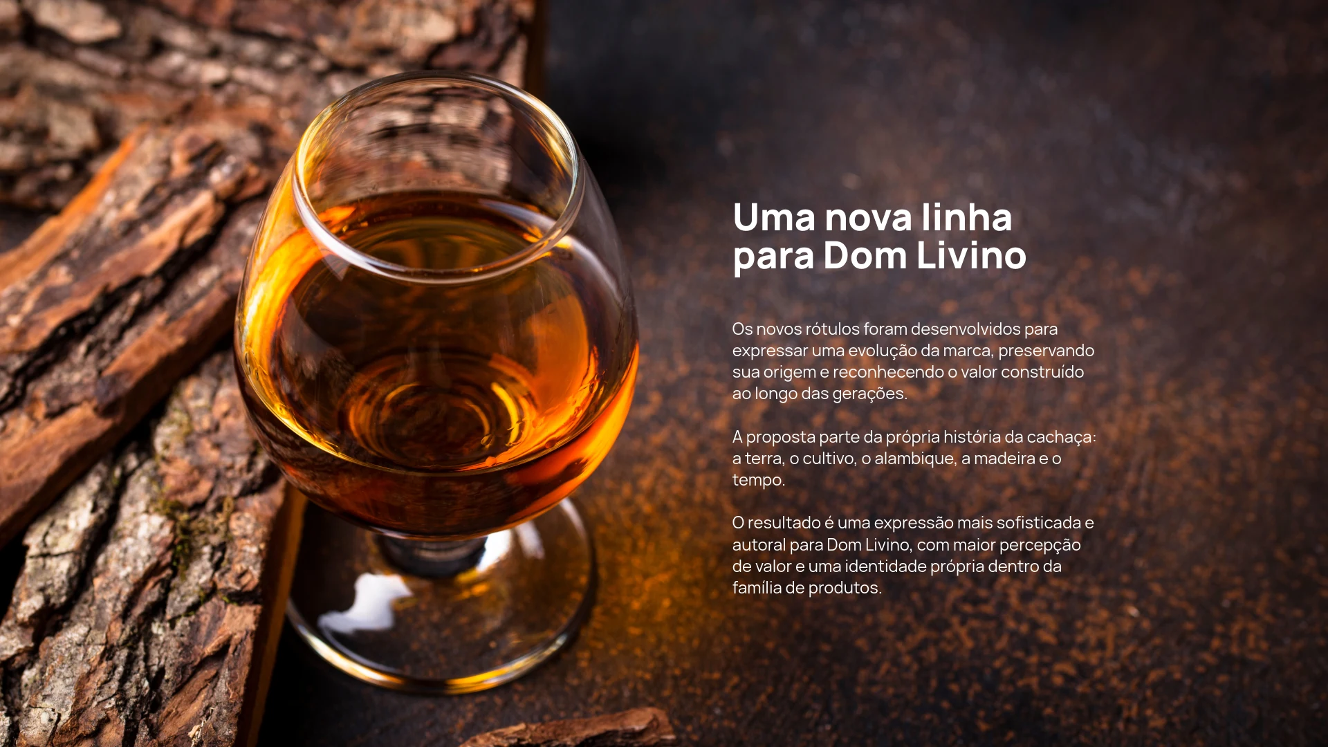
A New Line for Dom Livino
The new labels were developed to express the brand's evolution while preserving its origins and recognizing the value built over generations.
The concept draws inspiration from the very story of cachaça: the land, cultivation, the still, wood and time.
The result is a more refined and distinctive expression for Dom Livino, enhancing its perceived value and establishing a unique identity within the product range.
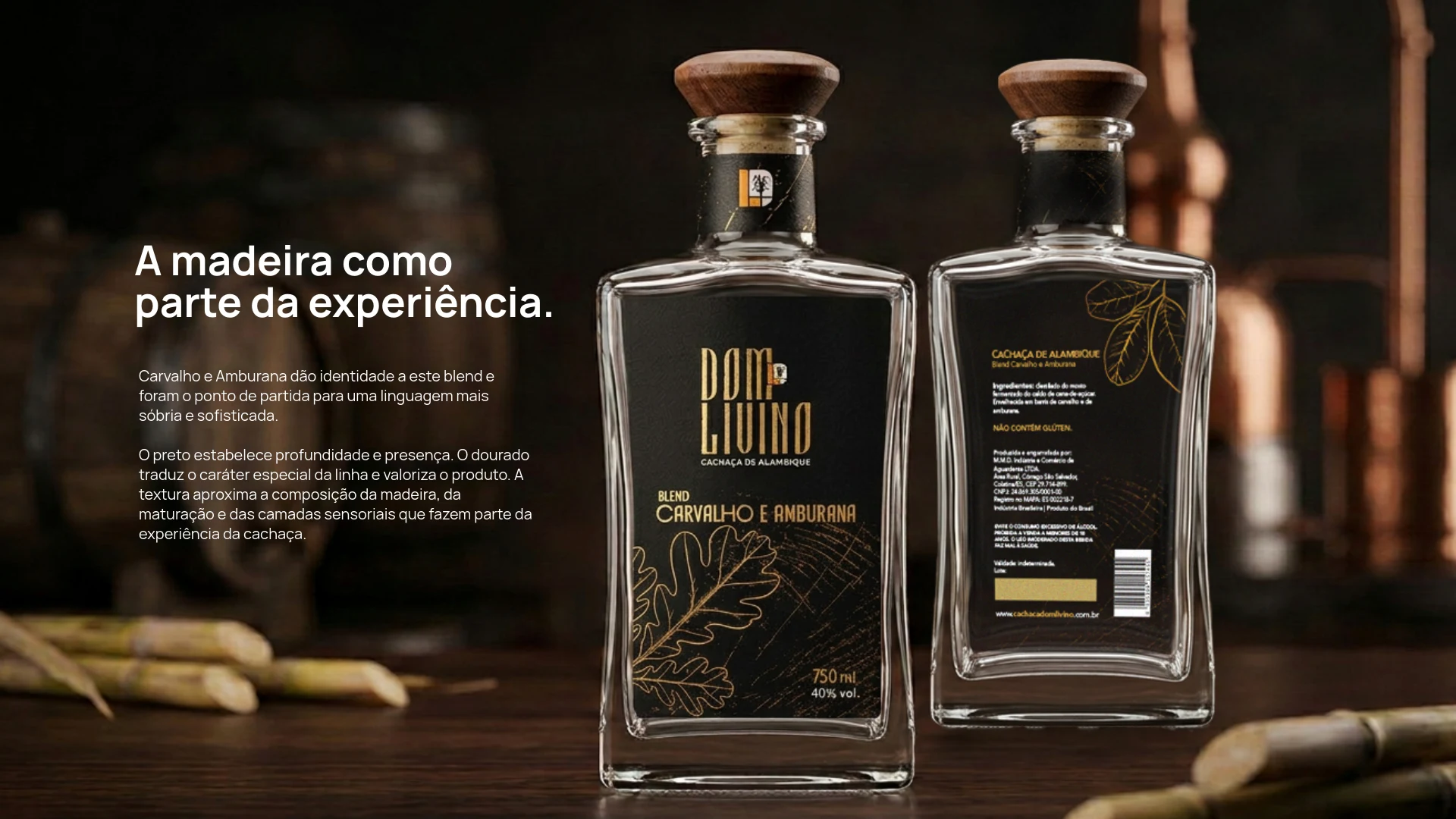
Wood as Part of the Experience.
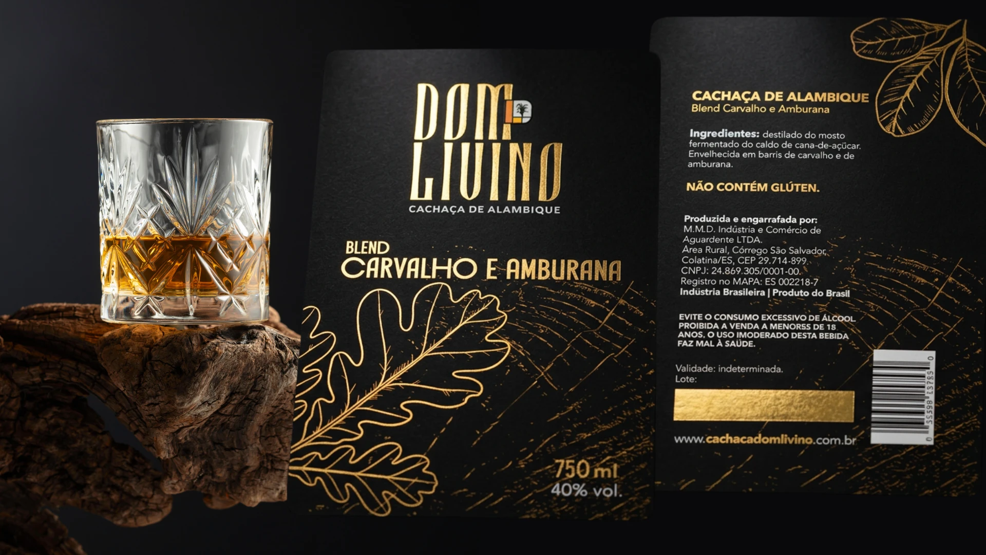
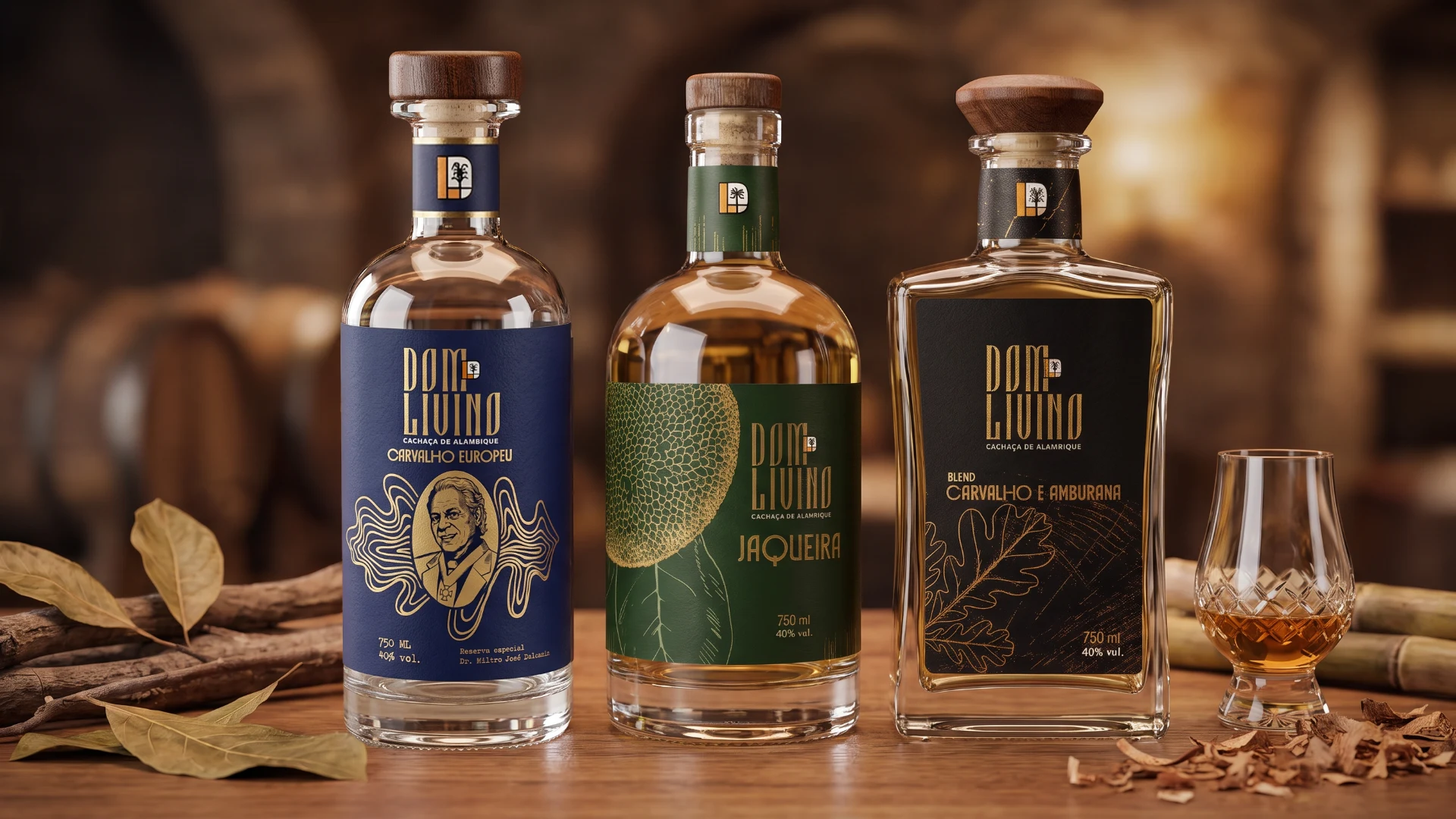
Oak and Amburana define this blend's character and served as the starting point for a more understated and sophisticated visual language.
Black creates depth and presence. Gold conveys the line's distinctive character and enhances the product. The texture evokes wood, maturation and the sensory layers that are part of the cachaça experience.
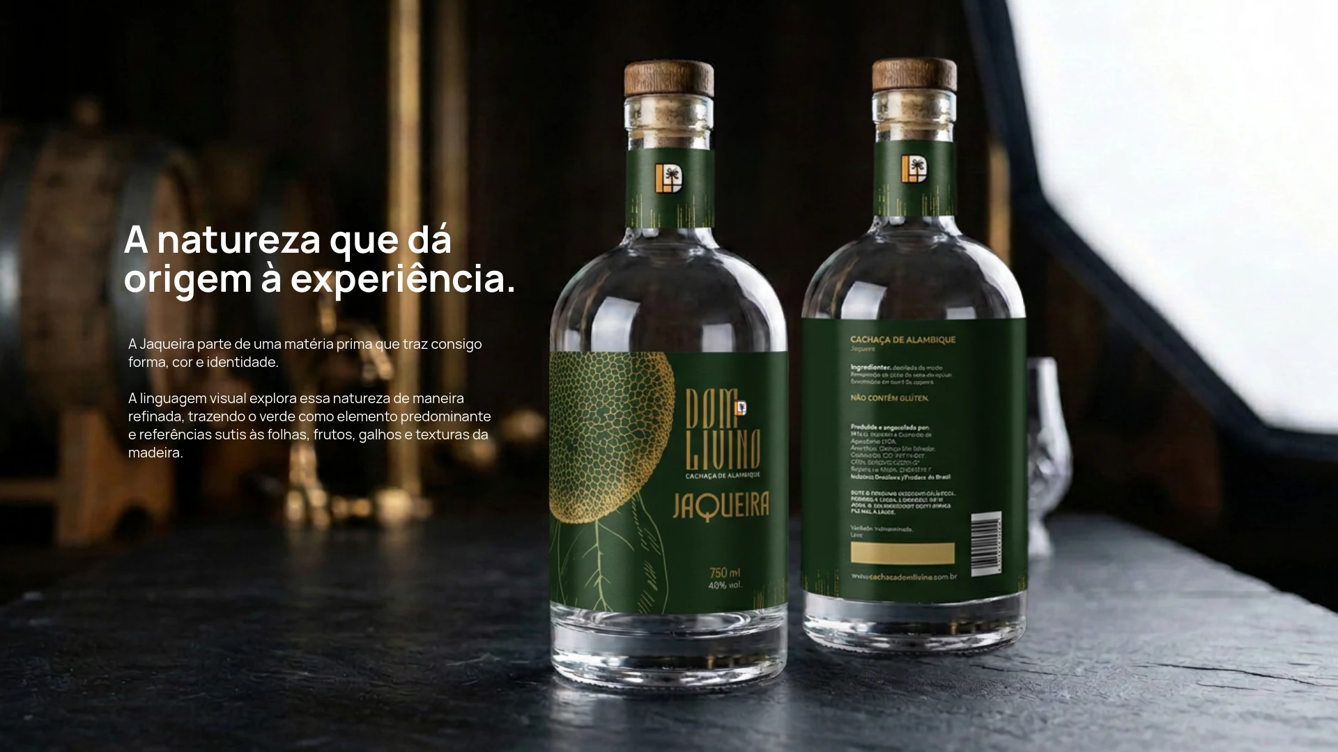
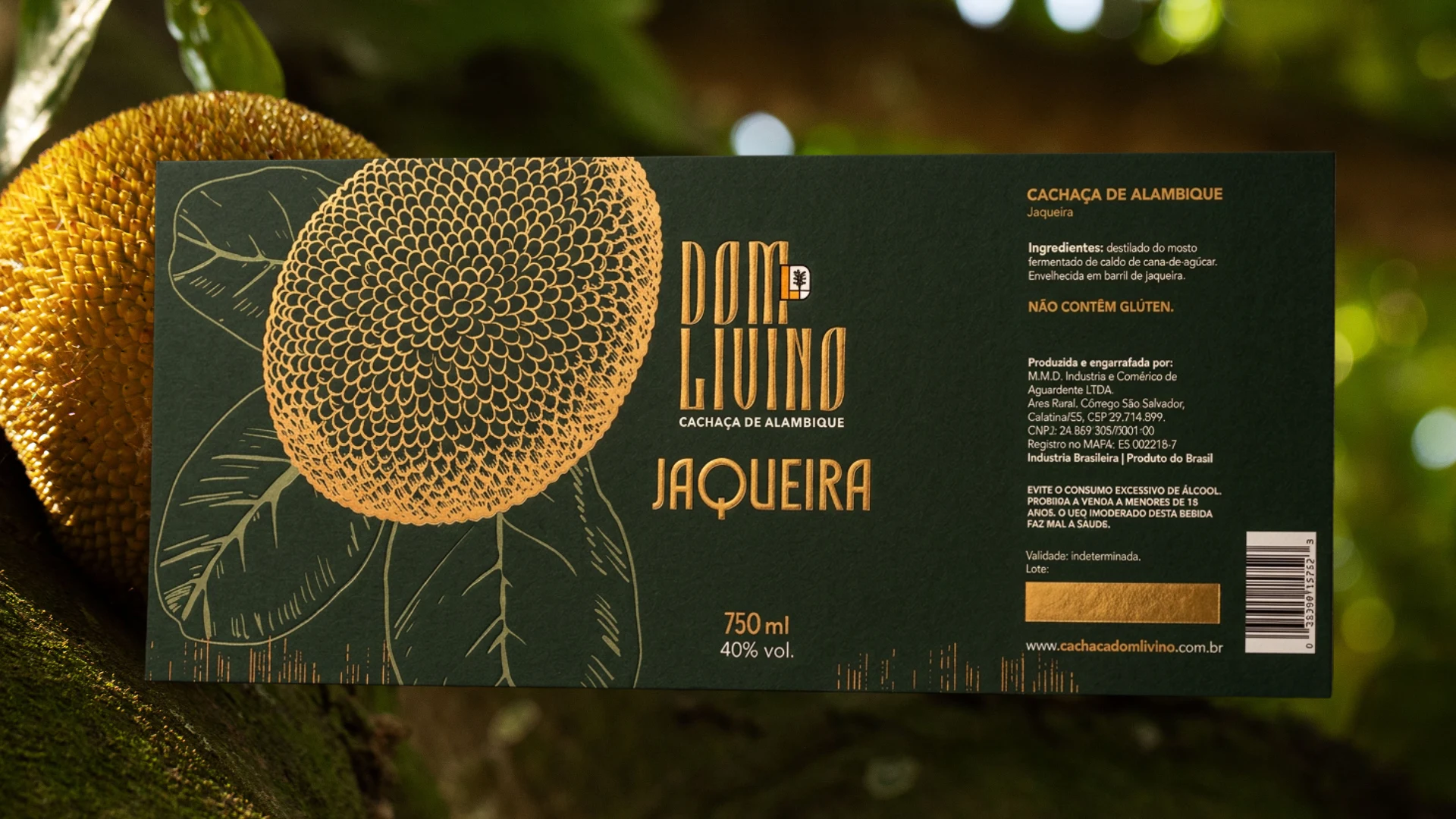
Nature as the Origin of the Experience.
Jaqueira draws inspiration from a raw material that carries its own shape, color and identity.
The visual language explores this natural character in a refined way, using green as its dominant element, alongside subtle references to leaves, fruit, branches and wood textures.
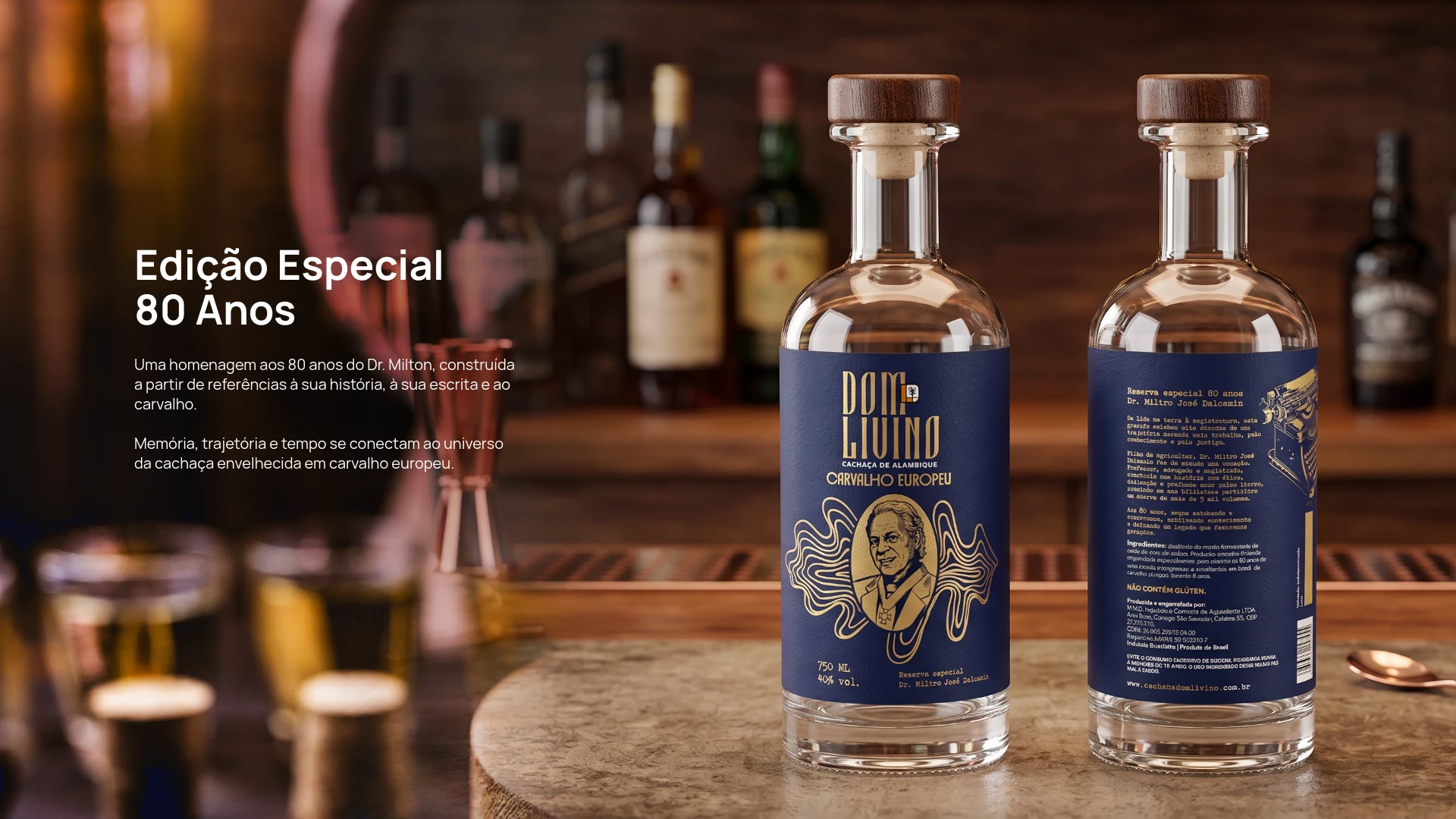
80th Anniversary Special Edition
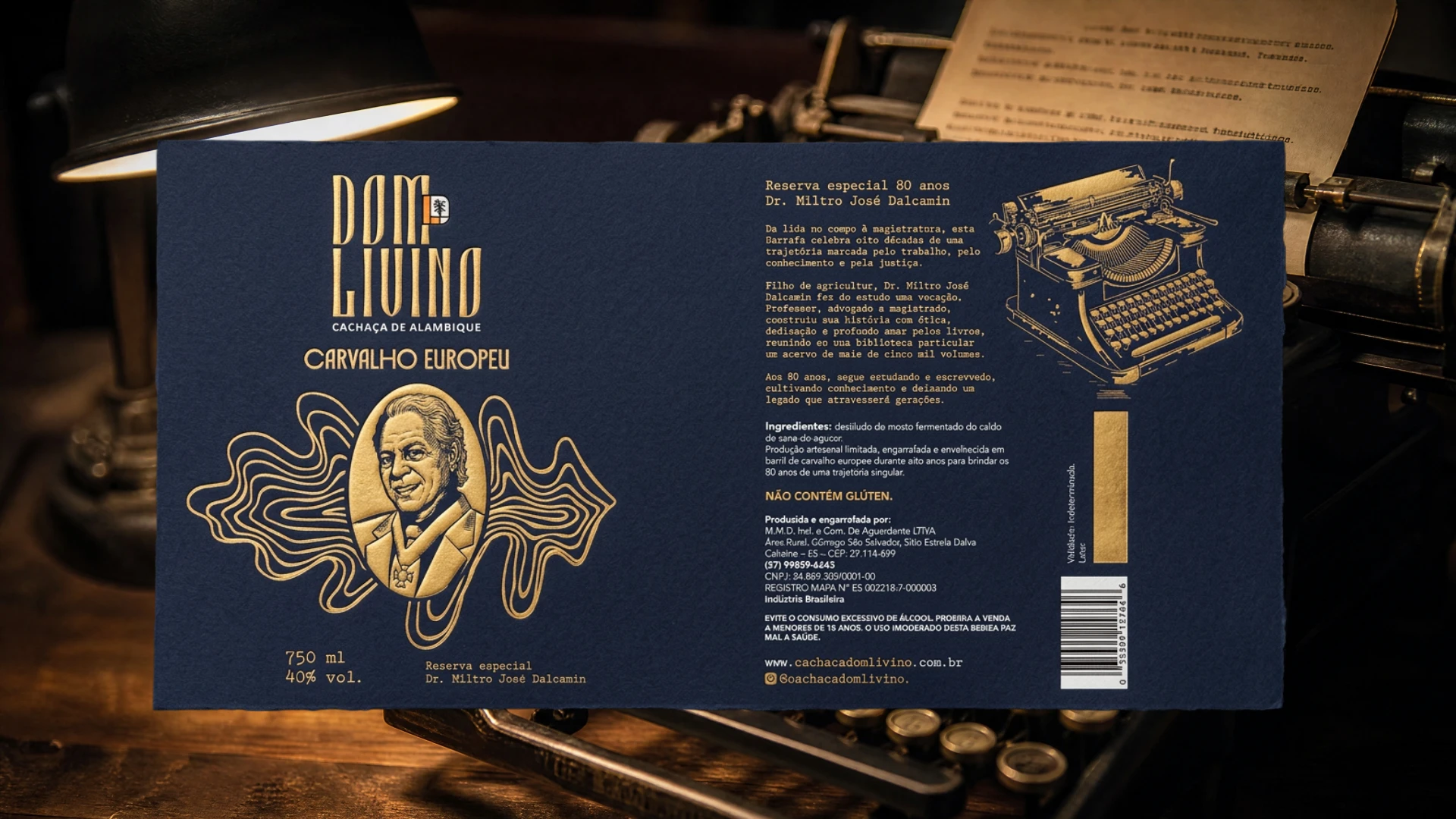
A tribute to Dr. Milton's 80th birthday, inspired by his personal story, handwriting and oak wood.
Memory, heritage and time come together in the world of cachaça aged in European oak barrels.
Dom Livino is a cachaça brand that celebrates memory, heritage and time.
The packaging project was developed from these references, translating the history and personality of each product into a distinctive visual language.
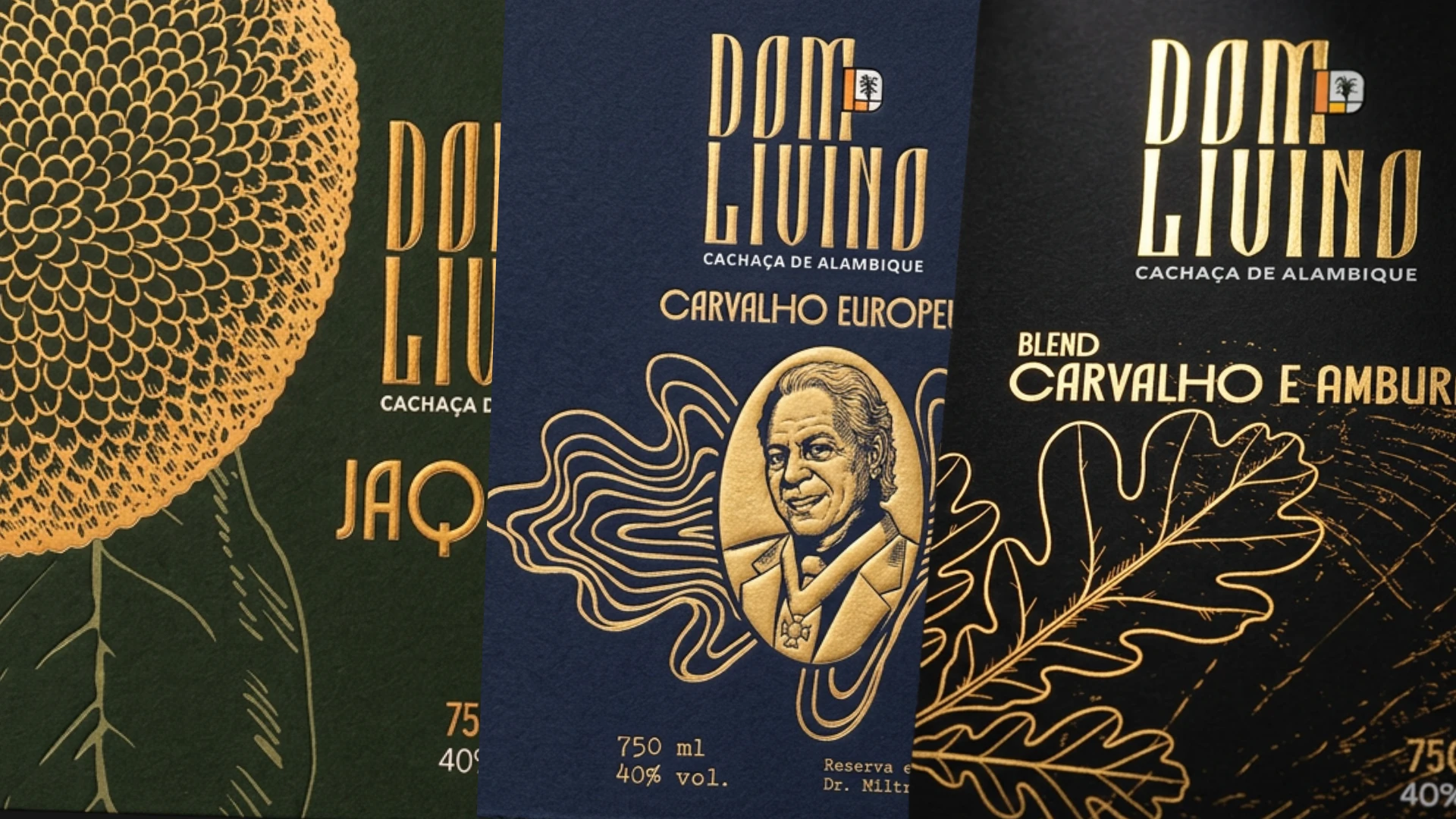
The project included the development of the collection's labels, exploring materials, typography, illustrations, colors and finishes that reinforce the connection between tradition, origin and time. Each package was designed to preserve the brand's identity while giving each product a distinct visual presence.
Packaging design, label development and visual direction.
A visual identity for a collection of products, translating their history and personality into distinctive packaging through typography, illustrations and colors.
0 likes · 2 views · Nov 15, 2026
The packaging project translates each product’s history and personality into a distinctive visual language through typography, illustrations and colors.

