The network for creativity
Join 1.25M professional creatives like you
Connect with clients, get discovered, and run your business 100% commission-free
Creatives on Contra have earned over $150M and we are just getting started
Back to feedPost
Taste Test
Character Design · Game Art · 3D Visual Concept
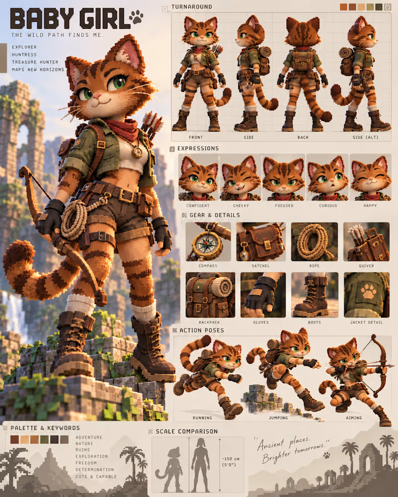
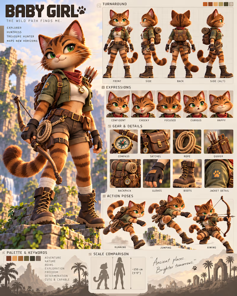
2 votes
Ends in 1d

Smoth is absolutely better character like this with this graphics and details great job 🎉👍

Mostafa I agree ☝🏽 thank you
Pardon ❤️
The network for creativity
Join 1.25M professional creatives like you
Connect with clients, get discovered, and run your business 100% commission-free
Creatives on Contra have earned over $150M and we are just getting started





Related posts

Light or dark, which one wins? ☀️🌙
Same site, two moods. Warm stone and lacquer red, or the same build after dark.
Both are hand-built with a 3D paper crumple, real physics, a stick-figure film drawn in code, and a receipt that gets a bicycle kick. 🔊 Sound on.
Tell me which you'd ship: light or dark? 👇
26 voted
59%
18 voted
41%
44 votes
Closed

I really like how the light version looks, but it has some legibility issues. Since readability is more important for users than visual appeal, I think the dark version is the better option.
BTW, I initially voted for the light version, but after analyzing both options more closely, I changed my mind 😄

Designed this interactive 3d dashboard with Opus 5.5 for an industrial company's vehicle and material tracking dashboard
A full 3D simulation of the plant, every truck tracked from gate to dock
Both modes are pixel precise. Which one you like?

4 voted
40%
6 voted
60%
10 votes
Closed

Voted Dark. On a dashboard watching trucks move from gate to dock all day, dark is easier on the eyes, and the 3D bars and route lines glow against it. Light is clean, but dark makes the live movement the focus.


Collage