The network for creativity
Join 1.25M professional creatives like you
Connect with clients, get discovered, and run your business 100% commission-free
Creatives on Contra have earned over $150M and we are just getting started
Back to feedPost
Taste Test
Designed this interactive 3d dashboard with Opus 5.5 for an industrial company's vehicle and material tracking dashboard
A full 3D simulation of the plant, every truck tracked from gate to dock
Both modes are pixel precise. Which one you like?

9 votes
Ends in 1d


Lights looks more clean. The blue is more contrasting here ✨

Great Observation, Thank you @Rahul Upadhyay

I think you have already added the theme-toggle-button for light/Dark mode. That's great job. I mostly prefer dark mode but Light/Dark mode button is always a plus.
Thanks @Prashant Kumar I'm happy that you liked it.

Voted Dark. On a dashboard watching trucks move from gate to dock all day, dark is easier on the eyes, and the 3D bars and route lines glow against it. Light is clean, but dark makes the live movement the focus.
The network for creativity
Join 1.25M professional creatives like you
Connect with clients, get discovered, and run your business 100% commission-free
Creatives on Contra have earned over $150M and we are just getting started





Related posts

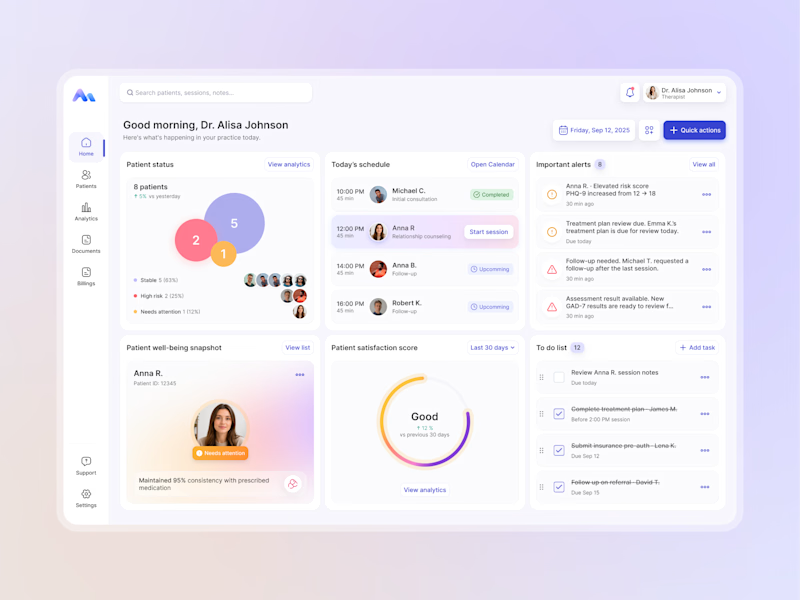
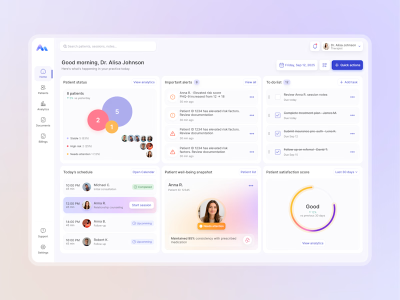
Designing for therapists means prioritizing what matters in the next few minutes, not just what looks good on a dashboard.
I explored two layout directions for a mental health practice management web app that helps psychologists manage sessions, patients, documentation, tasks, and follow-ups.
Both concepts use the same core widgets, but with different positioning and visual hierarchy. The goal was to make daily priorities easier to scan and act on.
Which option feels more intuitive - A or B? 🤔
17 voted
68%
8 voted
32%
25 votes
Closed



Professional work Sergey

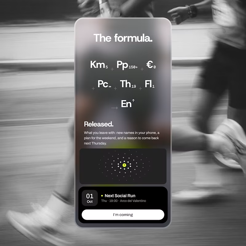
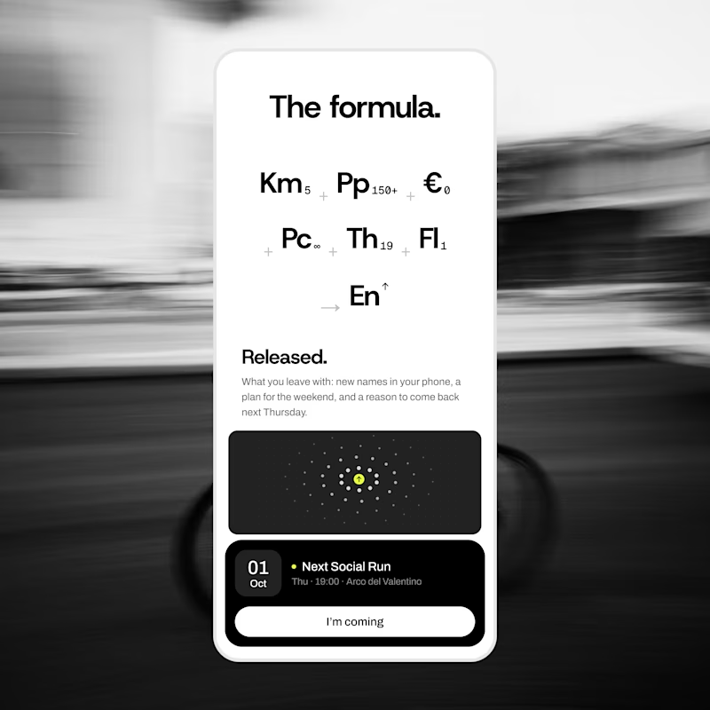
exploring some visual directions, which of this hero design looks better?
4 voted
40%
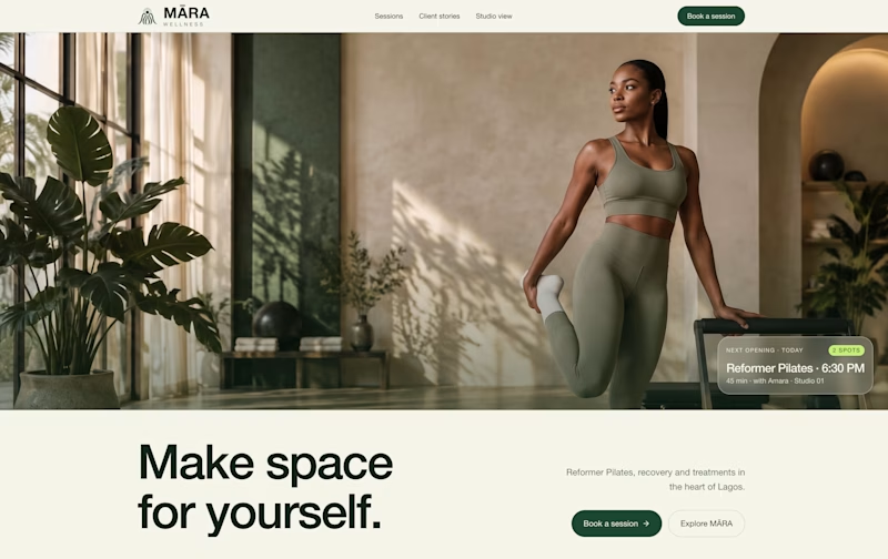
6 voted
60%
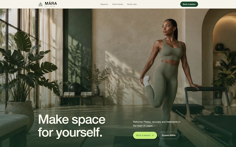
10 votes
Closed

Option 1 looks cleaner and more balanced. The layout feels more spacious and premium. ✨