The network for creativity
Join 1.25M professional creatives like you
Connect with clients, get discovered, and run your business 100% commission-free
Creatives on Contra have earned over $150M and we are just getting started
Back to feedPost
Taste Test

Hello there!
I keep on experimenting with tiny 2D elements inside stop-motion animation. This time I tried to personificate the puffs by adding them a sort of "bodies".
Which one looks more fun to you: with or without this personification? #
Thanks for your votes:)

0 voted
1%
0 voted
1%
0 votes
Closed
The network for creativity
Join 1.25M professional creatives like you
Connect with clients, get discovered, and run your business 100% commission-free
Creatives on Contra have earned over $150M and we are just getting started








Related posts

Public animation for Binance.
What do you think guys?


Stunning work! Love both the design and the way you presented it. ❤️✨

When Typography Breaks the Rules. 🖤
Bold 3D lettering, dramatic shadows, and twisted perspectives turn typography into an experience you can’t ignore.
Would you call this art or an obsession?
3dtypographymotiondesignexperimentaldesignGraphic DesignMotion DesignTypographyAdobe After EffectsAdobe IllustratorCinema 4D


That's really great Saleha it's unique I like it ❤️❤️❤️

Not every direction I create makes it to the final storyboard; here's one that didn't.
For a recent B2B SaaS intro video, I explored two very different illustration approaches before landing on the final style.
A: a friendly mascot character guiding viewers through dashboards and stats
B: minimal line-art, following one person's story instead of showing the product at all
Which one feels stronger to you as an intro, and why? Character design and personality, or the quieter, more narrative line-art approach?
6 voted
60%
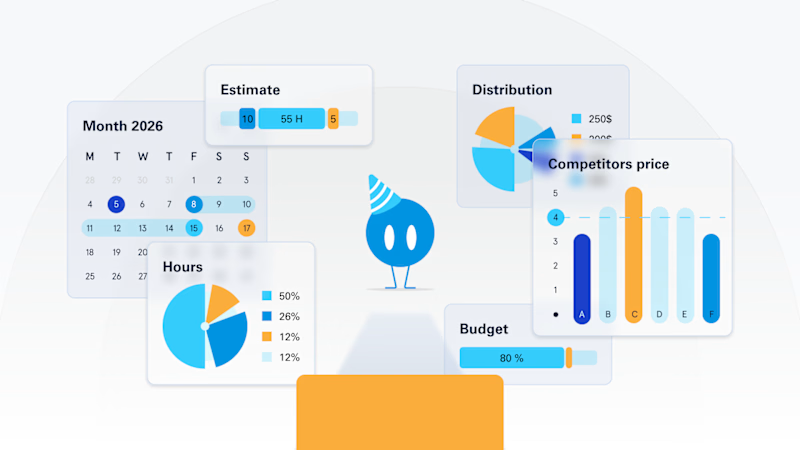
4 voted
40%
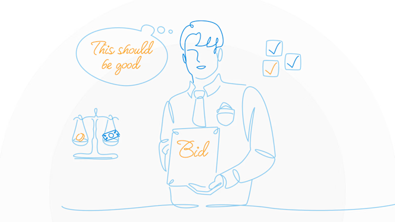
10 votes
Closed
A is stunning visuals shapes designs that's unbelievable 🔥🔥🔥🔥🔥
Great job Elvira❤️