The network for creativity
Join 1.25M professional creatives like you
Connect with clients, get discovered, and run your business 100% commission-free
Creatives on Contra have earned over $150M and we are just getting started
Back to feedPost

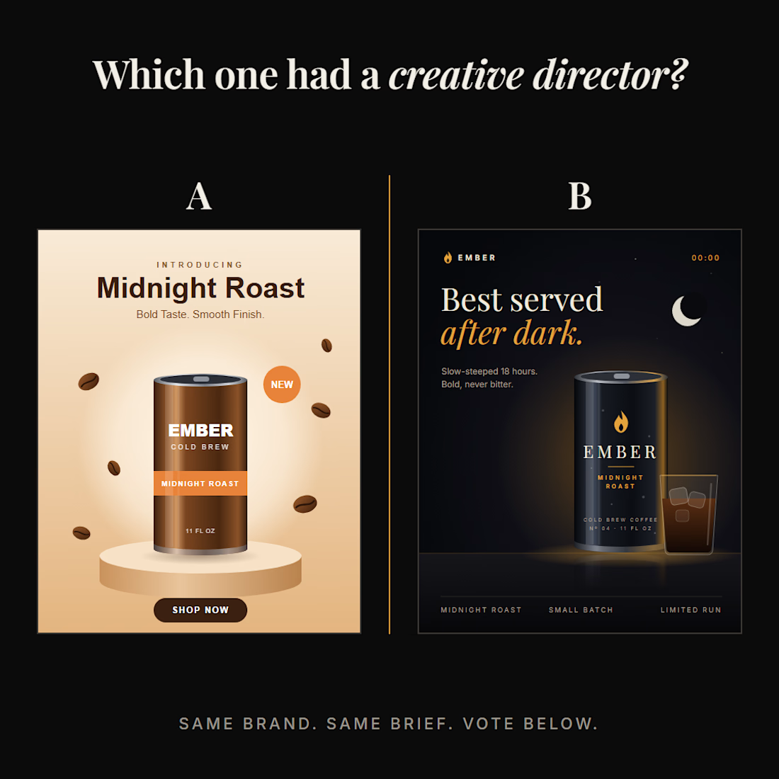
Same brand. Same brief. Two creatives.
One had a creative director. Can you tell which?
Make your guess, A or B, then swipe for the answer 👉
.
.
.
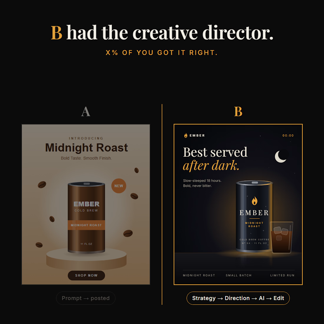
The answer is B. Here's why.
A isn't bad. It's clean, the product looks good, and the layout is neat. But look closer:
- The product is called Midnight Roast, and A shows it in warm daylight colours. The name and the visual say opposite things and floating beans with a soft glow. It's the same template every AI coffee ad uses.
- No logo, no brand system, just "EMBER" in a default font. Cover the name and it could be any coffee brand.
B started with one idea: midnight.
🌙 Night scene, moon, a 00:00 timestamp. Every element tells you when to drink it.
🔥 A flame logo that ties back to the name Ember, repeated on the can and in the layout.
✍️ "Best served after dark." The line sells the concept, not just the taste.
🎨 One palette, one type system, a clear hierarchy. It looks like a brand, not a one-off post.
Both used the same tools. A was one prompt, posted as-is.
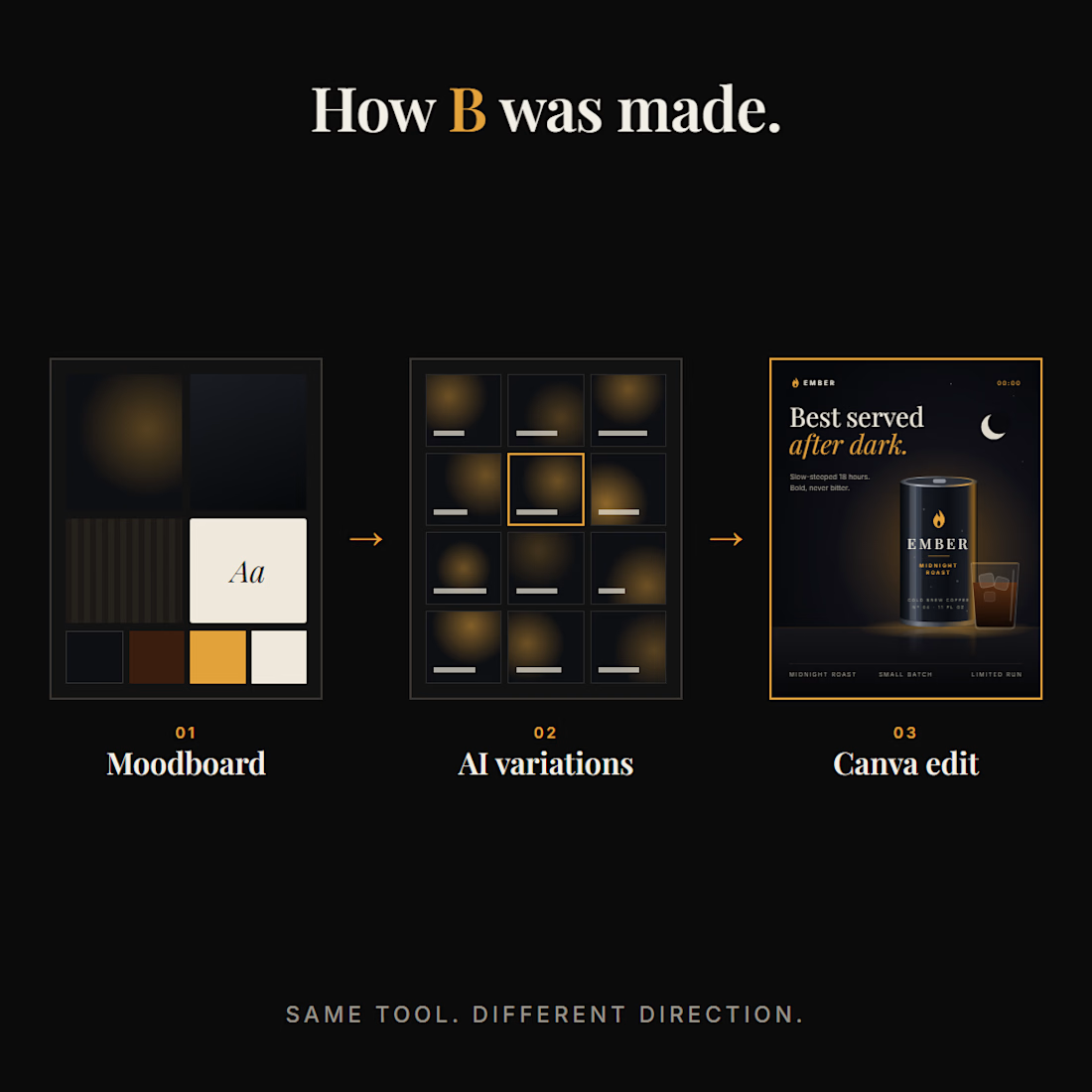
B started with a brand strategy, then a creative direction, then 10–15 AI variations, then a final edit by hand.
AI isn't the problem. Lack of direction is.
The AI wasn't removed. The direction was added.
Did you guess right? Drop it in the comments 👇
If your brand needs creative direction, let's talk. My DMs are open.
The network for creativity
Join 1.25M professional creatives like you
Connect with clients, get discovered, and run your business 100% commission-free
Creatives on Contra have earned over $150M and we are just getting started





Related posts


Your homepage should answer one question: what do you do? If a visitor can't answer that in five seconds, everything below the fold doesn't matter.
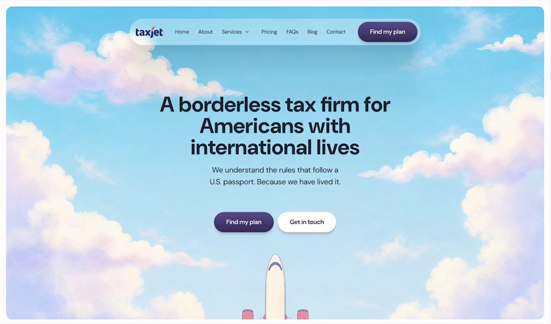

I just saw Bright Studios’ new website. You guys nailed it! Really like it.

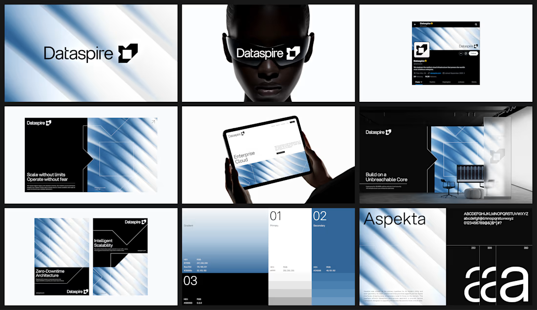


feels very sure of itself. i can picture this blown up on a conference stage

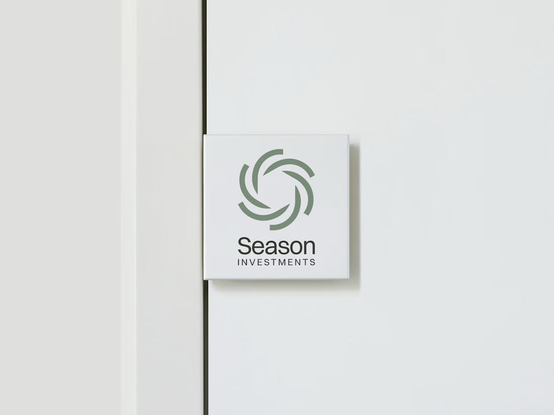
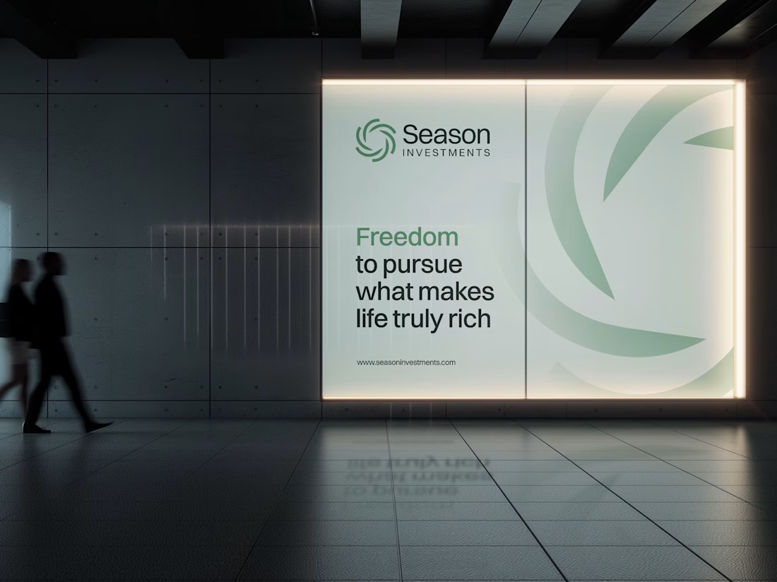
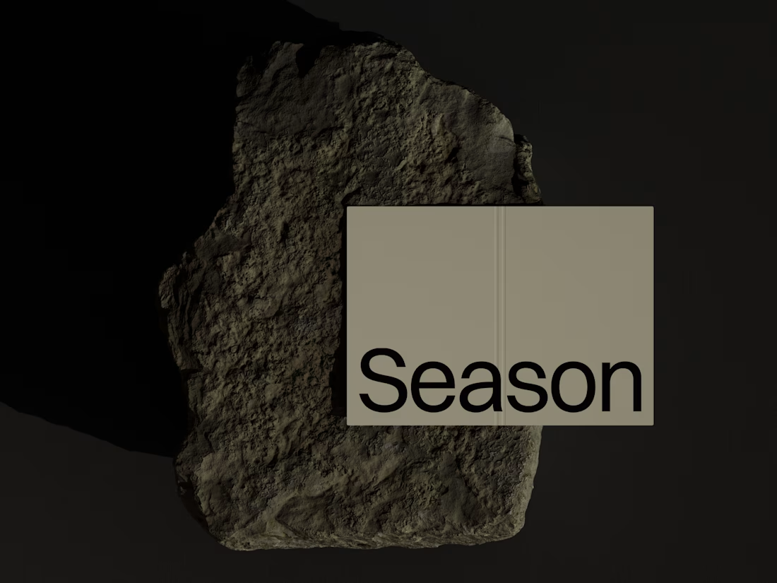
The Rebranding Challenge - Season Investments
One of the key challenges was deciding what to change and what was worth preserving.
Rather than starting from scratch, the new identity retains a visual connection to Season Investments’ heritage, but reframes it for a more contemporary and flexible brand system.
A major improvement was creating a symbol that can work independently from the wordmark. This gives the brand a stronger presence across investment platforms, digital interfaces, profile images, and other compact applications where the previous identity was difficult to use.
The result is a more adaptable system that moves the brand forward without losing its familiarity.



Love how adaptable this feels across compact digital spaces. Really well done. Any plans to post the original before version for comparison?