The network for creativity
Join 1.25M professional creatives like you
Connect with clients, get discovered, and run your business 100% commission-free
Creatives on Contra have earned over $150M and we are just getting started
Back to feedPost

This one section decides whether people pay you or leave forever.
I’m talking about your hero section.
The first thing visitors see on your website. The moment you win or lose their attention.
Most consultants treat it like decoration: a headline, a stock image, a button that doesn’t matter.
Your hero page has one job to do:
Convince your ideal client in 5 seconds that they’re in the right place, and take action.
Think about it:
Can a visitor tell who you serve?
Do they understand what transformation they get?
Is there an irresistible reason to act immediately?
If not, they’re gone. Forever.
A powerful hero page does three things:
1.Clarity: Instantly communicate who you help and what results you deliver.
Urgency - Give them a reason to act now, not later.
Action - The CTA is impossible to miss, and aligned with their goals.
When you get this right: your target audience instantly know they’re in the right place.
if you're a consultant, & want something that converts? Send a DM.
PS: What makes you stop scrolling the moment you see a page?

The network for creativity
Join 1.25M professional creatives like you
Connect with clients, get discovered, and run your business 100% commission-free
Creatives on Contra have earned over $150M and we are just getting started



Related posts

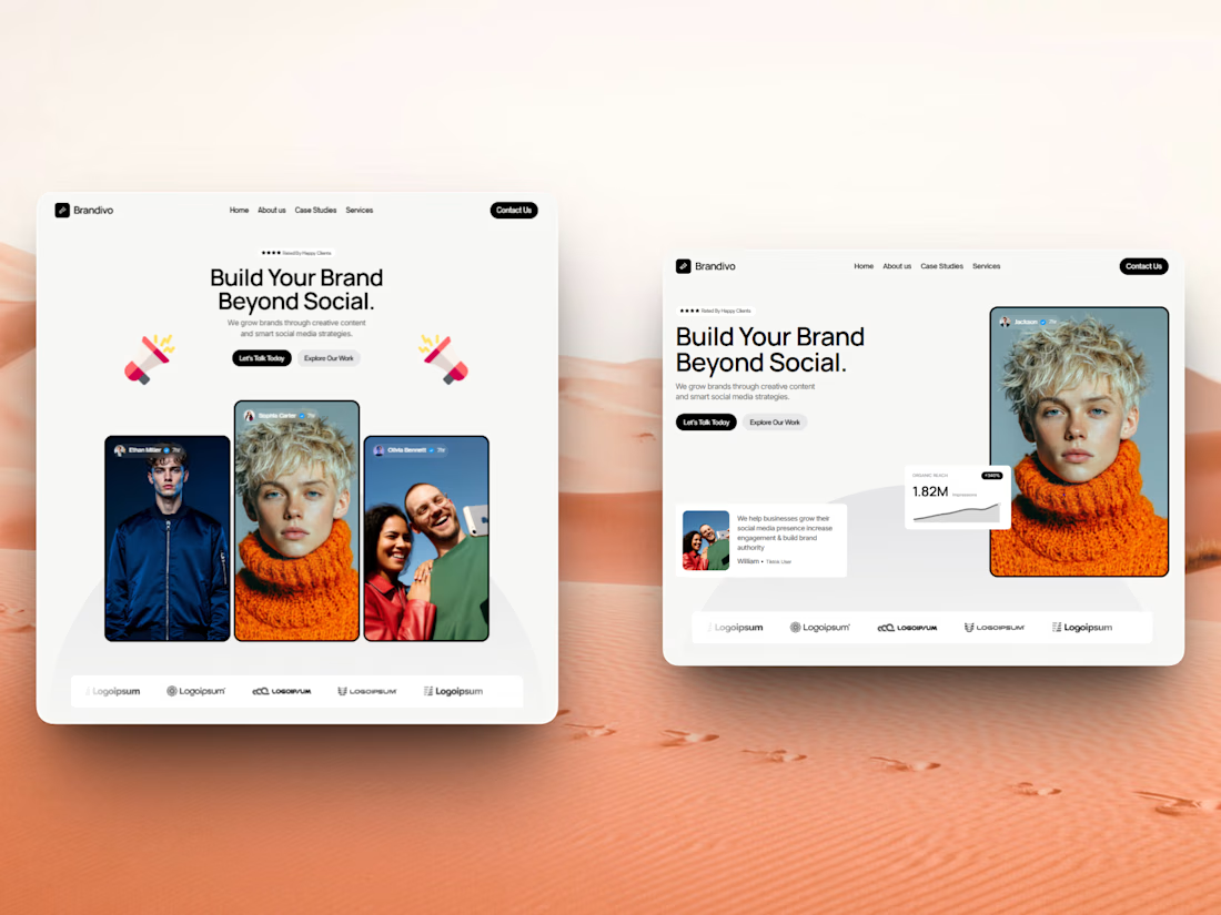

I'd pick the right one. The headline and image split is cleaner and the stats card gives proof right away, the left feels busier with three portraits. Is this template for Webflow?

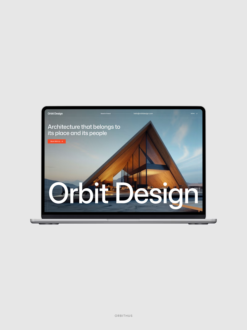
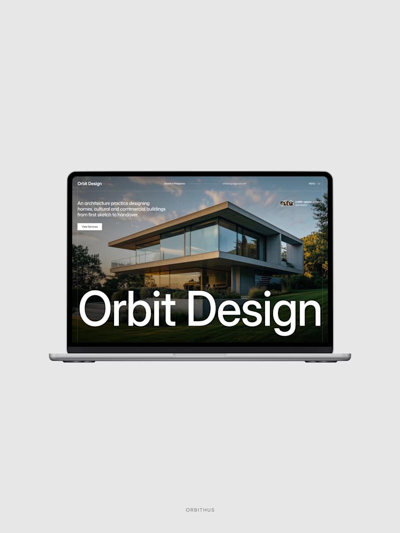
Revising my Hero Section with a little tweak. If you are my client, what revision would you choose?
Elements diff: Tagline, reviews, image, brand color.

2 voted
67%
1 voted
33%
3 votes
Closed

Option 1 for sure. The warm interior glow also gives the studio a much more distinct welcoming personality compared to standard concrete renders.

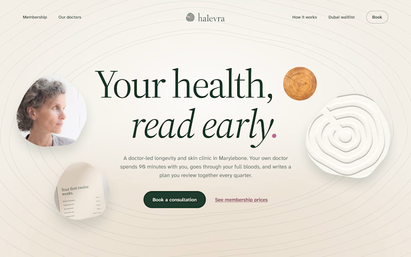
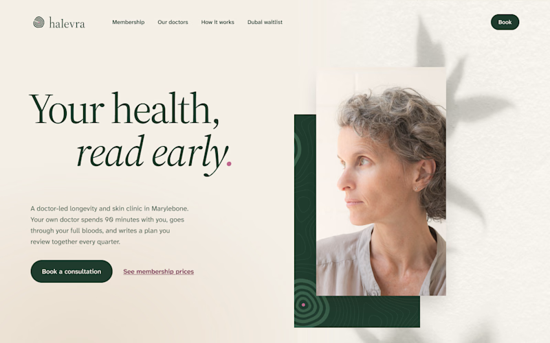
I’ve been building Halevra, a concept brand for a doctor-led longevity and skin clinic in Marylebone. This week was the homepage hero.
Same words, same brand kit, two different layouts.
A puts everything in the centre. The growth rings from the logo run across the whole page, with a few small pieces of the clinic around the headline.
B is quieter. The words sit on the left, one portrait on the right, and a leaf shadow on the wall behind her.
Which one would make you book the consultation?

3 votes
Ends in 13h

I would go with B, the editorial split. For a doctor-led clinic the portrait and the calm space around it do a lot of the trust work, and the headline reads clearly without competing with the rings. In A the rings are lovely but they pull the eye away from the message and the...