The network for creativity
Join 1.25M professional creatives like you
Connect with clients, get discovered, and run your business 100% commission-free
Creatives on Contra have earned over $150M and we are just getting started
Back to feedPost
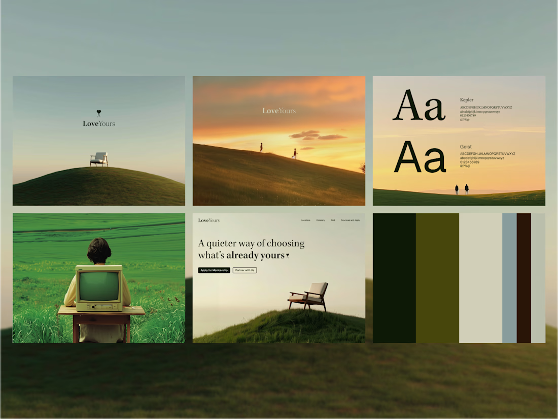
Taste Test

Wordmark logo design for Sipping.
Which version do you think works better for the brand? 🤔
Option 1 or Option 2?
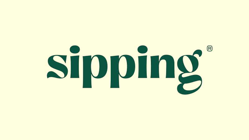
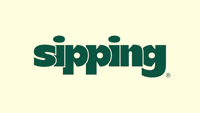
37 votes
Ends in 3h


Thank you, Really appreciate it. Glad you liked the concept.

option 2
Appreciate it, Akinkunmi! Option 2 is getting a lot of support.

#2 looks like a better fit and more fun :)
Appreciate the vote, Akin! Option 2 definitely has a more playful feel.

option 2
Appreciate it, Rajesh!

i will go for 2nd version
Thanks, Muhammad! Appreciate the vote for Option 2.

Option 2 is the strongest
Thank you, Mariyam! Happy to see Option 2 resonating with people.

Option 1 is looks too clean and sharp
Appreciate the feedback, Harsh!

BOLD! @Abox Agency
Appreciate the vote, Minhal! The bold style was definitely the intention.

It depends on the brand voice 😃
Absolutely!

Looks great
Thanks for feedback!

For me both typefaces look very creative & for modern audiences...but option 1 has some classy feel to it also with being bit quirky..so my vote goes to that one!
Thank you, Aishwarya! Really appreciate the detailed feedback. Glad the classy yet quirky feel of Option 1 stood out to you.

Option 1 has that elegant charm to it, feels more premium. Really clean work!
Thanks a lot, Stephanie! Happy to hear the elegant charm of Option 1 came through

option 2 all the way ✨ that curvy serif feels so premium for a sipping brand. elegant and memorable. great work Abox!
The network for creativity
Join 1.25M professional creatives like you
Connect with clients, get discovered, and run your business 100% commission-free
Creatives on Contra have earned over $150M and we are just getting started
Related posts

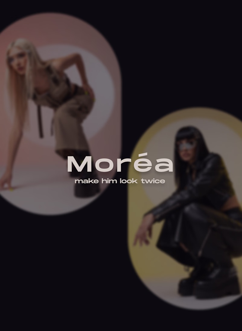
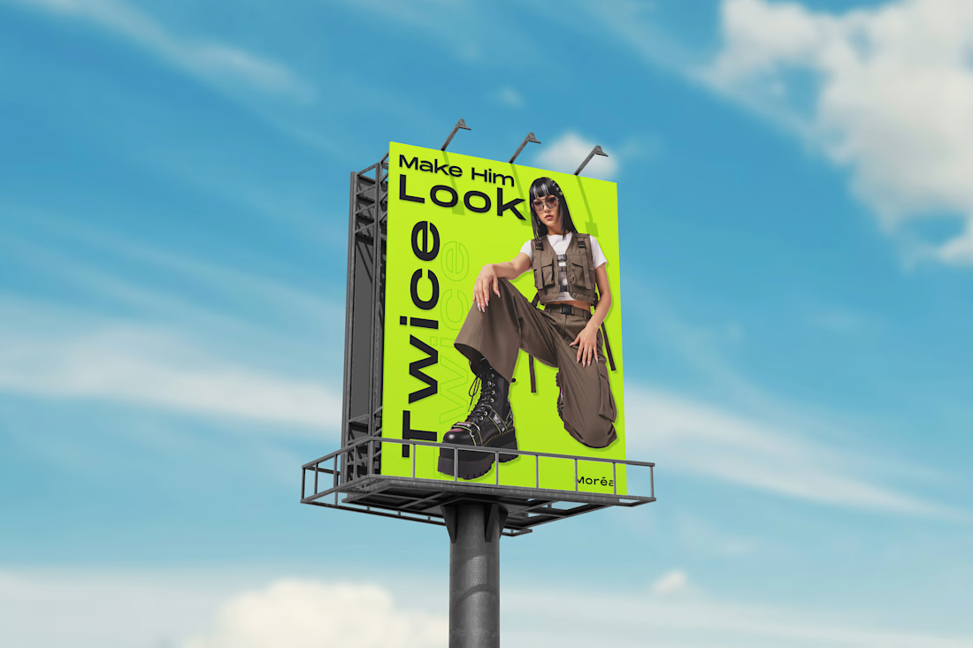
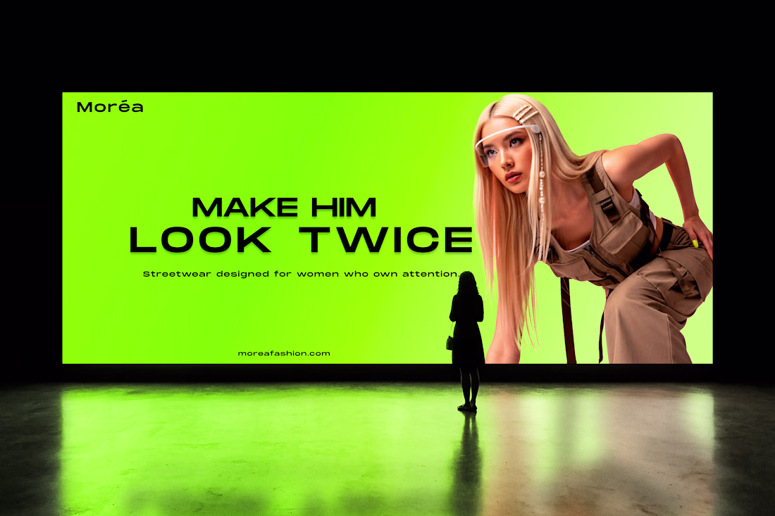
Moréa - Streetwear Brand Identity.
“Make Him Look Twice.”
A bold campaign exploring contrast, oversized typography and attention-driven design.
The neon lime color acts as a signature element meant to stand out in urban spaces like billboards and digital screens.


Well done. I can see how much effort you put in that one. I respect that!

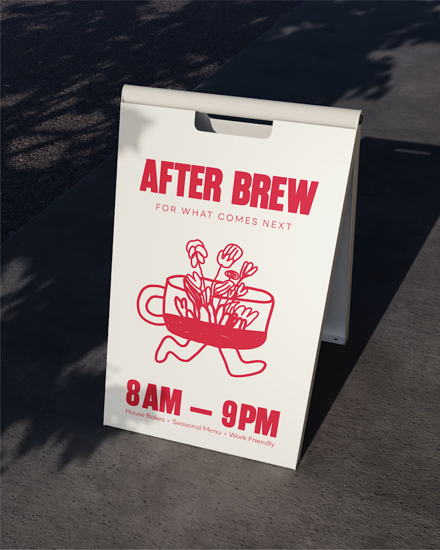
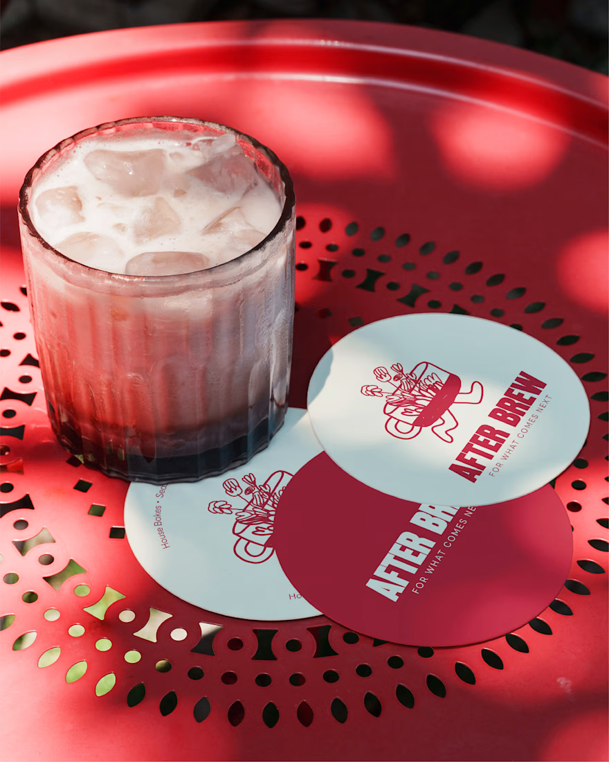
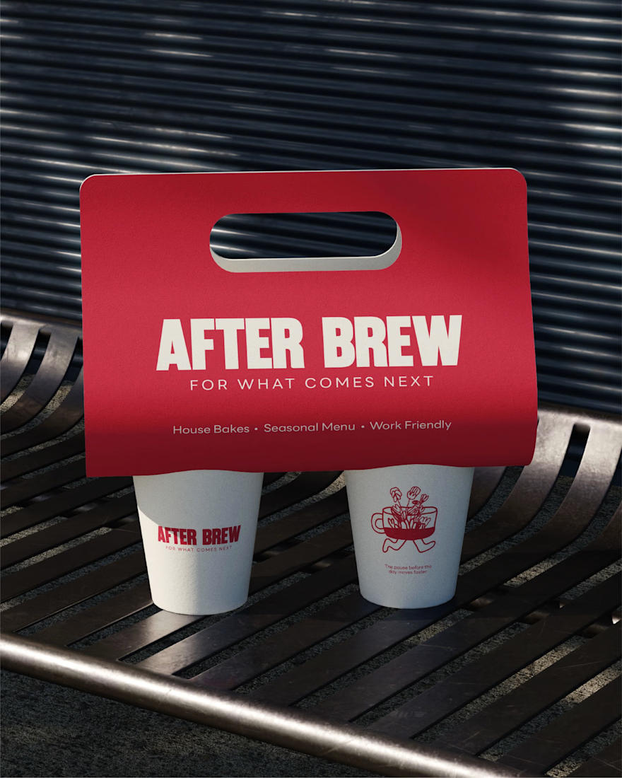
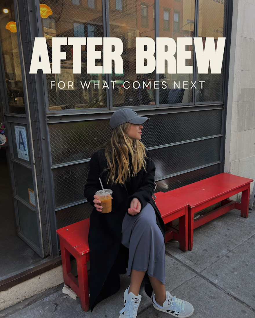
After Brew - Cafe Brand Identity
After Brew is a cafe made for the creators, where presence matters more than productivity.
The walking cup illustration introduces humanity into an otherwise minimal system. It represents creativity and growth, subtly reinforcing the idea of “what comes next”
Let me know if you like it!

After brew looks like a cult brand


beautiful work my man


Trending
aivideo
AI video tools are moving at warp speed. Which ones are you experimenting with?
returntonature
Spring is a reset for creativity. What’s inspiring you outside the screen right now?
aidesignflow
AI tools are redefining design work. What's your current workflow?
freelancerlife
Freelancer life is wins, pivots, and everything in between. What’s yours right now?
allthingsmetal
Metal is having a design moment – from chrome to gates and grates. What designs are you forging?