The network for creativity
Join 1.25M professional creatives like you
Connect with clients, get discovered, and run your business 100% commission-free
Creatives on Contra have earned over $150M and we are just getting started
Back to feedPost
Taste Test
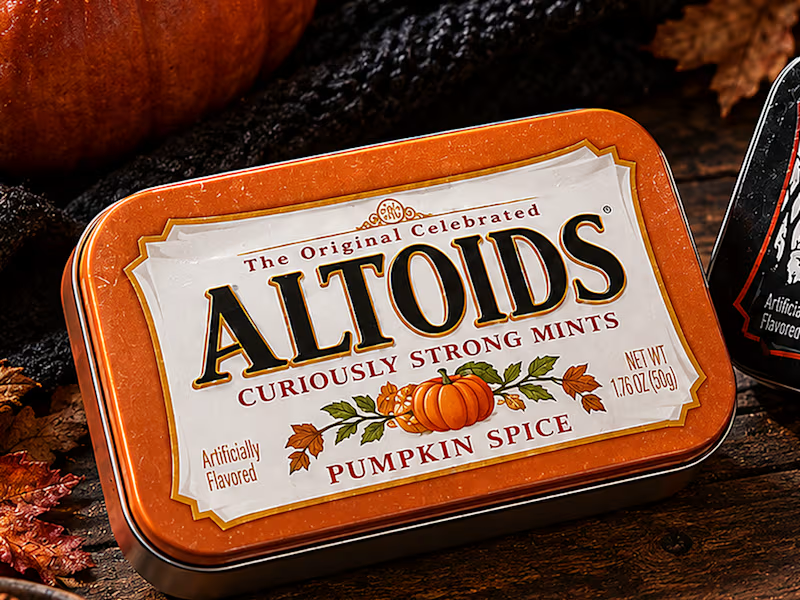
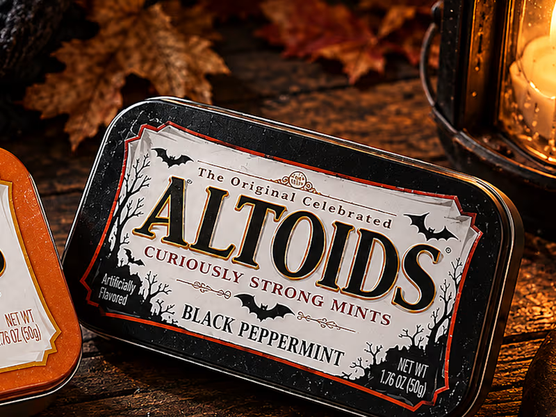
What if Altoids dropped a limited Halloween edition?
For this week's challenge, I gave one of the most iconic tins on the shelf a fall and spooky makeover with two seasonal flavors: 🎃 Pumpkin Spice and 🦇 Black Peppermint.
👻 What stayed recognizable:
The classic rectangular metal tin, the off-white parchment label, the stepped Victorian frame, and the bold serif wordmark with "The Original Celebrated" and "Curiously Strong Mints" locked in their exact spots.
🪦 What I twisted:
Swapped the classic red and green tins for burnt pumpkin orange and midnight matte black, traded the vintage apothecary crest for autumn foliage on one and gnarled trees with flying bats on the other, and lit the whole shot by lantern light.
Which one would you grab?
#brandincostume
17 votes
Ends in 1d

This is brilliant Agustin! 🎃 Love how you kept the classic Altoids tin recognizable but made it so seasonal. Pumpkin Spice + Black Peppermint is such a bold combo - the orange tin with that tiny pumpkin illustration is chef's kiss 👌 Would totally grab this off the shelf!

looove, super creative!
The network for creativity
Join 1.25M professional creatives like you
Connect with clients, get discovered, and run your business 100% commission-free
Creatives on Contra have earned over $150M and we are just getting started





Related posts


Last week: a logo with a name and a dot.
This week: a two weird wordmarks.
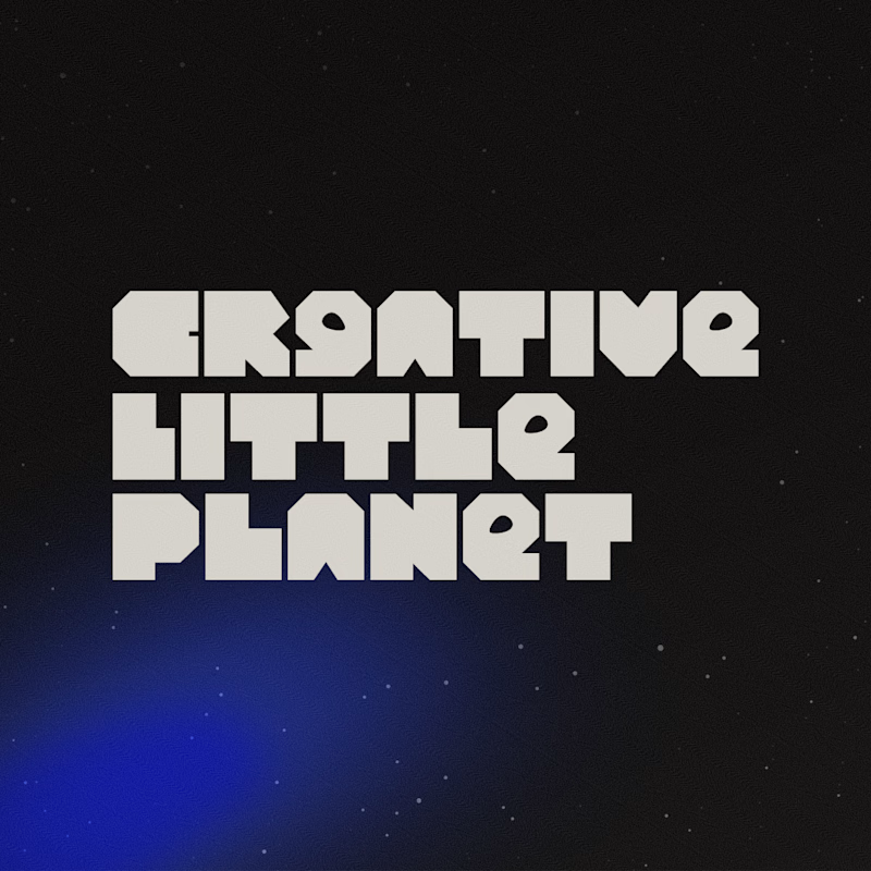
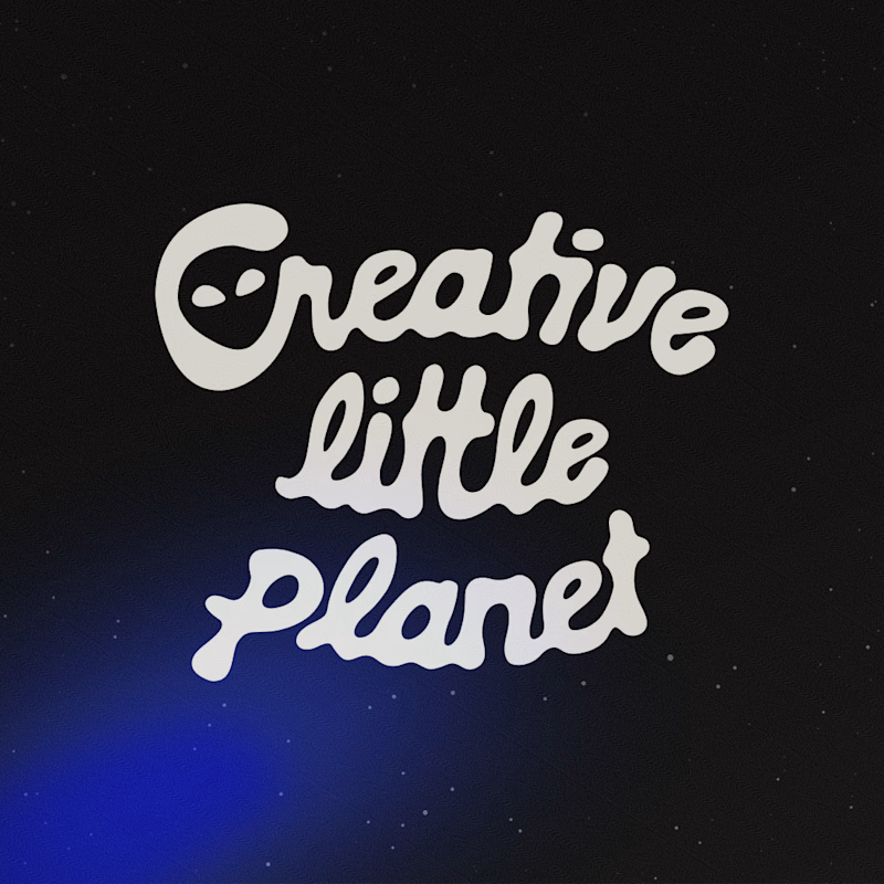
Creative Little Planet is a marketing agency for B2B clients brave enough to hire weird humans. A studio selling weird can’t look like any other SaaS, right? So I pushed weird two ways!! Which one do you prefer? 👽
A. Machined geometric & blocky letters
B. Melted script letters
Vote below! 👀
8 voted
22%
28 voted
78%
36 votes
Closed

the melted script plus the alien detail is absolutely brilliant!


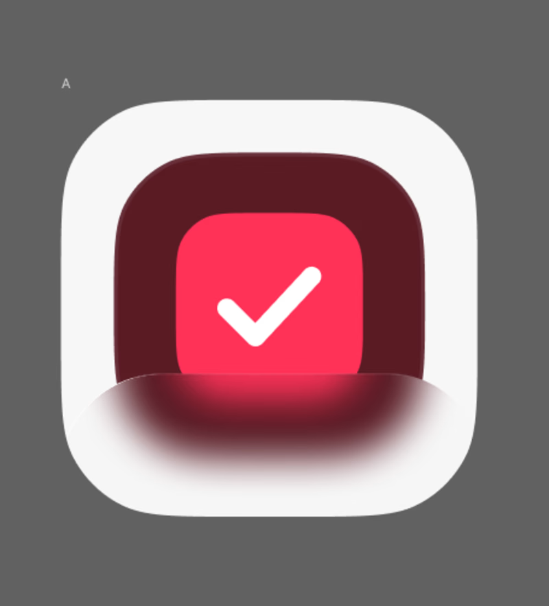
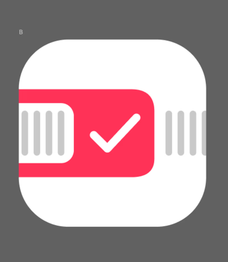
A or B?
this-day.app
41 voted
72%
16 voted
28%
57 votes
Closed

B for me. The red band across the icon with the calendar ticks reads instantly as a date planner, which is exactly what the app is about. A is bolder and honestly more striking, but it could be any checklist app. For a day-focused app, B tells the story faster. What kind of...
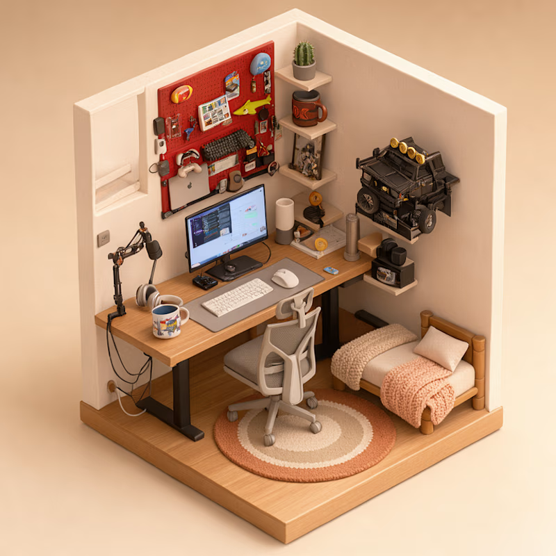
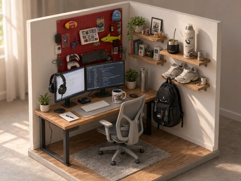
Turned my real desk into a tiny clay diorama ☕️
Made with FLUX 3 Klein running locally, using 10 photos of my actual setup as references: the pegboard wall, headphones, mug, shelves...
Which one do you like more, A or B?
21 voted
58%
15 voted
42%
36 votes
Closed
Did small pano animation too