The network for creativity
Join 1.25M professional creatives like you
Connect with clients, get discovered, and run your business 100% commission-free
Creatives on Contra have earned over $150M and we are just getting started
Back to feedPost
Taste Test


A or B?
this-day.app
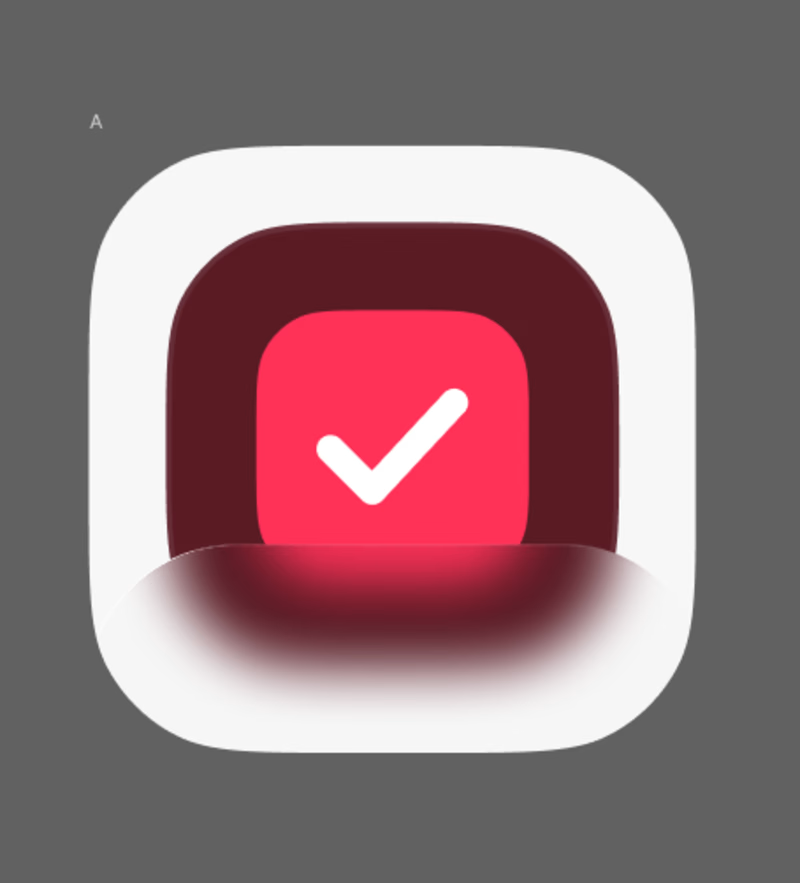
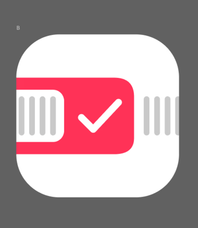
26 votes
Ends in 1d

B for me. The red band across the icon with the calendar ticks reads instantly as a date planner, which is exactly what the app is about. A is bolder and honestly more striking, but it could be any checklist app. For a day-focused app, B tells the story faster. What kind of...

B is better great job🎉🔥

Ye le Jani is post ke liye:
Going with B! Much stronger contrast and readability at small sizes - that white + bright red pops instantly as an app icon. A feels a bit muted/dark, might get lost on home screen. B is cleaner for this-day.app

B for me. The checkmark reads cleaner at small sizes and the red pops more.

A has more character and gives better sense of an app icon

well B looks familiar and systematically good

I’d go with B. It feels more distinctive and gives the app icon a unique visual identity.

A for me. The red check on white pops way more on a home screen, B is a fun idea but gets a bit lost in the grey

The network for creativity
Join 1.25M professional creatives like you
Connect with clients, get discovered, and run your business 100% commission-free
Creatives on Contra have earned over $150M and we are just getting started











Related posts

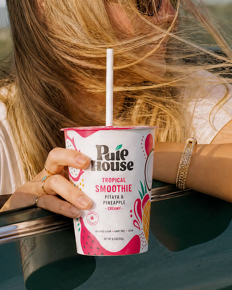
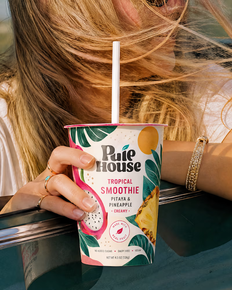
Exploring Two Branding Concepts
I explored two distinct visual directions for Pulp House, focusing on how color, composition, and design elements can shape a brand's identity.
This comparison reflects my approach to creating thoughtful, cohesive visuals that help businesses present their brands with confidence.
1 voted
5%
20 voted
95%
21 votes
Closed

Fun concepts, Mati!

Two camera distances for the same Movable Ink cut. One leans in, one shows the whole layout. 1 or 2.
10 voted
50%
10 voted
50%
20 votes
Closed
2 is more stunning the animations feels unique and that's unbelievable 🎉🎉🔥🔥
great job Blahomyr❤️❤️

Same content, different experience. A few thoughtful design choices can completely change how a presentation feels, flows, and communicates. Which version would you choose?

11 voted
31%
24 voted
69%
35 votes
Closed
Verde Vista 1 is more modern and futuristic specially with blue colors and robotic hand❤️
Great job Rasid🎉🎉🔥🔥