The network for creativity
Join 1.25M professional creatives like you
Connect with clients, get discovered, and run your business 100% commission-free
Creatives on Contra have earned over $150M and we are just getting started
Back to feedPost
Taste Test


Last week: a logo with a name and a dot.
This week: a two weird wordmarks.
Creative Little Planet is a marketing agency for B2B clients brave enough to hire weird humans. A studio selling weird can’t look like any other SaaS, right? So I pushed weird two ways!! Which one do you prefer? 👽
A. Machined geometric & blocky letters
B. Melted script letters
Vote below! 👀
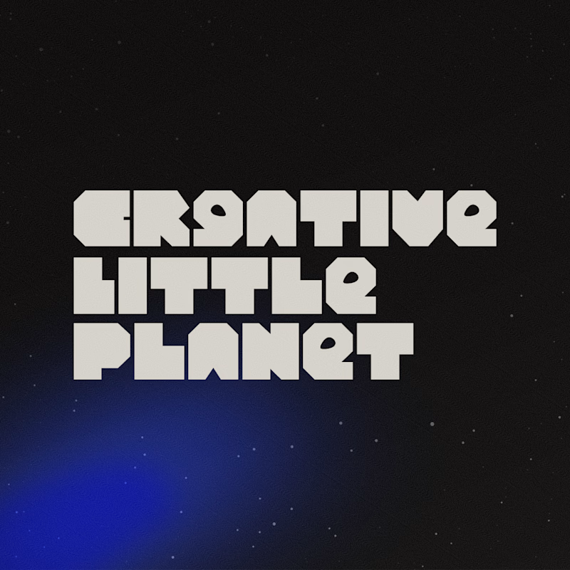
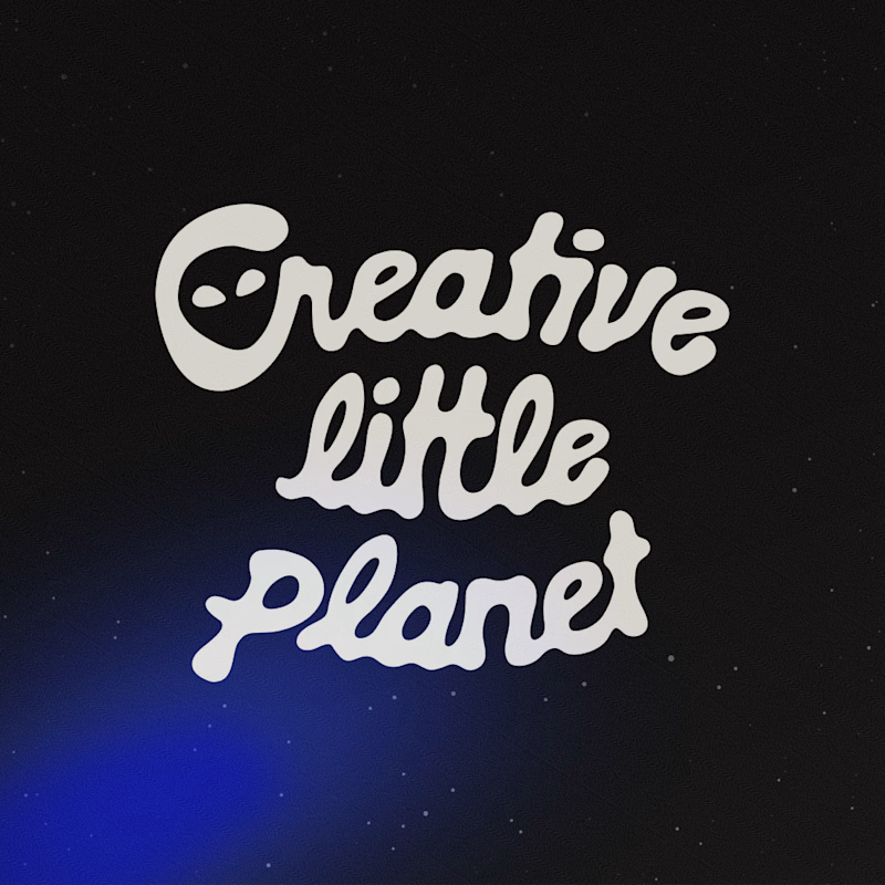
30 votes
Ends in 20h

love the melted one!! super playful
Thanks girl!! They ended up picking this one too hehe

The small size is only the alien "C"! I wanted to compare wordmark on this post, but each logo suite had 3 versions! I like that you're picking functionality over aesthetics 🙂↕️

the melted script plus the alien detail is absolutely brilliant!
Thank you so much Nicolette!!!! It looks simple to do but it fried my brain 😂

My favorite was the melted script; it's really cool. However, from a B2B perspective, customers tend to trust the most "boring" versions.
Thanks for your insights!! I kinda agree with that take!

I’d go with B! The melted script feels more unexpected and really fits the whole “weird humans” personality. 👽

For me Melted more clear. I also have made my vote. Please visit to leave your opinion.
The network for creativity
Join 1.25M professional creatives like you
Connect with clients, get discovered, and run your business 100% commission-free
Creatives on Contra have earned over $150M and we are just getting started











Related posts

WIP - Brand Identity
Which one?
9 voted
47%
10 voted
53%
19 votes
Closed

B is more suitable for these textures ❤️❤️
Great job Gaber🎉🎉🔥🔥

Which color looks better to this logo

2 voted
22%
7 voted
78%
9 votes
Closed

Built this in Framer as a concept project. Goal was to make it feel run by ex-journalists. Choices: editorial serif (Libre Baskerville), a dark photo with one color accent, and copy that positions against blast-style PR.
Where I’m unsure: text legibility over the photo and whether the two CTAs compete. What would you change?


That's great design it feels professional I like how the background mixed with interface ❤️❤️
Great job Cheree🎉🎉