The network for creativity
Join 1.25M professional creatives like you
Connect with clients, get discovered, and run your business 100% commission-free
Creatives on Contra have earned over $150M and we are just getting started
Back to feedPost

Two achievements. Same day. Big W. 🏆🔥

2 Achievements 🏆 On Same Day ... !!!
⚡I'm in the spotlight. My Post was Featured on Contra
⚡I Just Got 72 Discovery Score
Which one do you think more worth celebratingggg....!!! ✨💡🌟
16 voted
89%
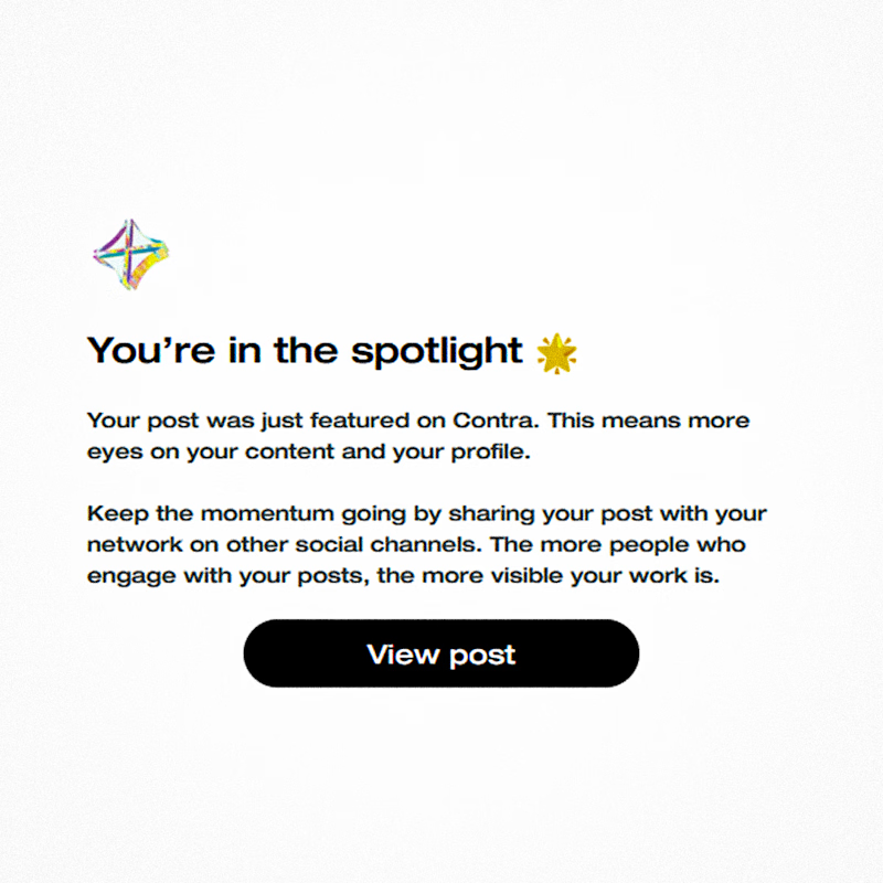
2 voted
11%
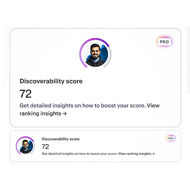
18 votes
Closed
The network for creativity
Join 1.25M professional creatives like you
Connect with clients, get discovered, and run your business 100% commission-free
Creatives on Contra have earned over $150M and we are just getting started









Related posts

A little peek at the brand work we did for Elio Mortgage.
A warm, approachable identity full of warm vibrant colors paired with soft sun rising inspired gradients, inner glows and custom illustrations & more. Loved this direction!
Full case study coming soon, from process to final identity.
Plenty of logo explorations to share too!


That color palette takes the whole identity to a different level!! I loove it.

Brand Expressions -- Olivir



Thats so crazy!!!!!! Seeing this I feel we humans are still far better than AI

I’ve been working on a bold, modern-retro logotype and can’t decide between these two options.
🆘 Which one feels more aesthetically pleasing to you?
11 voted
26%
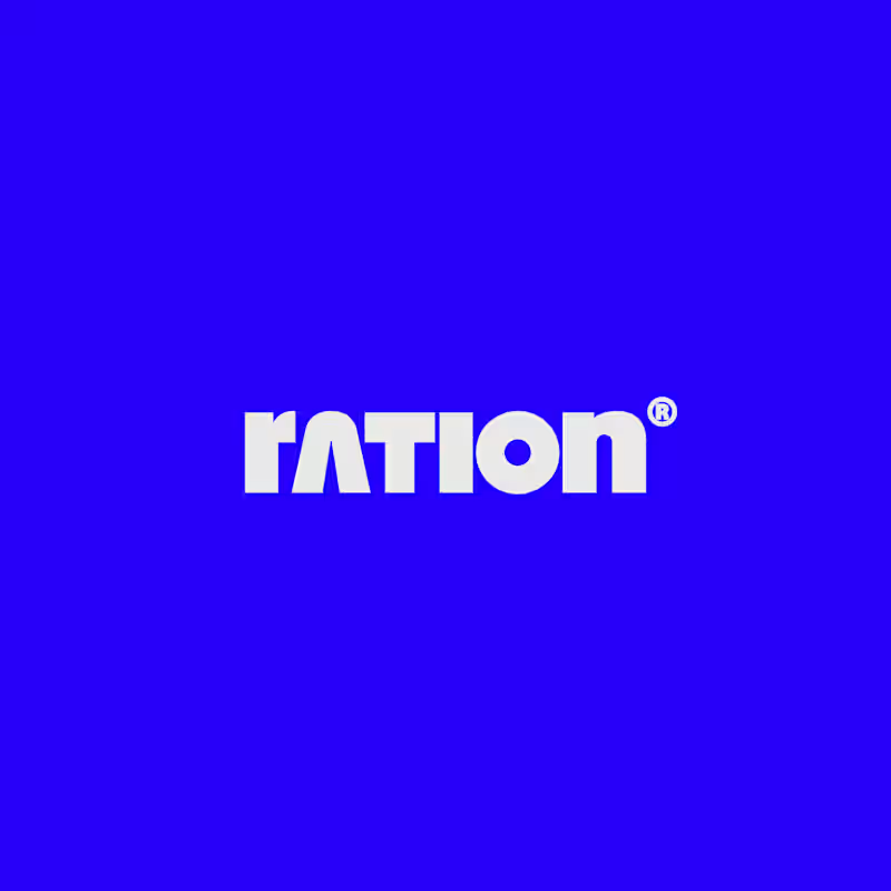
31 voted
74%
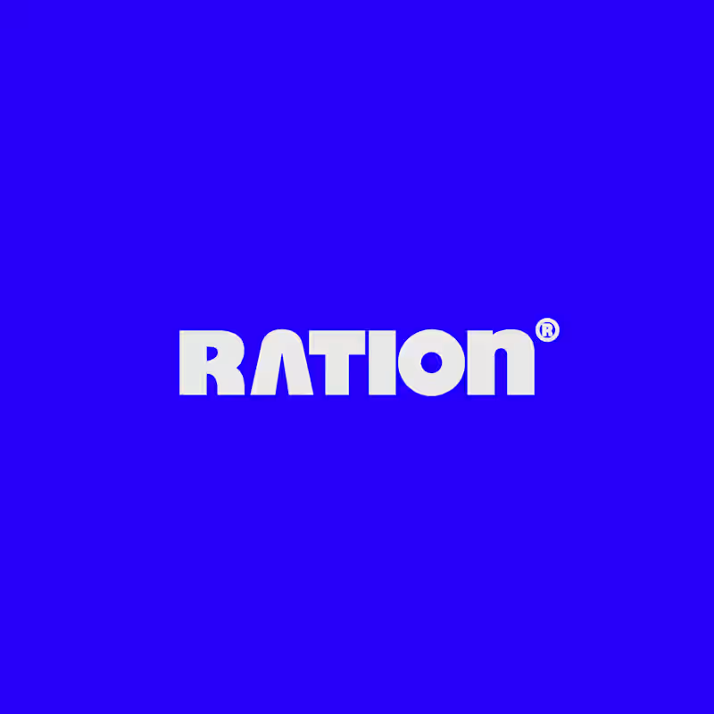
42 votes
Closed

CAPITAL is great but SMALL is unique great job Nawras 🔥🔥