The network for creativity
Join 1.25M professional creatives like you
Connect with clients, get discovered, and run your business 100% commission-free
Creatives on Contra have earned over $150M and we are just getting started
Back to feedPost

EMAIL MARKETING & TEMPLATE DESIGN FOR VIDA GLOW
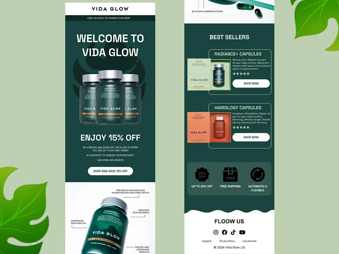
I designed a customer-focused email campaign for Vida Glow, combining a strong welcome offer with product education and best-seller promotion.
The campaign opens with a clear welcome message:
“WELCOME TO VIDA GLOW”
followed by a 15% OFF welcome incentive designed to encourage first-time customers to complete their first purchase.
I also created a Best Sellers section featuring Radiance+ Capsules and Hairology Capsules, giving customers a quick way to understand the products, explore their benefits, and move directly to shopping.
The email was structured around key conversion elements including:
Welcome Offer → Product Education → Best Sellers → Clear CTAs → Brand Benefits → Social/Retention Links
Messaging such as “Shop and Save 15% Off,” “Shop Now,” “Up to 20% Off,” “Free Shipping,” and “Automatic & Flexible” was strategically incorporated to make the customer journey clear and action-oriented.
My focus was not simply creating a beautiful wellness email. I designed the template to support customer acquisition, first-purchase conversion, product discovery, and long-term brand engagement.
Services: Email Marketing • Email Template Design • Welcome Email • E-commerce Email Design • Product Education • Best-Seller Campaigns • Promotional Email Design • Customer Retention • CTA Strategy
#EmailMarketing #EmailDesign #EmailTemplateDesign #EcommerceMarketing #WelcomeEmail #EmailCampaign #DigitalMarketing #WellnessMarketing #BeautyMarketing #ProductMarketing #RetentionMarketing #ConversionMarketing #MarketingDesign #EcommerceDesign #ContraFreelancer


The network for creativity
Join 1.25M professional creatives like you
Connect with clients, get discovered, and run your business 100% commission-free
Creatives on Contra have earned over $150M and we are just getting started

Challenges
View all


Related posts




really like the calm feel of this one

A digital concept for Madame Fin, a Thai fragrance brand, focused on translating the identity of K. Eau de Parfum into a more refined, editorial web experience.
The direction combines luxury fashion aesthetics, cinematic imagery, oversized typography, and immersive product storytelling to make the fragrance feel less like a product page and more like a campaign.


So gooood, Mara!

Crafting the Visual Identity for Elichi Coffee | Case Study
For Elichi, the goal was to build a brand identity that captures the ritual of craft coffee. The visual direction balances modern simplicity with a warm, sensory feel—creating a clean yet inviting identity across every touchpoint.
Design Highlights:
Custom Typography: Paired clean, modern letterforms with subtle editorial accents to establish an elevated, boutique feel.
Packaging & Collateral: Used generous white space and structured layout grids so the physical packaging feels premium in hand.
Palette & Materials: Blended deep, roasted tones with soft, muted neutrals to reflect the warmth of the space and the richness of the brew.
I’d love to get your feedback on this direction:
How does the balance between modern typography and warm tones feel to you?
Does the packaging strike the right balance between minimal and welcoming?


Cool work 🙌