The network for creativity
Join 1.25M professional creatives like you
Connect with clients, get discovered, and run your business 100% commission-free
Creatives on Contra have earned over $150M and we are just getting started
Back to feedPost
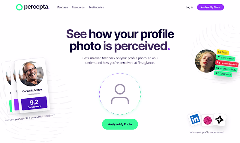
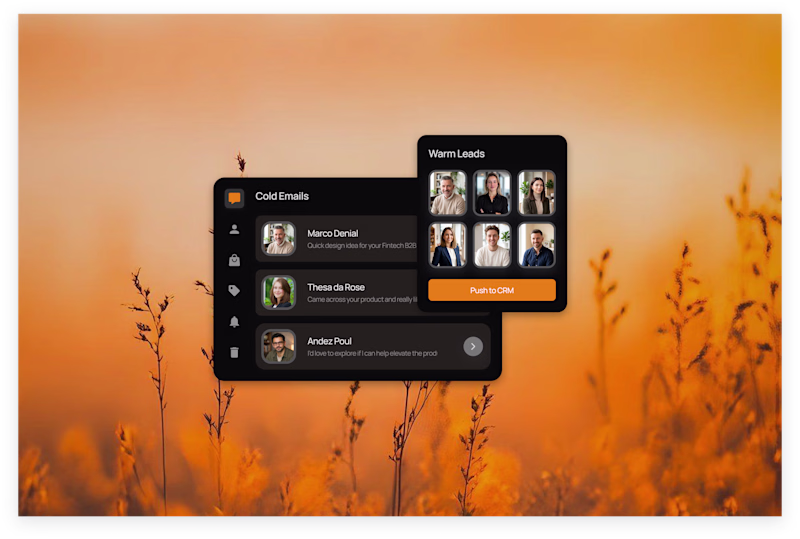
Taste Test
I have been atrackted to dark modes for years, but I know its not for everyone. Wondering if we should continue working on dark mode or play safe and go light?
4 voted
80%
1 voted
20%
5 votes
Closed
The white background does a perfect job of establishing an airy environment around colorful, playful elements. The black background kills the design for me.
Thanks man! I really appreciate your time! Took a couple of minutes to check your profile and you are doing some eeeeepic work! Excited for your journey!
Dark mode has a special vibe immersive, bold, and modern. But it’s true, it’s not everyone’s cup of tea. I’d love to see how others balance aesthetics with usability. Sometimes light wins for clarity, sometimes dark wins for personality.
Thaaaanks man! I appreciate your oppinion a lot
Thanks guys!
The network for creativity
Join 1.25M professional creatives like you
Connect with clients, get discovered, and run your business 100% commission-free
Creatives on Contra have earned over $150M and we are just getting started
Related posts
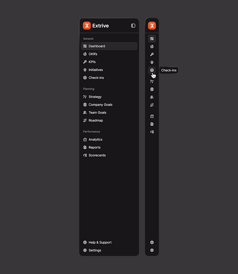
Sidebar navigation. Which mode looks much better?
Light / Dark 👀
1 voted
50%
1 voted
50%

2 votes
Closed
Every interface has a personality.
Light mode says, “Everything is clear.”
Dark mode says, “Let’s get to work.”
Which one would earn your trust?
2 votes
Ends in 1d
This is an excellent breakdown of interface psychology.
Sidebar navigation. Which mode looks much better?
Light / Dark 👀
1 voted
20%

4 voted
80%
5 votes
Closed
For some reason, i'd say light mode for this
Trending
Claude
Claude has entered the design space. How are you using Claude Design?
Contra University
Learn from expert creatives how to earn more using next-gen AI tools.
creativeaiflow
Creative AI workflows are evolving. What tools do you use, and what are their strengths and weaknesses?
portfolioreview
The best portfolios tell a story, not just show a grid. Share yours for feedback.
freelancerlife
Freelancer life is wins, pivots, and everything in between. What’s yours right now?