The network for creativity
Join 1.25M professional creatives like you
Connect with clients, get discovered, and run your business 100% commission-free
Creatives on Contra have earned over $150M and we are just getting started
Back to feedPost
Taste Test
I have been atrackted to dark modes for years, but I know its not for everyone. Wondering if we should continue working on dark mode or play safe and go light?
4 voted
80%
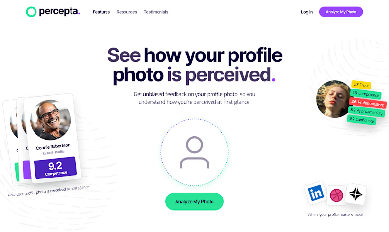
1 voted
20%
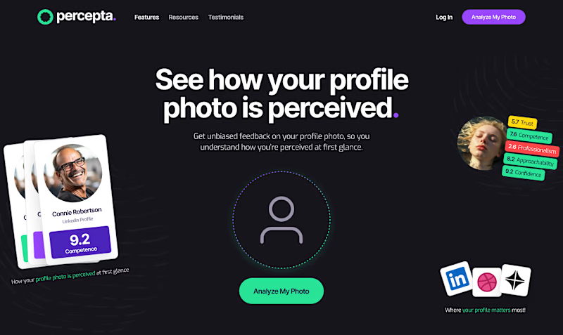
5 votes
Closed

Thanks guys!

The white background does a perfect job of establishing an airy environment around colorful, playful elements. The black background kills the design for me.
Thanks man! I really appreciate your time! Took a couple of minutes to check your profile and you are doing some eeeeepic work! Excited for your journey!
The network for creativity
Join 1.25M professional creatives like you
Connect with clients, get discovered, and run your business 100% commission-free
Creatives on Contra have earned over $150M and we are just getting started
Related posts


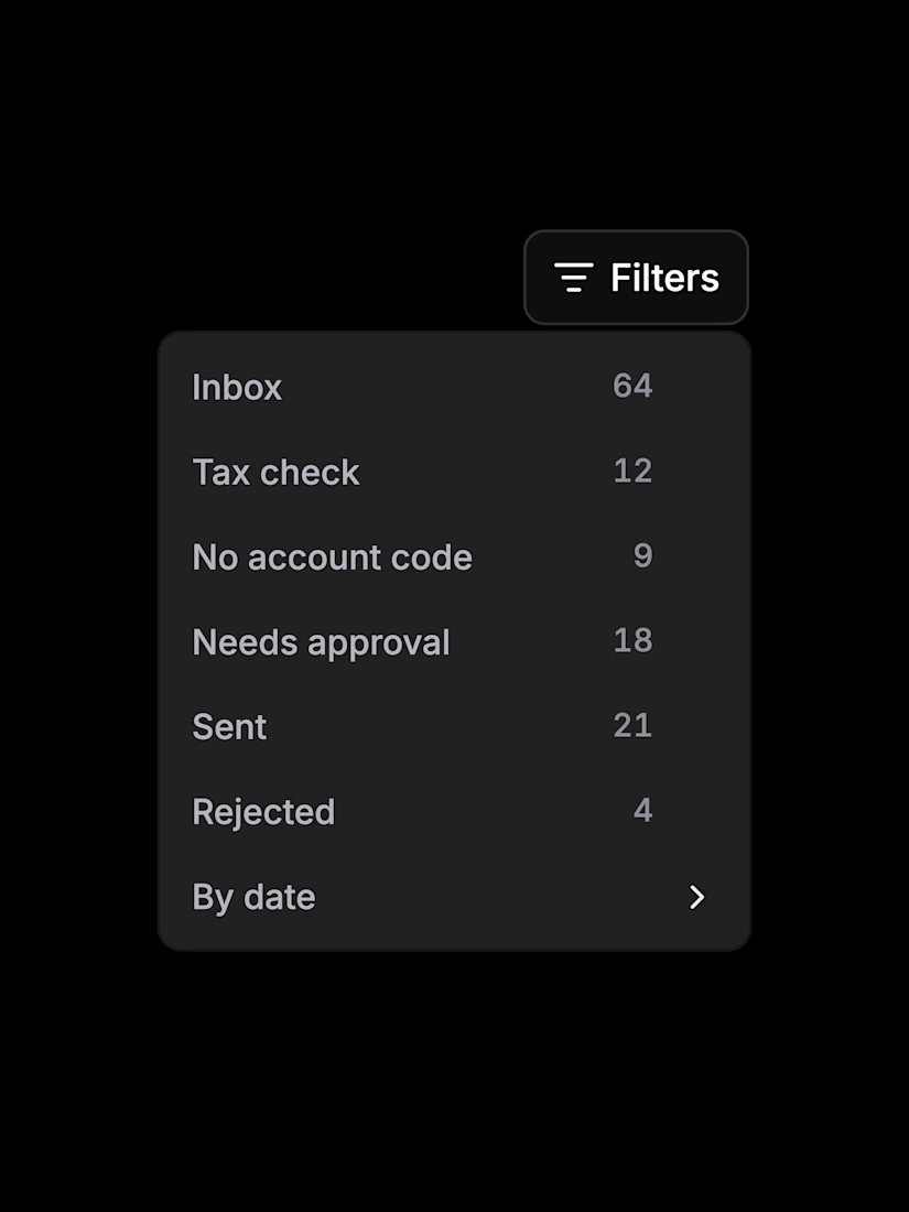
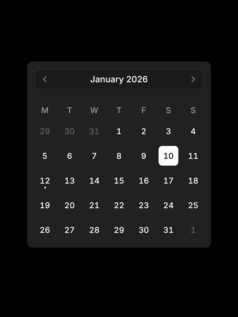

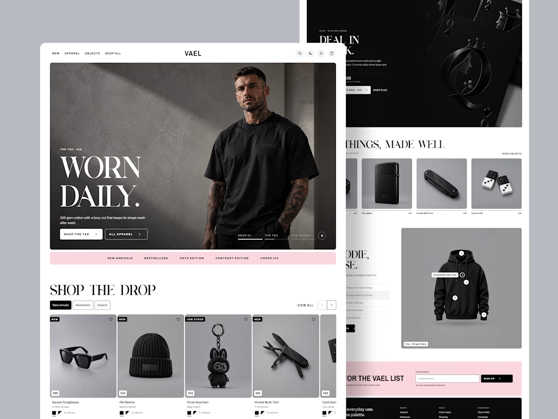
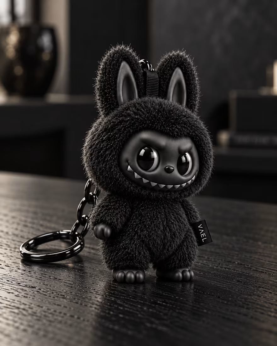
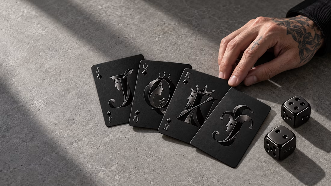
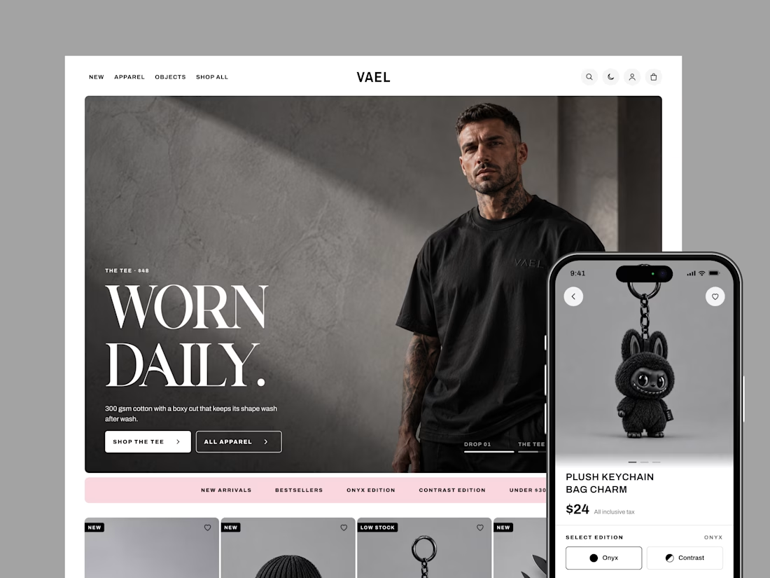
How do you design a store when every product is black? That was the challenge behind VAEL, a brand selling 15 pieces in two editions: Onyx and Contrast.
With no colour to guide shoppers, the design had to do it. Bold condensed type sets the tone, clean outlines show what's selected, and one soft pink highlights sales and rewards.
I designed 20 screens for desktop and mobile, in light and dark mode, from the homepage all the way to checkout.
The result is a store as sharp as the product, and easy to shop. Live demo: https://claude.ai/code/artifact/4e953fd5-47c5-4429-ae8f-e6550690f47b

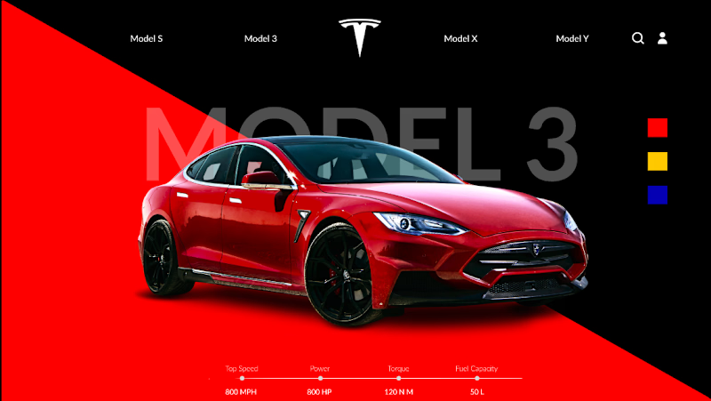
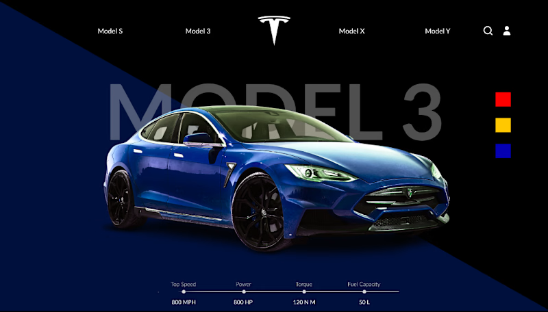
Working on a Tesla concept in Figma and need some feedback!
Which background vibe works better: Blue or Red? 🔵🔴
Comment "URL" if you want the Figma link, I’ve got a Yellow version in there too 👀


10 votes
Ends in 1d

Went with blue. The red feels a bit heavy behind the Model 3 and the blue lets the car stand out more.