The network for creativity
Join 1.25M professional creatives like you
Connect with clients, get discovered, and run your business 100% commission-free
Creatives on Contra have earned over $150M and we are just getting started
Back to feedPost
Just wrapped a SaaS landing page for an AI infrastructure platform — and this one was a different kind of challenge.
The product is genuinely complex. Neural network deployment, smart model routing, enterprise security, cost analytics. The kind of thing that takes 20 minutes to explain in a call — but needs to land in 10 seconds on a page.
The brief wasn't "make it look cool." It was: get skeptical engineers and technical founders to stop scrolling, understand what this does, and want to try it.
So we built the page around how that buyer actually thinks. Credibility before features. Show the product working, don't just describe it. Answer the "how long does setup take" question before they have to ask. Put social proof right before pricing, where doubt is loudest.
Every section has a job. Together they move a visitor from "what is this" to "let's talk" without a single wasted scroll.
If you're building an AI product, a SaaS tool, or anything where the sales cycle starts on a landing page — this is the kind of work I do.
Happy to take a look at what you've got and tell you honestly what's working and what isn't.


Thanks Man!

Excellent work on the overall consistency — every section feels like it belongs together.

"Flawless technical product strategy!"


The typographic hierarchy on the hero section is excellent.

Really like the focus on reducing friction in how the product is understood.
A lot of technical SaaS landing pages explain features —
but very few explain confidence.
The “show the system working instead of overexplaining it” approach feels much more aligned with how technical buyers actually evaluate products.
Thanks man, appreciate your feedback! you got the point🔥
The network for creativity
Join 1.25M professional creatives like you
Connect with clients, get discovered, and run your business 100% commission-free
Creatives on Contra have earned over $150M and we are just getting started





Related posts

Post
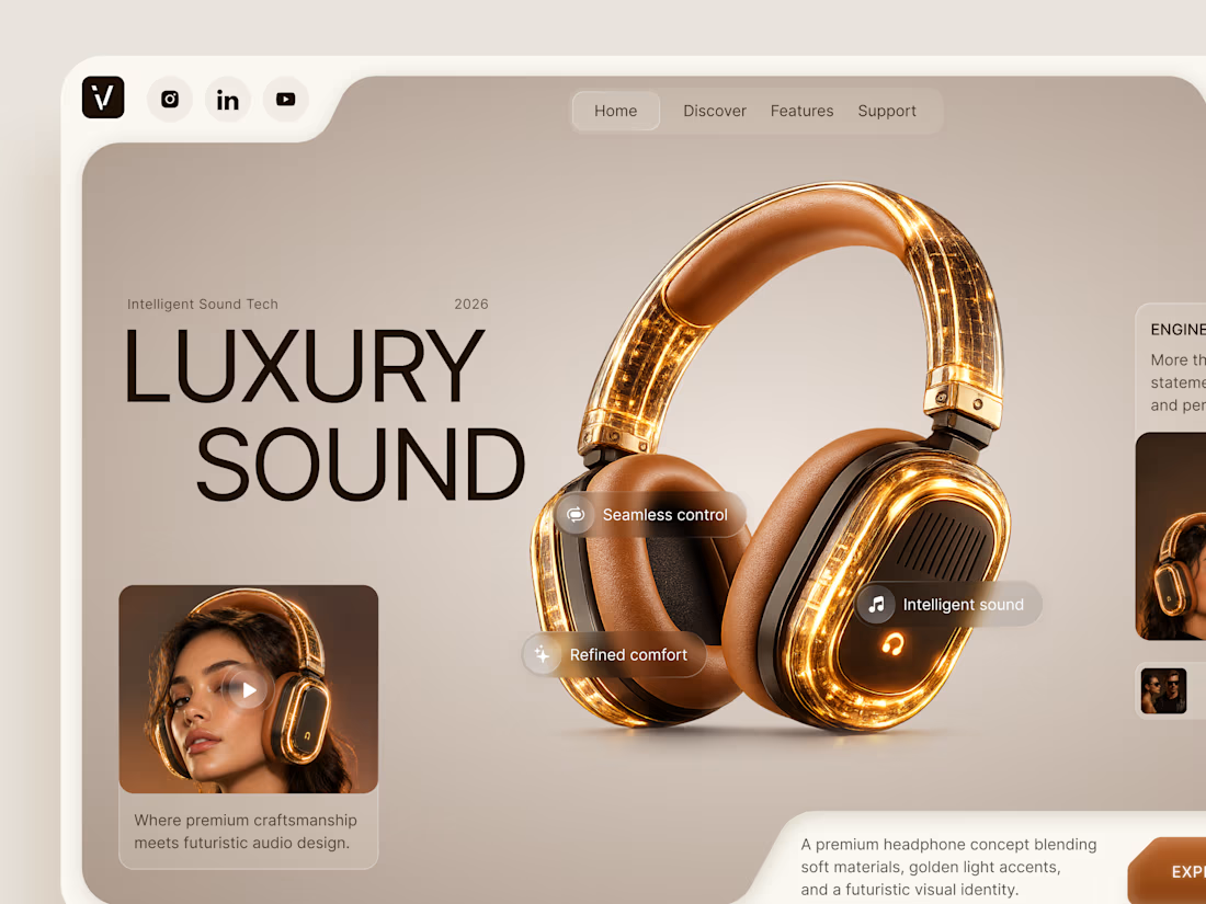
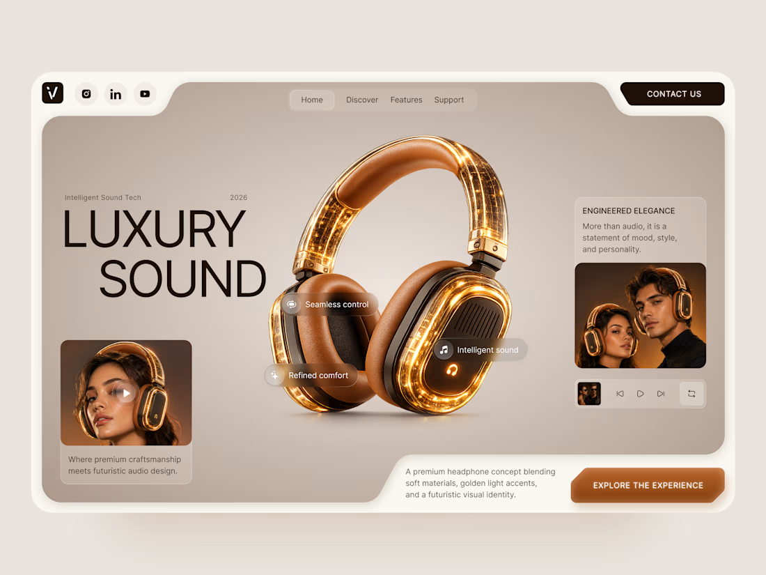
Luxury Sound — Premium Headphones Landing Page 🎧✨
A premium landing page concept for a luxury audio brand, built around a bold headphone design and a refined visual experience
The design combines warm neutral tones, glowing details, oversized product visuals, and minimal typography to create a futuristic yet elegant feel
Special attention was given to:
• Product-first composition
• Premium visual direction
• Feature highlights
• Lifestyle imagery
• Clear CTA placement
• Responsive mobile experience
The result is a clean, immersive product experience that makes the headphones feel like more than tech — they become part of the lifestyle 🔥


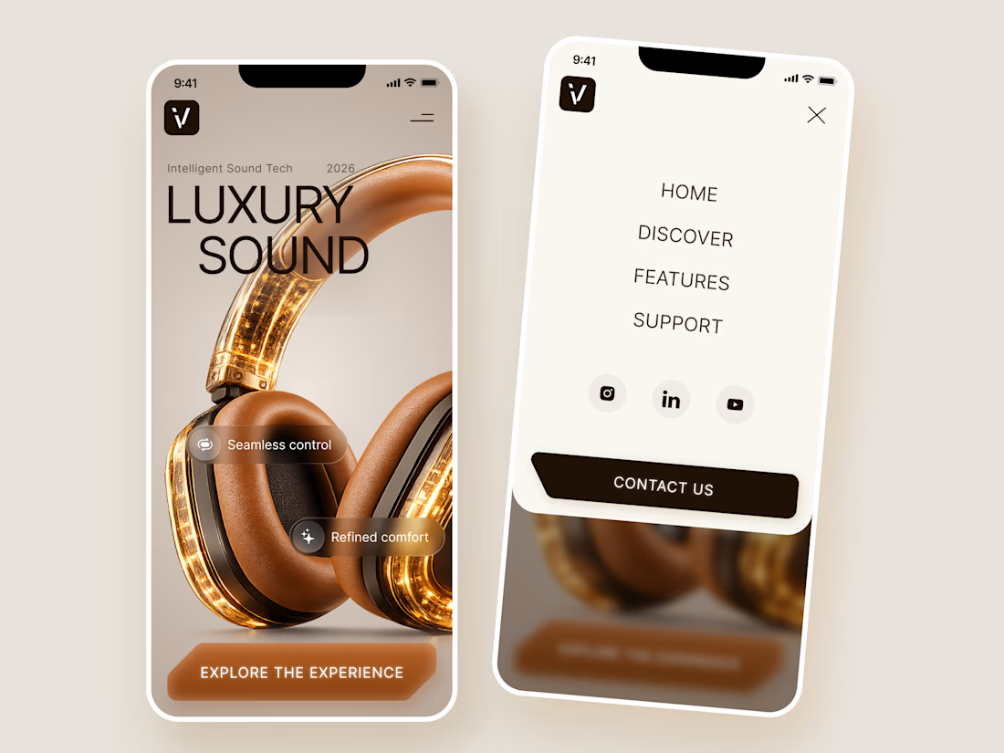

The amber glow on the headphones against that warm beige is lovely. How does the mobile menu handle the product image?

Before we move on to some client collaborations, a last post about the new LUCERRÁ digital experience to wrap it up.


Turning complex AI workflows into a calm, monochrome experience, brought to life with motion. We'd love to hear your thoughts!


