The network for creativity
Join 1.25M professional creatives like you
Connect with clients, get discovered, and run your business 100% commission-free
Creatives on Contra have earned over $150M and we are just getting started
Back to feedPost
Taste Test

Exploring mobile app onboarding options for a Fintech app. Which version should I lock?
10 votes
Ends in 20h

Citrus is the best choice for me🎉🎉

I would choose Cobalt. Good Work👍

Cobalt gets my vote for the clearer headline and direct account-opening action. Citrus has a more expressive illustration-led personality. I would compare both at actual phone size and check which makes the first step easier to understand.

Version 2 is stronger for Fintech. More clear, trustworthy & explains value instantly. Version 1 looks bold but feels vague for onboarding. I'd lock Version 2.

Both look solid! For fintech I'd go with whichever feels more trustworthy at first glance, onboarding is where people decide if they believe you.

Good Work
The network for creativity
Join 1.25M professional creatives like you
Connect with clients, get discovered, and run your business 100% commission-free
Creatives on Contra have earned over $150M and we are just getting started











Related posts

Same content, different experience. A few thoughtful design choices can completely change how a presentation feels, flows, and communicates. Which version would you choose?

11 voted
31%
24 voted
69%
35 votes
Closed
Verde Vista 1 is more modern and futuristic specially with blue colors and robotic hand❤️
Great job Rasid🎉🎉🔥🔥

FinPulse — Premium Cross-Border Remittance App
Designed a trustworthy FinTech mobile app for global money transfers.
Process: Started with user flow & wireframes for 3-tap transfer, then built a scalable design system in Figma with 100+ components.
Outcome: Final UI focuses on clarity and trust — from onboarding to Home Dashboard ($12,450 balance), Send Money, and Money Sent success state. Built for conversion and speed.
Tools: Figma, iOS Design System, SF Pro
Tags: Mobile App, FinTech, UI/UX, Product Design


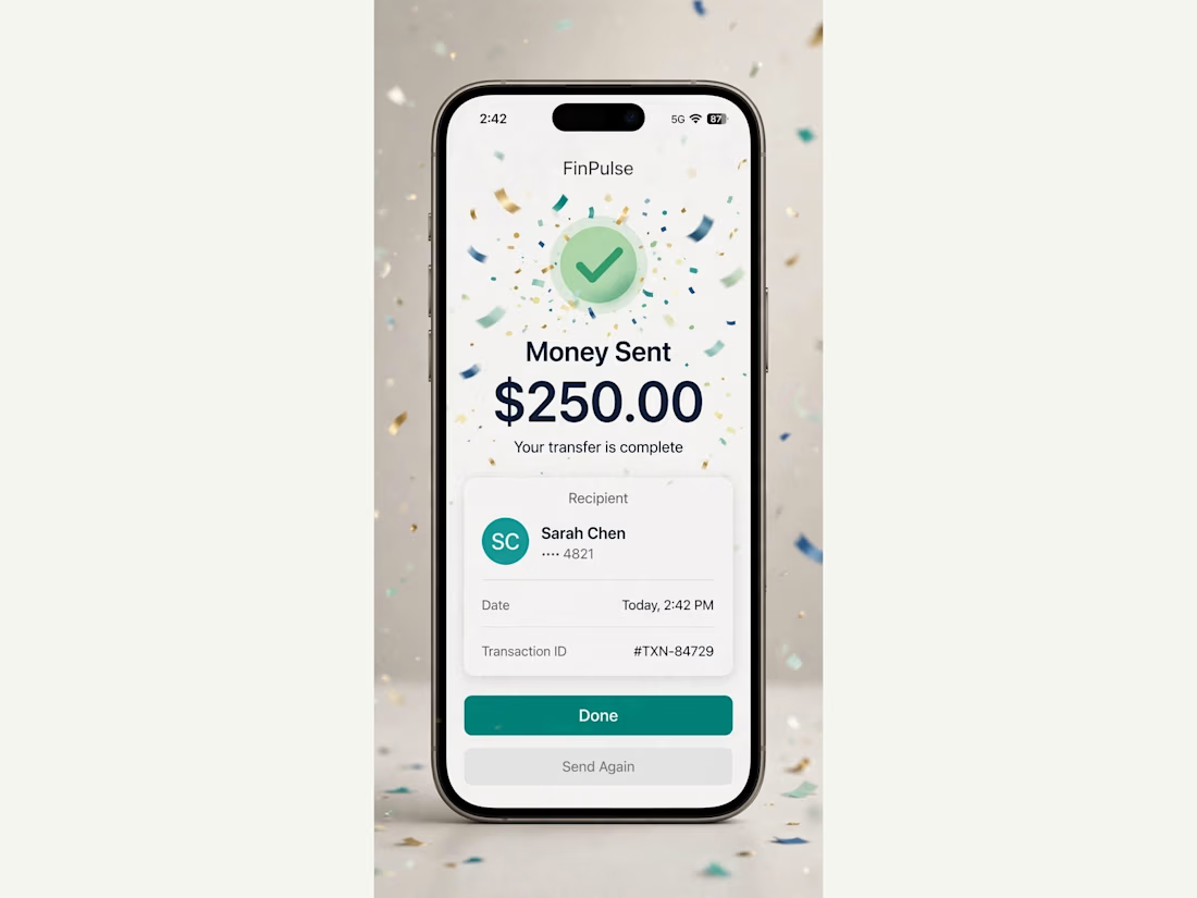
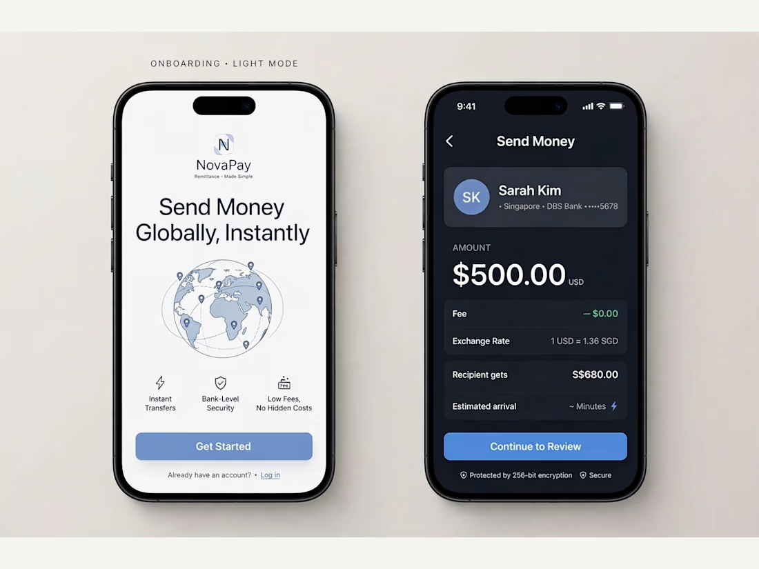
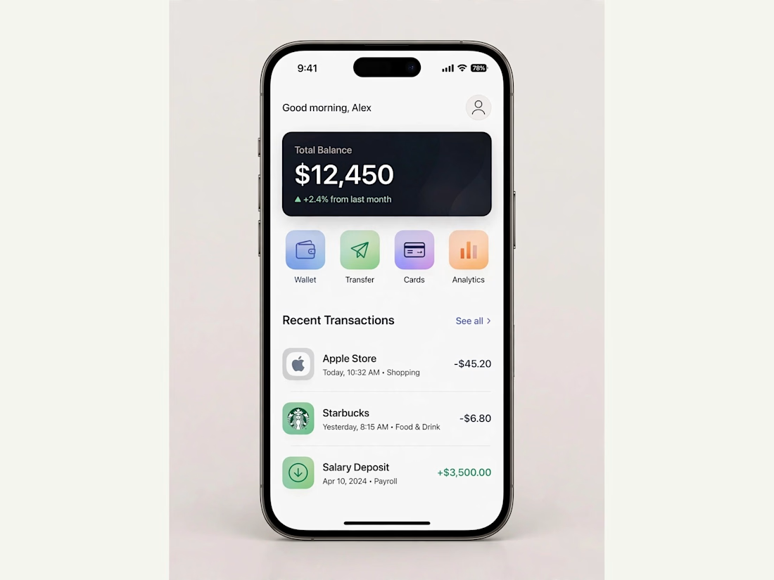
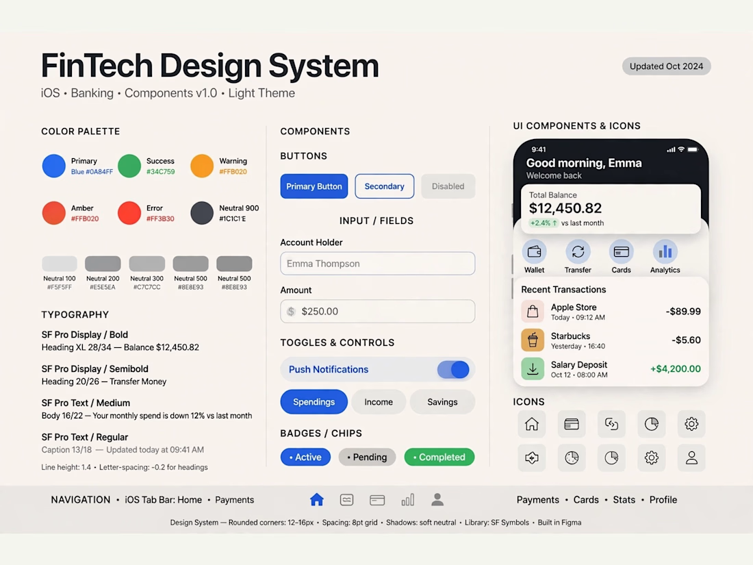

Really solid FinTech mobile design. Clean, trustworthy, and the user flow sounds well thought out. Great outcome on the final UI!

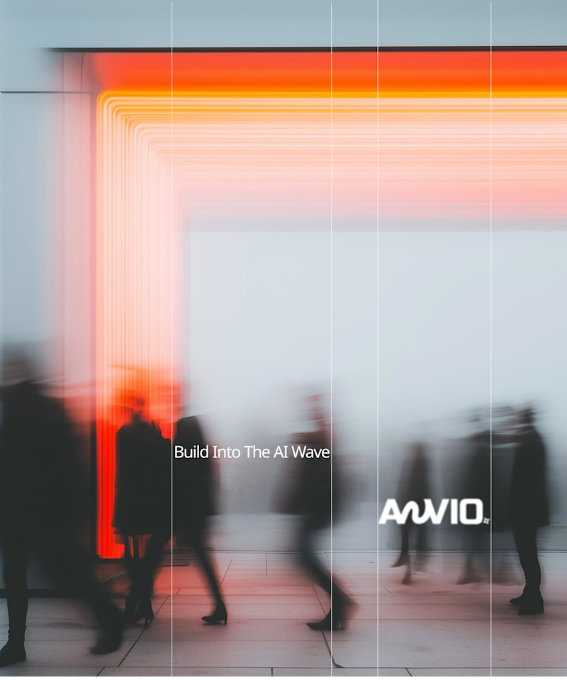
Which creative direction better communicates a Tech-Forward AI Brand Identity for anvio.online ?
25 voted
44%

32 voted
56%
57 votes
Closed
Fast vibrant energy gets my vote. The warm glow feels more human, which is nice for an AI brand.