The network for creativity
Join 1.25M professional creatives like you
Connect with clients, get discovered, and run your business 100% commission-free
Creatives on Contra have earned over $150M and we are just getting started
Back to feedPost


Another mobile app explainer video.
Here's a storyboard snippet from what we're building right now 👀


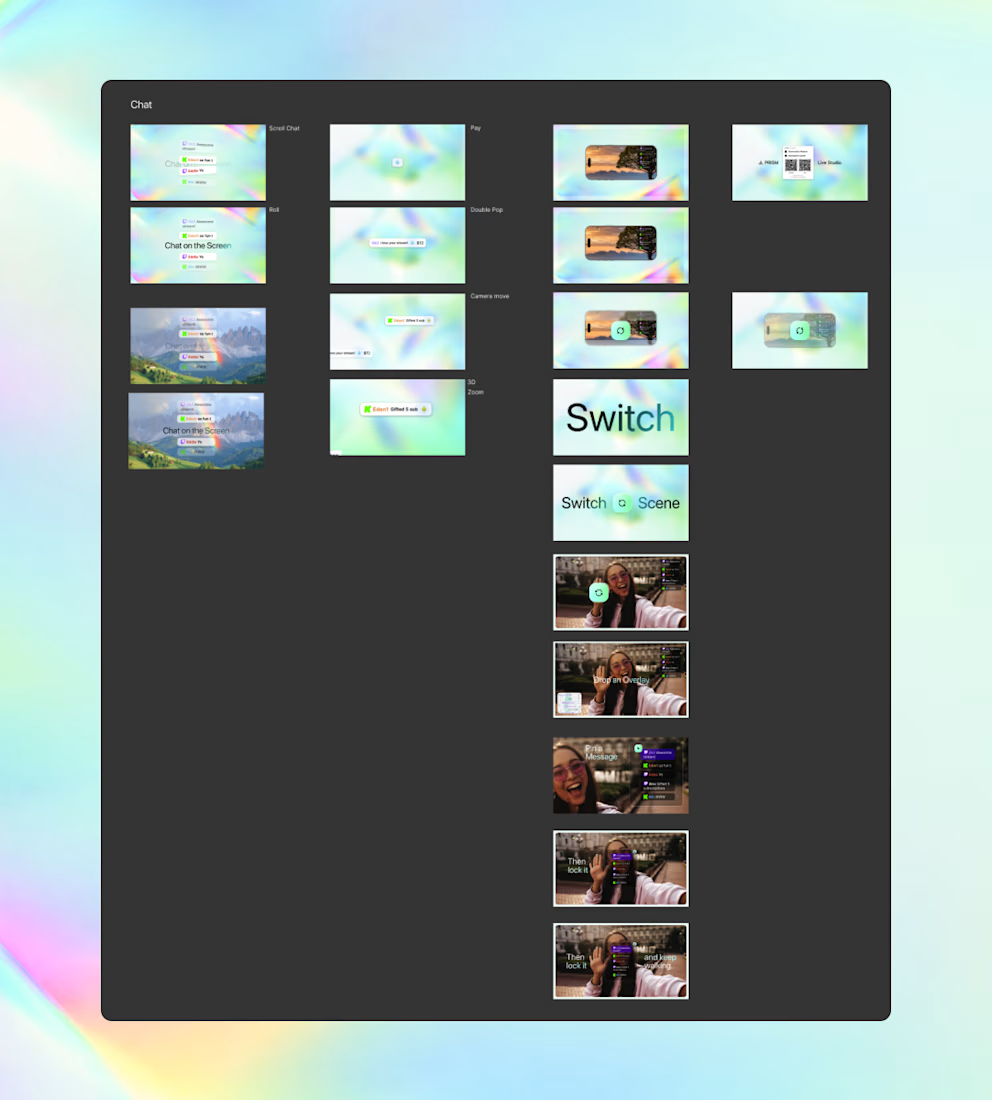

Interesting to see these in motion. Please share when you done.

Love seeing the storyboard stage of an app explainer.

The phone frames inside those landscape beats keep the product readable before motion is locked. The Switch scene lands as the payoff, not just another UI screenshot.
The network for creativity
Join 1.25M professional creatives like you
Connect with clients, get discovered, and run your business 100% commission-free
Creatives on Contra have earned over $150M and we are just getting started

Challenges
View all


Related posts


Engaging website for a New York–based architecture and construction studio, balancing bold typography, immersive imagery and a minimal editorial layout.


1M views in 3 days for OpusClip launch.
Obviously not just the video - it's the team, the timing, the distribution push. But I'm genuinely proud to be the part that moves that fast.
Delivered in 14 days.
Have a product launch coming up? Feel free to DM me.

The launch piece makes the product story feel tangible—the checkmark sequence and kinetic type build a clear sense of momentum without losing the human proof behind the result. Great example of motion carrying the narrative.


Can I call this productive procrastination? 👀
Was playing with kinetic type while working on another post and liked these too much not to share them separately.
Made in my aftrglo
No timeline. No keyframes. Free to try ✨
Your turn to play!
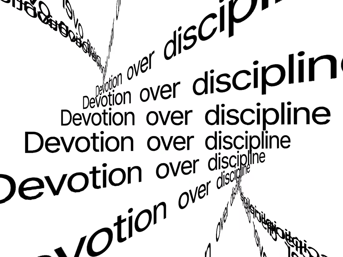


the black type looks so good. nice play


