The network for creativity
Join 1.25M professional creatives like you
Connect with clients, get discovered, and run your business 100% commission-free
Creatives on Contra have earned over $150M and we are just getting started
Back to feedPost

Behind the Project
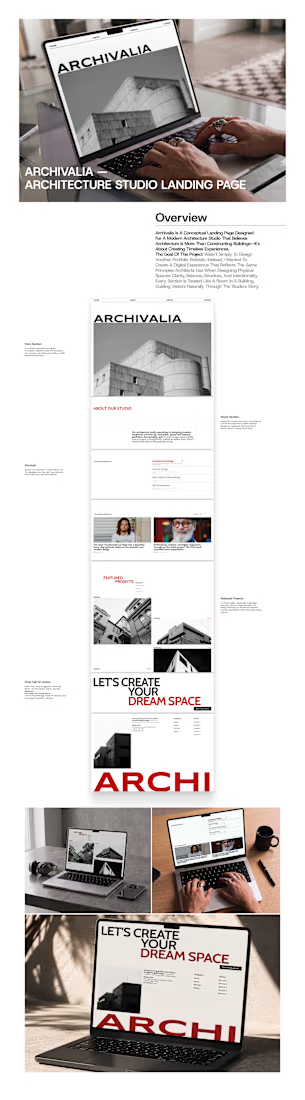
Archivalia — Architecture Studio Landing Page
Overview
Archivalia is a conceptual landing page designed for a modern architecture studio that believes architecture is more than constructing buildings—it's about creating timeless experiences.
The goal of this project wasn't simply to design another portfolio website. Instead, I wanted to create a digital experience that reflects the same principles architects use when designing physical spaces: clarity, balance, structure, and intentionality.
Every section is treated like a room in a building, guiding visitors naturally through the studio's story.
The Challenge
Many architecture websites rely heavily on beautiful imagery but often struggle with visual hierarchy and storytelling.
I noticed three common issues:
Projects feel disconnected from the studio's identity.
Excessive animations distract from the work.
Visitors don't clearly understand what makes the studio unique.
The challenge was creating a landing page where the architecture itself becomes the hero, while still providing a memorable browsing experience.
Design Approach
Instead of designing around UI trends, I borrowed inspiration from architectural principles.
Editorial Layout
The layout uses generous white space, strong alignment, and asymmetric composition inspired by architectural magazines.
Rather than overwhelming users with content, every section has room to breathe.
Monochrome Visual Language
Architecture is already visually rich.
Using a monochrome palette allows textures, geometry, and lighting to become the primary visual elements while introducing red only as an accent for emphasis and calls-to-action.
This creates a timeless aesthetic that doesn't compete with the projects themselves.
Typography as Architecture
The oversized headlines act like structural elements.
Large typography creates rhythm throughout the page while reinforcing confidence and professionalism.
Instead of decorative graphics, typography becomes part of the visual composition.
Storytelling Through Scrolling
The scrolling experience follows a deliberate narrative:
Introduction → establish the studio identity.
About → communicate philosophy and design values.
Services → explain expertise without overwhelming details.
Testimonials → build credibility through social proof.
Featured Projects → let the work speak for itself.
Final CTA → encourage visitors to start a conversation.
The page feels less like browsing a website and more like walking through an architectural exhibition.
Design Decisions
Hero Section
A full-width architectural photograph immediately establishes scale and atmosphere.
The oversized logo reinforces confidence while maintaining minimalism.
About Section
Instead of a lengthy introduction, the content is concise and supported by subtle oversized background typography, reinforcing brand identity without creating visual clutter.
Services
Services are presented in a clean editorial list.
The highlighted item naturally draws attention while preserving a minimalist aesthetic.
Featured Projects
The project gallery intentionally avoids rigid symmetry.
Different image sizes mimic the feeling of browsing an architecture magazine, creating visual rhythm while showcasing diverse projects.
Final Call-to-Action
Rather than using an aggressive marketing banner, the final section delivers one bold statement:
Let's Create Your Dream Space
This emotional message closes the narrative and encourages consultation naturally.
Design System
Style
Editorial Minimalism
Swiss-inspired Grid
Contemporary Architecture
Color Palette
Black
White
Neutral Gray
Accent Red
Typography
Bold Sans-serif
Oversized Display Headlines
Clean Editorial Body Text
Tools
Figma
What I Learned
This project reinforced an important principle:
Good architecture isn't about adding more elements—it's about removing everything unnecessary until only the essential remains.
The same philosophy applies to digital design.
Every spacing decision, typographic scale, image placement, and interaction was carefully considered to create an experience that feels calm, premium, and intentional.
Rather than chasing visual trends, this project focuses on timeless design principles that communicate trust, professionalism, and craftsmanship.
Outcome
The final landing page successfully balances editorial storytelling, minimalist aesthetics, and clear user flow, resulting in a premium digital presence suitable for architecture firms, interior studios, and creative design agencies seeking to showcase their work with elegance and confidence.

The network for creativity
Join 1.25M professional creatives like you
Connect with clients, get discovered, and run your business 100% commission-free
Creatives on Contra have earned over $150M and we are just getting started











Related posts


This UI was really great nice job Piotr🔥🔥🔥

A little peek at the brand work we did for Elio Mortgage.
A warm, approachable identity full of warm vibrant colors paired with soft sun rising inspired gradients, inner glows and custom illustrations & more. Loved this direction!
Full case study coming soon, from process to final identity.
Plenty of logo explorations to share too!


That color palette takes the whole identity to a different level!! I loove it.

Here we go, check the full case study, I think you will love it! 🎃

Love this! 🎃 The pumpkin concept for Renesia is super creative - perfectly matches the Pumpkin Seed Oil story. Clean work in Illustrator & Figma!