The network for creativity
Join 1.25M professional creatives like you
Connect with clients, get discovered, and run your business 100% commission-free
Creatives on Contra have earned over $150M and we are just getting started
Back to feedPost

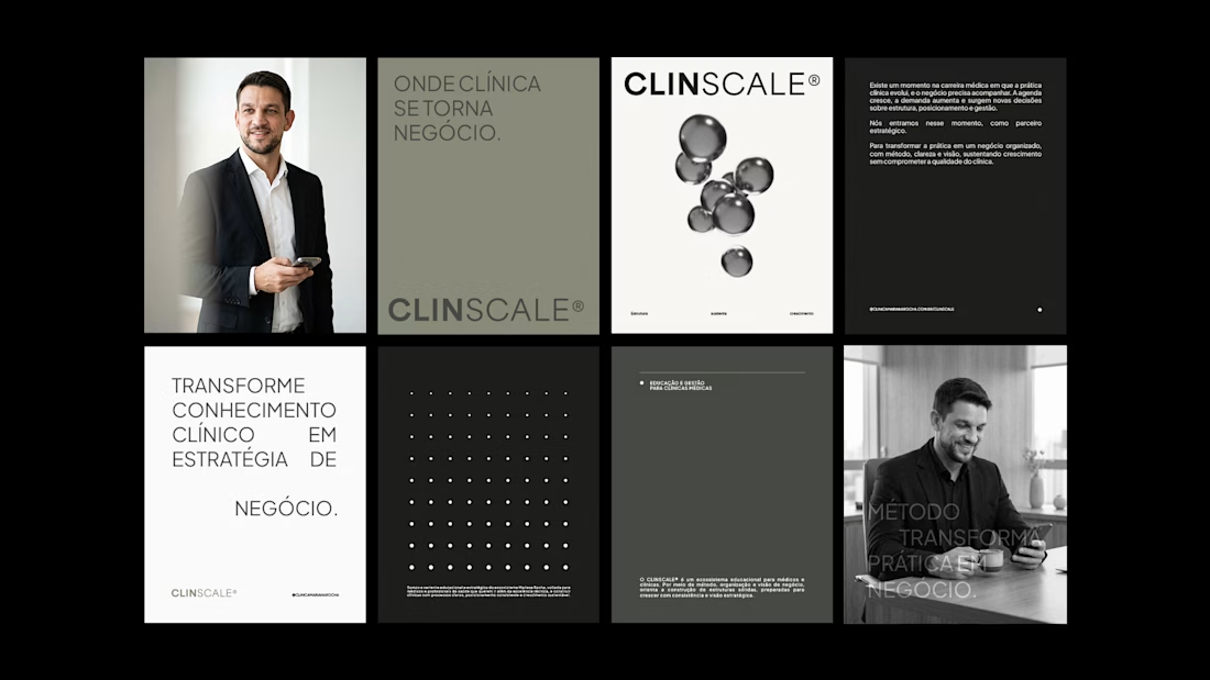
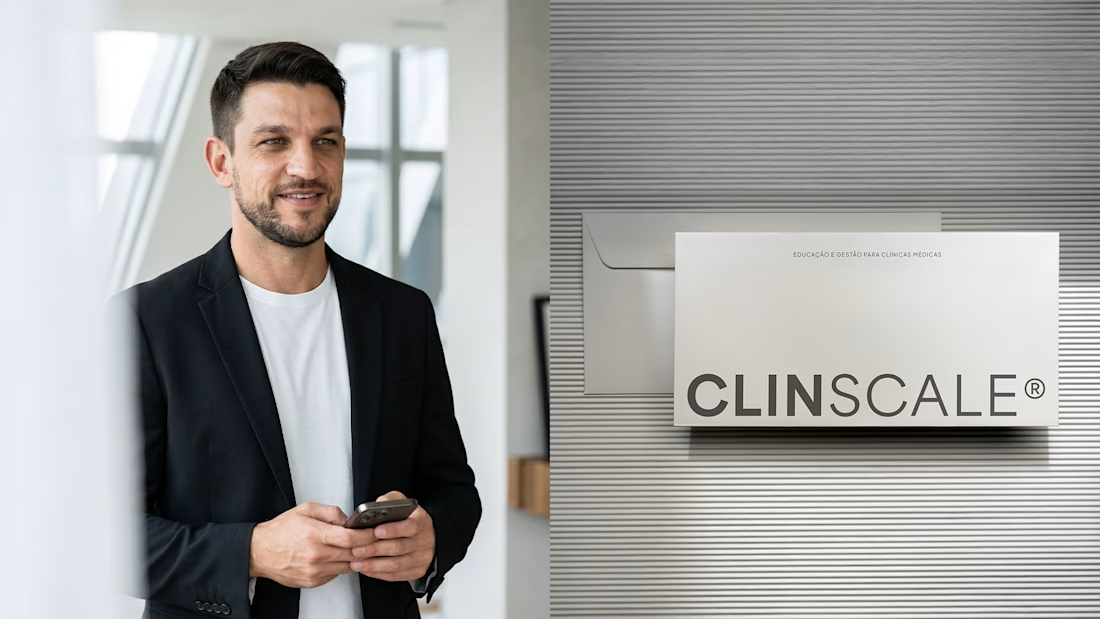
Most healthcare branding reaches for the same visual shorthand: a cross, a heartbeat line, a shade of clinical blue. ClinScale needed something else. It's a platform built around turning clinical expertise into a real business, and the identity had to carry that idea instead of borrowing from medicine.
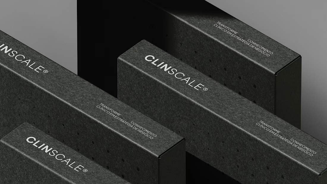
So the system starts with a single unit. One shape, precise and self contained. Add another, and they connect. Add more, and they form a structure. That's not a metaphor added after the fact, it's how the whole graphic system works, because the belief behind ClinScale is that growth only holds up if there's structure underneath it.
Deep neutral tones and metallic dimension carry the rest: enough weight to read as serious, without ever tipping into the coldness healthcare branding usually settles for.
Project made in collaboration with Nathalia Ultramar

Super sleek work!

Love the direction here. It feels unique and really breaks away from the usual medical branding clichés, which is a big win. My only thought as a first-time viewer: before reading the context, I assumed it was a clinic creating beauty products like serums and treatments.

Nice work, Flavia


Nice work👏🔥🔥

Naming the shorthand up front is the useful move. The cross and the clinical blue survive because they're instantly legible, so leaving them means the identity has to earn recognition on its own terms instead. A unit-that-connects system does that, though it lives or dies on...

Flawless 🧡

Outstanding work, I really like it! 🔥

The unit-that-connects system is the right idea for a platform whose whole promise is structured growth, so the concept earns its keep. The test I would run is the smallest scale: at favicon or app-icon size the structure collapses back to one unit, so that base shape has to...
The network for creativity
Join 1.25M professional creatives like you
Connect with clients, get discovered, and run your business 100% commission-free
Creatives on Contra have earned over $150M and we are just getting started


Trending
retrofuturism
Share your favorite designs from the past exploring the distant future. Or your own take on the aesthetic 🚀
halftone
Dots. Texture. Grain. Let's see your designs using the halftone technique.

Midjourney
Creatives are showing off what they're making with Midjourney.
colorgrade
Video editors sound off: How do you enhance the mood of your video in color grading?
Related posts

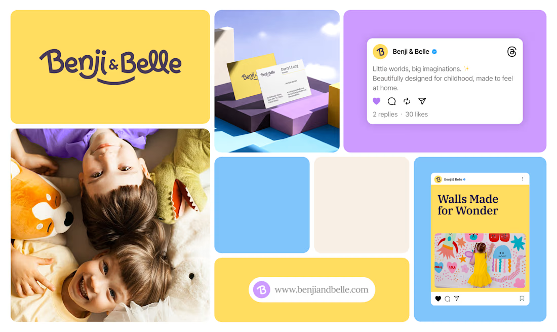
Benji & Belle - a family-founded children’s interiors and lifestyle brand creating thoughtful products for beautiful childhood spaces.
The brand brings together playful creativity, refined design, quality, and care- helping parents transform ordinary walls into joyful little worlds where imagination can grow.
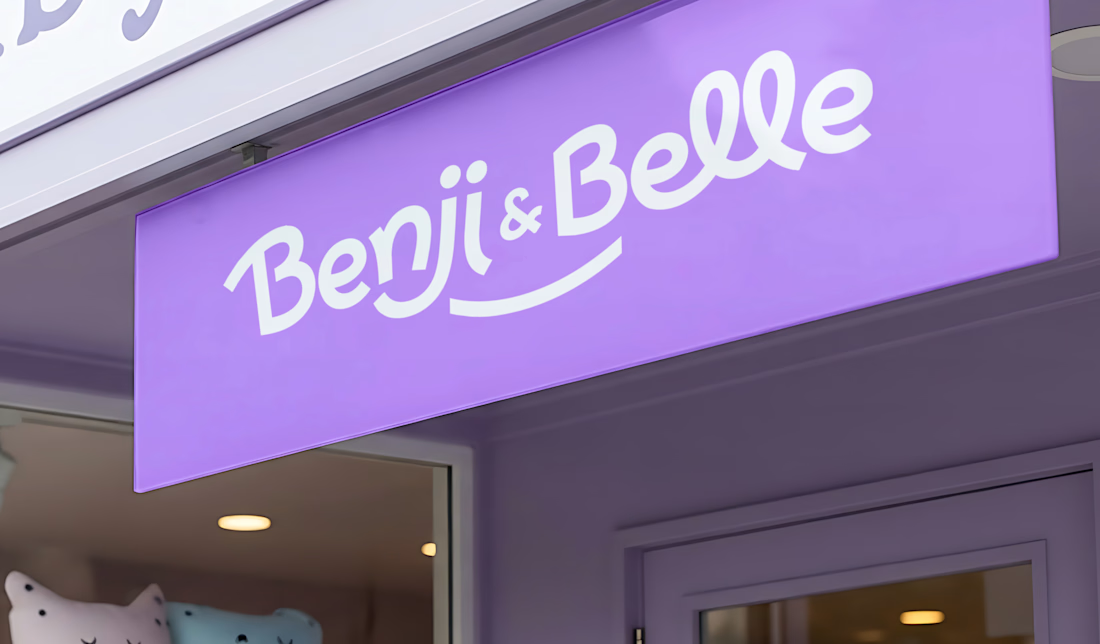
The visual identity balances a friendly, expressive personality with a polished and trustworthy feel. Bright yellow, soft purple, and sky blue create a warm and playful colour system, while the distinctive wordmark makes the brand memorable across packaging, digital platforms, and future product categories.
Because childhood spaces aren’t just decorated—they’re where stories begin, personalities grow, and memories are made.
What makes a children’s brand feel truly memorable to you?
#BrandIdentity #KidsBranding #VisualIdentity #LogoDesign #ChildrensInteriors #BrandDesign



Your brand identity is meant to do the talking even before your product is encountered.
It should express the value your brand possesses, its features, and the benefits it offers.
ColdPro was not just designed to look good, but to communicate the brand’s value and benefits clearly, even before the audience interacts with the product.
That’s what good design does. It doesn’t just make things look good. It makes your brand speak.

Amazing 🤩

Finished putting together the storyboard for the Brainrot Reel, soon to be shown!
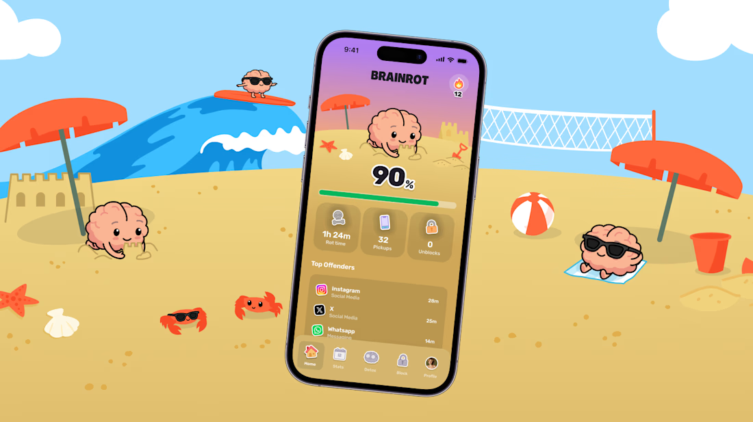
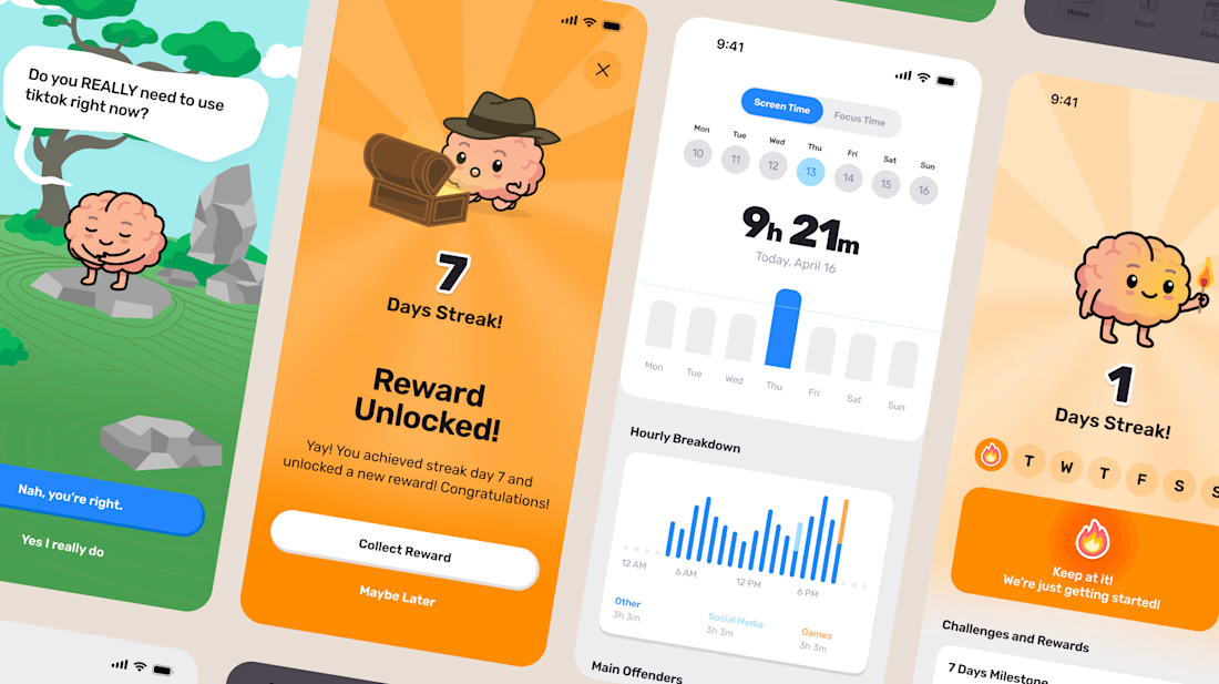
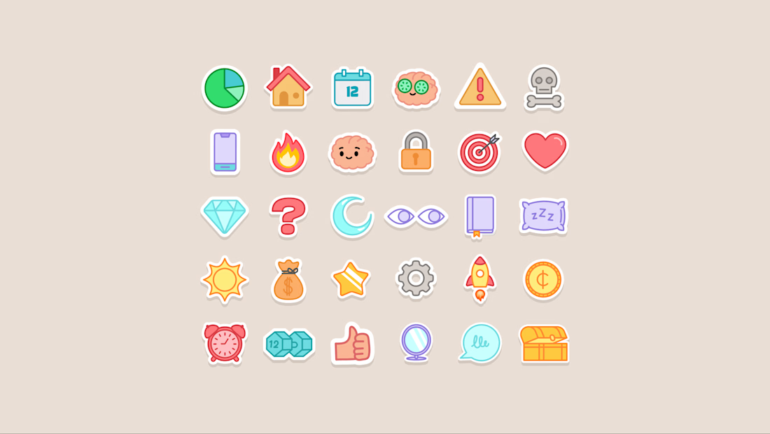

I love the customized icons