The network for creativity
Join 1.25M professional creatives like you
Connect with clients, get discovered, and run your business 100% commission-free
Creatives on Contra have earned over $150M and we are just getting started
Back to feedPost

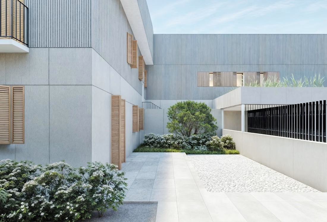
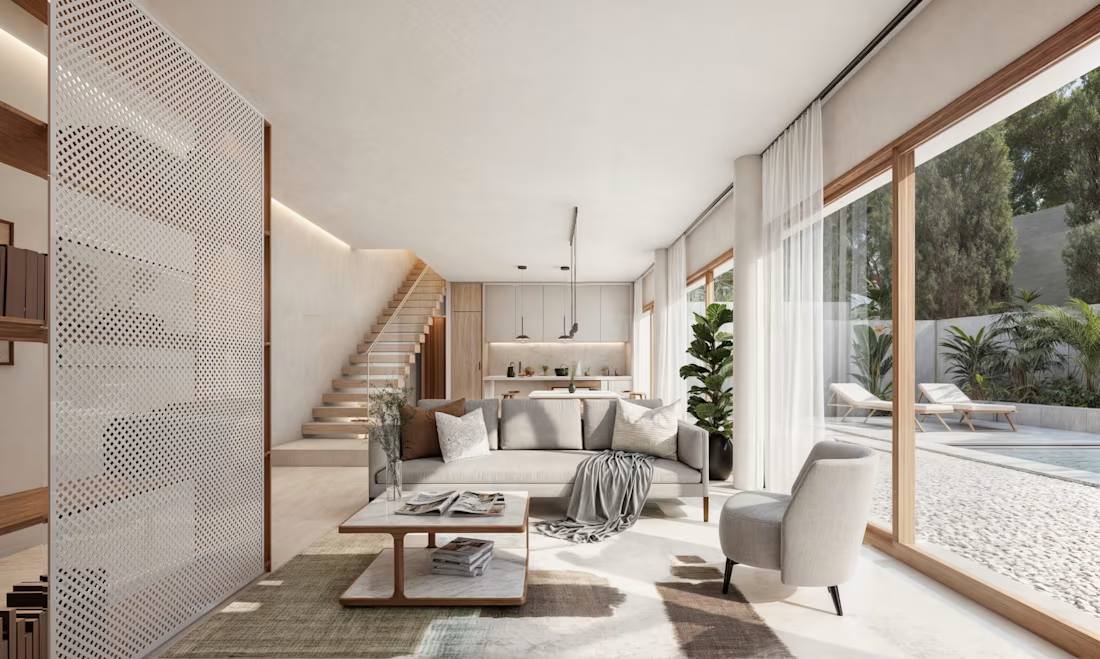
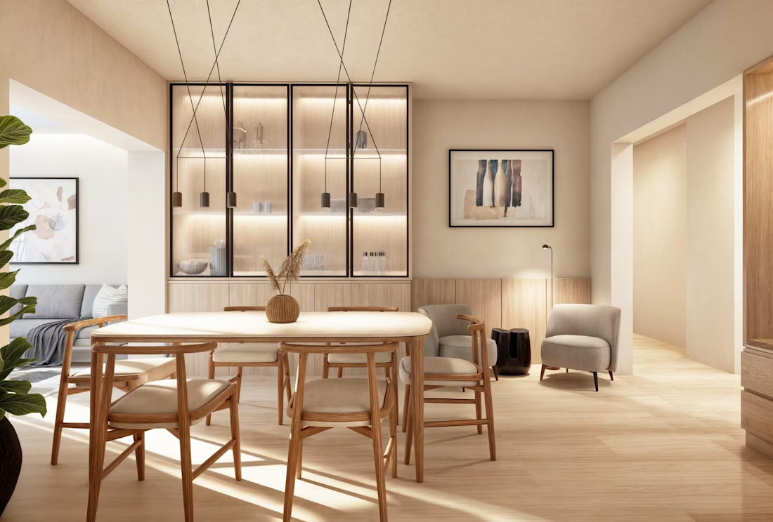
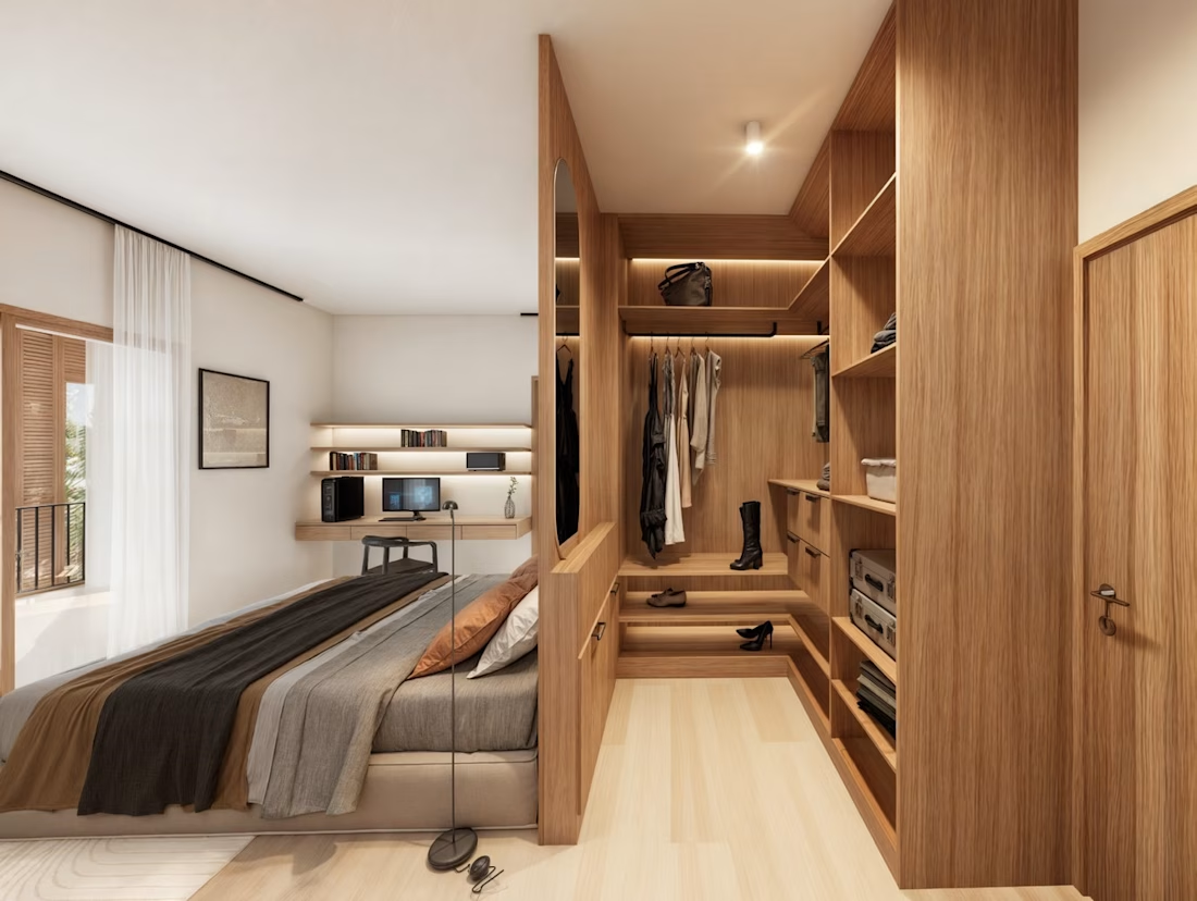
Sunlit Serenity: Warm Minimalist Apartment Visualization ☀️🌿
Project Overview:
Bringing unbuilt spaces to life is all about capturing a feeling. For this recent apartment project, the goal was to evoke a sense of calm, earthy elegance, and seamless indoor-outdoor living.
I focused heavily on natural light simulation, ensuring the sun cast realistic, inviting shadows across the organic textures—from the subtle veining in the kitchen marble to the raw stone finish in the bathroom and the warm wood tones throughout the living and dining areas. The result is a photorealistic, biophilic sanctuary that allows clients to truly step into the design.
The Collaboration:
I had the absolute pleasure of working on this project as a contract 3D Visualizer for the incredible team at OverTheRender. Collaborating with top-tier international studios pushes my creative boundaries and ensures the final visuals meet the highest global industry standards.
What I Brought to This Project:
Advanced Lighting & Texturing: Meticulous attention to material accuracy (stone, wood, linens) and natural sunlight simulation.
Composition & Styling: Carefully framing each shot to highlight architectural flow and key design features.
Efficient Workflow: Delivering high-fidelity results on deadline for a fast-paced agency environment.


The network for creativity
Join 1.25M professional creatives like you
Connect with clients, get discovered, and run your business 100% commission-free
Creatives on Contra have earned over $150M and we are just getting started





Related posts


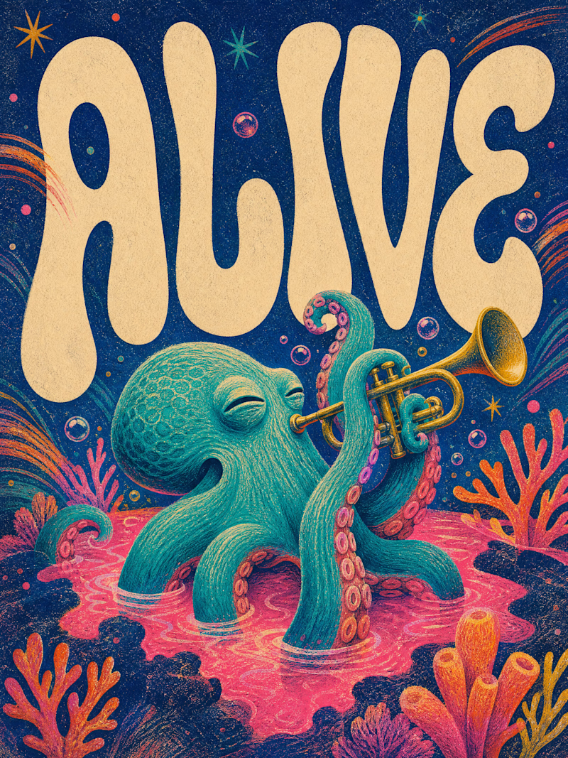
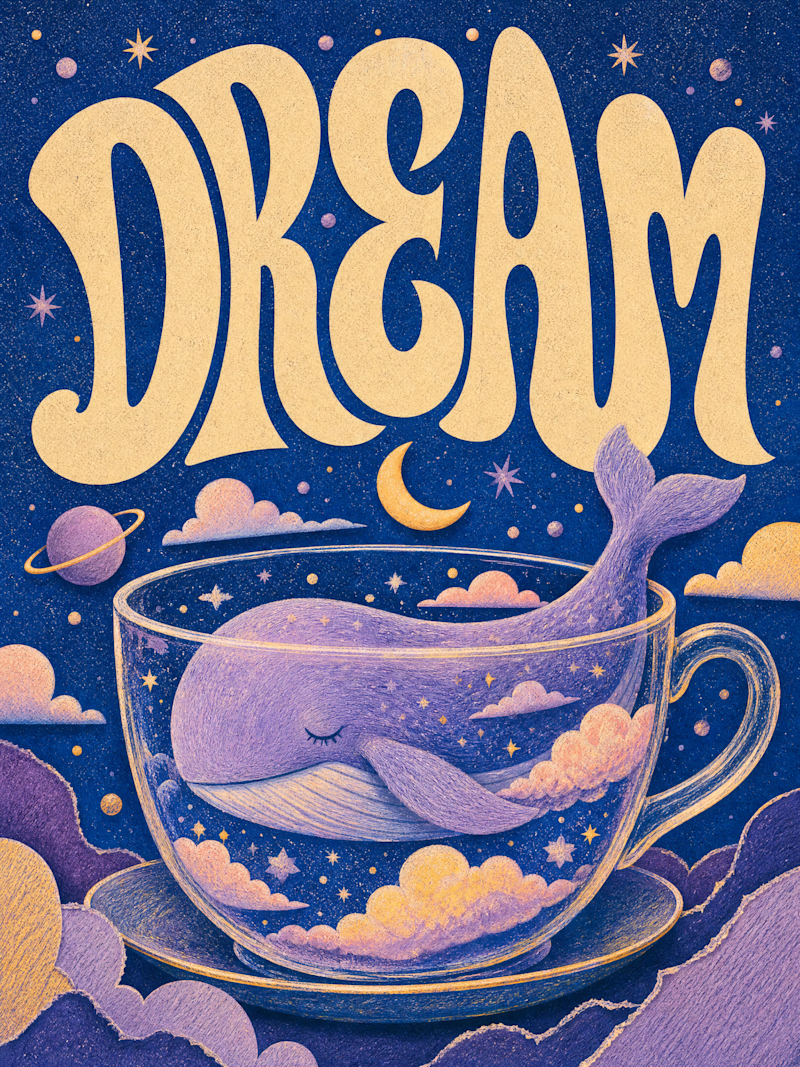
Only one will win, and you get to decide which.
Two AI-generated images. Same creative intent. Different visual outcomes.
The images were generated with AI, but the art direction, visual decisions, composition, styling, and overall creative direction came from me as the human behind the work.
Now comes the real taste test.
Which one has the stronger visual language? Which one feels more intentional, more refined, and more memorable?
11 voted
69%
5 voted
31%
16 votes
Closed

Outstanding work

Brand identity work for WesoftAI




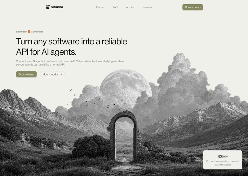
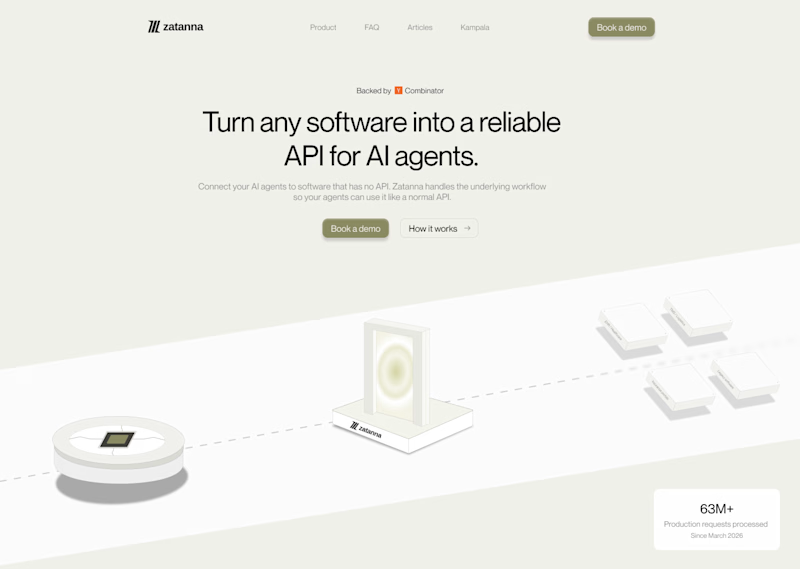
Which one brings more clarity to the hero section?
I was exploring a hero section concept for an AI product and tried two different visual directions.
Visual-led — focuses on explaining the idea through the interface/visual.
Isometric — uses a visual system to represent how the product works.
Both look good, but the real question isn't which one looks better.
Which one helps you understand the product faster?
That's something I always try to think about when designing hero sections — the visual should help explain the product, not just make the page look good.
Which one would you choose?
7 voted
58%
5 voted
42%
12 votes
Closed

The visual direction looks great, but I think Isometric does a better job of explaining the product.