The network for creativity
Join 1.25M professional creatives like you
Connect with clients, get discovered, and run your business 100% commission-free
Creatives on Contra have earned over $150M and we are just getting started
Back to feedPost
Taste Test

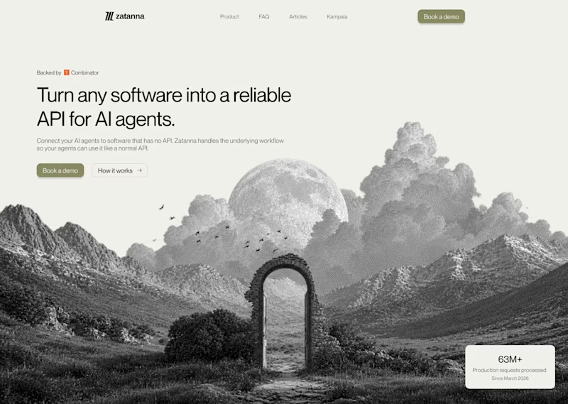
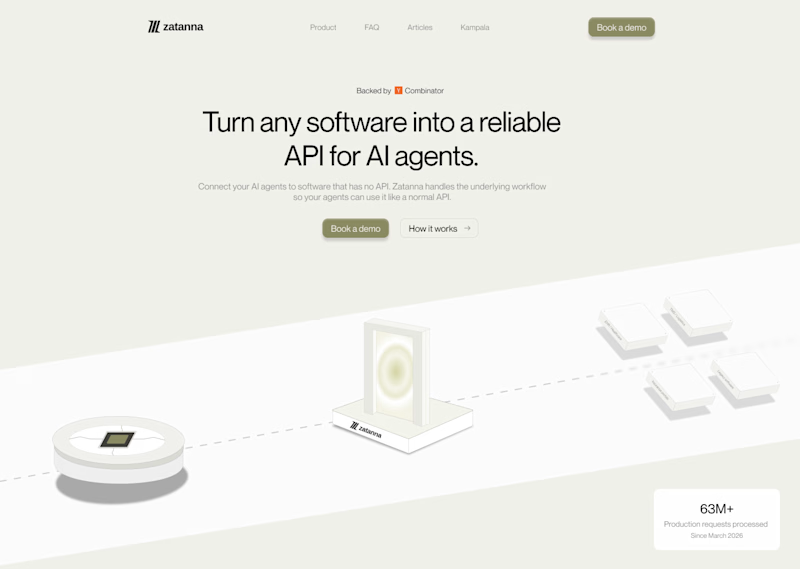
Which one brings more clarity to the hero section?
I was exploring a hero section concept for an AI product and tried two different visual directions.
Visual-led — focuses on explaining the idea through the interface/visual.
Isometric — uses a visual system to represent how the product works.
Both look good, but the real question isn't which one looks better.
Which one helps you understand the product faster?
That's something I always try to think about when designing hero sections — the visual should help explain the product, not just make the page look good.
Which one would you choose?
6 votes
Ends in 1d


The network for creativity
Join 1.25M professional creatives like you
Connect with clients, get discovered, and run your business 100% commission-free
Creatives on Contra have earned over $150M and we are just getting started





Related posts


Professional work Sergey

If you had to guess the final pick, would you go with A or B?
I explored two different visual identities for an eye clinic. Both have their own personality, but only one made it to the final round. Can you guess which logo made the cut?
A or B?
#logo #pool #eyeclinic #eyelogo #cliniclogo
14 voted
70%
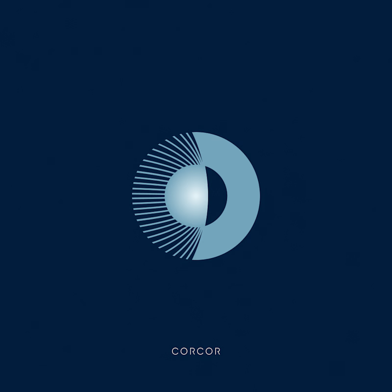
6 voted
30%
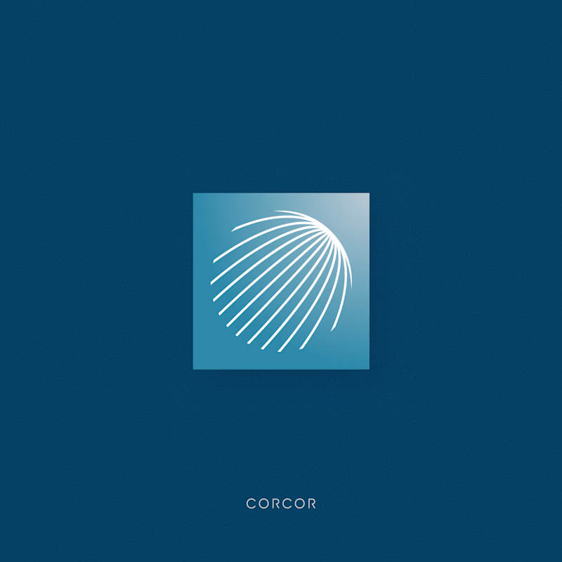
20 votes
Closed

Logo A is more attractive I like it

Designing for therapists means prioritizing what matters in the next few minutes, not just what looks good on a dashboard.
I explored two layout directions for a mental health practice management web app that helps psychologists manage sessions, patients, documentation, tasks, and follow-ups.
Both concepts use the same core widgets, but with different positioning and visual hierarchy. The goal was to make daily priorities easier to scan and act on.
Which option feels more intuitive - A or B? 🤔
17 voted
68%
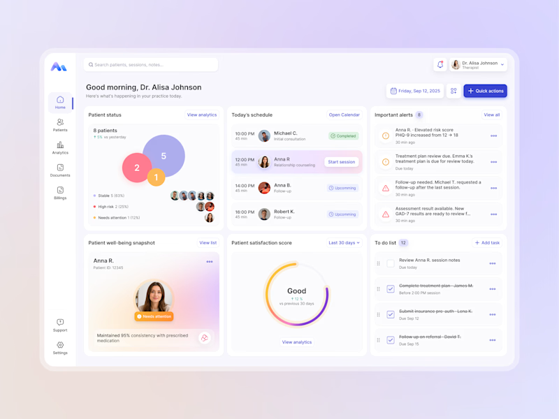
8 voted
32%
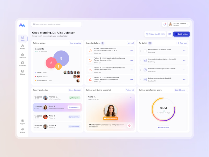
25 votes
Closed
