The network for creativity
Join 1.25M professional creatives like you
Connect with clients, get discovered, and run your business 100% commission-free
Creatives on Contra have earned over $150M and we are just getting started
Back to feedPost

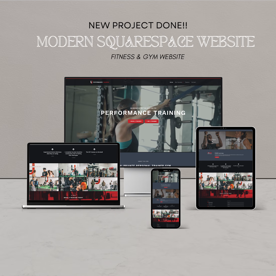
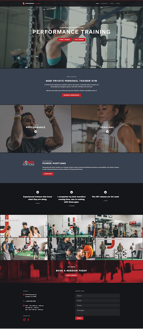
A growing fitness business needed a professional online presence to attract new members and showcase its training programs. Their existing website lacked clear navigation, mobile optimization, and effective lead-generation features.
I designed a modern website with a strong visual identity, service-focused pages, class schedules, and integrated booking forms. The site was optimized for mobile users and structured to guide visitors toward consultations and membership sign-ups.
The result was a professional, conversion-focused website that improved user experience, strengthened brand credibility, and made it easier for potential clients to discover services and take action.

The network for creativity
Join 1.25M professional creatives like you
Connect with clients, get discovered, and run your business 100% commission-free
Creatives on Contra have earned over $150M and we are just getting started





Related posts

Which hero visual feels right for this brand?
While working on the homepage for Halfspace, a website design and SEO agency, I explored two different hero visuals for the same headline and layout. Same message, same structure, just a different visual metaphor and mood.
Option 1 - Rocket Launch. Bold, literal, and energetic, visually reinforcing the "launch your business" message with motion and fire.
Option 2 - Glass Cube. Abstract, sleek, and premium, giving a more refined, tech-forward feel without relying on a literal metaphor.
Would love your honest UX/UI take, which direction feels more impactful, memorable, and aligned with a web design/SEO brand, and why?
11 voted
41%
16 voted
59%
27 votes
Closed

Both design are great; it's hard to choose one





Option B feels nothing but premium

Just published another Framer code component to show your work!
Best part: it's connected to your CMS, so no need to manually update the content.
It has drag and scroll to stir the arc, plus an infinite project list 🔥
Check it here


Svg filters ?