The network for creativity
Join 1.25M professional creatives like you
Connect with clients, get discovered, and run your business 100% commission-free
Creatives on Contra have earned over $150M and we are just getting started
Back to feedPost
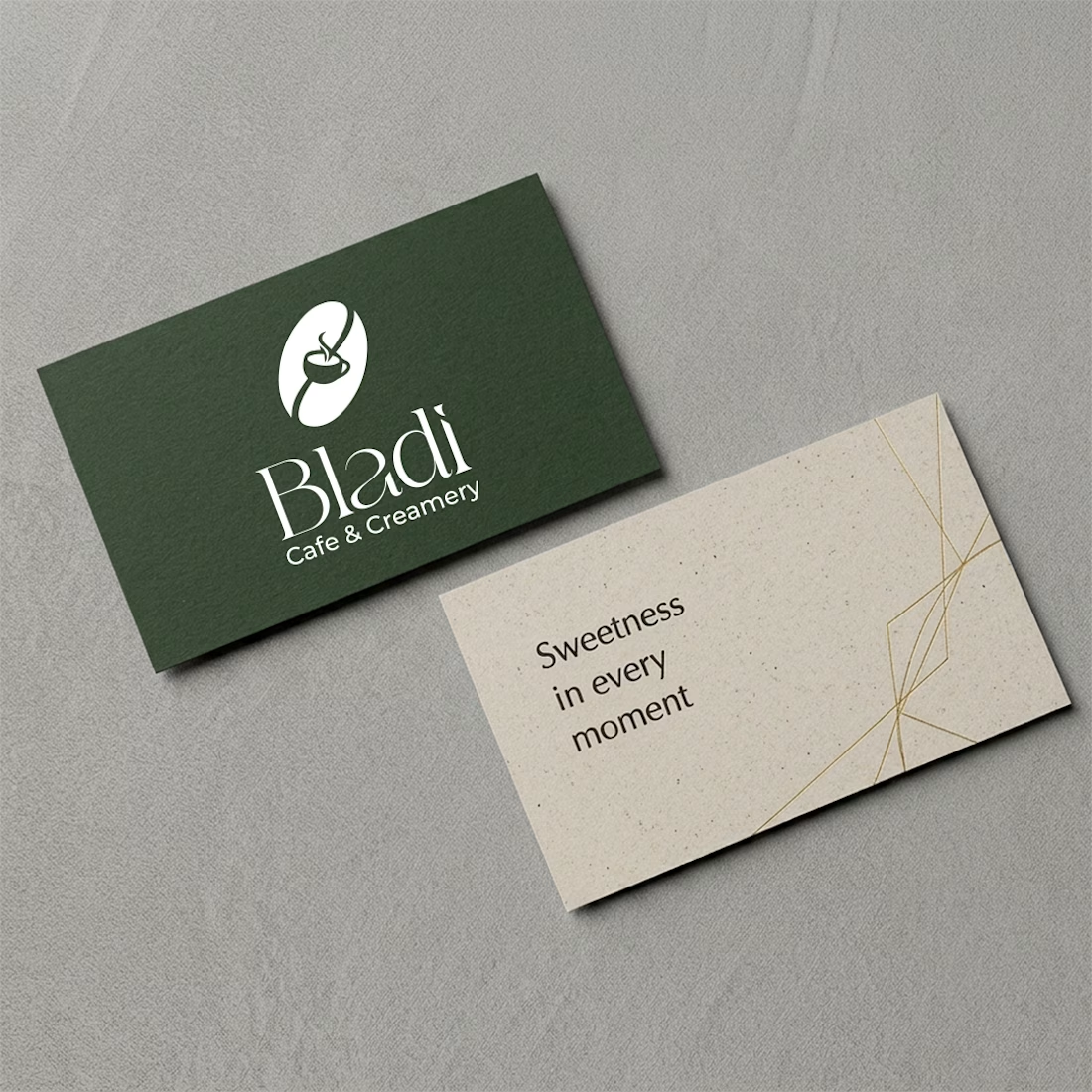
Bladi Café & Creamery — A Thoughtful Brand Identity Concept
A café’s identity should feel just as memorable as the experience it creates.
For Bladi Café & Creamery, the direction brings together deep forest green, warm neutral tones, elegant typography, and refined packaging to create a cohesive, premium look.
From business cards to takeaway packaging, each touchpoint follows the same visual language — keeping the brand recognizable across both printed materials and everyday customer experiences.
A concept built around simplicity, consistency, and a little everyday indulgence.
#BrandIdentity #PackagingDesign #LogoDesign #Branding #GraphicDesign


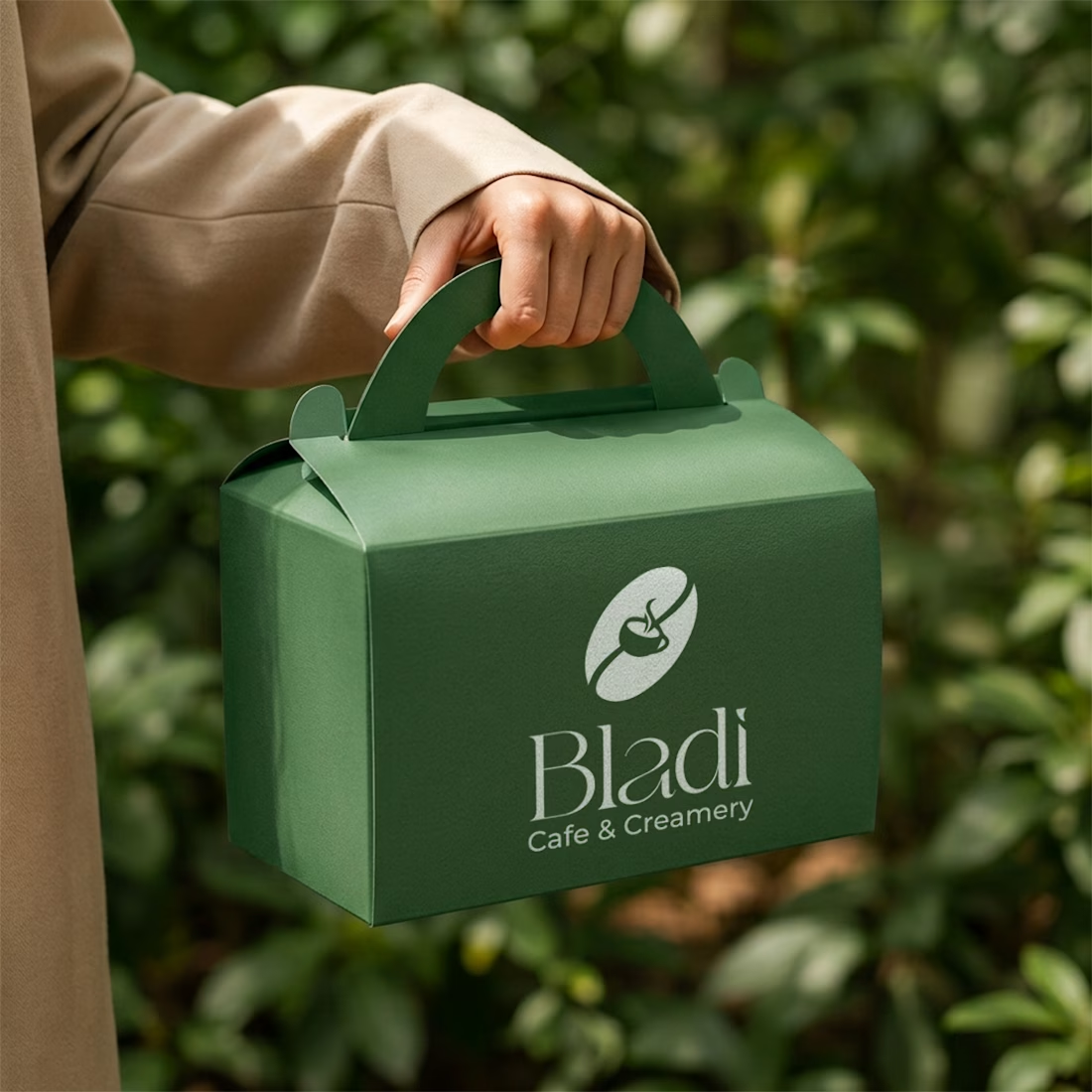
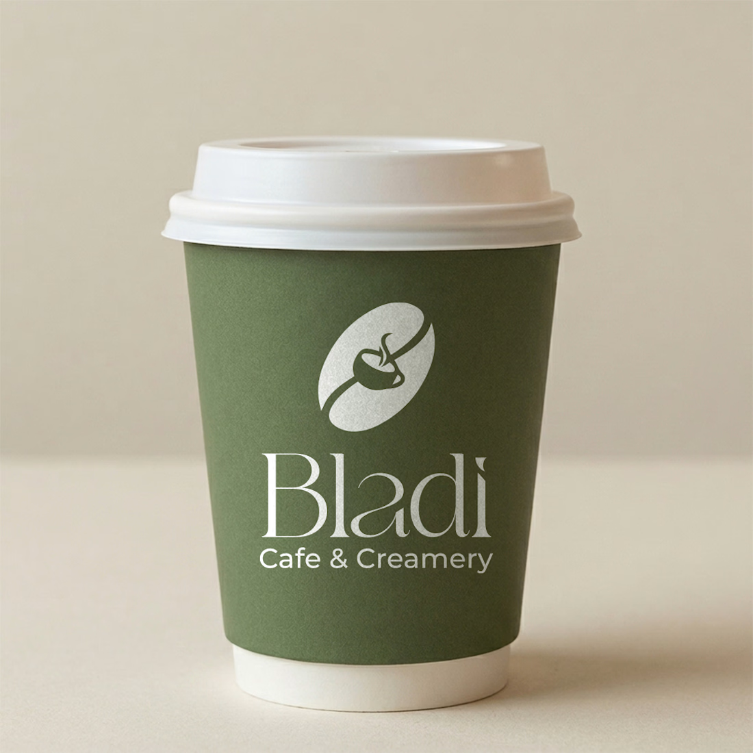
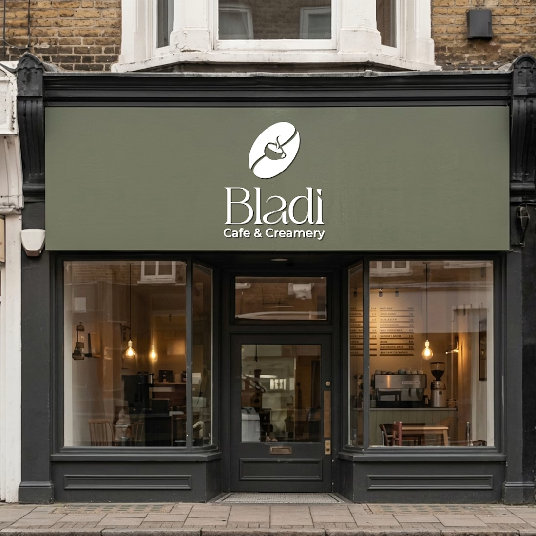

The deep green against those warm neutrals feels exactly right for a cafe. The takeaway box and cup mockups show the identity working at real touchpoints, which is the part a lot of concept posts skip. Did you design the packaging dielines yourself or use stock mockups?

Thank you! Really appreciate that. Our designer created the packaging designs and brand identity from scratch, including the layouts for the takeaway box and coffee cup. The mockups simply help showcase how the identity translates across different touchpoints.
The network for creativity
Join 1.25M professional creatives like you
Connect with clients, get discovered, and run your business 100% commission-free
Creatives on Contra have earned over $150M and we are just getting started


Related posts


Love a good all round project full of branding, merch, fitouts etc
Always fun!
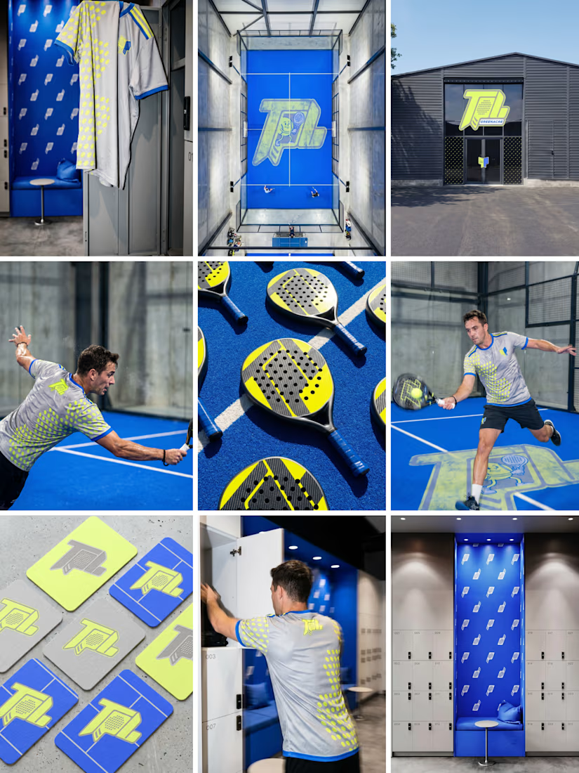

Branding across merch and fitouts looks wonderfully cohesive.

Can AI create a professional-looking logo?
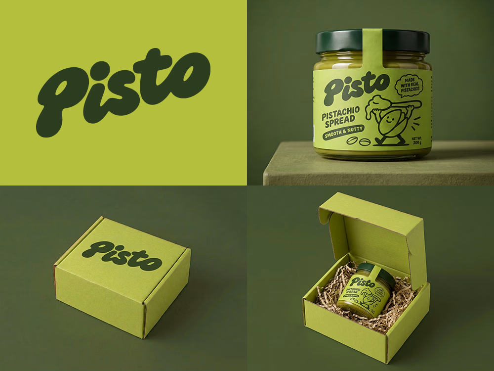
I tried to create a logo concept for a pistachio spread brand using Recraft Logo Maker.
After answering a few questions about the brand and going through several variations, I finally landed on a logo that felt right and captured the fun, fresh personality I had in mind.
But I didn't want to stop at just the logo.
I took it a step further by exploring how the identity could come to life through product packaging and a branded mailer box.
A quick process video is included in the comments.
What do you think?


Label Design · Wine Branding · Malbec Gran Reserva · Mendoza


looks great