The network for creativity
Join 1.25M professional creatives like you
Connect with clients, get discovered, and run your business 100% commission-free
Creatives on Contra have earned over $150M and we are just getting started
Back to feedPost

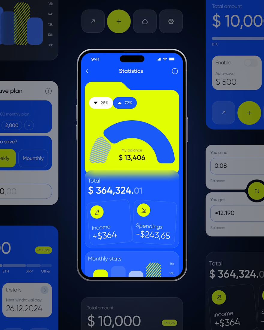
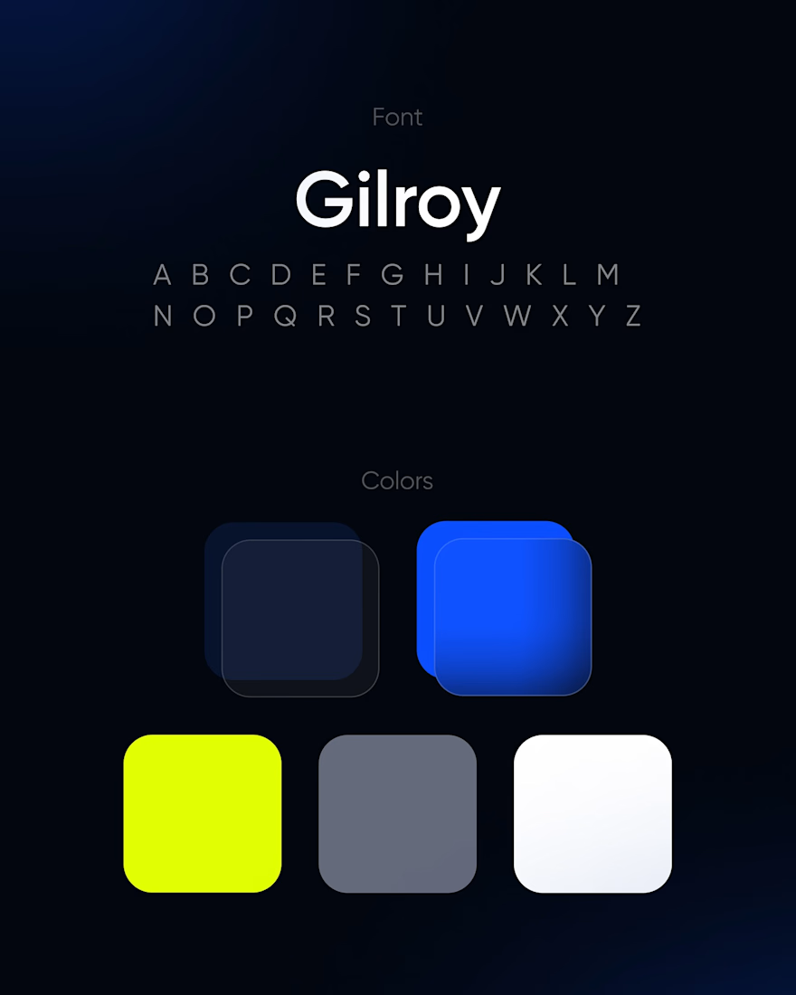
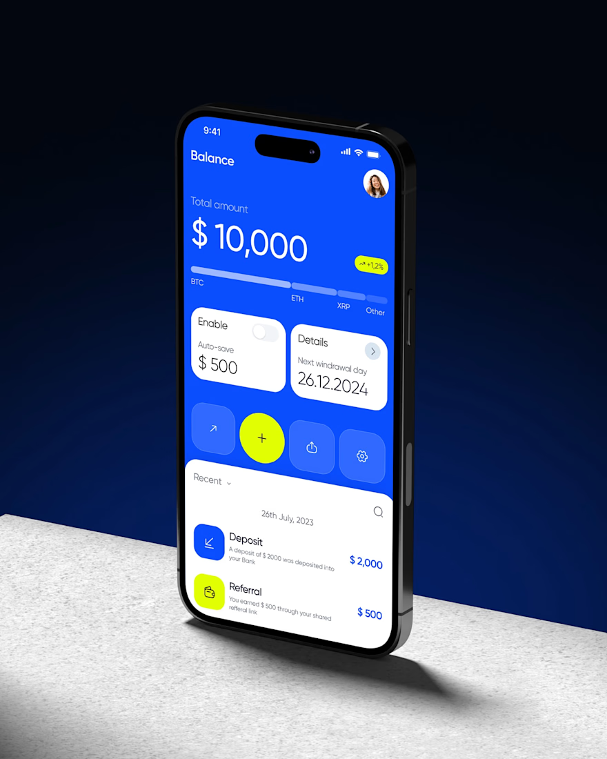
A look back at a crypto wallet concept from our archives. We designed the core screens, balance, statistics, and swap flow, using an electric blue and neon yellow palette paired with Gilroy for a bold fintech feel.
The set covers balance overviews, portfolio breakdown, auto save settings, and a swap screen, all built around one consistent visual identity.
A concept that still holds up: clean, punchy, and easy to navigate.




Different color choices and a great execution, i love it!

Amazing work!

The electric blue and neon yellow pairing gives the finance screens a clear visual signature. The balance and swap views still feel easy to scan despite the high-contrast palette.

Really nice... its actually different...generally there is ocean blue...yellow and orange... your got nice evening sky blue...a green that's a green mixed with yellow... and white... it looks nice
The network for creativity
Join 1.25M professional creatives like you
Connect with clients, get discovered, and run your business 100% commission-free
Creatives on Contra have earned over $150M and we are just getting started

Challenges
View all


Related posts




A feels more professional ❤️

SPRINT — Experimental Brand Visual
A visual experiment built around an unused logo concept from a recent branding project.
The design was created manually, while exploring how AI-driven aesthetics are increasingly influencing contemporary visual language, even when AI itself isn’t part of the design process.
Logo design, art direction and visual exploration.