The network for creativity
Join 1.25M professional creatives like you
Connect with clients, get discovered, and run your business 100% commission-free
Creatives on Contra have earned over $150M and we are just getting started
Back to feedPost

The network for creativity
Join 1.25M professional creatives like you
Connect with clients, get discovered, and run your business 100% commission-free
Creatives on Contra have earned over $150M and we are just getting started



Related posts

Rejected or Final Cut? 👀
Let's see how well you can read a brand direction.
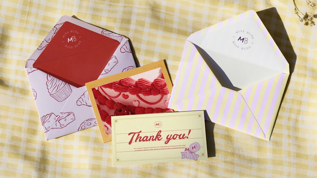
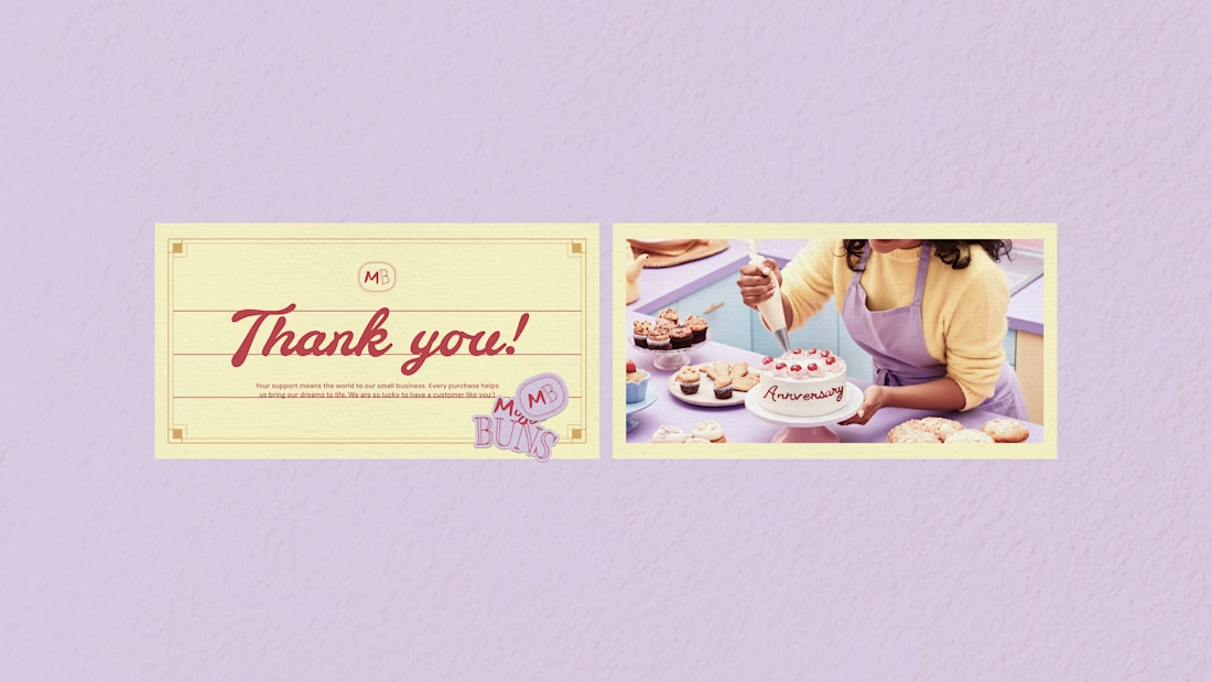
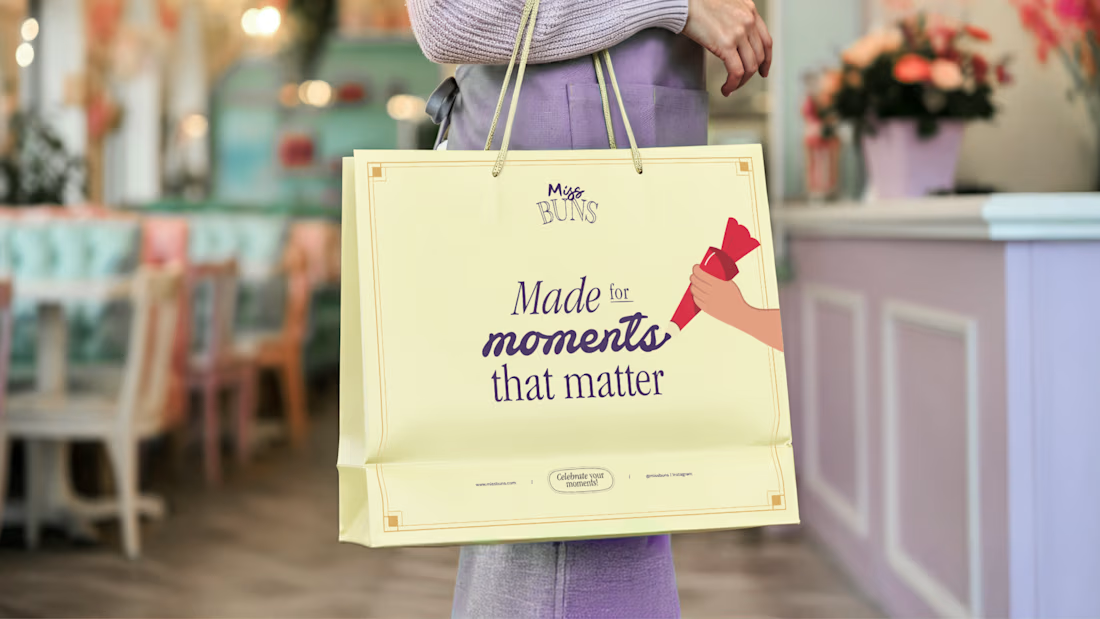
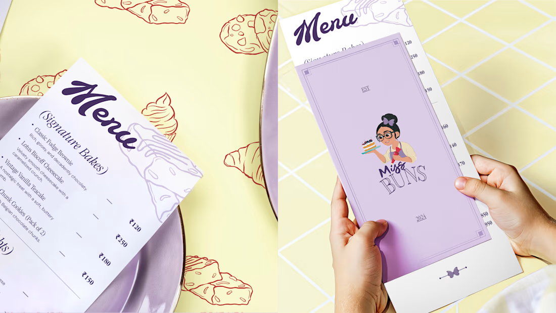
These are some collaterals we designed for Miss Buns, a patisserie brand. The direction explores a nostalgic, whimsical and premium feel through pastel colours, hand-drawn typography and vintage-inspired visuals.
The idea was to capture personalisation, indulgence and those little sweet moments that make the experience special.
But here's the question:
Did this direction make the final cut, or was it rejected?
Drop your guess in the comments. I'll reveal the answer soon!

Just added a new project to my portfolio.
This project focused on creating a professional appointment booking landing page using Kajabi, designed to guide visitors from their first interaction with the brand to taking the next step.
The goal was to bring the company's introduction, video content, testimonials, and appointment-booking experience together in one clear, engaging layout.
I focused on creating a clean visual structure, making the information easy to navigate, and giving visitors a straightforward path to schedule an interview.
It's always interesting to see how thoughtful design and the right structure can make a digital experience more effective.
Built with Kajabi.
I would love to hear your thoughts, What stands out to you about this design?
#Kajabi #LandingPageDesign #WebDesign #KajabiExpert #AppointmentBooking
Check it out


This is a great example of thoughtful design.

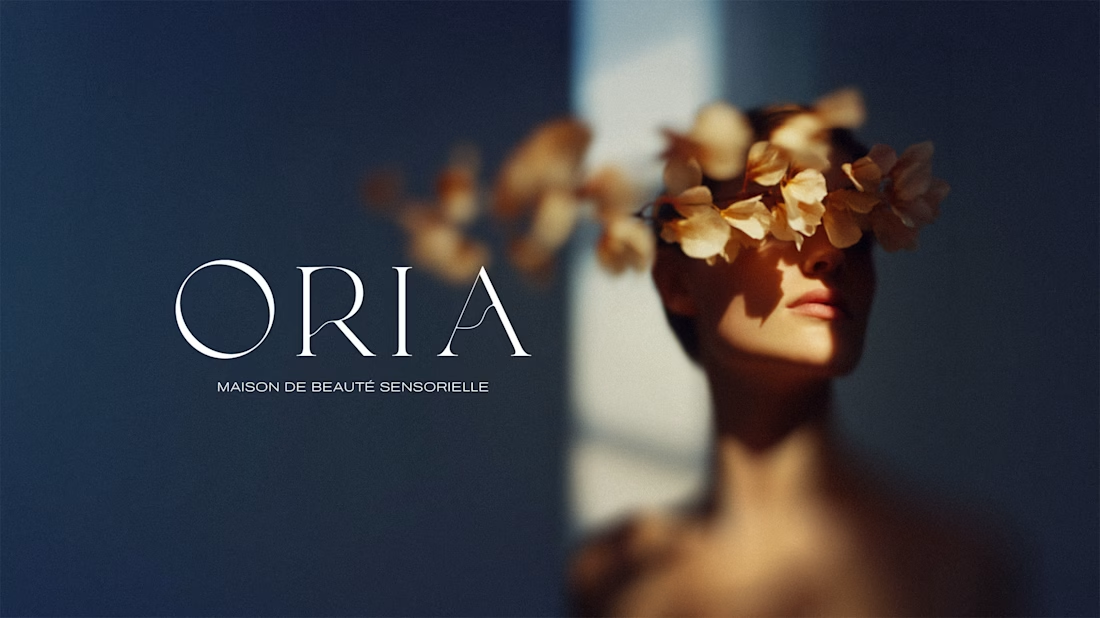
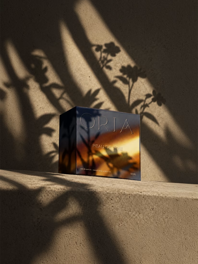
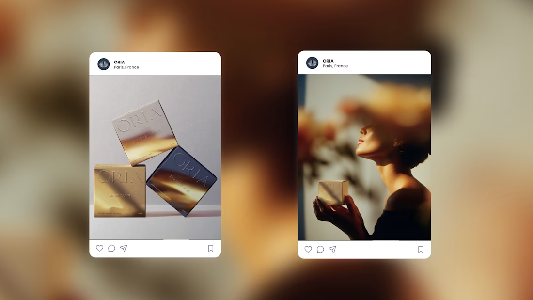
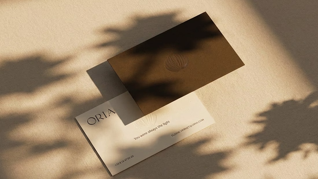
ORIA - Beauty felt in every detail.
What ORIA stands for is simple: you already have what you’re looking for. The brand doesn’t sell transformation. It sells the feeling of being at ease in your own skin — which, it turns out, is harder to find than most beauty brands admit.