The network for creativity
Join 1.25M professional creatives like you
Connect with clients, get discovered, and run your business 100% commission-free
Creatives on Contra have earned over $150M and we are just getting started
Back to feedPost

I’m currently testing my 3D flipping card component in Framer .
During testing, I discovered a few things users should be able to do:
• Change the font size and font type
• Make the card an image with text overlay if they want
• Add images inside the card
• Have better control of the layout
Building components is not just about how they look. It’s also about giving users the flexibility to use them in different ways.
So I’m going back to recook the component and make it more useful and flexible for designers.
If you’re looking for a Framer developer who can build interactive components and experiences, let’s connect.
#Framer #BuildInPublic #UIDesign #DesignEngineering
The network for creativity
Join 1.25M professional creatives like you
Connect with clients, get discovered, and run your business 100% commission-free
Creatives on Contra have earned over $150M and we are just getting started
Related posts

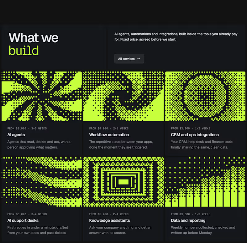
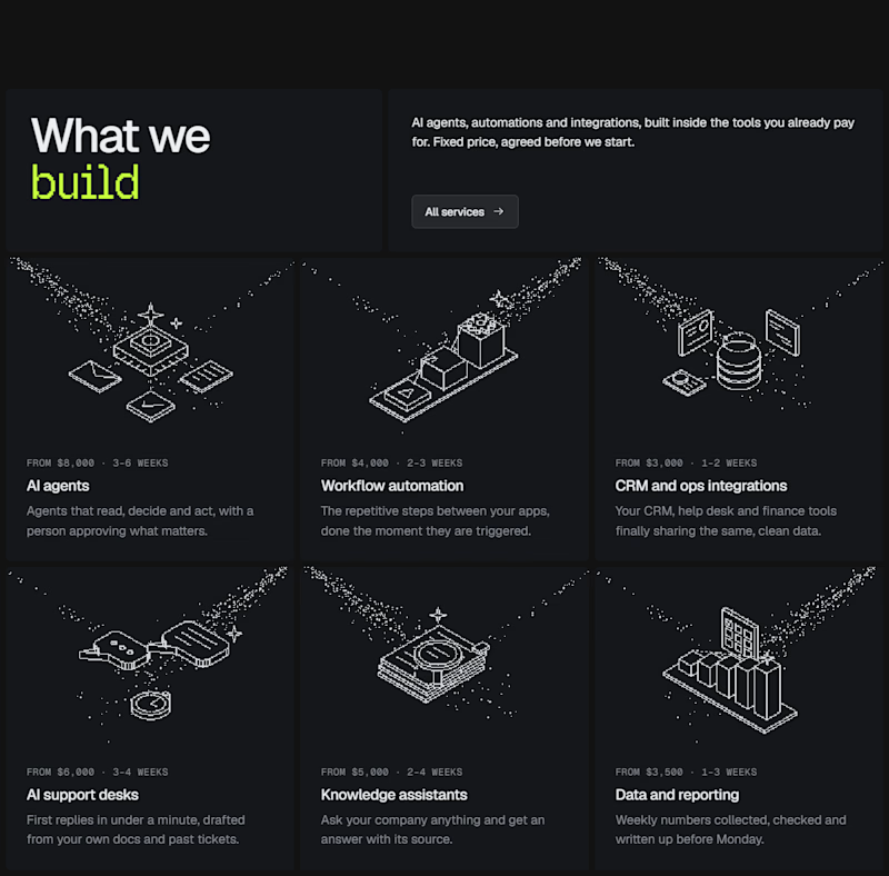
I experimented with a different illustration style for this section of my latest Framer template.
The goal was to make the UI feel more engaging without distracting from the content.
Which direction would you choose for a better user experience? Curious to hear your take. 👀
0 voted
0%
1 voted
100%
1 vote
Closed

This is a smart balance! Engaging but still content-focused. The Dither Pattern works really well here, not distracting at all.

The contact page is usually the last page anyone designs.
We made it one of the best
Recent client work: a contact section UI design for a company with offices across cities. Globe in the back, every location up front, and small interactions that make the whole web design feel alive.


Impressive work

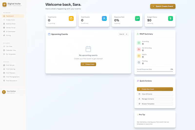
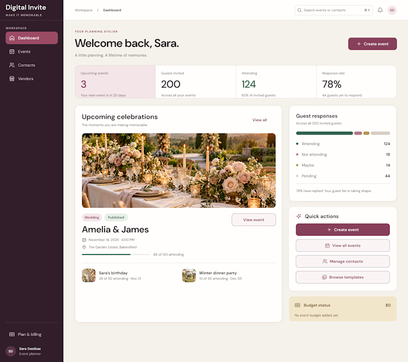
AI can generate a dashboard. But can it give a product its own identity?
The first design was created by my client using AI a familiar dashboard style you've probably seen across countless AI-generated products.
I redesigned it to feel less generic and more intentional, with a distinctive visual identity, clearer hierarchy, and an experience built around meaningful celebrations.
The goal wasn't just to make it look better. It was to make it feel like its own product.
What do you think is missing from most AI-generated interfaces?
#ProductDesign #UIDesign #AI

5 voted
23%
17 voted
77%
22 votes
Closed

I think personality is what makes a product stand out. A clean design is good, but it should also feel unique and memorable. 👏