The network for creativity
Join 1.25M professional creatives like you
Connect with clients, get discovered, and run your business 100% commission-free
Creatives on Contra have earned over $150M and we are just getting started
Back to feedPost
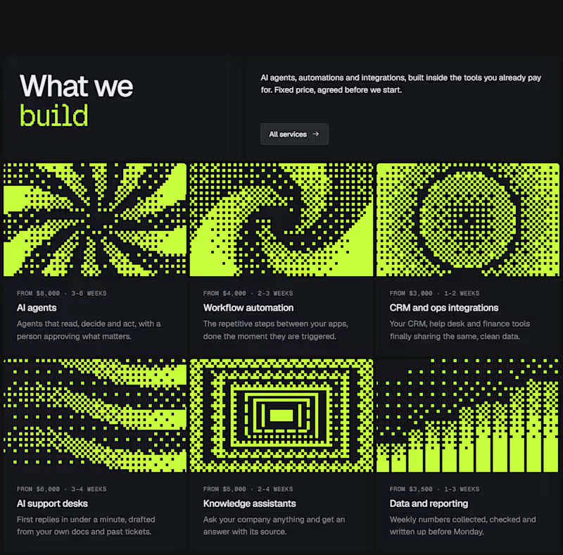
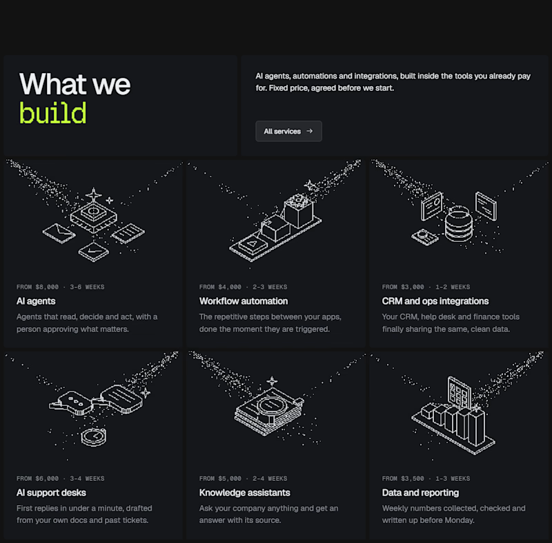
Taste Test

I experimented with a different illustration style for this section of my latest Framer template.
The goal was to make the UI feel more engaging without distracting from the content.
Which direction would you choose for a better user experience? Curious to hear your take. 👀
0 votes
Ends in 1d

This is a smart balance! Engaging but still content-focused. The Dither Pattern works really well here, not distracting at all.
Appreciate your choice, Sagar
Of course! Both were strong but that one just clicked for me. Would love to see how you evolve it further! Fawaz bahi 🔥♥️

Amazing work
The network for creativity
Join 1.25M professional creatives like you
Connect with clients, get discovered, and run your business 100% commission-free
Creatives on Contra have earned over $150M and we are just getting started





Related posts


Badge Placement: Consistency or Visual Balance?
Even a small indicator can change how the entire interface feels
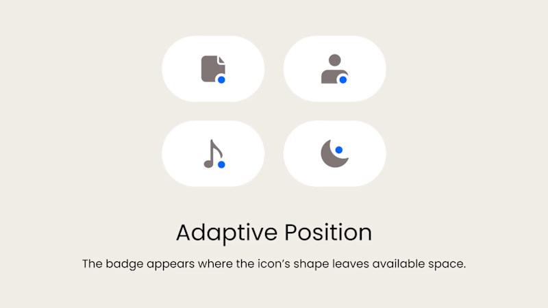
Adaptive Position
The badge placement changes depending on the icon’s shape and available space. The result feels more visually balanced but requires individual adjustments.
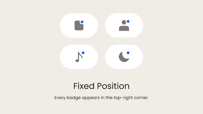
Fixed Position
The badge always appears in the top-right corner. This creates a consistent and predictable system, but on some icons it may feel disconnected or awkwardly placed.
What matters more in a design system: consistency or optical balance?
17 voted
43%
23 voted
57%
40 votes
Closed

Fixed for me. In a system, people learn where to look. I'd tweak the odd icons before breaking the rule.

Trying out two symbols for this identity.
The type and colors stay the same, but the feel changes.
Which one would you go with?

6 voted
50%
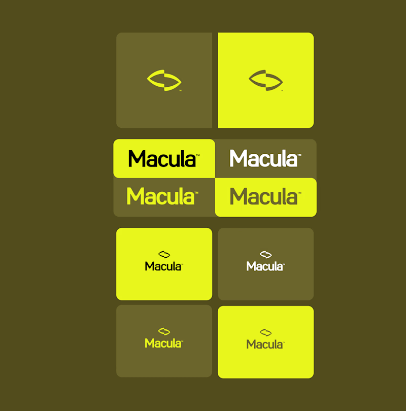
6 voted
50%
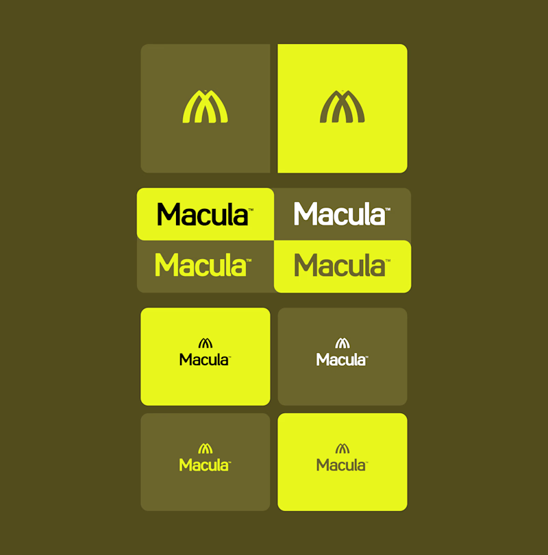
12 votes
Closed

Converge is great but Spotlight feels an updated macdonalds logo ❤️
Great job Gabriel 🎉🎉🔥🔥

Jiangliang (疆良) · SHC-12/36 🐯⚡
Which do you prefer — Foil Card 🃏 or 3D Render?


11 voted
48%
12 voted
52%
23 votes
Closed
Honestly I has no choice every work you do is stunning 🔥🔥