The network for creativity
Join 1.25M professional creatives like you
Connect with clients, get discovered, and run your business 100% commission-free
Creatives on Contra have earned over $150M and we are just getting started
Back to feedPost
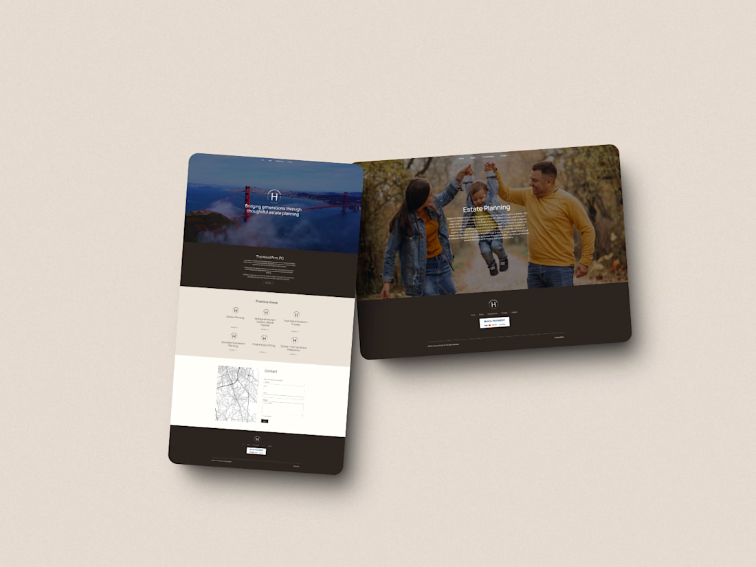
Legal websites have a reputation for being boring. Stephanie Hood didn't want that.
The Hood Firm needed a brand and website that communicated authority without the stuffiness. Sharp and modern without losing the credibility signals that matter to someone choosing legal representation.
That's a very specific balance in a very conservative industry. And it's exactly the kind of challenge I enjoy most.

Legal branding is such a tightrope, too safe and you're forgettable, too bold and clients stop trusting you with anything serious. What ended up being the riskiest element you pushed for here, and did Stephanie push back on it at all?

Honestly the typography was the biggest risk. Most law firm sites default to serif fonts to signal tradition and gravitas. We went with a cleaner, more modern type system that felt closer to a high-end consultancy than a conventional firm.
The client was open to it from the start...
The network for creativity
Join 1.25M professional creatives like you
Connect with clients, get discovered, and run your business 100% commission-free
Creatives on Contra have earned over $150M and we are just getting started
Trending
retrofuturism
Share your favorite designs from the past exploring the distant future. Or your own take on the aesthetic 🚀
halftone
Dots. Texture. Grain. Let's see your designs using the halftone technique.

Midjourney
Creatives are showing off what they're making with Midjourney.
colorgrade
Video editors sound off: How do you enhance the mood of your video in color grading?







Related posts

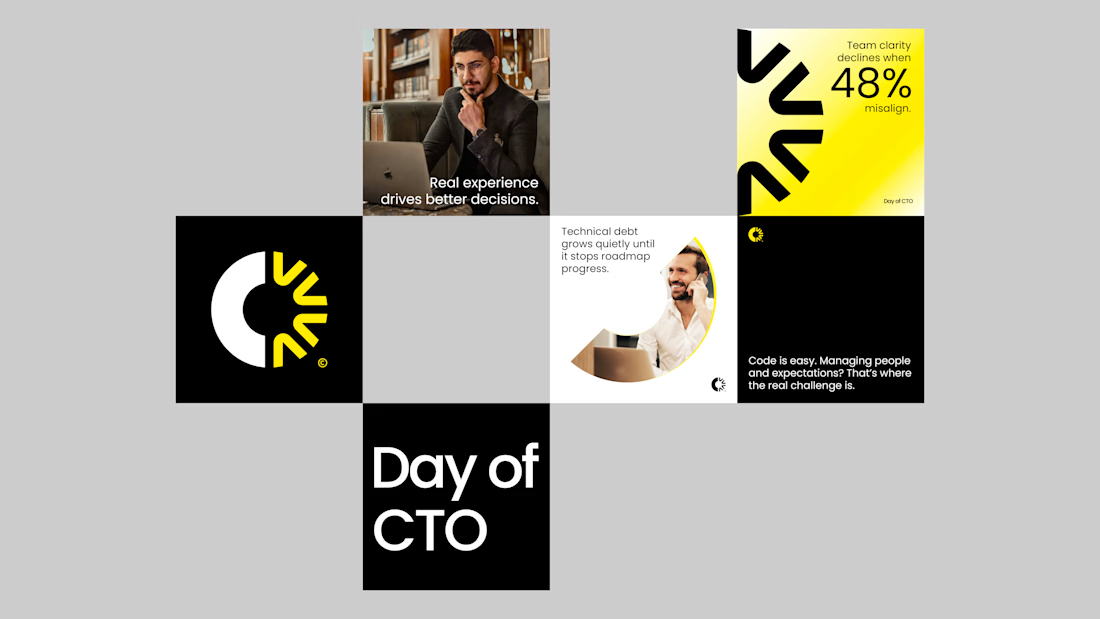
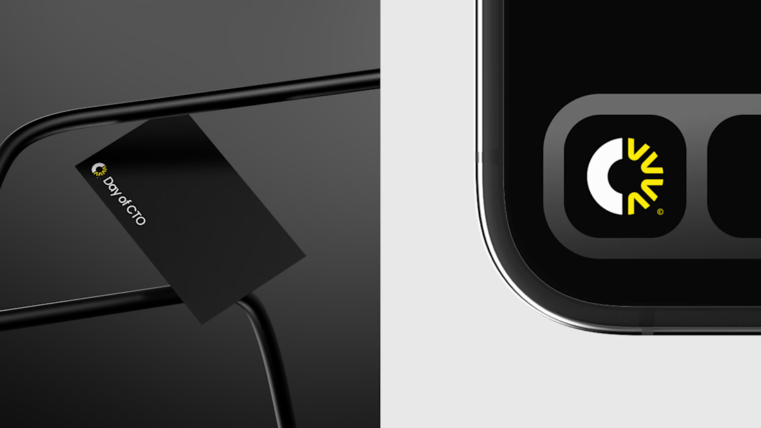
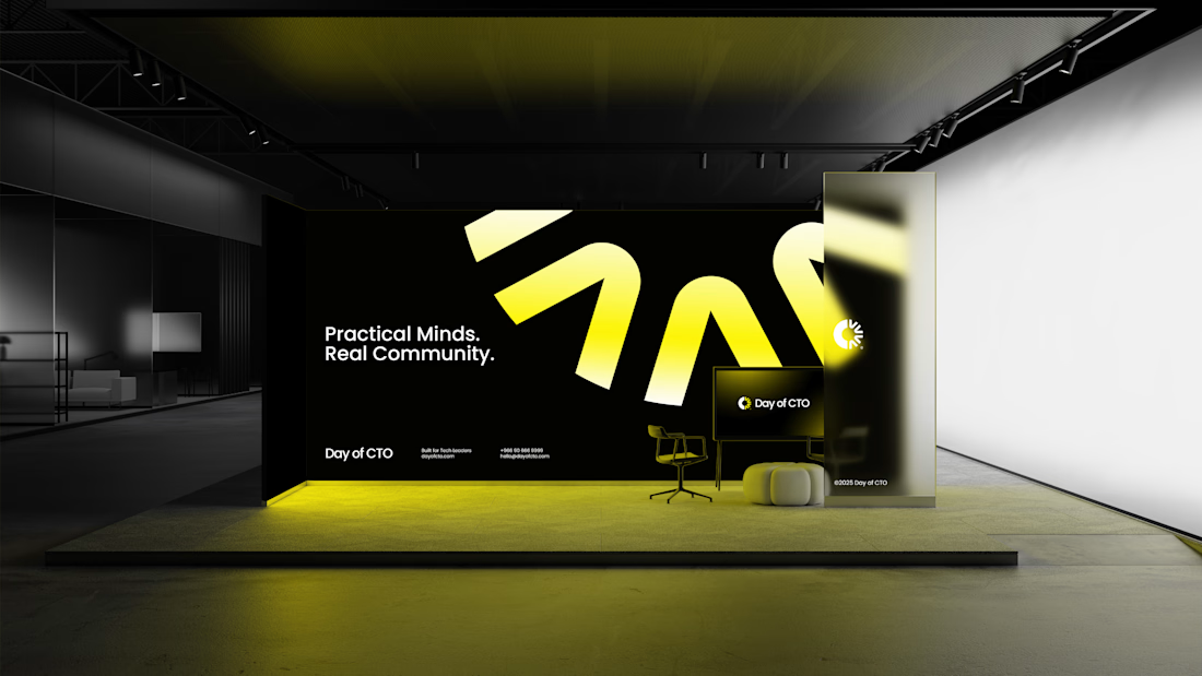
Branding for Day of CTO a newsletter or digital media that captures the real, day-to-day challenges of being a CTO. It reads like a diary of tech leadership, sharing the realities that are often left unsaid.

Branding 😍


Which header would you choose?
While working on a new landing page, I wanted to test two different approaches to desktop navigation. Both have their strengths, but they create a very different first impression.
Option 1 - Full Navigation. The logo, navigation links, and the primary CTA are always visible.
Option 2 - Hidden Navigation. Only the logo and a menu icon are visible. The navigation slides in from the side when the burger menu is opened.
Which option would you choose - 1 or 2? And why?
107 voted
84%
21 voted
16%
128 votes
Closed

Full 🌱

Designed a modern Restaurant Management Dashboard for Restro.
Clean and elegant UI with order status, weekly summary, customer insights, occupation analytics, and real-time reports for smarter restaurant operations.


Very beautiful! Love the modern design and clean, intuitive UI ❤️