The network for creativity
Join 1.25M professional creatives like you
Connect with clients, get discovered, and run your business 100% commission-free
Creatives on Contra have earned over $150M and we are just getting started
Back to feedPost
Taste Test


Which header would you choose?
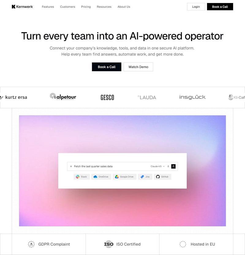
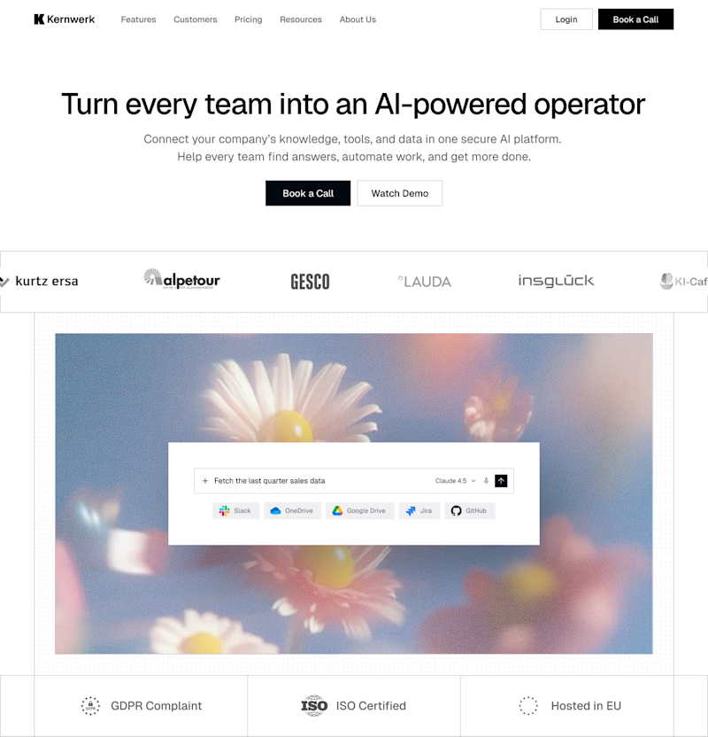
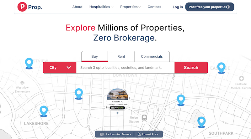
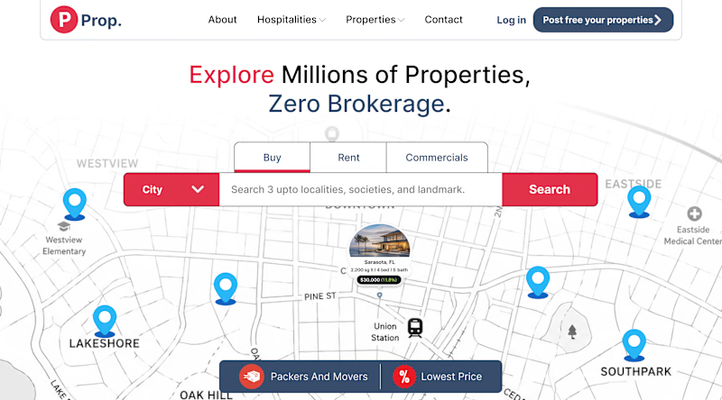
While working on a new landing page, I wanted to test two different approaches to desktop navigation. Both have their strengths, but they create a very different first impression.
Option 1 - Full Navigation. The logo, navigation links, and the primary CTA are always visible.
Option 2 - Hidden Navigation. Only the logo and a menu icon are visible. The navigation slides in from the side when the burger menu is opened.
Which option would you choose - 1 or 2? And why?
34 votes
Ends in 1d


Option 1 for desktop. Faster access and the CTA gets more visibility.

Full🔥

BOTH!


Wonderful design !

Full 🌱

Full for a landing page. A first-time visitor needs to see where they can go before they will trust a hidden menu, so full nav lowers the friction on cold traffic. I save hidden nav for apps and portfolios where people already know why they came.

Although the hidden menu feels cleaner, having a full header makes your site immediately more accessible and just requires less cognition for first time users.

Definitely Full

hidden animation is good,

full! there's an immersive nature to it, & the task being so meticulous already wins the viewer's intrigue. i think to cut away so abruptly would break a sort of psychological 'lock in' on the content you have to offer that the full version sort of takes the brain into by the hand.

Both looks great. Full one for me

Full💯

Full always, there is no reason to hide important links behind a hidden navigation and have the user take two actions to find the right path.

Full is okay
The network for creativity
Join 1.25M professional creatives like you
Connect with clients, get discovered, and run your business 100% commission-free
Creatives on Contra have earned over $150M and we are just getting started
Trending
retrofuturism
Share your favorite designs from the past exploring the distant future. Or your own take on the aesthetic 🚀
halftone
Dots. Texture. Grain. Let's see your designs using the halftone technique.

Midjourney
Creatives are showing off what they're making with Midjourney.
colorgrade
Video editors sound off: How do you enhance the mood of your video in color grading?


Related posts




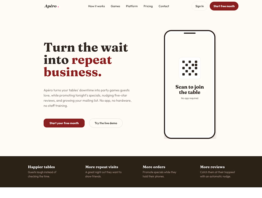
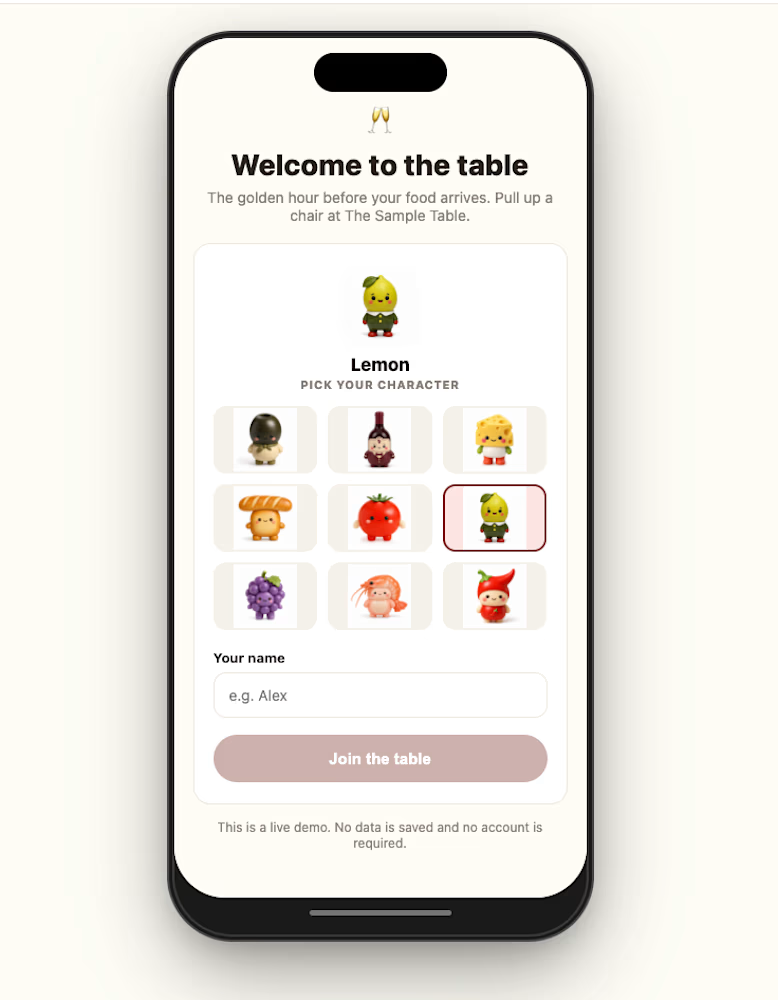
Excited to share my submission for the #Bubble Free-For-All!
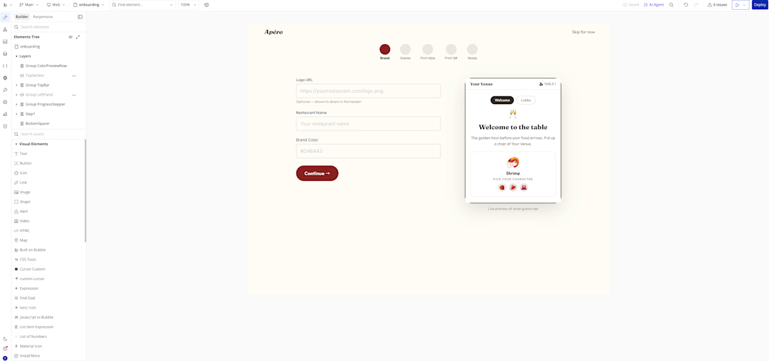
The project is Apero, a business concept focused on improving the restaurant dining experience. Instead of patrons getting bored or annoyed waiting for their food, Apero provides lightweight entertainment right at the table.
I’d been working on Apero prior to this, so I decided to see how far I could take the web build using Bubble to build it completely from scratch. The AI assistant was super helpful for quick iteration, but what really stood out was how seamlessly I could manage custom workflows, complex datasets, and distinct project pages.
Improvements are still underway, and testing with real restaurants will begin soon! However really happy with how it turned out so far and I'm excited to see all the other competition entries! 🙌
Check it out and let me know what you think!


Hero A vs Hero B. Same real estate concept, small but deliberate differences. Vote below and tell me why.
1 voted
20%
4 voted
80%
5 votes
Closed

B has more clarity