The network for creativity
Join 1.25M professional creatives like you
Connect with clients, get discovered, and run your business 100% commission-free
Creatives on Contra have earned over $150M and we are just getting started
Back to feedPost

I really love to make chili oil and even more so love eating it!
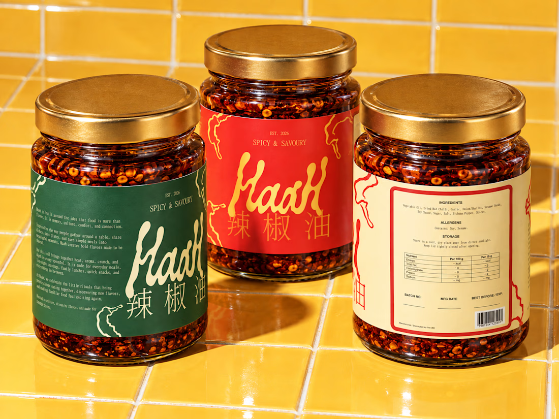
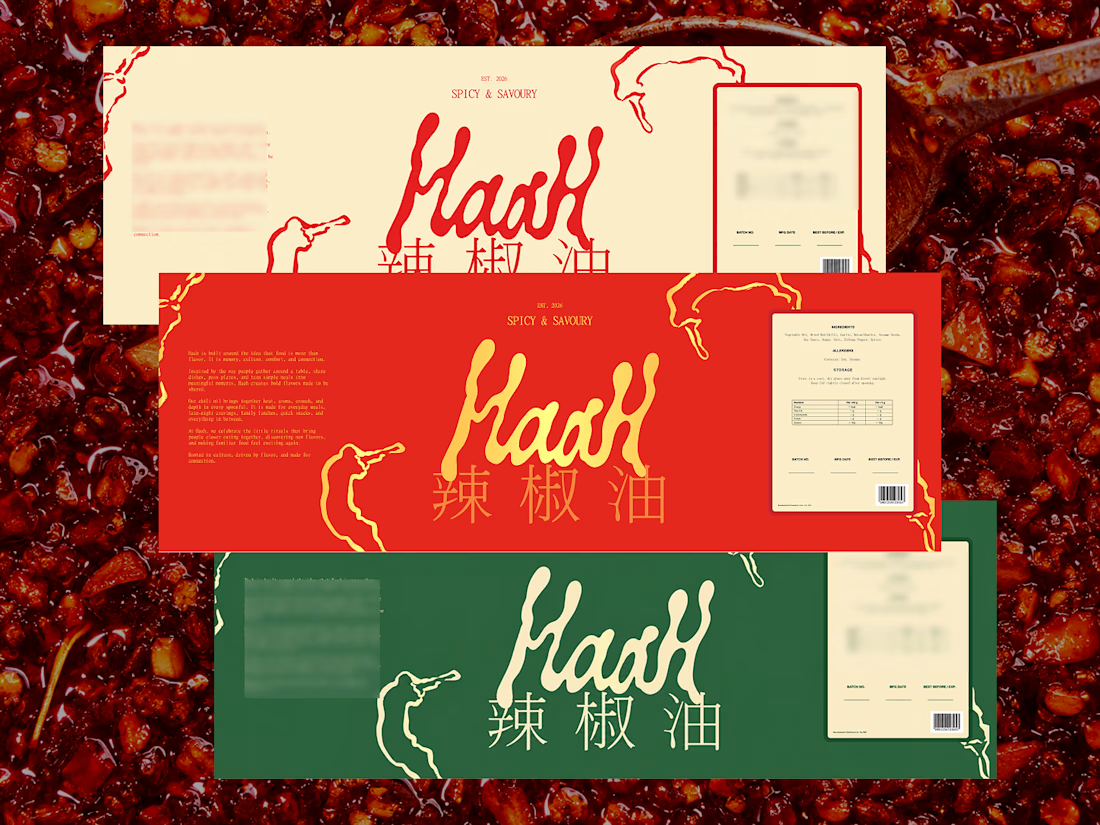
I wanted to create something that would be not only attractive but also practical and meaningful. I did this by drawing my own sketches, looking at packaging reference images, working with typography, color, and photographing the images to direct the brand. With the help of generative AI, I was able to portray this into such production grade imagery.
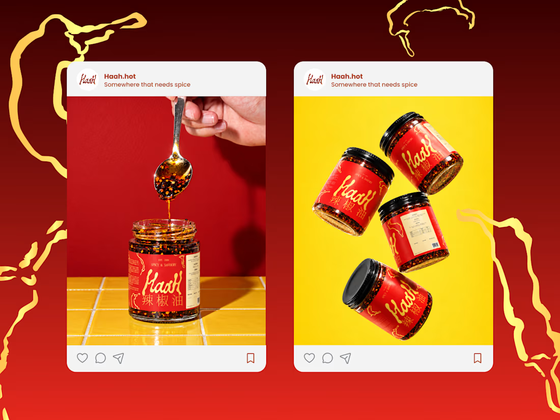
I worked with the little visual details that would make it stand out from the typical modern food brand. Many of my decisions were based on a previous branding project I did. How to strengthen the visual system, how to make the packaging feel familiar at a distance, how to make the product photo part of the identity, and how to do it.
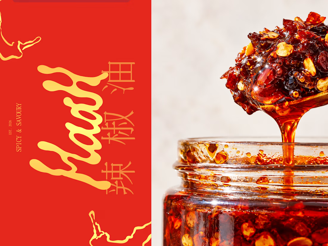
The final direction's visual language is a blend of chili red, retro green, cream tones, chinese typography and a touch of nostalgia. A feeling of tradition with a current enough vibe to comfortably sit on a shelf, website, or social media platform.
It was a very personal project, but also a great exercise to create a food brand from scratch.
If you're a food, beverage or consumer brand and you're looking for help with brand identity, packaging or visual direction, I'd be delighted to do something similar.
#branddesign #packagingdesign #graphicdesigndaily #graphic #packaging #customtype


The network for creativity
Join 1.25M professional creatives like you
Connect with clients, get discovered, and run your business 100% commission-free
Creatives on Contra have earned over $150M and we are just getting started
Challenges
View all


Related posts

What if a space brand didn’t just look futuristic — but felt like it was already living in the future?
For XPACE, the goal was to build a visual identity that could turn the idea of space exploration into a complete and immersive brand experience.
The identity combines a bold typographic system, a high-contrast visual language, and electric blue accents against deep black to create a futuristic presence that feels precise, technological, and unmistakably XPACE.
But the identity didn’t stop at the logo.
The system was extended across digital interfaces, web design, favicon and UI icons, access cards, board passes, and branded applications — creating a consistent experience across every touchpoint.
Every detail was designed to make XPACE feel less like a brand inspired by the future, and more like a brand built for it.
XPACE — Visual Identity System.
Looking to build a visual identity that goes beyond a logo?
Let’s create something with a world of its own.


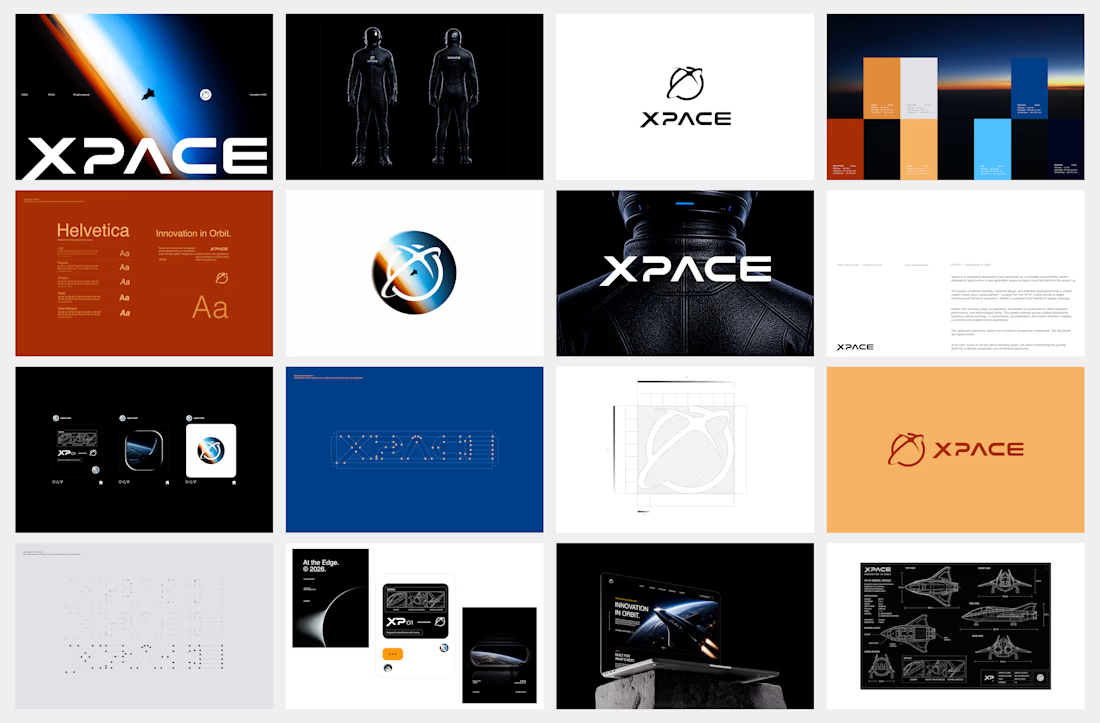

The identity system feels cohesive because the typography, electric blue accents, and image language all push in the same direction. Extending that logic into interfaces and packaging is what makes XPACE feel like a real world, not just a futuristic logo.

Celvico Energy – Solar & Renewable Energy Logo.
A modern logo concept for Celvico Energy, a renewable energy company focused on solar power and clean energy solutions. The symbol combines a rising sun, circular energy flow, and the C + O letter concept to represent solar power, sustainability, continuous energy, and innovation. The clean geometric construction and bold typography create a professional and contemporary look suitable for solar energy companies, renewable energy providers, clean technology, and sustainable power solutions.
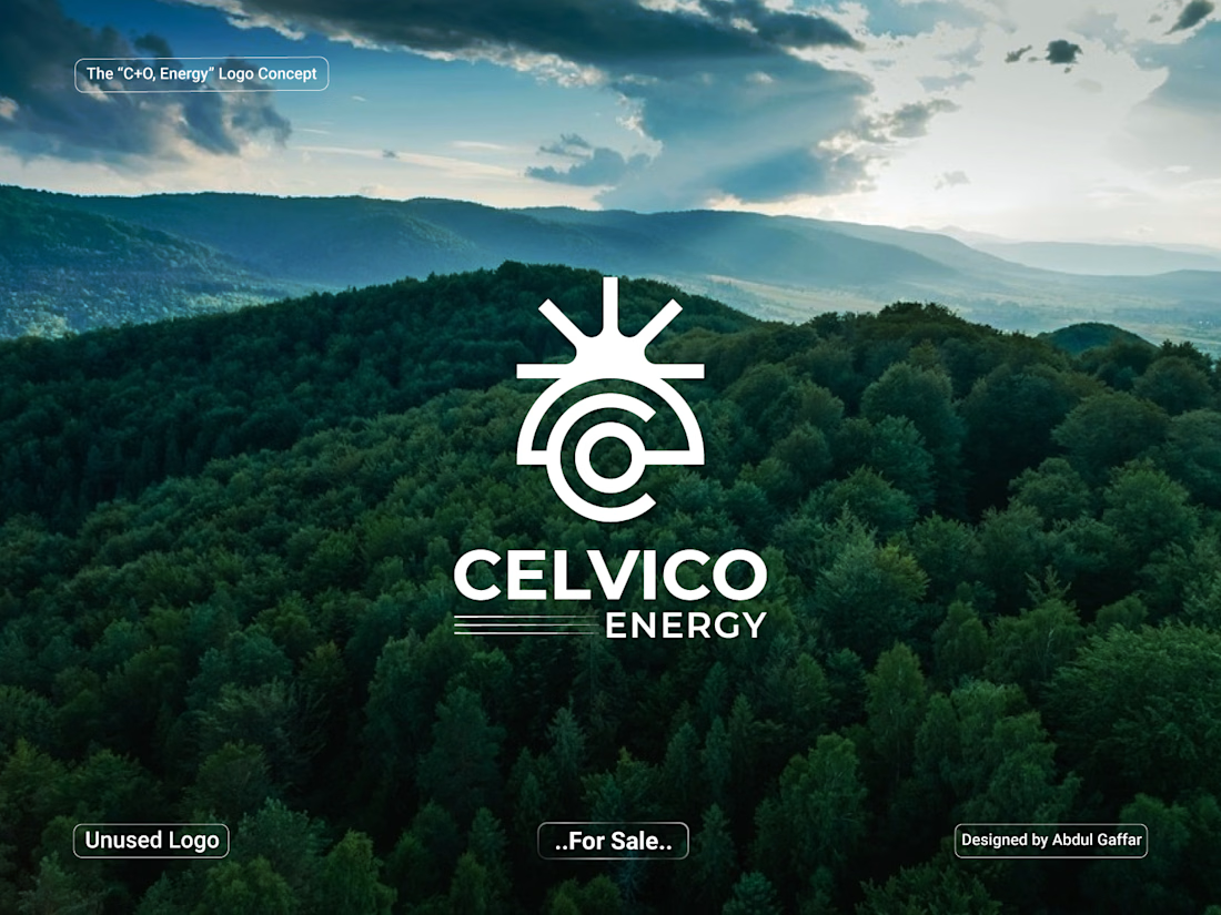

Stacking three ideas — sun, flow, C+O — into one mark is the hard version of this brief. If it had to survive at favicon size and only one of the three could read, which would you protect? My instinct says the letterform, since sun-plus-circle is the crowded part of the solar category.

Design Concept
Clean & Premium
A minimalist layout creates a refined and professional spa experience.
Natural Colour Palette
Soft ivory and deep botanical green reflect wellness, relaxation, and a natural spa atmosphere.
Clear Information Hierarchy
Treatment names, durations, and prices are structured for quick and easy browsing.
Visual Consistency
Consistent typography, spacing, and imagery create a cohesive treatment menu across different categories.
Credit: HWG

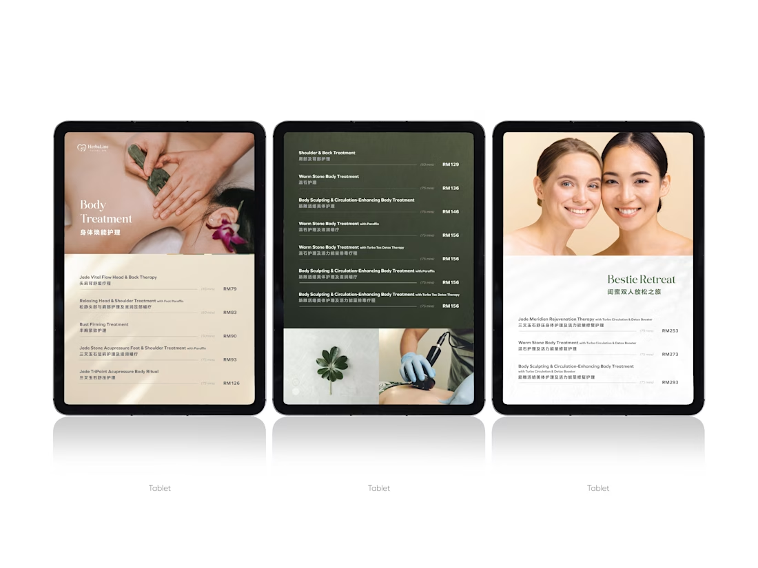
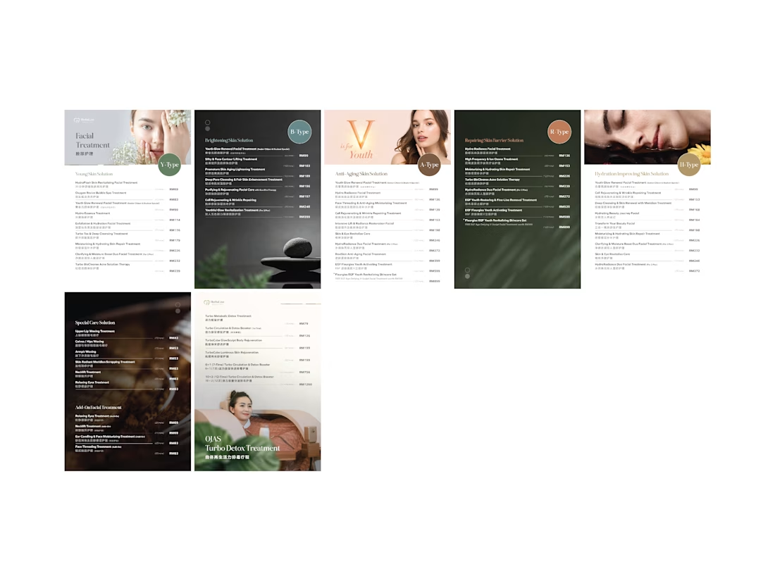
Treatment menus are a nastier hierarchy problem than they look — name, duration and price all want the same eye at the same moment. Curious how you settled it: lighter weight on the durations, or pulling them into their own column?