The network for creativity
Join 1.25M professional creatives like you
Connect with clients, get discovered, and run your business 100% commission-free
Creatives on Contra have earned over $150M and we are just getting started
Back to feedPost
Taste Test


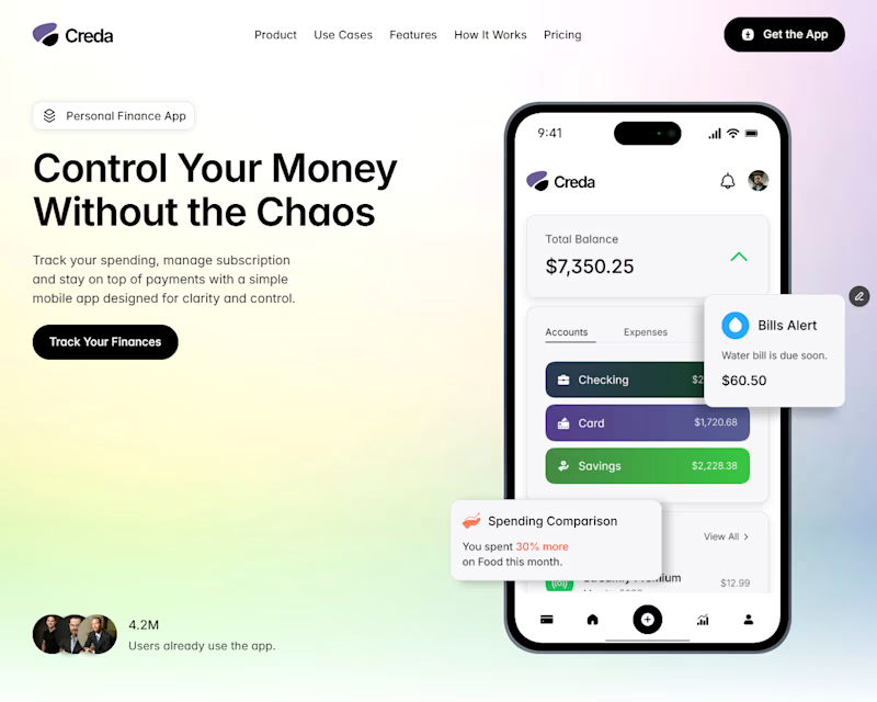

The vertical is better, The horizontal give the page alot of empty space, which can bore users

Thanks for the feedback


Vertical all the way. But overall, great designs!
Thank you
welcome

Vertical 🫠
thanks for the feedback
this is the website https://www.framer.com/marketplace/templates/creda/

vertical is mobile friendly and easy to scroll
yes i think so

yes, thank you for the feedback
The network for creativity
Join 1.25M professional creatives like you
Connect with clients, get discovered, and run your business 100% commission-free
Creatives on Contra have earned over $150M and we are just getting started





Related posts

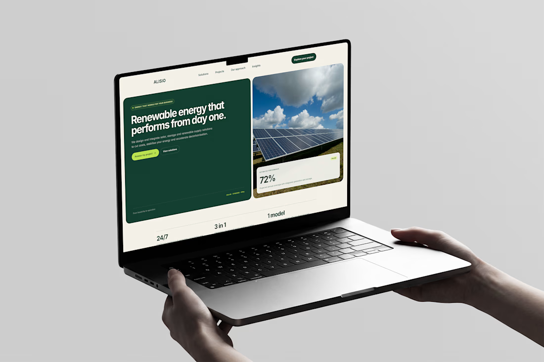
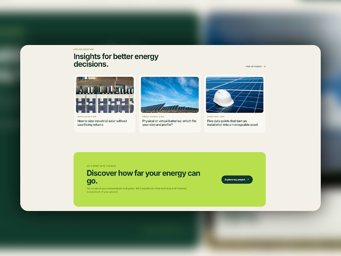
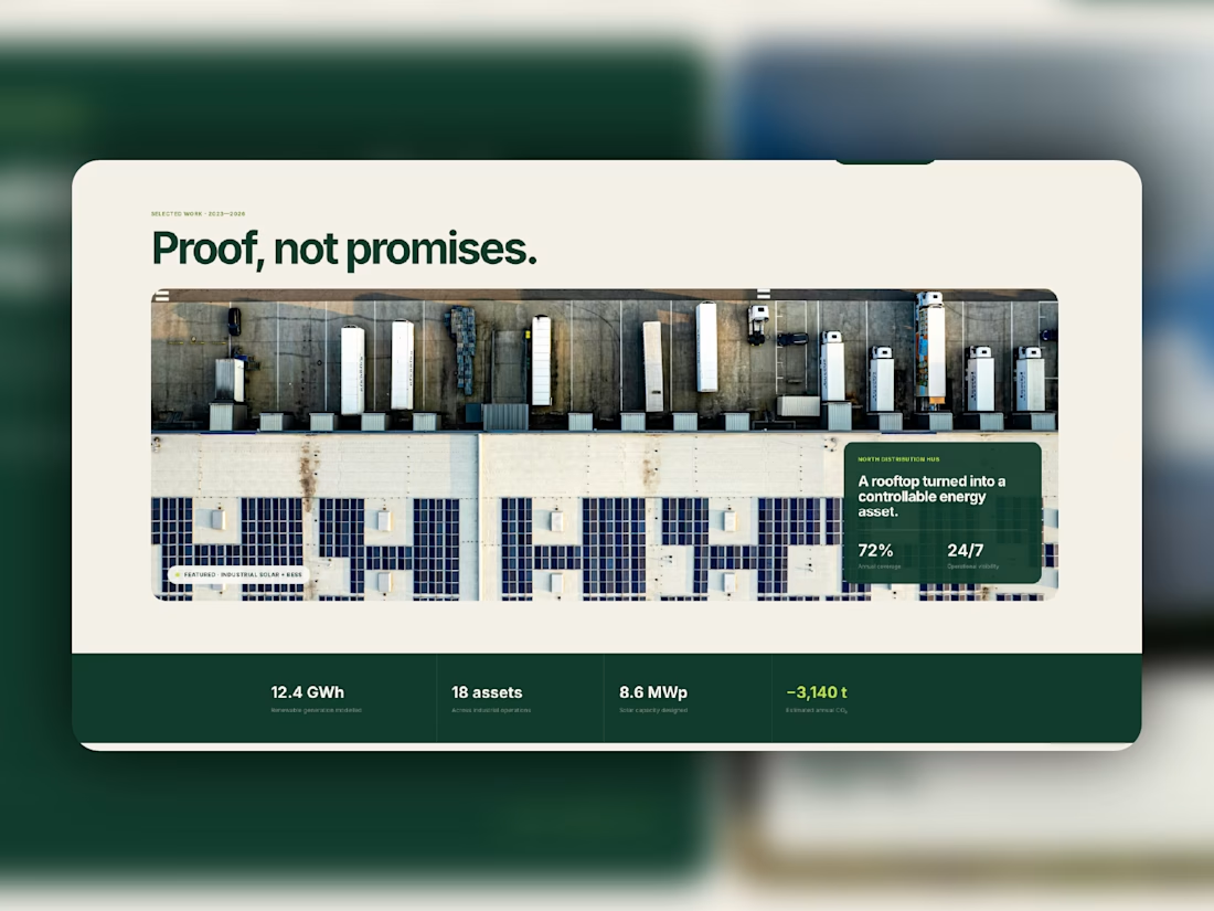
Meet Alisio, my latest Framer template for renewable energy and sustainability businesses.
Deep greens, warm neutrals, bold typography, and a bright lime accent give it a distinctive visual identity. Dedicated service pages, CMS project case studies, and an insights blog help businesses explain what they do and showcase their work.
Designed for desktop, tablet, and mobile, with reusable components and subtle motion throughout.
Take a closer look at Aliso, or make it your own.




Love this!

Which one brings more clarity to the hero section?
I was exploring a hero section concept for an AI product and tried two different visual directions.
Visual-led — focuses on explaining the idea through the interface/visual.
Isometric — uses a visual system to represent how the product works.
Both look good, but the real question isn't which one looks better.
Which one helps you understand the product faster?
That's something I always try to think about when designing hero sections — the visual should help explain the product, not just make the page look good.
Which one would you choose?
7 voted
58%
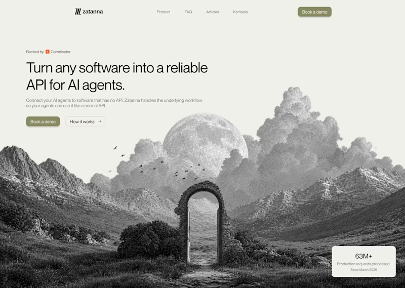
5 voted
42%
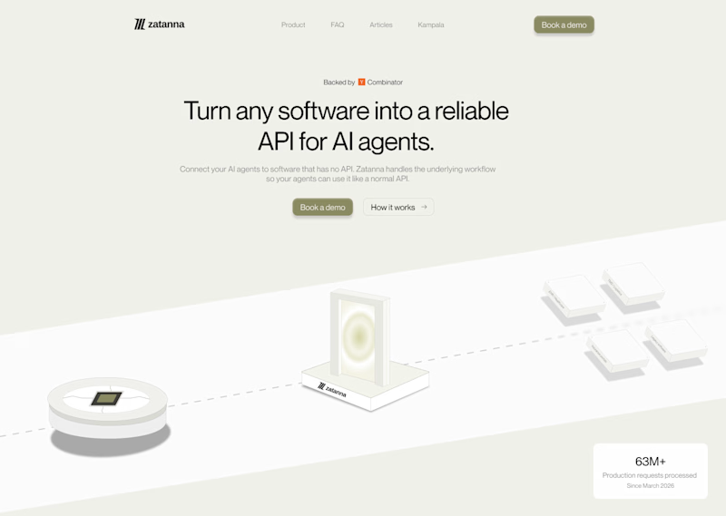
12 votes
Closed

The visual direction looks great, but I think Isometric does a better job of explaining the product.

I think this could be my favorite Framer code component I’ve created. Meet Page Transition Studio, you can add animated transitions between pages across 10 styles. My favorites are vertical strips and centre split. What’s yours? Check the live preview here

Good work, like the interaction