The network for creativity
Join 1.25M professional creatives like you
Connect with clients, get discovered, and run your business 100% commission-free
Creatives on Contra have earned over $150M and we are just getting started
Back to feedPost


Brand Visuals for a Maternity Brand “TEM CLINIC”
The General idea is to help first time expectant mothers to journey through motherhood in this modern age
To assure them that they are safe and heard and that they are not alone.
To break down the technicalities of the logo. It’s shaped as a form of sunflower which can signify joy, growth, optimism, resilience, or hope. And all this feelings are felt during this period.
To break it down further, looking at each petals you will notice some variations in their sizes this are reflecting the bodily changes a woman goes through when carrying a child.
if you were to count each petals you would notice that there are 12 in total (in this case they represent 12 months)
Month 1-3 — First Trimester Month 4-6 — Second Trimester
Month 7-9 — Third Trimester (Baby is born)
Month 10-12 — Postpartum Transition(The woman’s body begins to recover)
So looking at the anti clock wise movement of the logo you can tell the journey The expectant mothers goes through seeing that after delivery on the ninth month her body start to transition back to how it was see the petals fade out.
.
Would appreciate your thoughts on this project as well if it connected with you 😊


The network for creativity
Join 1.25M professional creatives like you
Connect with clients, get discovered, and run your business 100% commission-free
Creatives on Contra have earned over $150M and we are just getting started





Related posts

Jordan Reid - Sportswear Brand Identity






Like the logo direction

Puresip — a fresh identity taking shape.
Built around one idea: make a fruit brand feel refreshing, natural and full of personality without falling into the usual “healthy juice” look.
From Spain, direct to you.
A little preview of the identity and digital direction before the full case study.
Impressive work man

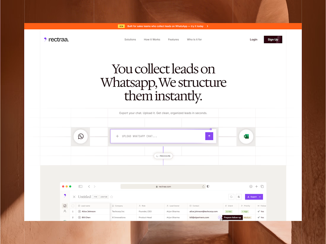
Rectraa helps sales teams extract, classify and organize leads collected through WhatsApp. I designed and developed its marketing website to explain the product clearly, demonstrate its workflow and encourage visitors to try it.
Project information:
Role: Website Designer & Framer Developer
Scope: Website strategy, UI design, responsive design and development
Tools: Figma and Framer
Deliverable: Responsive SaaS marketing website


High end design