The network for creativity
Join 1.25M professional creatives like you
Connect with clients, get discovered, and run your business 100% commission-free
Creatives on Contra have earned over $150M and we are just getting started
Back to feedPost

🔥 Some projects just hit differently.

This brand guide for MavenHill Development Initiative is one of my favorites.
Not just because of how it looks, but because of what it represents—clarity, consistency, and a strong brand presence. ✨
From defining the core identity to refining the smallest design details, every element was crafted with purpose.
🎨 The typography, the color system, the layout—each piece working together to build a brand that feels solid and impactful. 💡
One thing I always focus on when designing brand guides is making them not just beautiful, but usable.
📖 A great brand guide should make it easy for teams to maintain consistency across all touchpoints—without overcomplicating things.
📌 Would love to hear your thoughts—what’s one element of a brand guide you always pay attention to? 👀
The network for creativity
Join 1.25M professional creatives like you
Connect with clients, get discovered, and run your business 100% commission-free
Creatives on Contra have earned over $150M and we are just getting started











Related posts

Not every client comes to me for a brand identity and not all my clients are skincare or cosmetic brands.
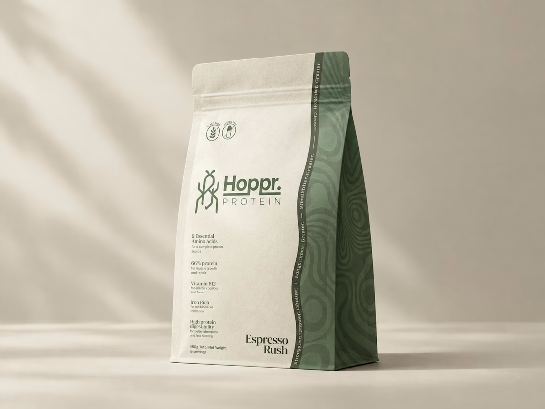
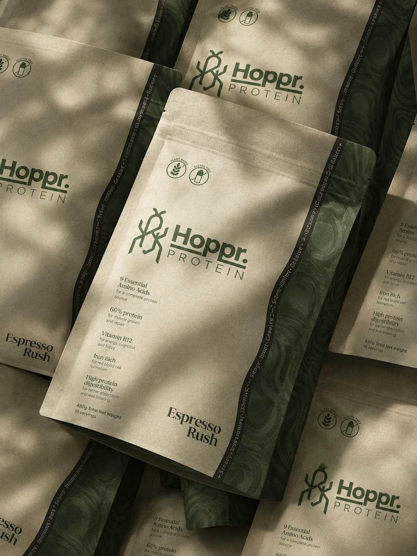
That was the case with Hoppr, a protein powder brand made from crickets. 🦗 YES, CRICKETS!
Sometimes the logo, colors, and visual system are already there and my job is to bring them to life on packaging and see how far I can push them.
I love projects like this because I get to play with typography, layout, and materials while working within an existing identity.
How much freedom do you think a designer should have when working with an established brand?


Great packaging work, nice job

Second Serve Club — Exploring Visual Identity Through AI & Design.
For this branding challenge, I created a series of original logo marks in Adobe Illustrator, inspired by vintage tennis culture.
I then explored how these designs could come to life by combining my own typography, monograms and colour identity with AI-generated visuals using ChatGPT.
From the texture of a clay court to embroidered details on tennis balls, the goal was to bring the brand identity into a more tangible, realistic setting.
An exploration of how traditional graphic design and AI can work together to create a cohesive visual world.
Designed by me. Visualised with AI. 🎾
Full brand identity case study coming soon.
#BrandIdentity #VisualIdentity #GraphicDesign #AIDesign #ChatGPT
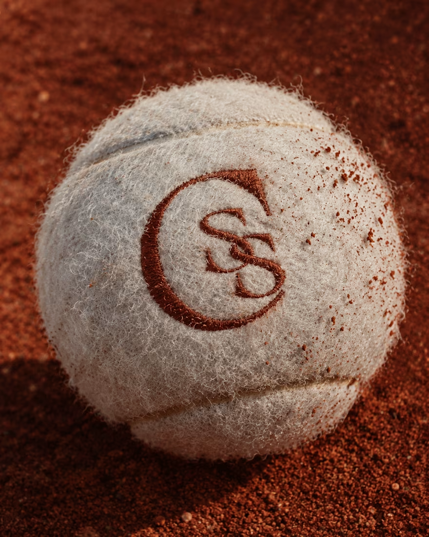
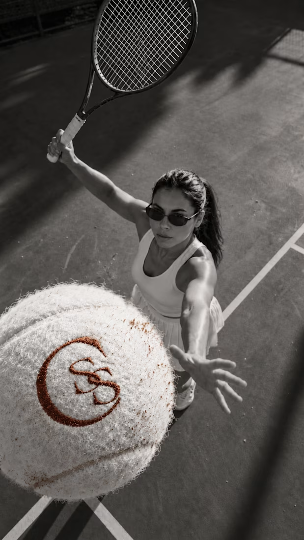
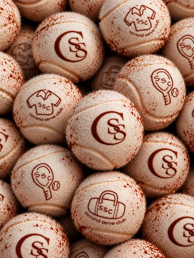

The SS mark stamped into the tennis ball felt is a great detail. Looks very real on the clay court.

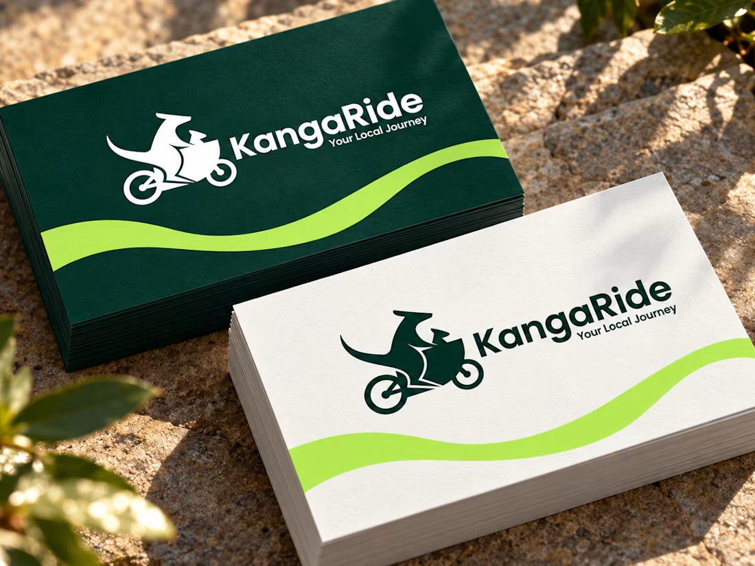
Check it out KangaRide — Sustainable Mobility Brand Identity. A bold, community-focused visual system designed to make greener local journeys feel practical and memorable.

Black packaging is so stunning Ideaplane🔥🔥